"It’s all about a ‘back to basics’ approach being bold and courageous with fun key elements and no illusions or pretension"
The concept builds upon the current Bonds vision. It’s all about a ‘back to basics’ approach being bold and courageous with fun key elements and no illusions or pretension.
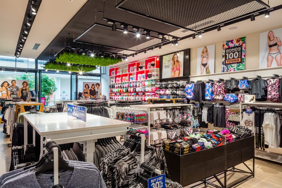
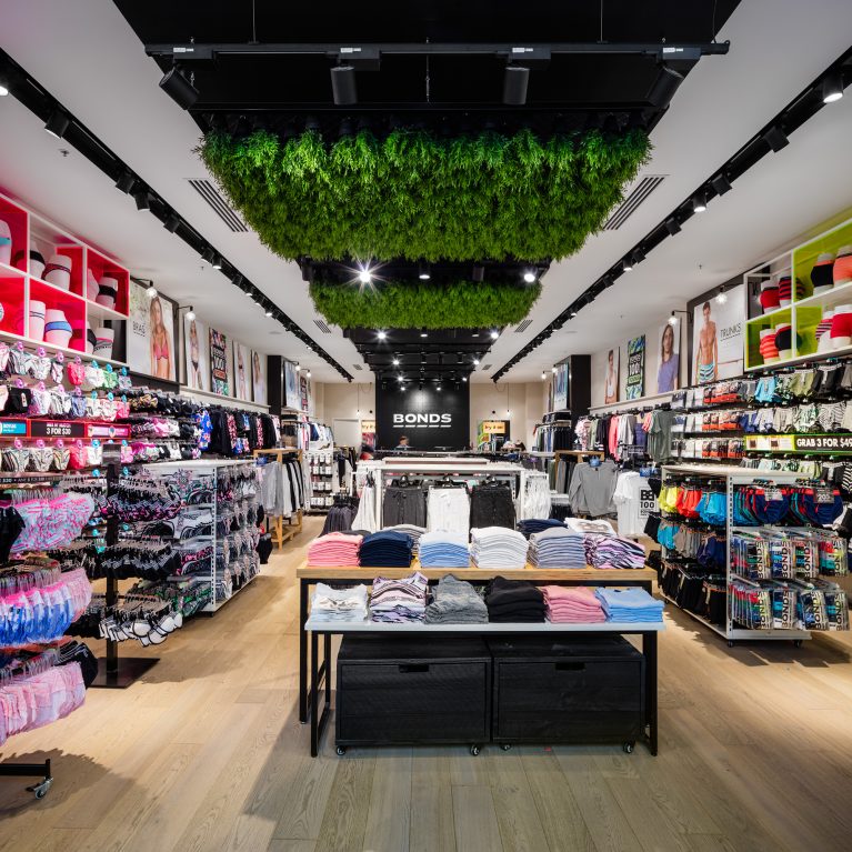
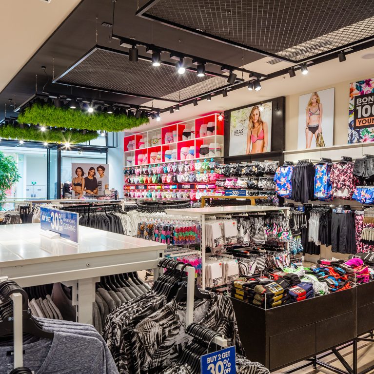
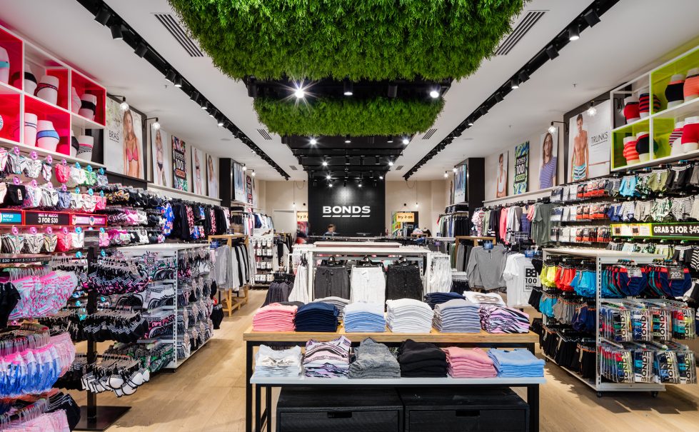
The concept embraces diversity and originality, with a ‘think outside the box’ approach. It draws upon the notion of individuality and nonconformity – not being just another white sheep! The Bonds brand is not just like any other brand, so why should its stores be?
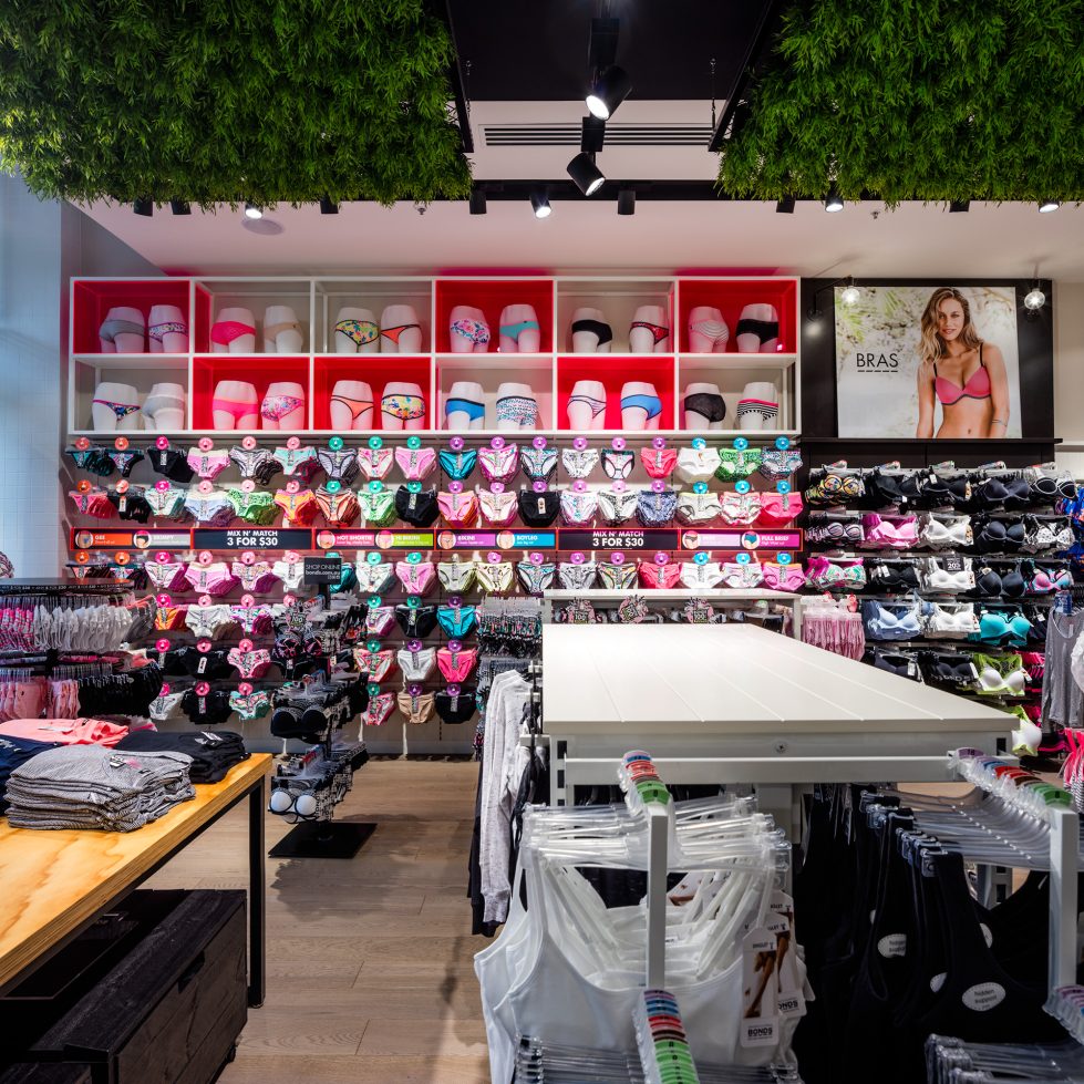
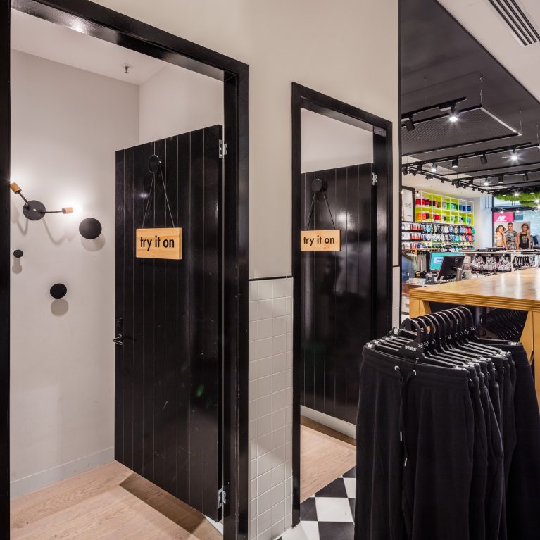
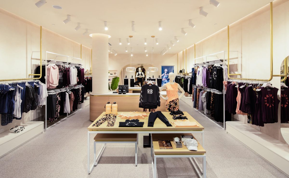
Bold, empowering and cheeky graphics, dynamic display fixtures and honest finishes in contrasting colours convey a welcoming, fun and lively space.
The in-store experience and customer journey are enhanced by informative, directional wayfinding and graphics. New in-store purchasing and sign-up facilities encourage interaction and loyalty, answering the brief by creating a stronger emotional connection between the Bonds brand and their customers.
The design and layout are practical and realistic, being operationally and cost-effective; allowing for high-density Visual Merchandising with flexibility for high volume stock turnover. This new retail concept relates to the fundamental values and the ‘roots’ of the Bonds brand itself.
“I saw the store for the first time yesterday and was blown away with its impact. Interestingly there has been much more debate surrounding the design than ever. My take on this is because the store has a strong point of view and stands for something. I LOVE IT and am very proud of how far we have come in one big leap forward.”
– Belinda Barlow, GM – retail, Underwear Group