High street banking hits new benchmarks
Revolution! An overthrow of the old world order has happened. Victor Harbor lays the scene for a retail bank design first. Introducing the ‘anti-bank’, otherwise known as the People’s Choice Credit Union.
So who is leading the charge in up-ending the staid old bank-scape? Retail bank design specialists, Design Clarity.
With scores of high street banking transformations under their belts in both Australia and the UK, Design Clarity has placed People’s Choice Credit Union about as far from your traditional bank as you can get. Inviting gathering points, streamlined service zones and even child-friendly entertainment are all part of the anti-bank fabric.
Consumer cut-through has been resounding with patrons keen to take up an easy, engaging and enjoyable – yes, enjoyable – banking experience. If you want to unleash transformative retail bank design, speak to the high street banking experts today. Speak to Design Clarity or scroll to the end of this post for links to portfolio work.
Read David Mellonie’s article account of the ‘new cool’ in Victor Harbor banking:
Victor Harbor is a sprawling seaside resort town about sixty kilometres south of Adelaide, notable for its temperate climate and large elderly population, thereby giving rise to the unkind local nickname of ‘God’s Waiting Room’.
But not everything in Victor Harbor is lace curtains, seagulls and ten pin bowling greens.
There’s a new credit union in town too, which takes a decidedly ‘anti-bank’ approach to its branding and rejoices in a clever visual identity, courtesy of DIA Practice Member, Design Clarity.
Based in Sydney and London, Design Clarity is a relatively small design studio that punches way above its weight with innovative, eye-catching design work in hospitality, commercial, residential and retail design.
Its work for the People’s Choice Credit Union in Victor Harbor was the pilot for a proposed national roll-out, and Design Clarity provided a ‘revolutionary’ design solution that included just about everything you wouldn’t expect to find in a traditional bank.
Coffee machines, real money trees, communal lockers, bright colour schemes, fake lawn, umbrellas and trolleys available to borrow, and iPads for kids to draw electronic pictures on are just some of the items customers can find inside the credit union premises.
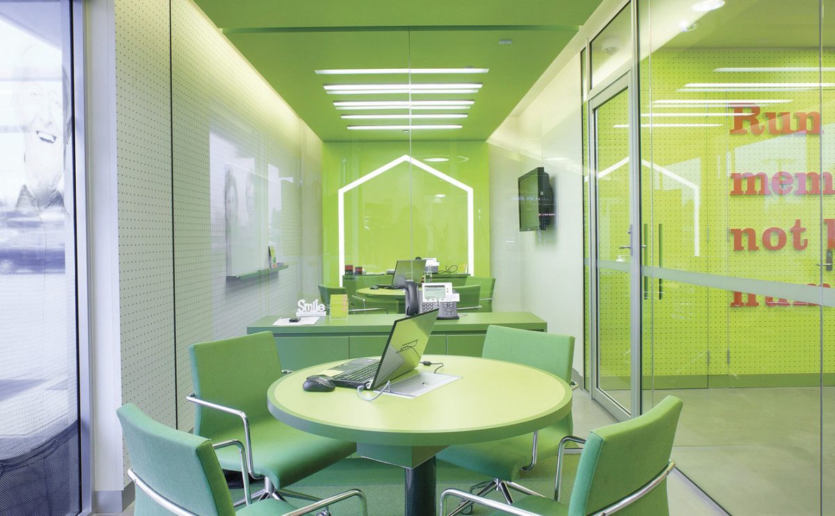
The Design Clarity team’s overall concept focused on the visual segmentation of the space into three zones: a personal, a communal and a ‘social strip’ as the core of the design.
Not everyone’s favourite colour, bright green was nevertheless made the highlight of the social strip, which includes everything from green faux turf to green light fittings and even living money plants.
Communal tables are provided where credit union members can rest and relax in a fresh, bright and welcoming atmosphere that is ‘perfectly aligned with the Credit Union’s new brand’.
A floor-to-ceiling plywood wall creates the communal strip which hosts the more bank-orientated functions such as tellers and foreign exchange desks.
The personal zone includes distinctive red, white and charcoal colours with plywood 3D lettering and timber pencils that pop out of the wall to convey to the public the Credit Union’s new approach to communication.
According to Design Clarity, ‘the design respects the functionality required of a traditional banking space while being fresh, unique and in-line with the Credit Union’s main vision.’
The end result is a design solution that has resulted in high praise from members of the Credit Union and wider community.
To view the article online, please click here
Sound radical yet brilliant? It is. What is more, Design Clarity has done this before. Creating bold new horizons in banking is nothing new to these retail bank design gurus. Just check out the hip and happening high street banking experiences that Design Clarity has crafted for:
Bankwest
Bankwest Express
UAE Exchange