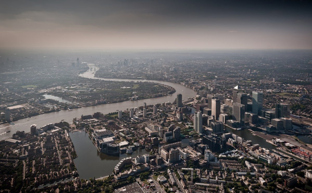
Design Clarity was approached early 2011 by a residential client offering an exciting opportunity to refurbish his riverside apartment. Located in a grade II listed 19th century grain warehouse on Mill Street, very close to the Design Museum, this warehouse building was the very first of this type of residential conversion in London’s Docklands in the 1980’s.
Our initial brief was to start from a completely blank canvas, and strip back the apartment to it original form, and reconfigure the space to accommodate a weekday London pied-à-terre for one, but also accommodate the occasional family visit to London for the weekend. The request was for a comfortable, serene & functional space.
Aware of the importance of the building’s history, the owner also wanted some of its original industrial usage to become manifest in the space. Keen that strong key features such as the original beamed ceiling, and the exposed brick façade wall were retained but juxtaposed with a mixture of industrial fittings and more refined contemporary finishes and detailing
Design Clarity explored a number different layouts in order to respond to the clients brief, but also to take into consideration the services restrictions presented by such an historic building, and in addition the limited natural light available, as while very beautiful, the original windows are only present on one side of the apartment, challenging us to maximize natural daylight within the space.
The flat is treated as a “open warehouse” type of space, with a continuous flow of movement from space to space, the new timber flooring providing a sense of continuity throughout, and the latest underfloor heating leaves wall space free.
The kitchen is now at the heart of the flat. Located centrally in the space, everything radiates from it. A key joinery ‘spine wall’, divides the living space from the bedroom.
It is designed as a flexible piece of joinery with specific attention to detail. The detailing & materials combine an industrial feel with more sleek finishes, such as plywood edge details and coloured back glass, alongside stainless steel hanging runners for the glass sliding door leading to the bedroom.
The partitioning wall provides storage accessible from both the living room & the bedroom. It also conceals a “secret door” to the bathroom, a quirky solution to accommodate a second access to the bathroom.
To suit the ever-changing light of London, different ‘layers’ of lighting are used. Creating a soothing atmosphere, the ceiling beams and wall shelving conceal ambient lighting, and light pendants are used as a statement, echoing the industrial feel of the space.
Overall the design works with the space to create a “sanctuary” as the client first described his vision, using space planning and materials to harmoniously combine both industrial history with contemporary high end design.


