Improving the Overall User Experience
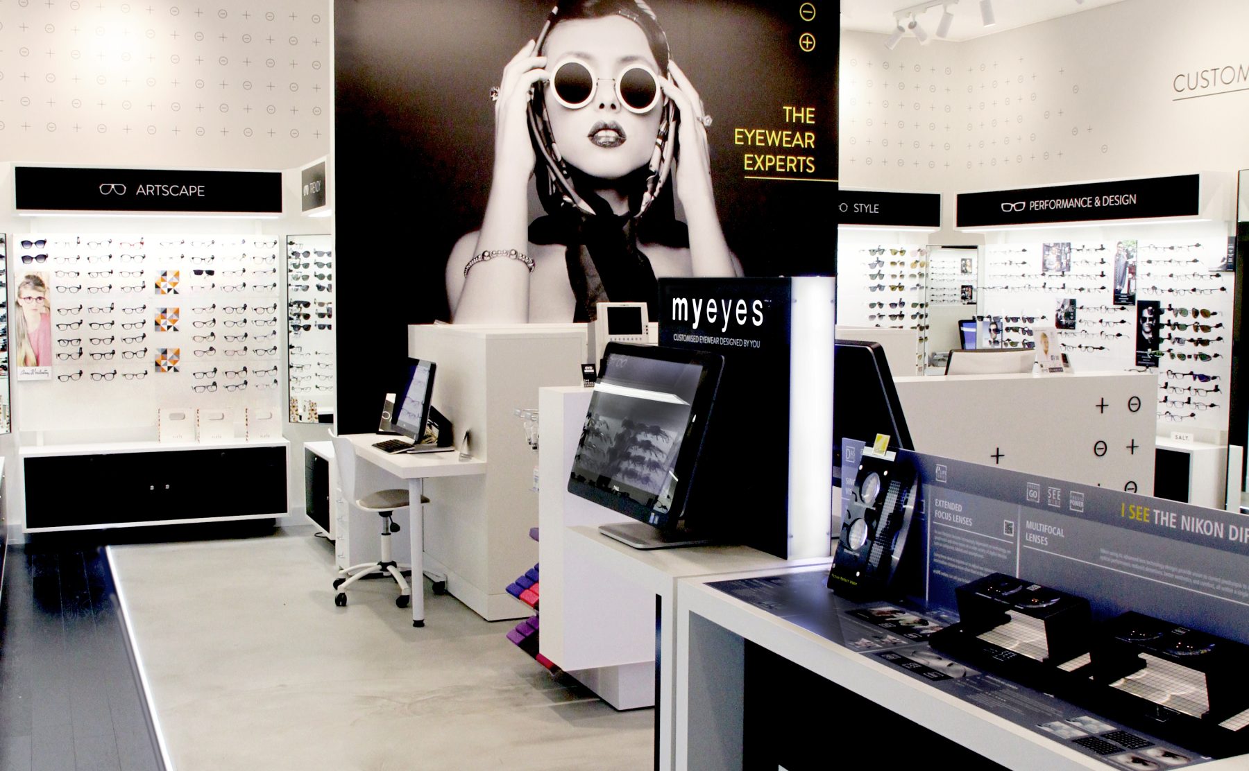
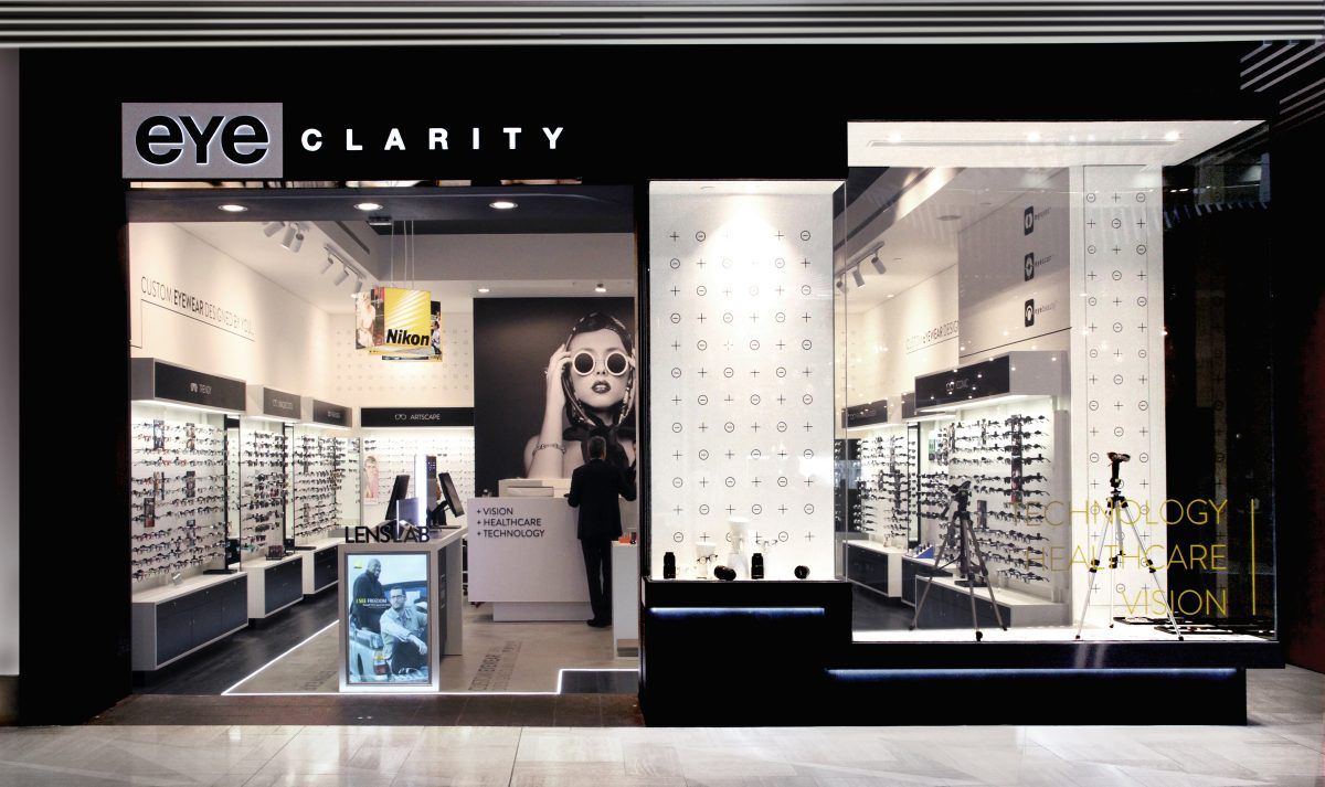
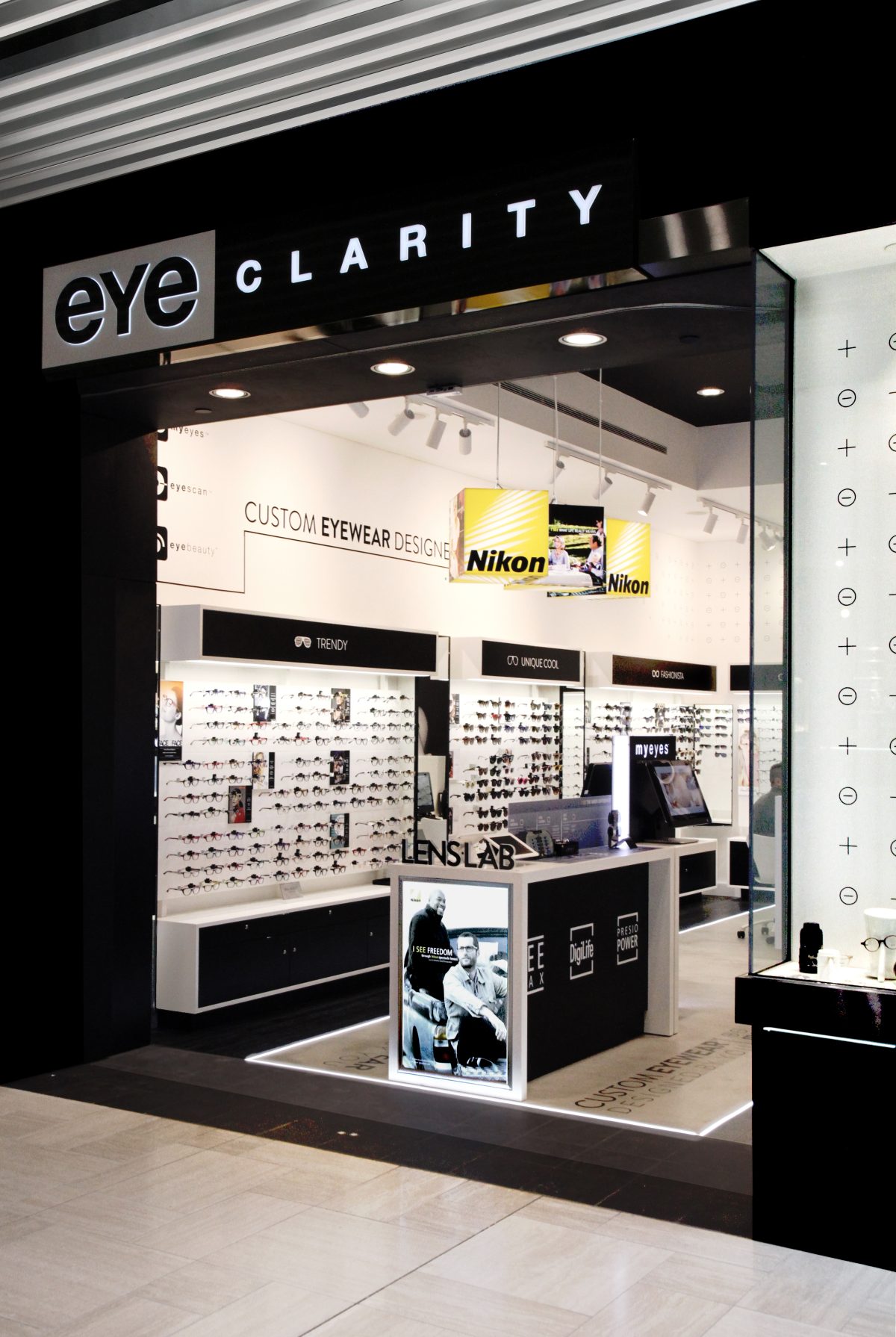
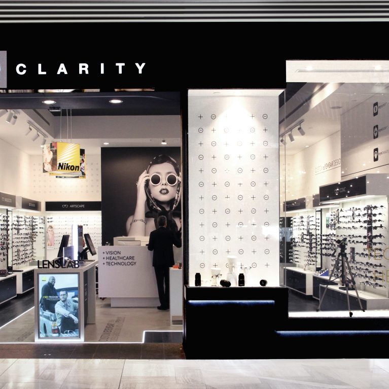
Eyeclarity is all about exceptional and professional eye care and eye wear fashion. A leader and innovator in optical retailing, Eyeclarity required an equally exceptional interior to match and their Emporium fitout we designed provides exactly that.
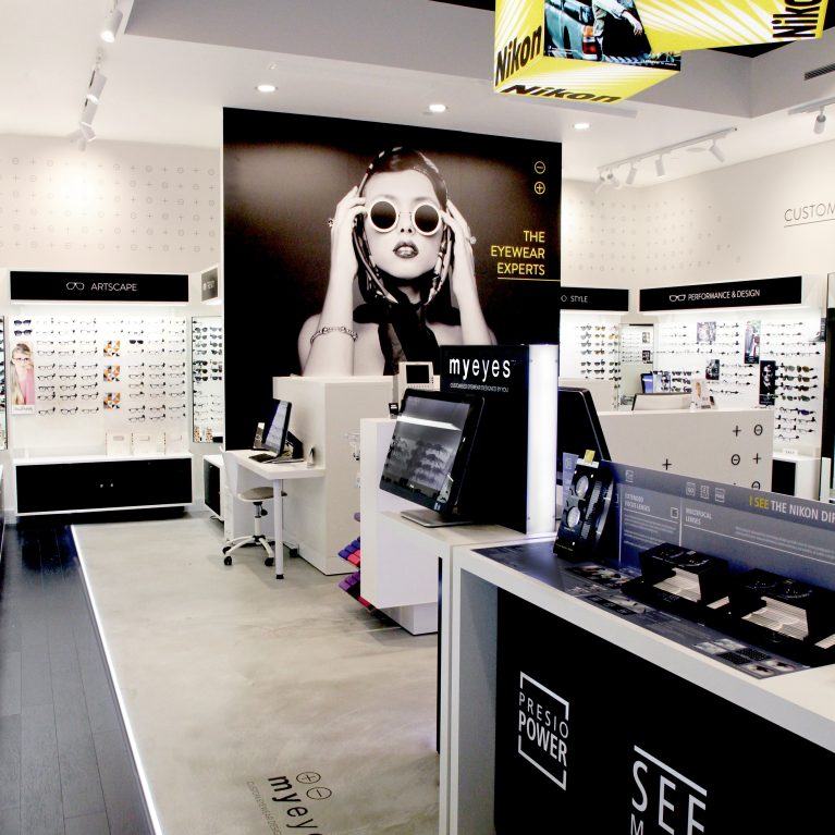
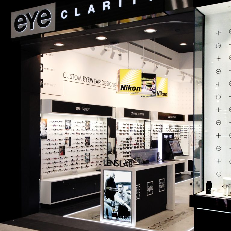
We developed with the client a ‘Lens Bar’ concept in response to the brief – improving the overall user experience by enabling customers to design and customise the perfect pair of glasses utilising the latest technology and materials.
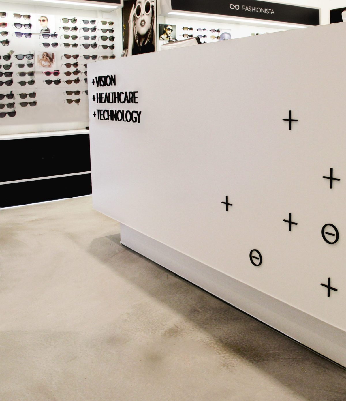
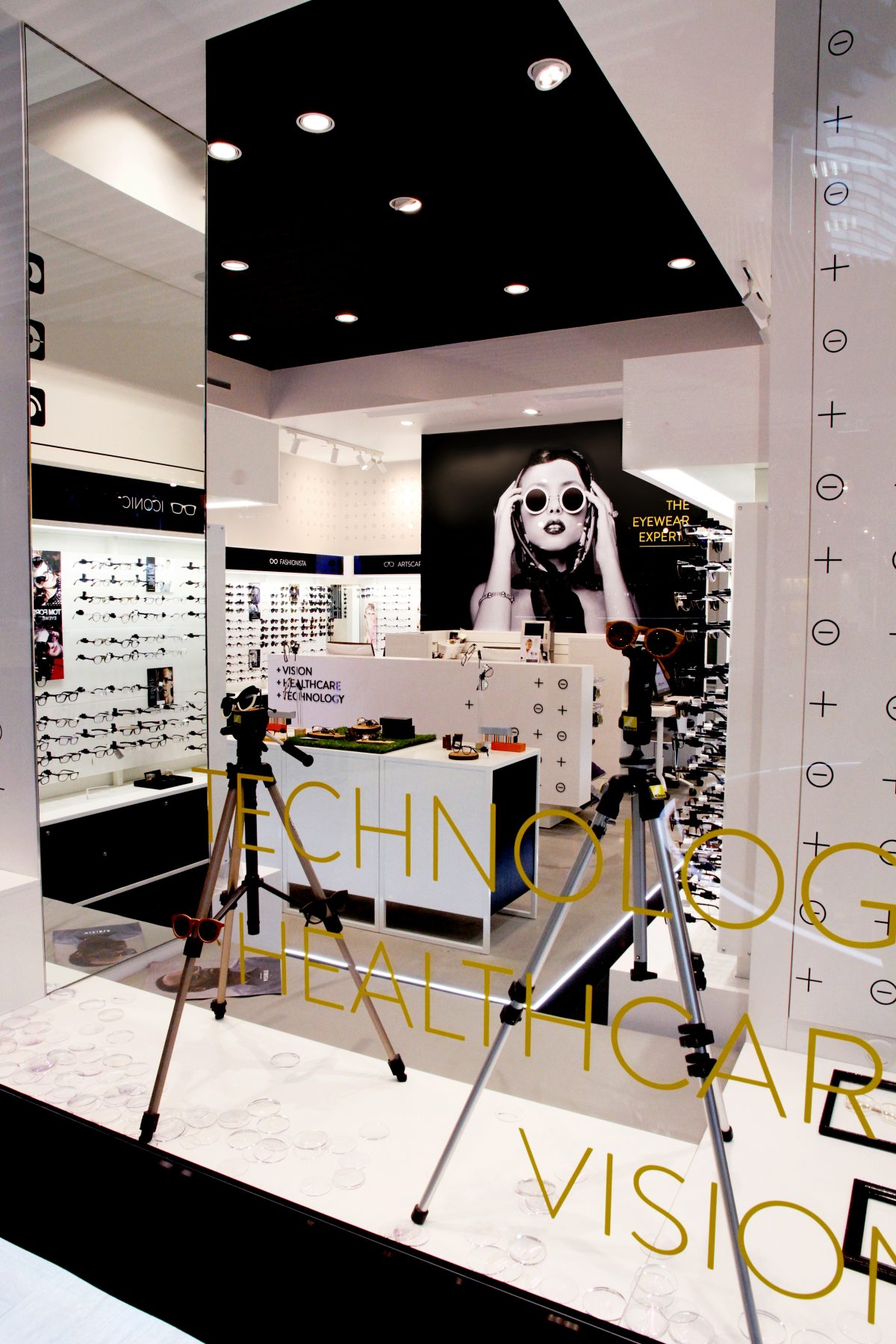
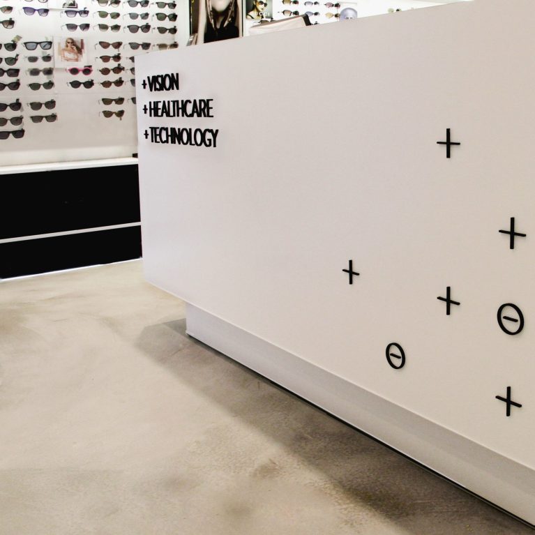
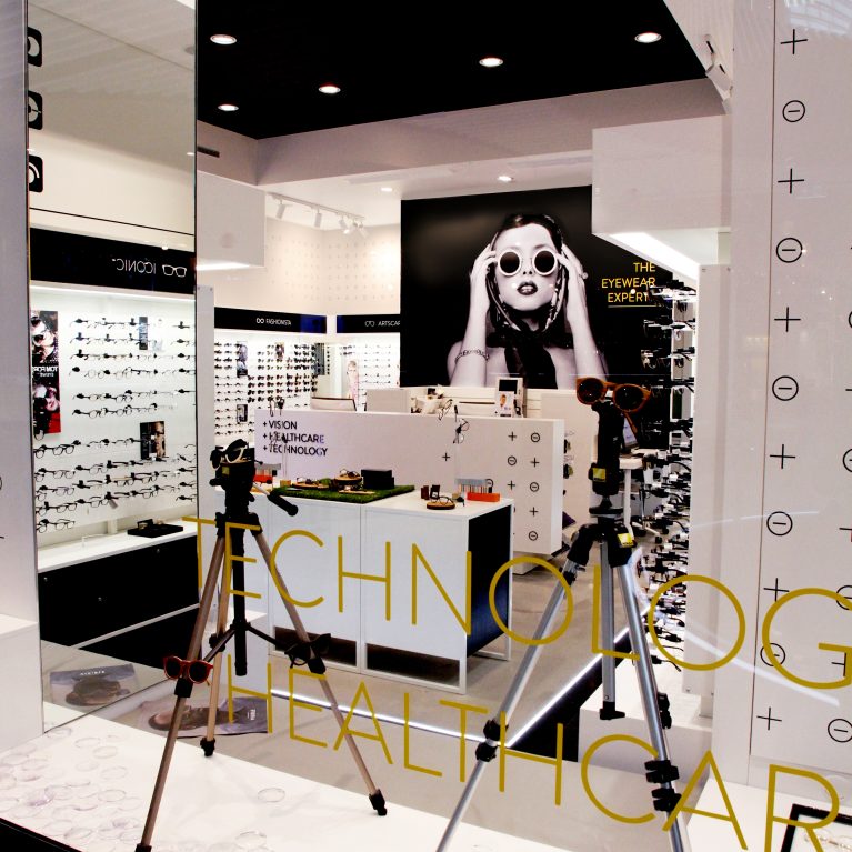
The in-store graphics and overall branding, also part of the design package, not only showcase the product categories but assist by informing and directing customers through the space. The large scale super graphics add the finishing touch to the design, leaving a bold, sophisticated and yet restrained lasting impression.
Curated details extend to the floor with inset text highlighted by subtle LED floor strip lighting.
As a truly Australian company eyeclarity has grown and developed over 20 years starting from a single location in Melton in 1986 and now services a number of communities in Melbourne with several stores.

