As passionate designers, our busy absorbing brains are constantly on the search for new design inspirations.
We love thinking about trends – the next “it” colour, product designs, store fitouts & curations etc.Therefore, shops are the ultimate source of inspiration. Today, in times of online shopping and the transition to virtualise our purchasing experience, we have come to a point, where, if we go “offline” shopping, we are looking for a truly unique experience.
That being said, we find ourselves being particularly drawn to so-called brick & mortar shops. Perhaps it is how the physical needs of a store, from signage to window styling to lighting, provide countless opportunities for striking design. There is so much dedication required to run a shop of any kind but a unique magic in opening a store for the day, interacting with customers and creating a tangible sense of community.
This post and its pictures are very much focussed on physical storefronts but can be used to inspire any facet of retail. With the rise of big box stores and discount e-commerce, brick and mortar shops feel like fragile yet vital components of how a city formulates its design aesthetic and uniqueness.
And as the soul of a store really emerges within its surrounding cityscape, we believe there is a great possibility even for chain stores to embrace each location in a new way. To enhance the community, they join, yet to remain true to the overall brand (as per Aesop’s philosophy for example).
With the vibrant necessity of brick and mortar shops in mind, let’s pretend we are on a magnificent (and global) walking tour and ponder inspiring retail spaces!
Small retail spaces can still be mighty places of design from kiosks to food carts to self-contained pop-up shops.
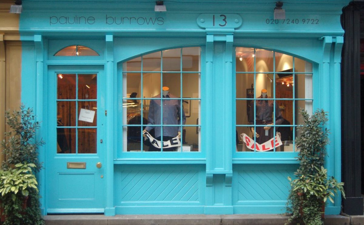
Colour, whether applied with a rustic sensibility or kept spotlessly clean, is a great way to bring life to your storefront and streetscape.
Another great detail? Focusing on one impactful design element like a vinyl window illustration or typography feature. How great is that artful door frame? At once minimalistic and ornate.
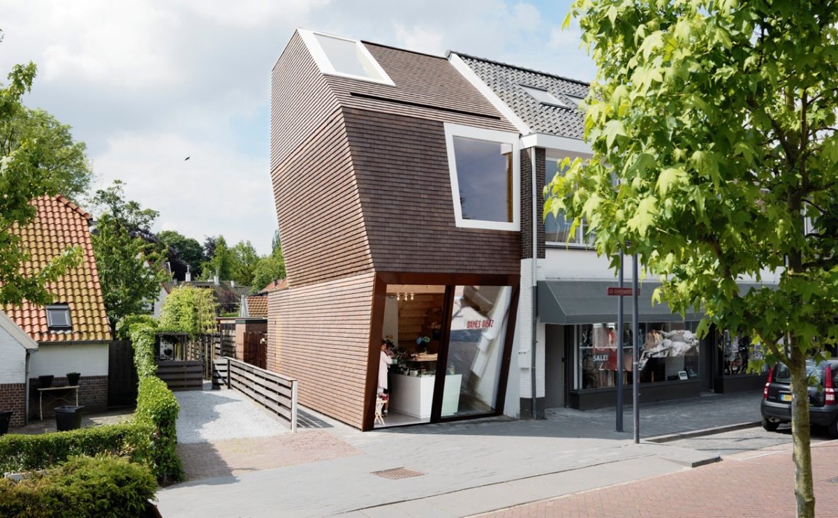
While not every shop budget includes new architecture or a stand-alone structure, there is still plenty of inspiration to be gained for exploring this corner of retail design. The top left photo illustrates how a chain, when it wants to, can infuse a street with great architecture (in this case, Starbucks). Or how about utilizing a brand colour? The middle right image is a Barbie concept store. Light effects or brand colours can be used on a much smaller scale and still be full of impact. The architecture of any space, whether you have the budget for large changes or not, can be embraced and enhanced with striking results. Highlighting raw industrial ceiling details or creating an artful room divider from old shipping pallets – there are no limits to the possibilities.
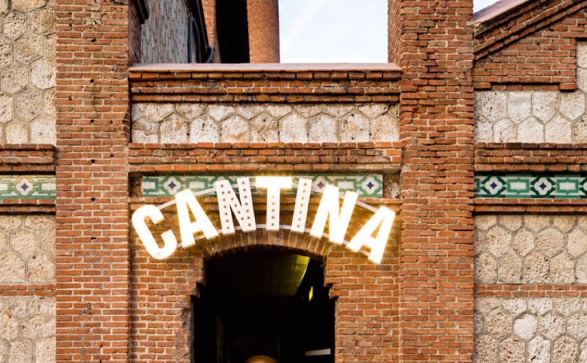
Details form the soul of a shop. Typography installations, windows that creatively use recycled clothing tags, gorgeous sandwich boards, fabulous lighting, a chic dressing room or a striking cash desk – the details are the design.
Clearly, we could go on forever. We love brick and mortar establishments but also truly believe that all shops can be inspiring, full of great design and create a sense of community. Now more than ever, we need to support small businesses of all forms as they create the soul of our neighbourhoods and cities. And, at the same time, we need to hold chain stores to a higher standard of unique location design!


