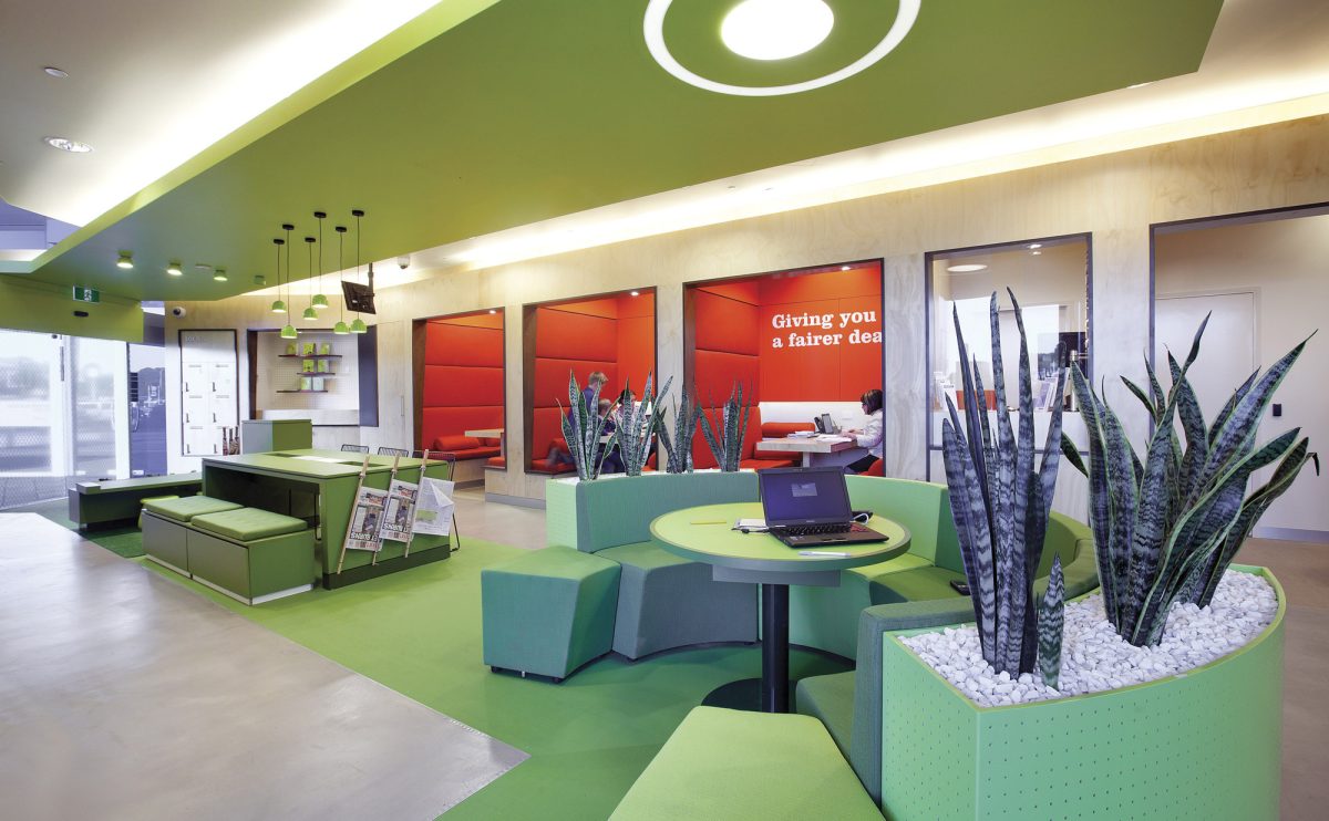
With two South Australian Credit Unions merging late in 2010, Design Clarity was asked to develop a visionary, forward-thinking design concept for the new credit union’s national store roll-out that represents their new brand identity. The design brief was to create a very member orientated, social, transparent, purposeful, as well as rebellious space within a total anti-bank atmosphere. “Run by members, not by numbers.”, “We are for people, not for profit.” are examples of the new brand statements that describe the new way of thinking.
The Design Clarity team has responded to the client’s brief by producing an exciting and innovative concept that focuses on the visual segmentation of the space into three main zones: a “personal”, a “communal” & an unconventional “social” strip as the core of the design. If you expect to find traditional service-desks when visiting one of the ACSL branches you will be disappointed. Members are invited to a space where they can take a break, interact, work, play and experience a personalised service in a friendly and relaxed environment.
The core green strip running throughout the retail space visualises the credit union’s personality – a social zone for the members. Borrow an umbrella or a shopping trolley for the day at the meet & greet unit; relax on the communal table by grabbing a drink, browsing the internet or reading the paper while your kids are painting electronic pictures on iPads. The design of this strip picks up the new brand colour green in an extended way – fabrics, carpets, faux turf, light fittings etc.; there is nothing that is not green. Even living money plants and greenery privacy screening.
A floor-to-ceiling plywood wall creates the “communal” strip, holding the more bank-orientated functions such as teller and foreign exchange booth. Booth seating for semi private meetings replace the so-traditional service desks used in the past. Members get the opportunity to leave personal things in the communal lockers while going shopping or just pick up some local produce or handcrafted goods from the community market, which is offered for use by local businesses and farmers.
The “personal zone” accommodates self-service units for internet, coin counting, coffee and the members’ feedback, which are recessed within a perforated wall covered with everyday people supergraphics. Feature details are the timber pencils, which pop out of the wall holding brochures, notepads and inviting members to send ACSL a message. White, red and charcoal colours with plywood 3D lettering define this zone.
The design respects the functionality required of a traditional banking space, but looks afresh at how we interact with information, technology and people in such an environment.
The new branch design is a space for the members to define their own banking style; a new kind of community, one of commerce, exchange & participation.


