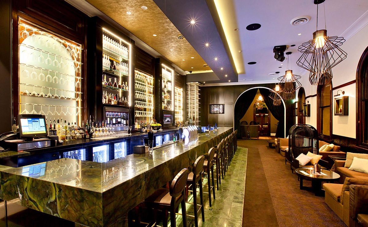
Restaurant interior trends; stand-out designs, stripped back interiors and retro vibes. The use of monochrome is rather overwhelming at the moment especially when combined with industrial fixtures and finishes therefore bold, bright interiors bring life to the restaurant sector.
Design Clarity’s layout for Din Tai Fung is certainly bold with colour – see picture above!
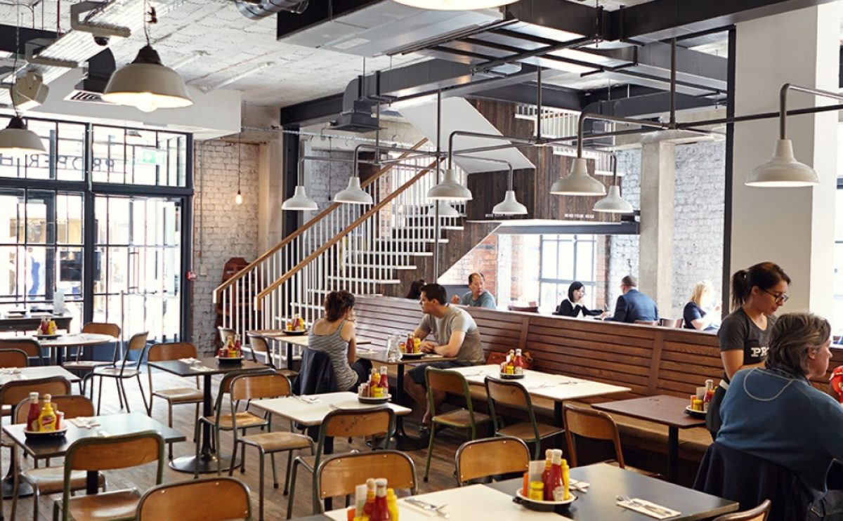
Stripped back interiors: every burger joint in London (with the exception of Five Guys) has an exposed brick wall, low hanging lightbulb fixtures and a dark wood or concrete floor. It’s sad that a lot of restaurant identities are blurring into the same mould.
When making a restaurant choice, British consumers are becoming less price conscious and instead, desiring an eating out experience. From the first step into a restaurant, consumers want to feel excited and ready for a memorable dining experience.
A twist on stripped back interiors by Design Clarity is Moo Moos (see pictures below). This lovingly designed restaurant interior is modern, bright and with rustic touches. The success of the restaurant speaks volumes, customers keep going back for more.
Retro Vibes- killing this trend is the Hoxton Hotel in Holborn- it’s like being in the 70s except the other customers don’t have sideburns or brightly coloured flairs on! What’s great about this trend is that it is full of life and something new to experience.
Restaurant interiors are a talking point and the main feature of eating out. For example La Bodega Negra- you enter a sex shop (it’s not quite as risqué as it sounds though). When Gaucho first opened, their extensive use of animal print was different but they pushed boundaries and as designers – we are getting more inspired. Each restaurant experience should be memorable and this is down to the interiors, food and customer service.


