When considering a new menu layout – here’s a few tricky design tips from the experts on ways to subtly sway the diner and maximise dining profitability for your restaurant:
- Eyes go to the upper right hand corner first – put the pricier items here
- The anchor – the role of the most expensive plate on the menu is to make everything near it look like a relative bargain
- Offer a smaller serving size of the anchor – still profitable and feels indulgent
- High profit dishes cluster near the anchor
- Columns are killers. Omit all $ or £ symbols too
- Add boxes to draw attention
- Menu Siberia – for low margin dishes or reliable orders
- Bracketing to offer size options – diners will tend to trade up
To read more, here’s a link to the Menu Mind Games article on the New York Restaurants site.
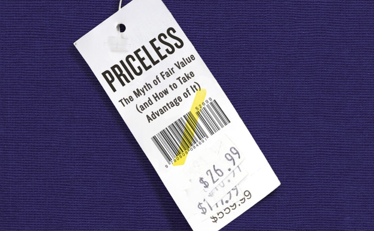
Excerpted from Priceless: The Myth of Fair Value (and How to Take Advantage of It), to be published in January by Hill & Wang, an imprint of Farrar, Straus & Giroux. © 2010 by William Poundstone. All rights reserved.


