We’re very excited to see Design Clarity’s Nando’s Restaurant designs for Canberra and Adelaide featured on FRAME Magazine’s website!
Both restaurants showcase Nando’s Australian approach to introduce refreshingly modern, bright and designed spaces.
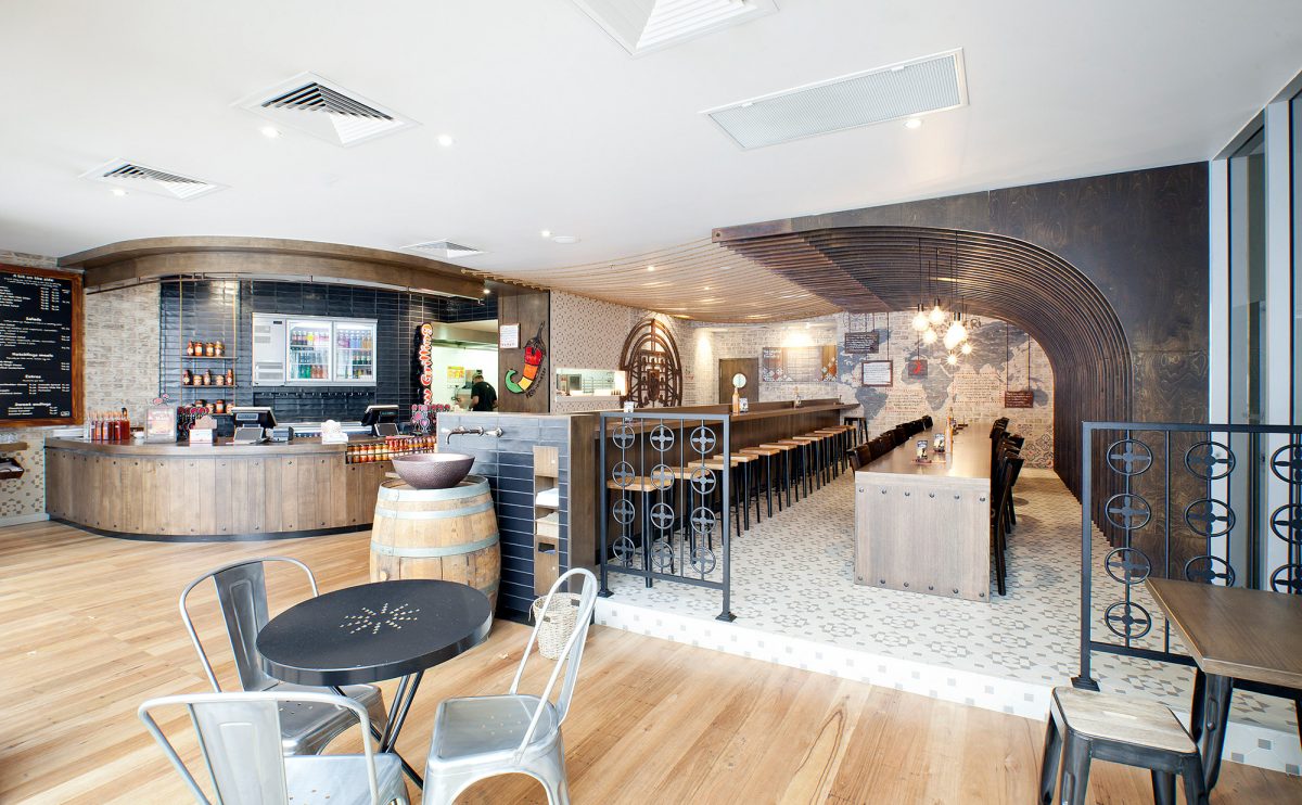
Nandos Canberra is inspired by the history of Portuguese sailors exploring the world, the 135-sqm Nando’s Canberra has a raw, natural concept. The focal point, a ceiling installation made of curved plywood panels, is above the raised seating area and accented with rope and copper detailing.
‘These panels evoke and abstractly convey the interior structure or “ribs” of an explorer’s sailing ship,’ says Kristina Hetherington, director of Design Clarity. ‘The finishes include tone-on-tone decorative floor and wall tiles, whitewashed brick and copper details to create a natural aged, raw look.’ Laser-cut timber combines with rustic wall paint to accent the concept of being on a ship.
Click here to see the Nandos Canberra Article on the FRAME MAGAZINE WEBSITE
Nando’s Adelaide features rustic farmyard influence with a large barn-like installation framing the central interior. Inspired by Australia’s agricultural and rural heritage, the vernacular architecture resembles a simplified country shed. Complete with exposed trusses, a raised seating platform and even a coiled wire chicken coop pendants overhead, the raw structure has a rural aesthetic. Totaling 260-sqm, the restaurant boasts ample reclaimed objects including machinery relics, timber trusswork and rustic finishes.
Click here to see the Nandos Adelaide Article on the FRAME MAGAZINE WEBSITE


