If you are looking for a new venue next time you’re feeling peckish, why not make it a bit of an experience? The following food haunts have successfully extended their brand image into their spaces, menus and packaging by injecting some fun into food on the run.
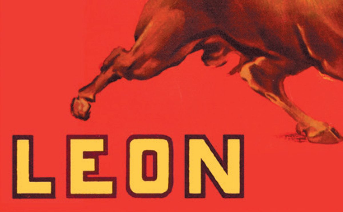
Restaurants such as Leon in the UK focus on the ever changing and artisanal nature of the brand using a playful and approachable style, whereas an energetic youthful narrative has been injected into the identity for Story in a Cup – a new self serve frozen yogurt concept store – on the other side of the world – in Melbourne, Australia.
Poncho No. 8 is all about the food but equally it is as much about the brand experience. The example shown below is located in the buzzing Spitalfields Market in London, where the graphic language and vivid colour palette is successfully carried through from the website to the wall and floor treatment within the space.
Interior graphics, signage and promotional material for Gino Gelato in London use a strong graphic approach to communicate their offer while Grill’d in Sydney commissioned several artists to decorate its new Sydney outlets. Grill’d founder Simon Crowe said of The Grill’d Collective, “We love the idea of turning the restaurant into an evolving canvas for young Australian artists to showcase their talents while also creating a fresh, bright space for our customers to hang out and enjoy their favourite Grill’d burger. From the very beginning we’ve featured illustrations on our restaurant walls – this project takes it to the next level.”
Links –
Leon Restaurants – www.leonrestaurants.co.uk
Story in a Cup – www.storyinacup.com.au
Poncho8 – www.poncho8.com
Gino Gelato – www.ginogelato.com
Grill’d – www.grilld.com.au


