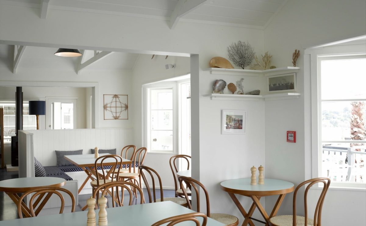
Today, on the search for inspiration, as usual, we came across another excellent example of a thorough design concept combining both aesthetic interiors & decoration and strong brand marketing – The Oyster Inn on Waiheke Island.
A short hop from the big smoke of Auckland on the east side of New Zealand’s North Island, Waiheke Island offers its visitors a lush & relaxing environment, a world away from city life.
When viewed in isolation the restaurant, a stone’s throw from Oneroa Beach, has the outward look and feel of an out-of-the-way yet meticulously maintained colonial outpost, grand in its way but not ostentatious.
The nearby beach is not so close that the fishermen could throw their catch straight through Oyster Inn’s kitchen window without disembarking, but the elevated verandah does provide diners with impressive views of the bay, and the sand is only a short stroll away if you want to walk off your meal, locally-sourced food from Cristian Hossack, formerly head chef at London’s Providores.
The Oyster Inn’s interiors are crisp and white with shades of timber; the dining area, the bar, and the clean and fresh-looking guest rooms all provide a palpably cool atmosphere, and there are plenty of shady places to kick back and relax. In the winter when things take a turn for the chilly, guests can throw a log or two in the wood-burning stove and relax with a good book, or use the dipping temperature as an excuse to warm themselves with some of the original drinks on offer from the bar.
It’s fascinating how a simple design is just right, absolutely sufficient and most elegant. And Ok, we’ll have to admit, that the white and yellow stripes are just an everlasting classic…:)
And definitely, check out their beautiful website! http://theoysterinn.com
Copy Excerptss via weheart.co.uk


