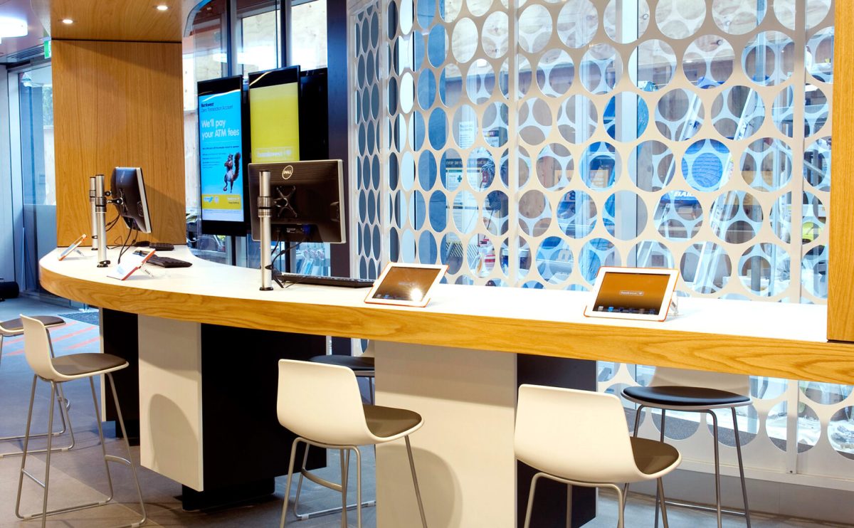
Anti-bank hits the high note in innovative high street banking
Visiting the bank has traditionally been met with loathing. So Design Clarity turned the whole banking experience on its head by delivering the ‘anti-bank’. The People’s Choice Credit Union 2010 flagship store achieved prime responsive store design and nothing less than a complete 360° from classical banking.
Visionary retail bank design split the banking environment into three inspired precincts: personal, communal and social, yes, social. After all, departing from ‘banking as we know it’ meant creating an environment that people want to be in. So with inspired touches like real money trees, inviting communal tables, coffee machines and even iPads for the kids, it’s small wonder that the social strip is a great ‘place to be’.
Yet, of course, functionality lies at the heart of every high street banking experience. So in true anti-bank style, the communal strip is geared to allow and enhance the conversation. Teller and foreign exchange desks are easily accessible and welcoming. There’s even comfy booth seating for semi-private meetings. All of this is tied together by smart cohesive use of brand colours and physical expression of the anti-bank’s fresh approach to communication. The bright absorbing personal precinct even has a pop-out wall and lettering dedicated to this cause.
Are you looking for retail bank design specialists? High street banking brilliance starts with dropping Design Clarity a line. Our retail bank design expertise is called on by clients from Australia to the UK. So email ustoday and kick-start bold responsive store design for your bank environment.
Certainly, the anti-bank concept is one-of-a-kind. Yet rest assured Design Clarity is no ‘one trick pony’. Our responsive store design has revolutionised the performance and personality of several other major high street banking names. Take Westpac’s Melbourne head office for example. A 24/7 lobby space, interactive online ‘discovery space’ and vibrant retail merchandising platform all speak to the progressive interaction-centric spirit of this flagship retail branch.
Bankwest’s Perth flagship branch offers yet further proof of Design Clarity’s exceptional retail bank design flair. Here the 116-year history of Bankwest’s brand met with cutting-edge modern media that allows and enhances the conversation. Think a suspended Expert Bar portal facilitating face-to-face advice, seated and standing meeting hubs and inspired seminar zone. And these are just a taster of what’s on offer. All the same visionary creativity and smart innovation with which Design Clarity helped launch Bankwest kiosk retail banking in 2011. Quicky, vibrant and ever-so-handy, the Perth flagship pop-up met with resounding customer praise.
Why not take a look at our retail banking design repertoire for yourself. We welcome you to browse our portfolio of recent work, including the high street banking projects we’ve mentioned:
BankWest retail kiosk
BankWest flagship store
Westpac Melbourne flagship
Testimonial
“Just what has been needed in Victor Harbor. It is really well designed, welcoming and user-friendly. Well done to the designers, staff and all.”
“Amazing. Such a thoughtful setup. Games for the children, umbrellas, coffee. Great colour scheme and friendly staff. Great to see this in Victor Harbor.”


