Great restaurant design is imperative in today’s dining climate. All those core factors on which restaurant brands used to compete still stand – yet they no longer stand alone. Restaurant design has joined the competitive points of location, cost and quality to spur a wide-reaching wave of restaurant chain roll out ‘anti-branding’.
So what does the anti-brand movement actually mean? Essentially many that prominent brands are moving away from their long-term well-recognised and expected restaurant spaces to embrace the unexpected. We, therefore, need to deliver more innovative and sophisticated physical dining surrounds – and menus to match.
Modern consumers demand much more from their eateries. Great coffee, stylish café settings and fare crafted from fresh wholesome produce. Such elements do not fit the traditional ‘big box’ fast food giants. Enter several fast-casual challenger brands. Through revolutionary restaurant chain rollouts, such challenges are offering a delectable merger of quick affordable service with healthier made-to-order food served in stylish surrounds. Consumers have taken up fast-casual dining with alacrity causing several forward-thinking major fast food brands to up their look through a strategic sweeping restaurant design overhaul.
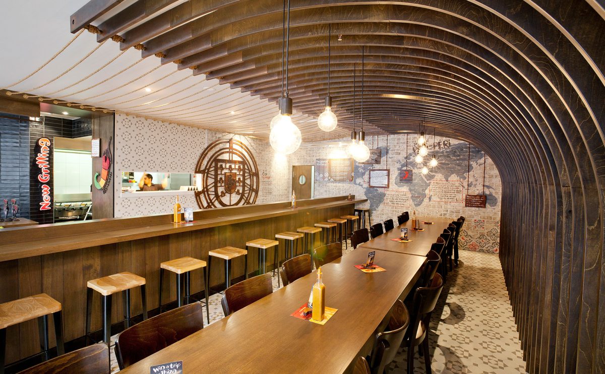
Take the restaurant design execution for Nando’s Canberra as an example. We infused the dining space with Nando’s absorbing history complete with stories and legends. Raw design tempered with nautical themes included curved plywood panelling, copper detailing, washed brick plus decorative floor and wall tiles. The result was a clean contemporary and engaging dining space that was a far cry from Nando’s original fast food origins.
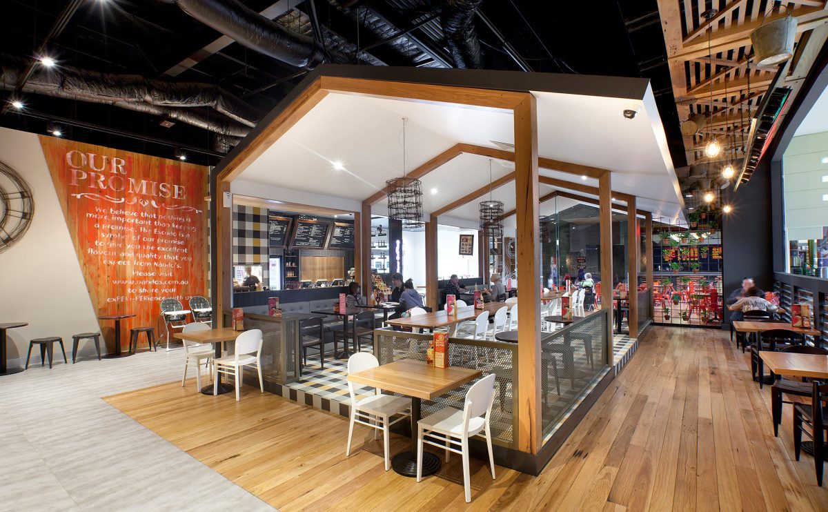
Restaurant design need not be rolled out verbatim across all stores under a major brand. The direction changed for Nando’s Adelaide, drawing on locational heritage is a powerful restaurant design force. Here the unique rural and agricultural heritage of South Australia laid the scene. Old items of farm machinery, timber trusswork and gingham-inspired floor tiles combined to craft a truly eclectic dining experience.
Recent examples in the UK include ‘Smash Burger’ in Westfield Stratford who doesn’t even have one logo inside their restaurants and it seems McDonald’s is also going that way too.
We’d love to hear your thoughts.


