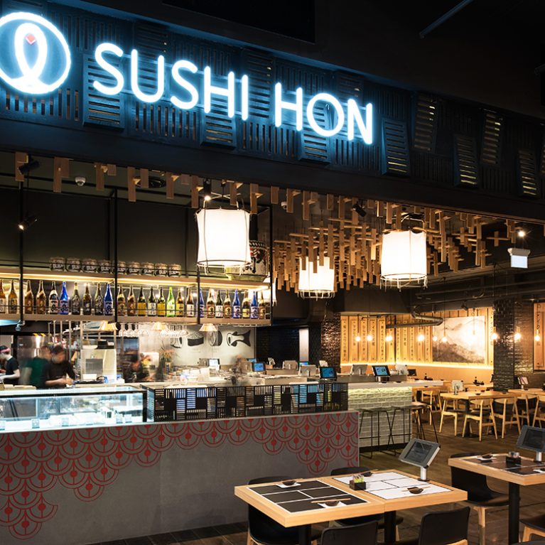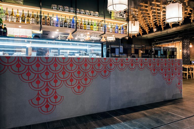
A close-up view of the primary service counter demonstrates how heavy, industrial materials can be refined to communicate a delicate brand story. By carving traditional graphic textures directly into a solid concrete volume, the facade shifts from an industrial structure into a highly crafted architectural centerpiece. This detailing establishes an immediate, high-end design tone right at the main point of sale.
The expansive counter is built from smooth, stone-grey poured concrete panels that anchor the high-energy entrance zone with a dense, permanent weight. The upper face of the concrete is etched with a repeating Seigaiha wave pattern filled with a soft pink pigment, introducing a traditional Japanese architectural graphic that breaks up the solid grey color block. Bright glass-fronted refrigerated display cases sit flush on top, keeping fresh culinary prep under optimal visibility for arriving guests.
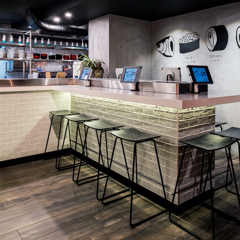
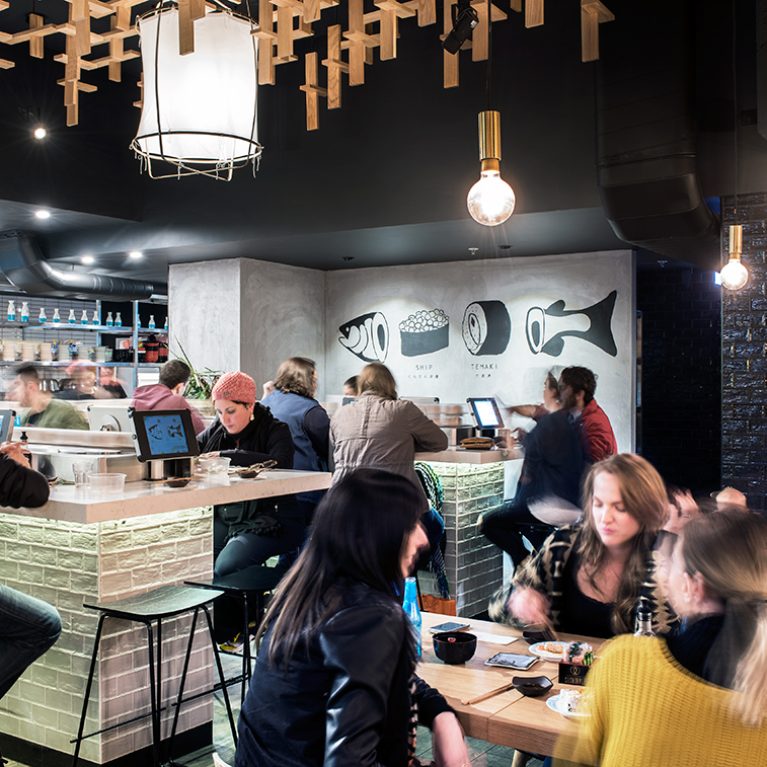
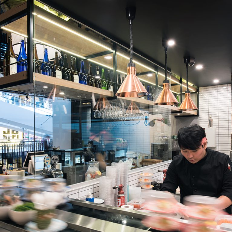
Behind the counter line, a long floating timber shelf holds rows of premium sake bottles, illuminated by hidden LED strip lighting to create a glowing, jewel-like backdrop. Thick black steel structural supports drop down from the dark ceiling grid, holding equipment firmly in place while keeping active workspaces uncluttered. On the right, the timber lattice ceiling installation peaks into view, casting soft shadows across the floor to complete a balanced, multi-textured interior scheme.