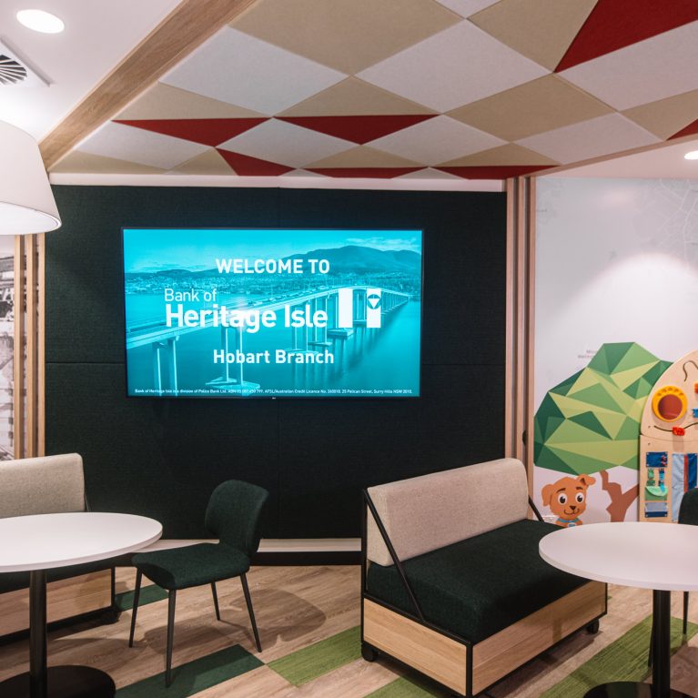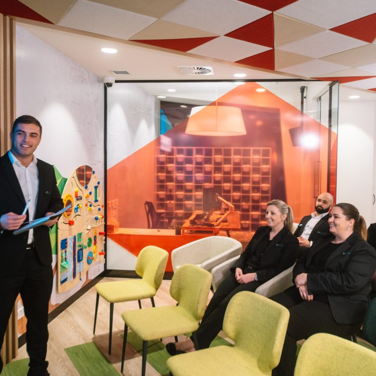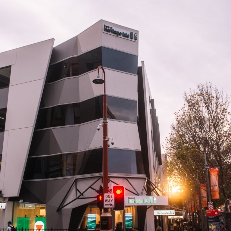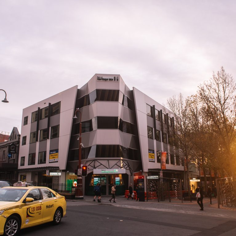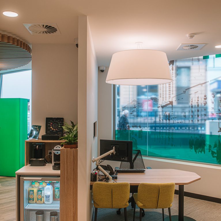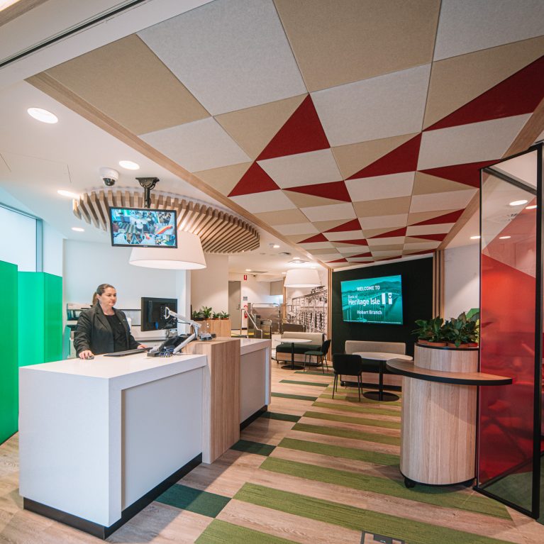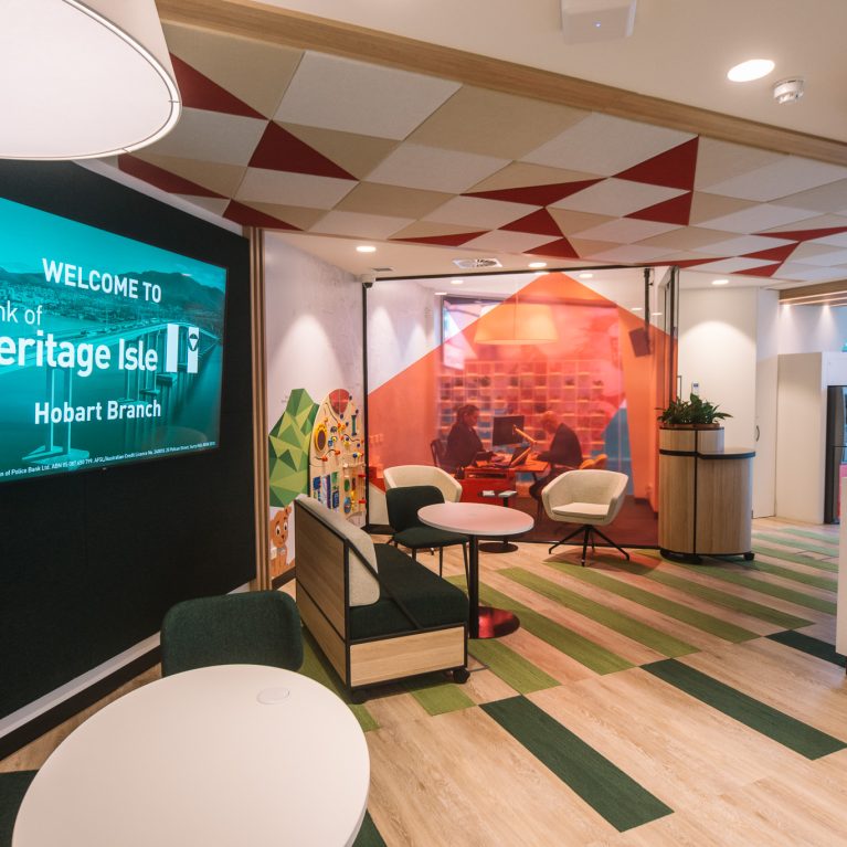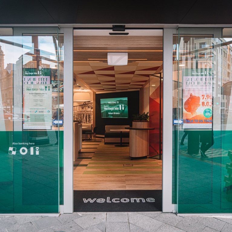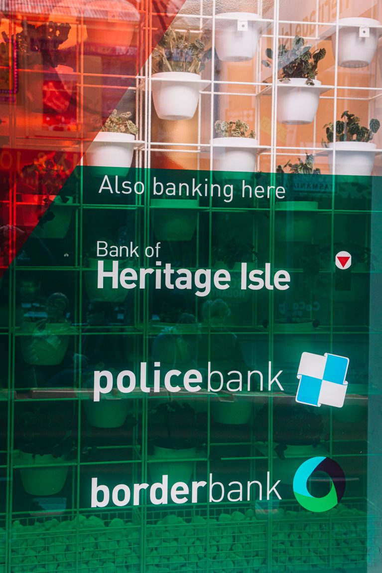
The shopfront of Heritage Bank emphasizes its umbrella of financial services, showcasing branding details for the main bank and its related institutions. With a dark-green backdrop and clean, white text, the window display communicates a unified brand identity that is both professional and approachable. The design integrates well with the bank’s modern, plant-enhanced interior, subtly visible through the tinted glass.
The display centers on bold, white text against a deep forest green background, stating "Also banking here" followed by the names of the associated institutions: "Bank of Heritage Isle," "policebank," and "borderbank." This clear messaging reinforces the bank’s extensive service range while creating visual consistency. The “policebank” logo, a distinctive light-blue square divided into four smaller squares, and the “borderbank” logo, a stylized circular shape in teal and dark green, each stand out, adding color variety and reinforcing the unique identities of each entity within the Heritage Bank umbrella.
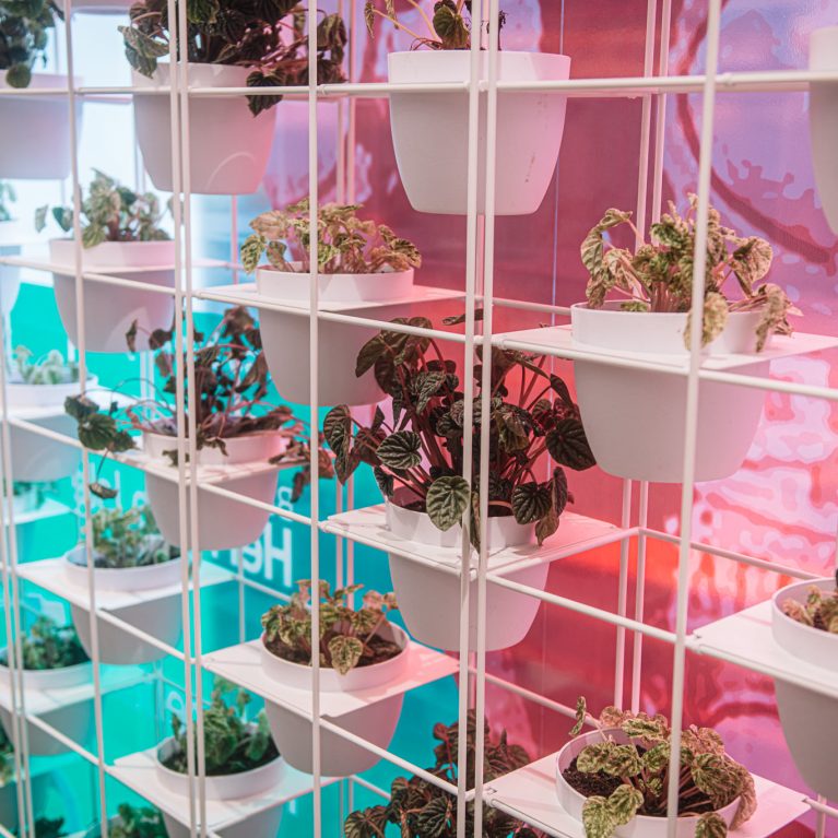
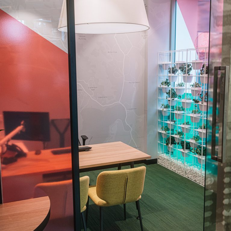
The shopfront is framed by a metallic grid structure with white supports, housing small potted plants that add a refreshing, natural touch to the overall display. Through the tinted glass, hints of the bank’s warm interior, including the featured plant wall with geometric metal framing, subtly integrate with the branding. The reddish-orange hues reflected in the background provide a complementary contrast to the green and white text, enhancing the visibility of the logos and emphasizing the cohesive, customer-centered design of Heritage Bank’s branding approach.

