Retail changing rooms, timber flooring, upholstered bench seating, dimensional wall signage, heritage graphic curtains, minimalist floor lamps, commercial fit-out.

House of Bonds

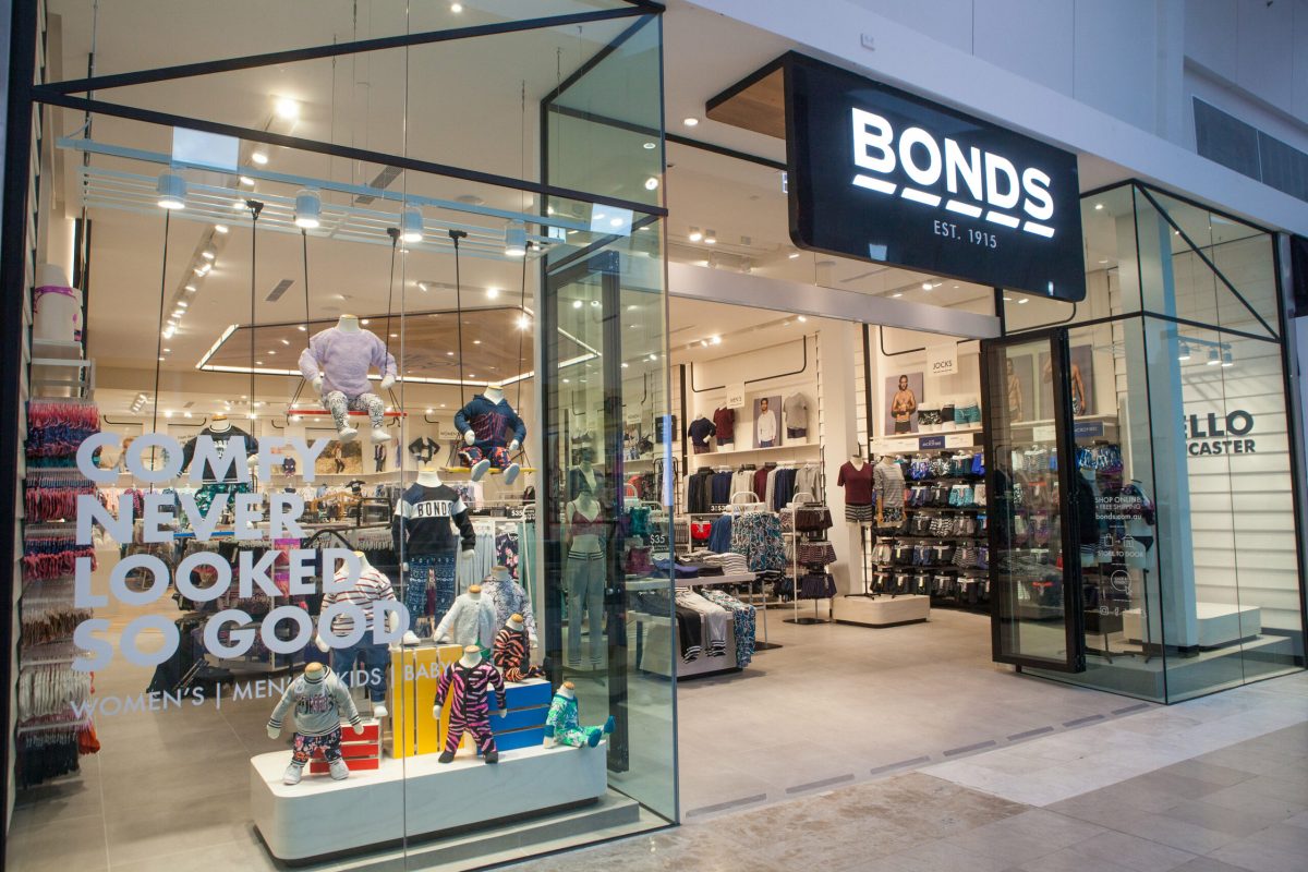
Next Generation Store Design

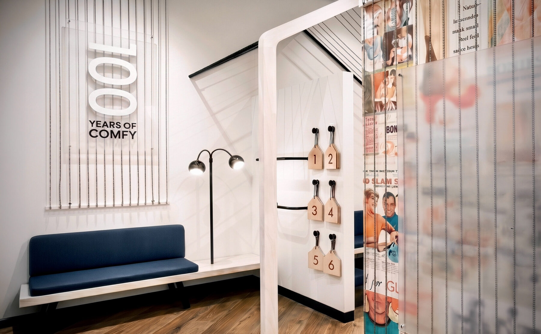
How to keep an iconic 100-year-old heritage brand young?

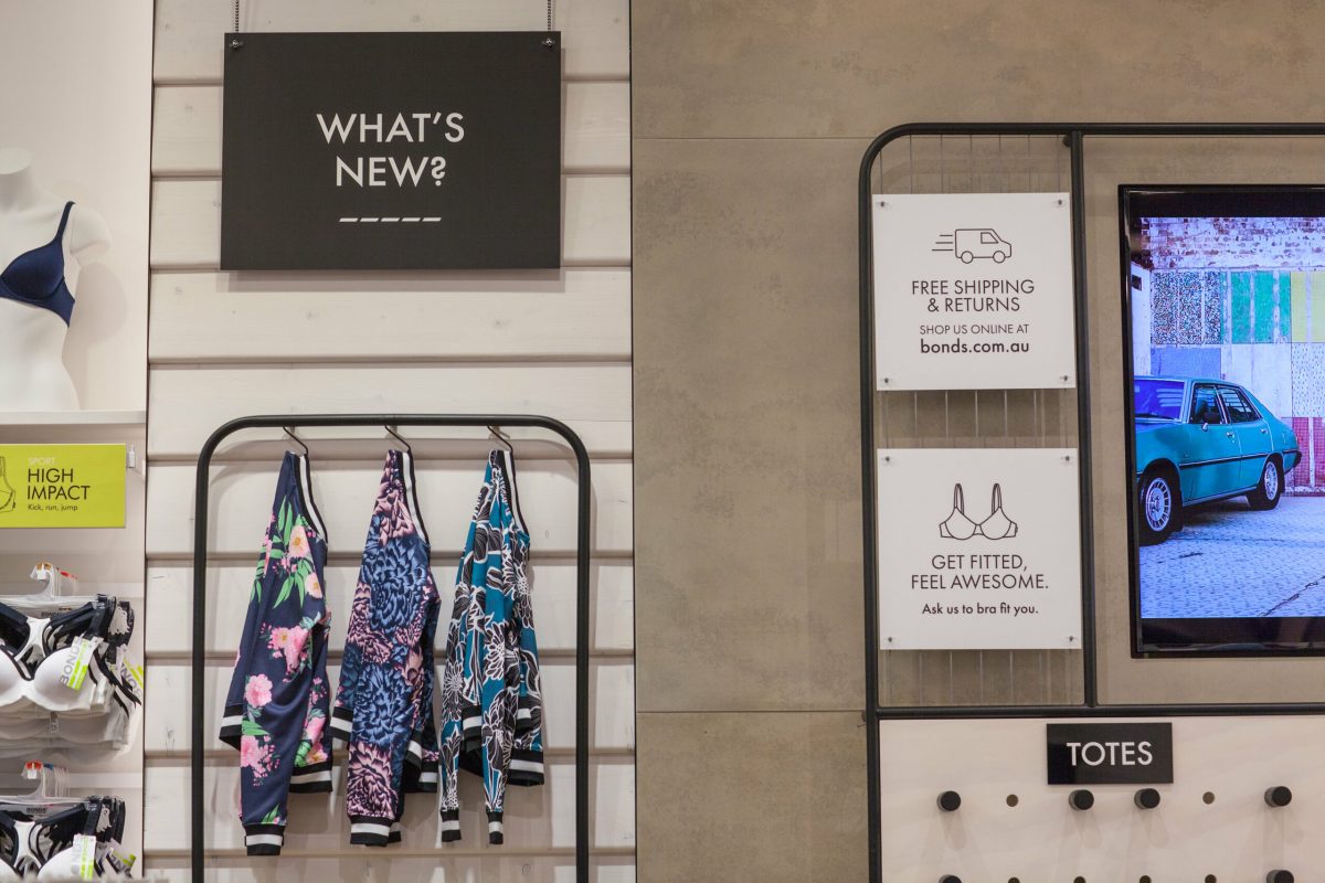
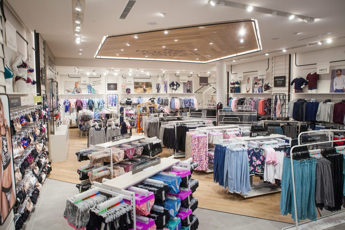
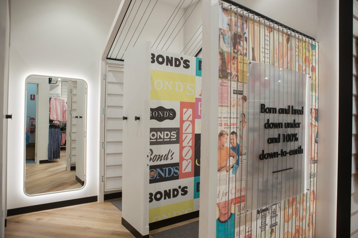
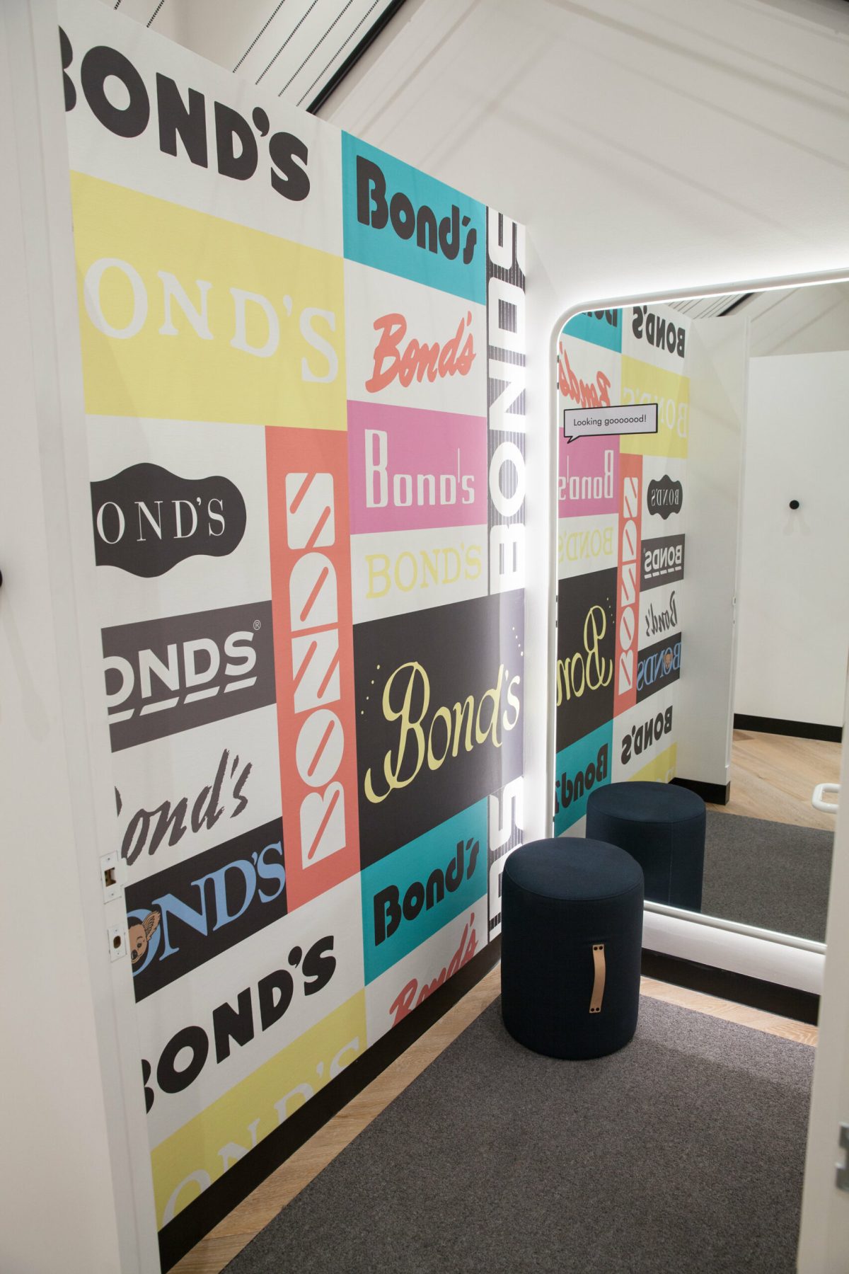
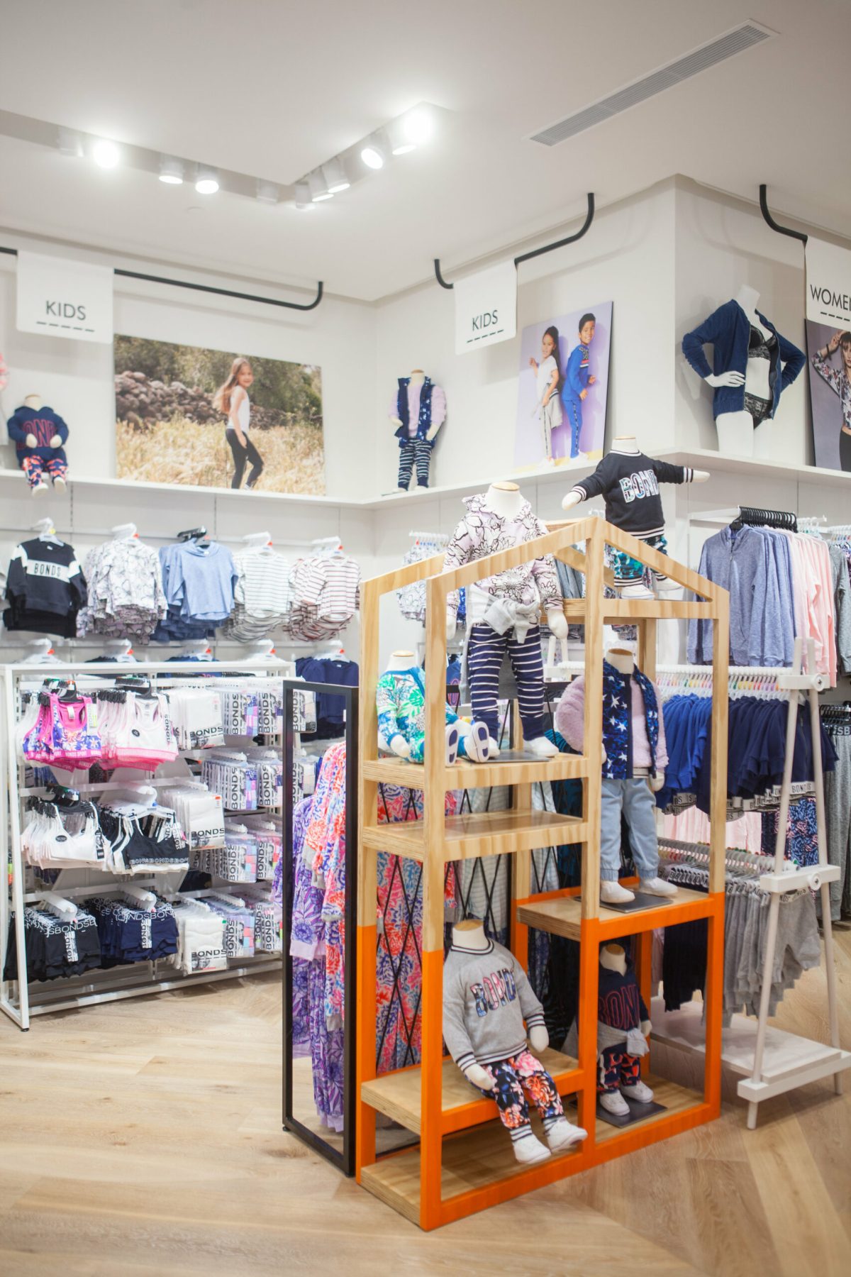
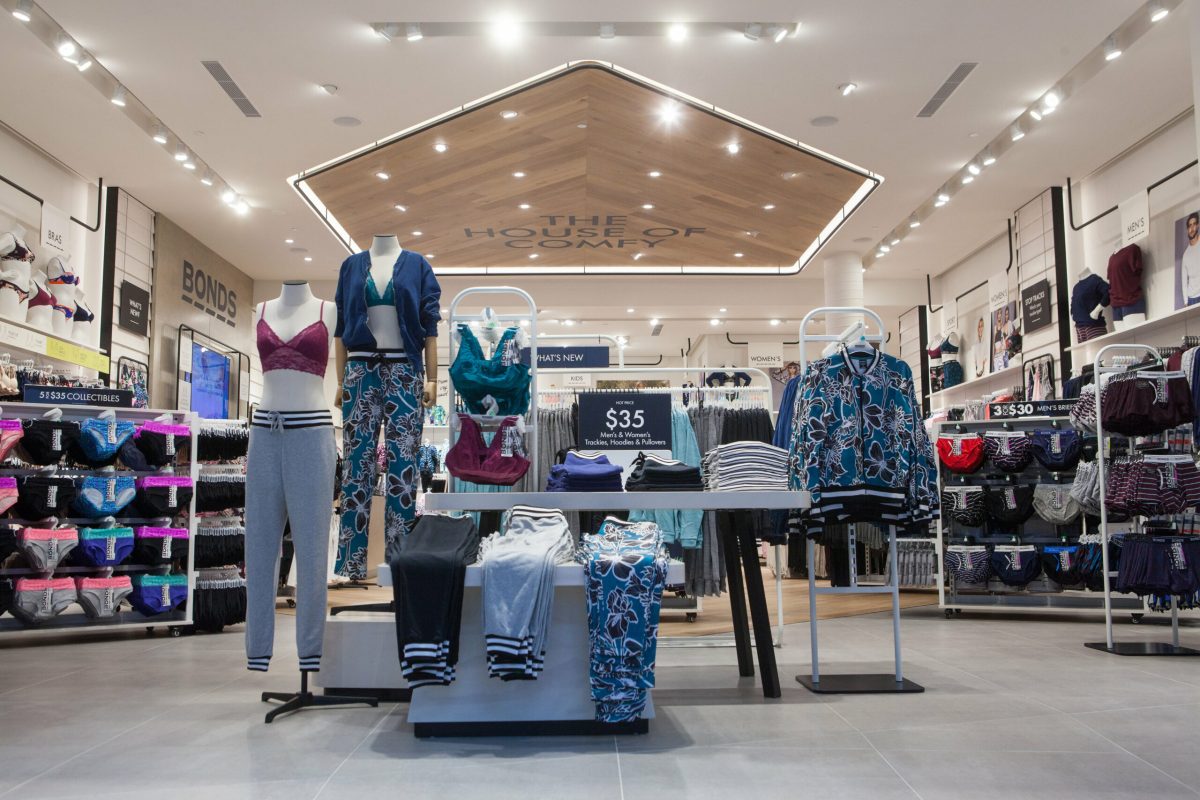
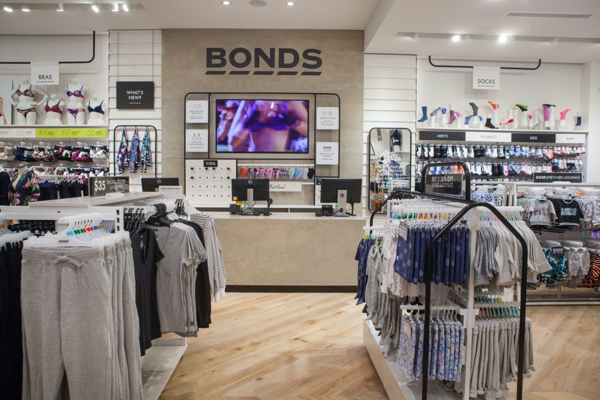
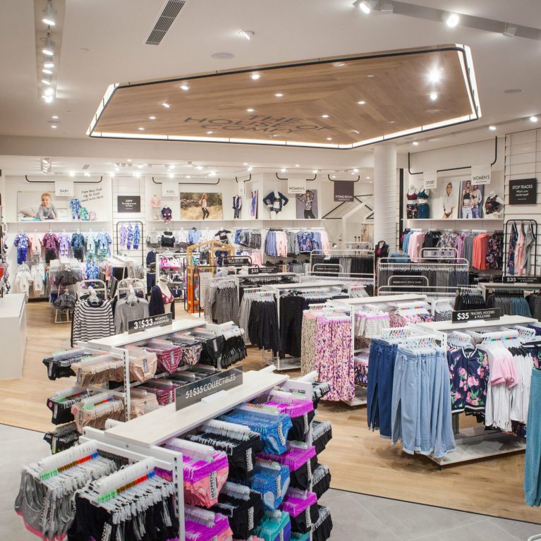
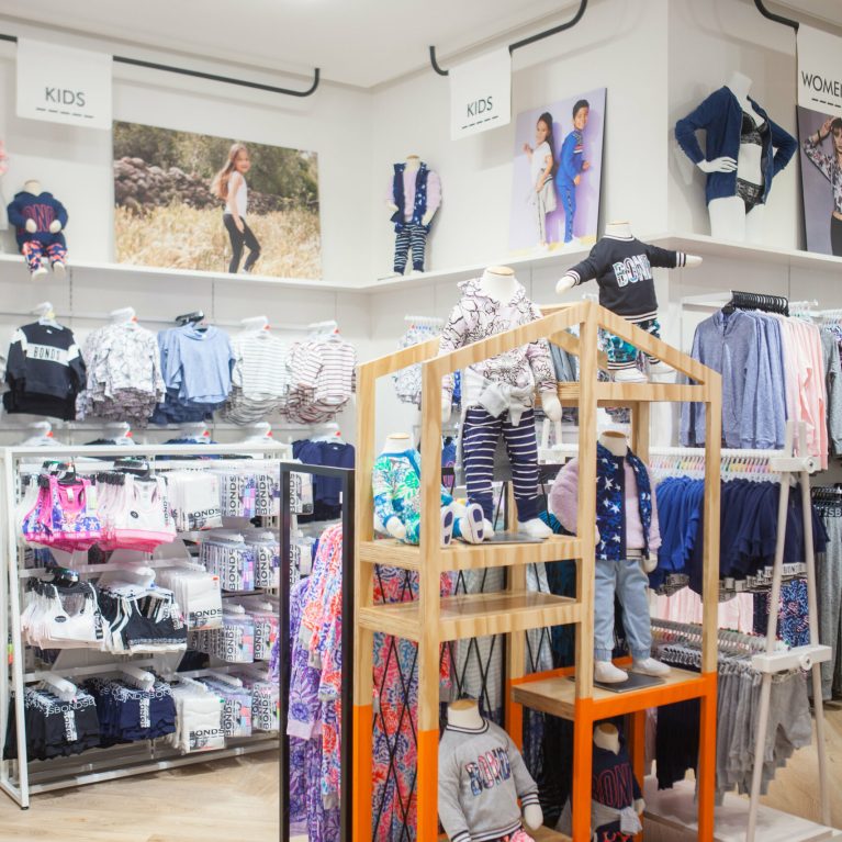
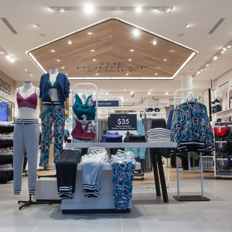
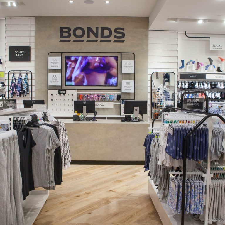
The objective with this latest V4 design is to create an in-store experience that is distinctively Bonds. Of course we are always asked to create spaces that are operationally efficient and cost effective, but the true focus is to capture the brand spirit and the essence of Bonds. To strengthen the emotional connection between brand and customer, balancing retail evolution with heritage values. Bonds is always at the heart of Aussie wardrobes. The vision is to be the most loved Australian brand.

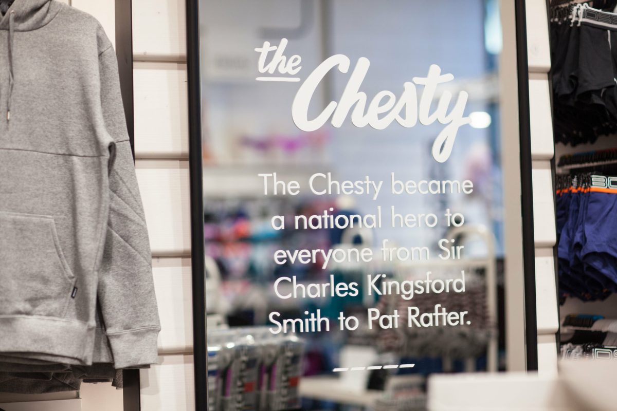
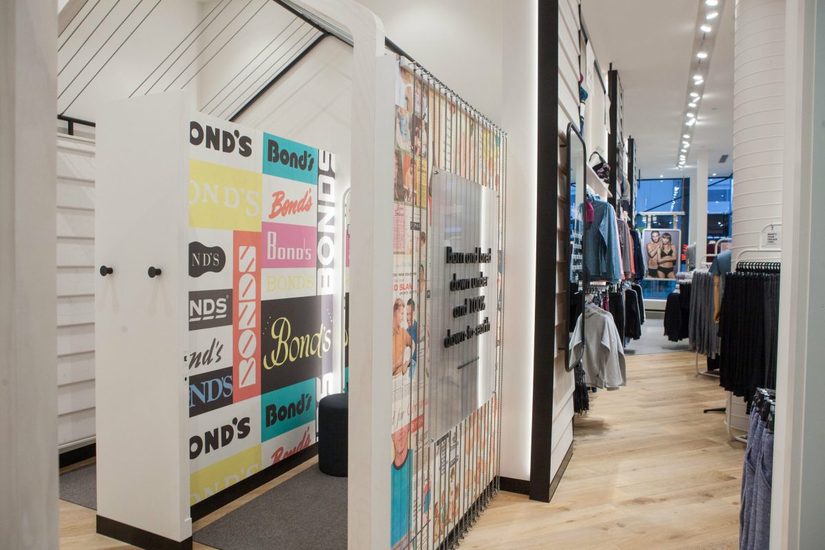
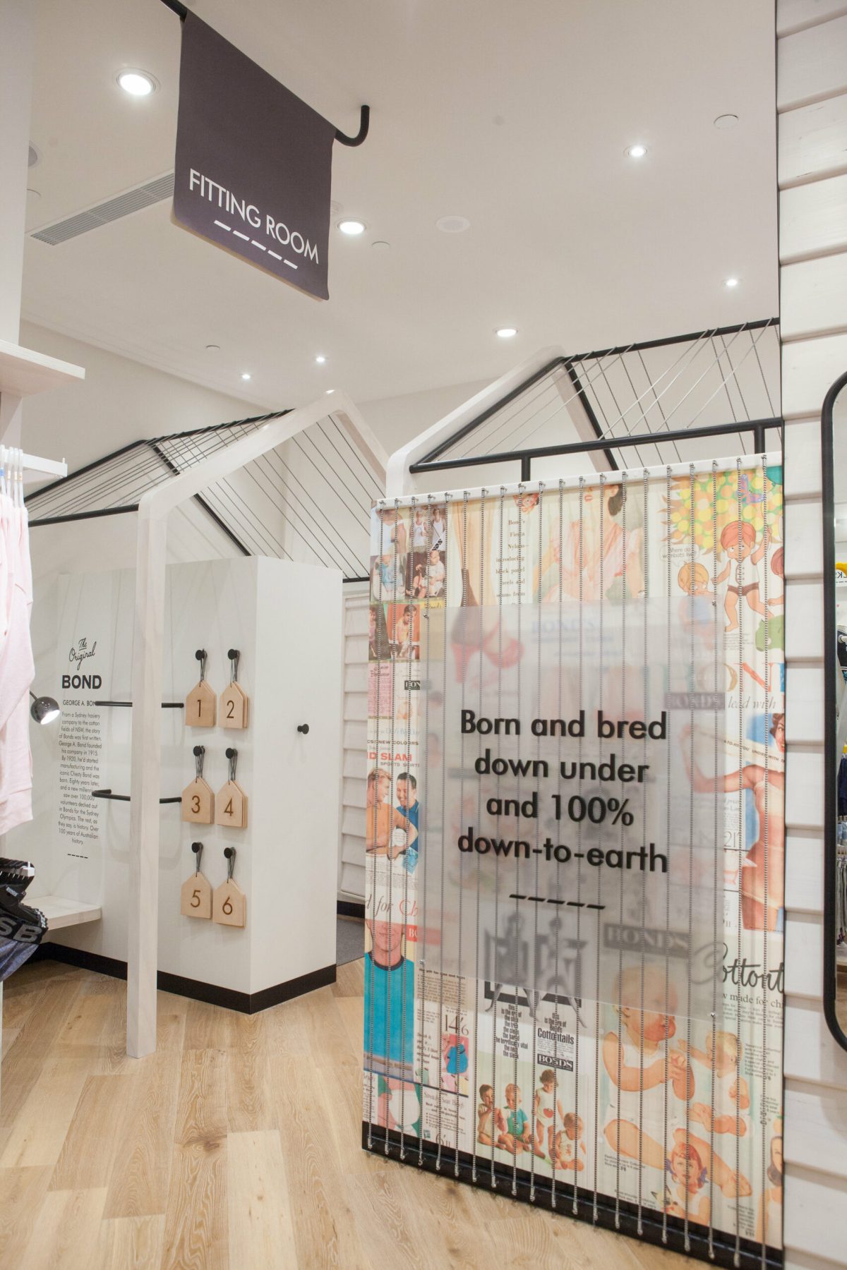
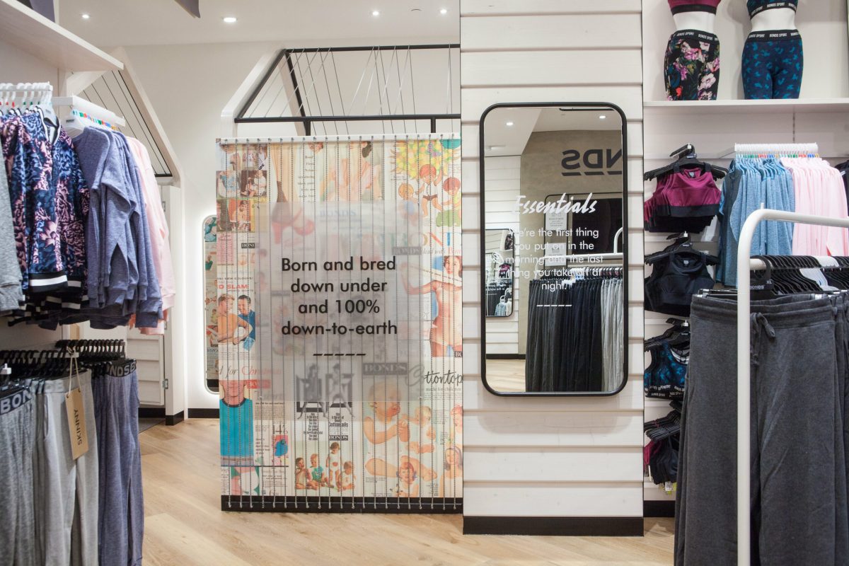
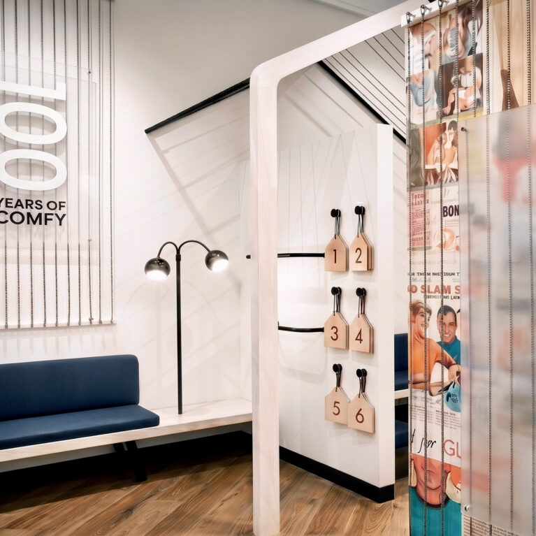
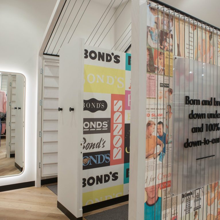
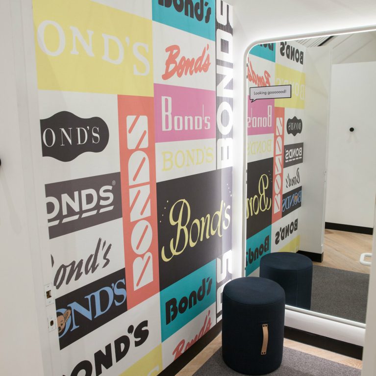
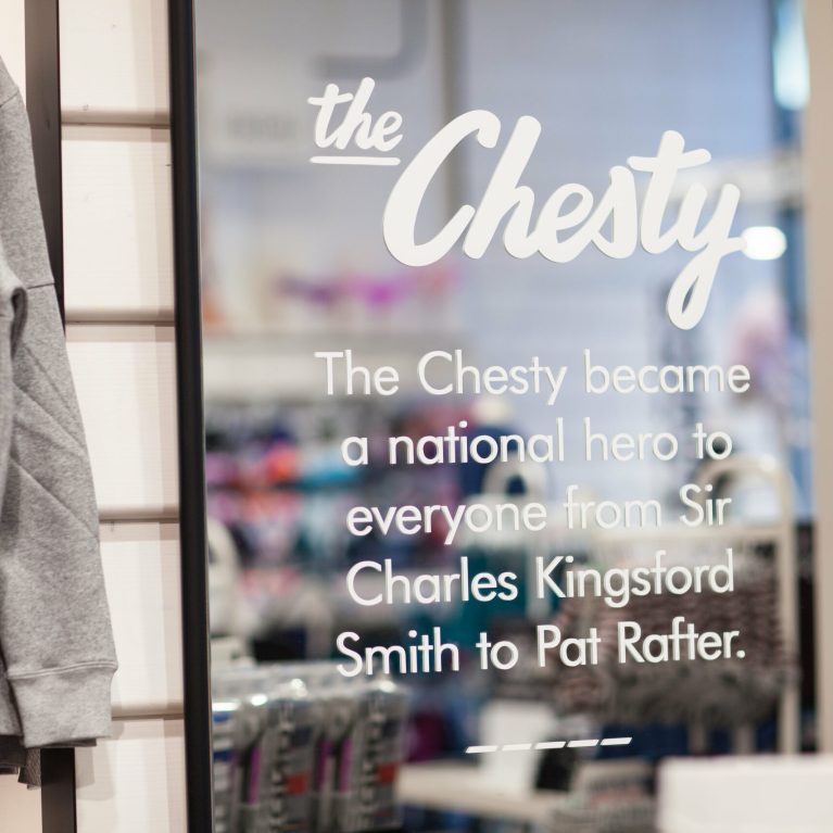
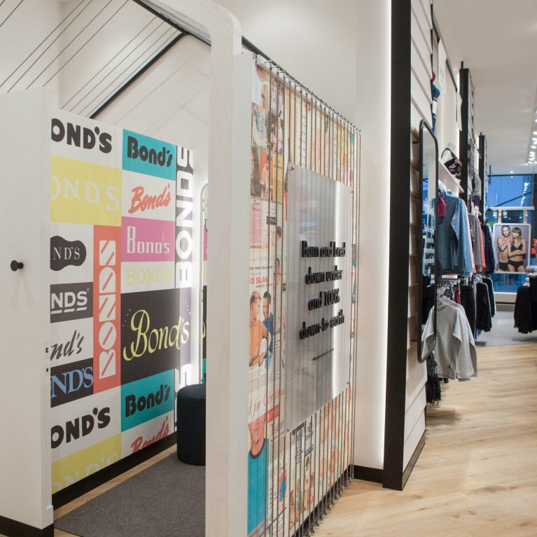
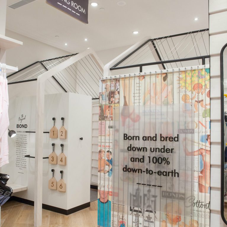
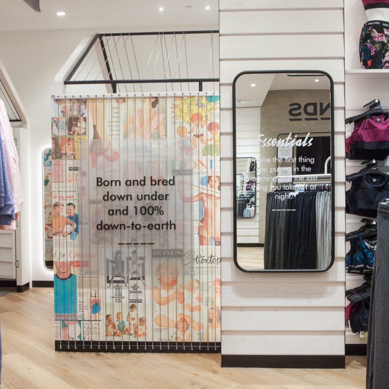
When a brand is so loved, where do you start? DC took a look back at the core brand values to drive the design insights. We were also invited to delve into the archives and draw inspiration from the rich history that is Bonds dating back to 1915. To forge forward, we stepped back in time.

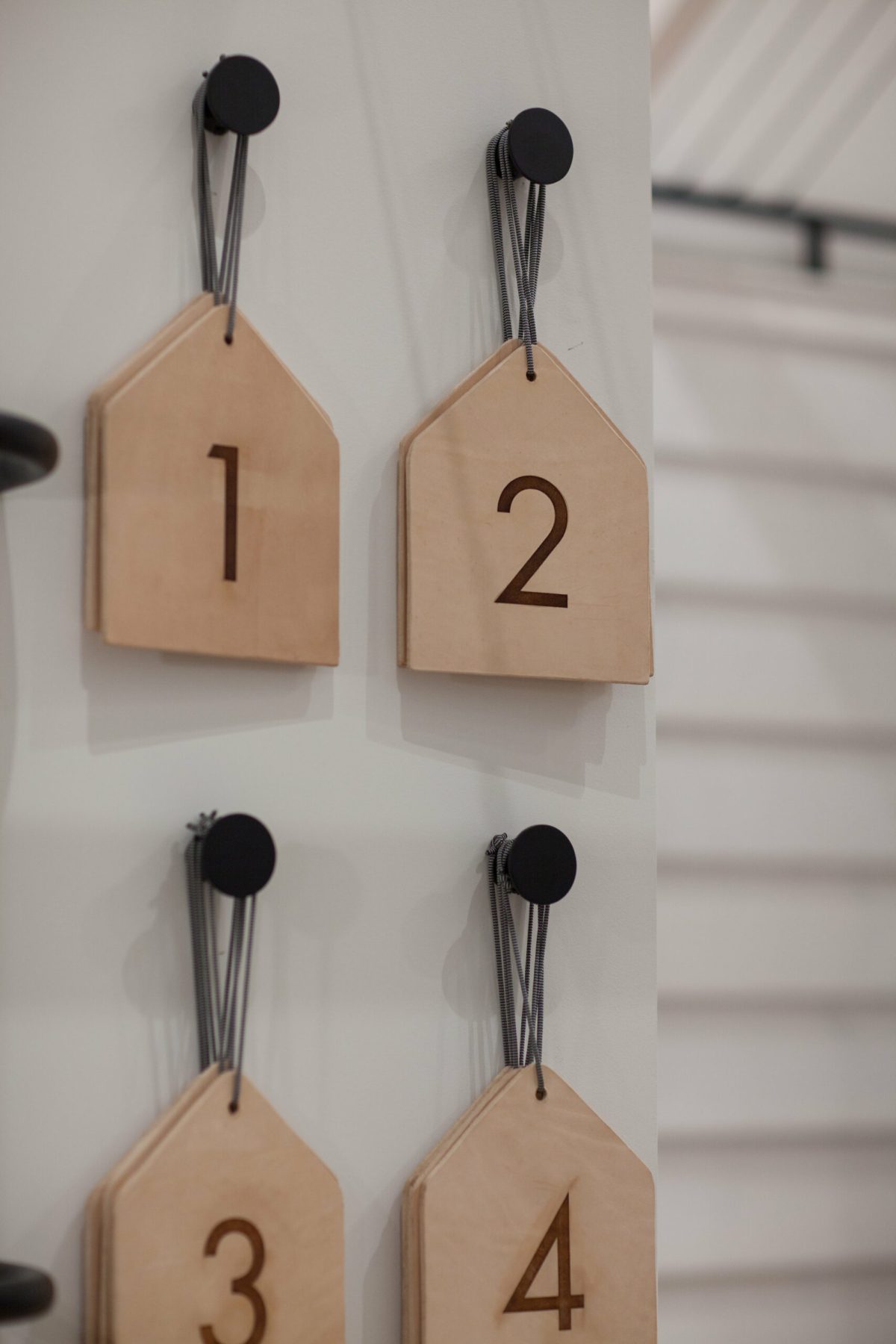
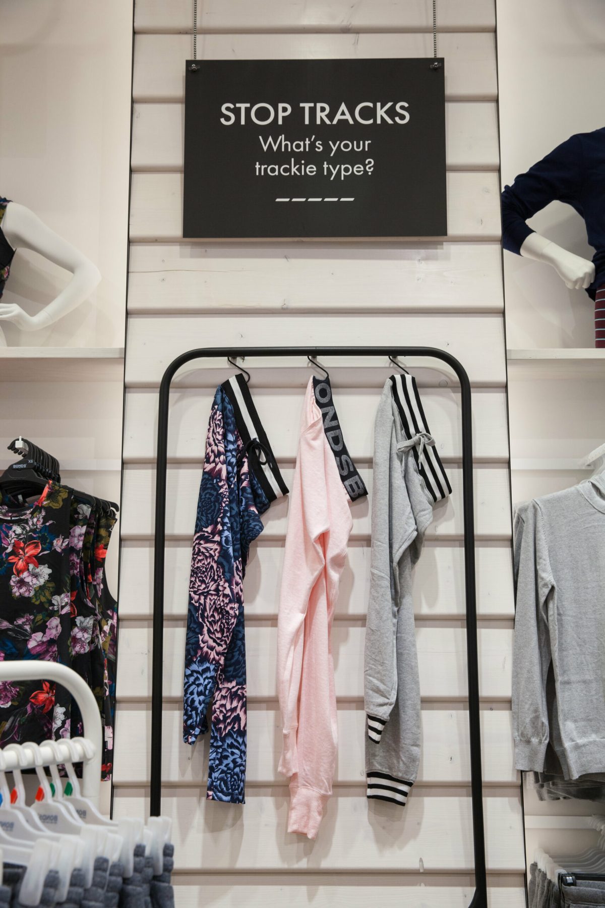
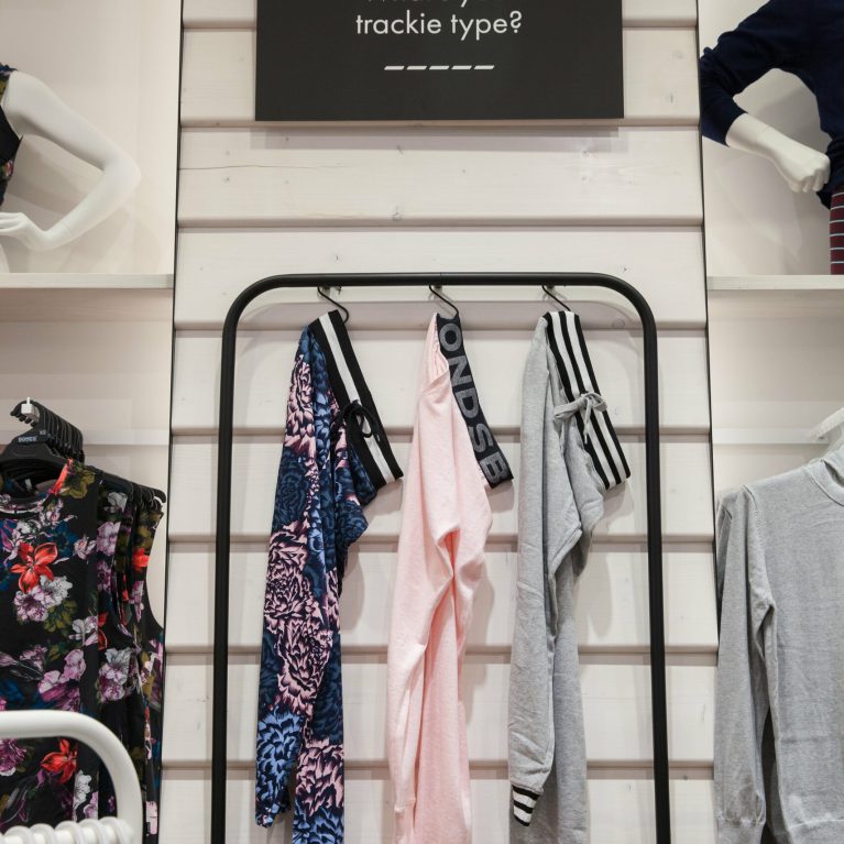
We created a retail experience that connects with the Aussie customer. We elevated the fitting room experience, introduced storytelling, easier ways to shop across the collection, with cheeky chat and a reminder that Bonds has been appealing to a broad customer spectrum from 8 seconds to 80 years, for more than a century, and is here to stay young!

Dynamic digital integration meets tactile merchandising in this highly flexible display zone. By pairing electronic screens with modular physical components, the architecture allows for rapid promotional updates while keeping product lines neatly organized and highly visible to browsing shoppers.

An expansive, frameless glass facade removes the traditional barrier between the mall concourse and the retail interior. The wide, inviting entrance sequence uses strategic lighting and strong geometric lines to draw passersby inward, offering clear views of the vibrant merchandising zones inside.

A striking geometric timber ceiling canopy anchors the main showroom floor, defining the central hub within the open-plan interior. Strategic floor material zoning guides customer foot traffic, while flexible, low-profile fixtures keep sightlines open across the expansive retail environment.

A minimal, eye-level hanging track isolates key product lines, creating a curated gallery effect on the perimeter wall. This focused display solution pairs clean horizontal geometries with textured backgrounds to elevate small-scale merchandise into a clear focal point.

Gabled architectural geometry frames the entrance to the changing suite, establishing a cozy, residential-scale pavilion within the open commercial floor. Bold brand history collages and soft perimeter lighting blend seamlessly to offer a premium, highly private trial experience for customers.

Inside the changing cubicle, a bold typographic archive wall brings personal scale to the historical narrative. The compact layout balances high-impact visual design with premium, comfortable furnishings, creating a private, functional space that enhances the personal trying-on experience.

Tactile, house-shaped wooden tokens introduce a warm, analog approach to customer service and stall allocation. Suspended neatly from minimal wall hardware, these custom timber elements mirror the overarching architectural forms of the fitting room pavilions while providing clear functional direction.

Horizontal shiplap wall paneling creates a clean, textured backdrop for seasonal apparel stories. This perimeter display setup utilizes flexible hanging systems and crisp signage options, allowing the visual merchandising team to quickly reconfigure layouts based on shifting product campaigns.

White vinyl lettering applied to a framed mirror surfaces regional brand history directly into the customer's line of sight. By combining functional glass with curated cultural text, the display layers educational narratives over the physical shopping experience without taking up valuable floor space.

A custom, house-shaped timber fixture brings playfulness and scale to the children's apparel department. Positioned centrally on the warm chevron flooring, this multi-tiered pavilion acts as a mini-landmark, organizing small-scale clothing lines into a highly accessible, clear product destination.

A wide internal thoroughfare connects high-density product displays directly to the hospitality-focused fitting room zone. The transition uses clear architectural zoning and materiality to guide customers seamlessly from browsing to trying on apparel.

Two identical house-shaped frames structure the fitting room zone, creating a charming neighborhood of private pavilions within the high-ceilinged space. This layered layout strategy clearly identifies service areas while using playful, honest architecture to enrich the spatial experience.

A vertical shiplap partition wall anchors the transition between high-density sportswear shelving and the private changing suite portal. This central junction coordinates functional mirrors, graphic art screens, and modular product displays into a highly efficient and visually cohesive customer node.

A striking, house-shaped timber canopy creates a powerful architectural anchor over the main showroom floor. This overhead feature coordinates with low-profile display islands and symmetrical track lighting grids to organize the expansive open plan into an intuitive, high-energy shopping environment.

An expansive service desk and digital media wall form a clear operational anchor at the rear of the main showroom floor. Framed by textured architectural surfaces, this point-of-sale hub streamlines transactions while serving as a dynamic platform for continuous brand marketing.