Instilling the true essence of Englishness of an iconic brand throughout the restaurant & bar
#Browns
#London
#Selected
#UK
#Hospitality & Leisure
#restaurants
Furniture: Inside Out Contracts
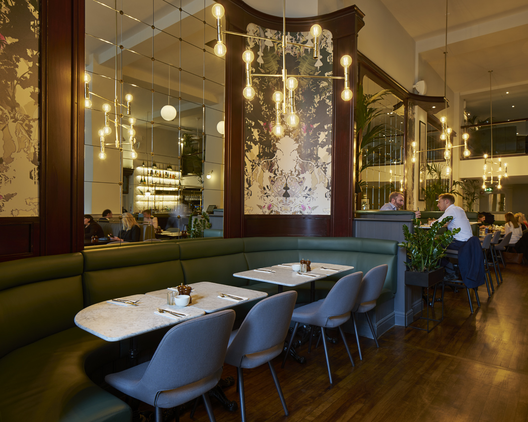
Wallpaper: Timorous Beasties
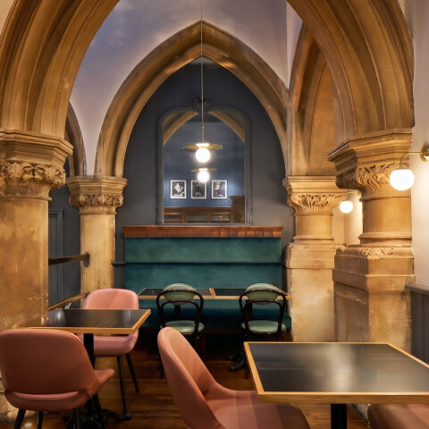
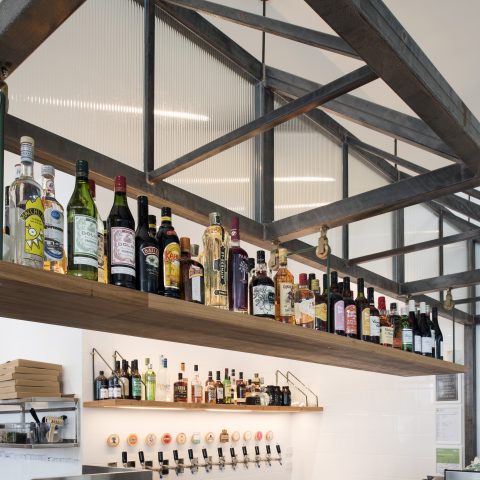
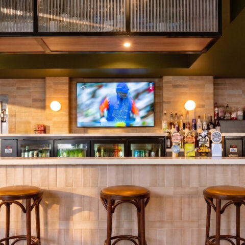
Design Clarity took on the design refresh for Browns, Mitchells & Butlers’ flagship F&B brand, with a clear brief: modernize the iconic ‘English Brasserie’ identity without alienating its loyal customer base. The client needed a sharper operational strategy that squeezed better seating efficiency out of the floor plan, accommodated mixed group sizes, and introduced higher-grade furniture and finishes. To prove the versatility of the new concept, Design Clarity tested it across two vastly different heritage properties in London—Old Jewry and West India Quay—creating a flexible template for future venues across the UK.
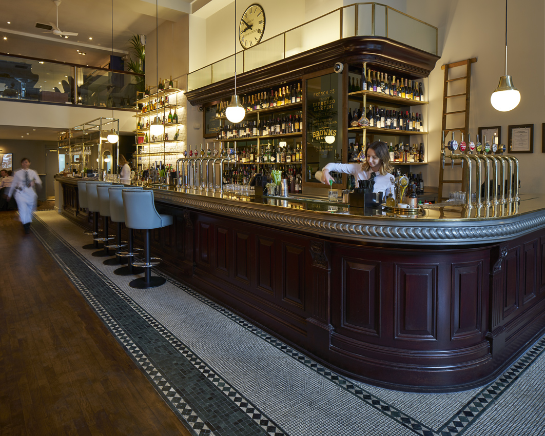
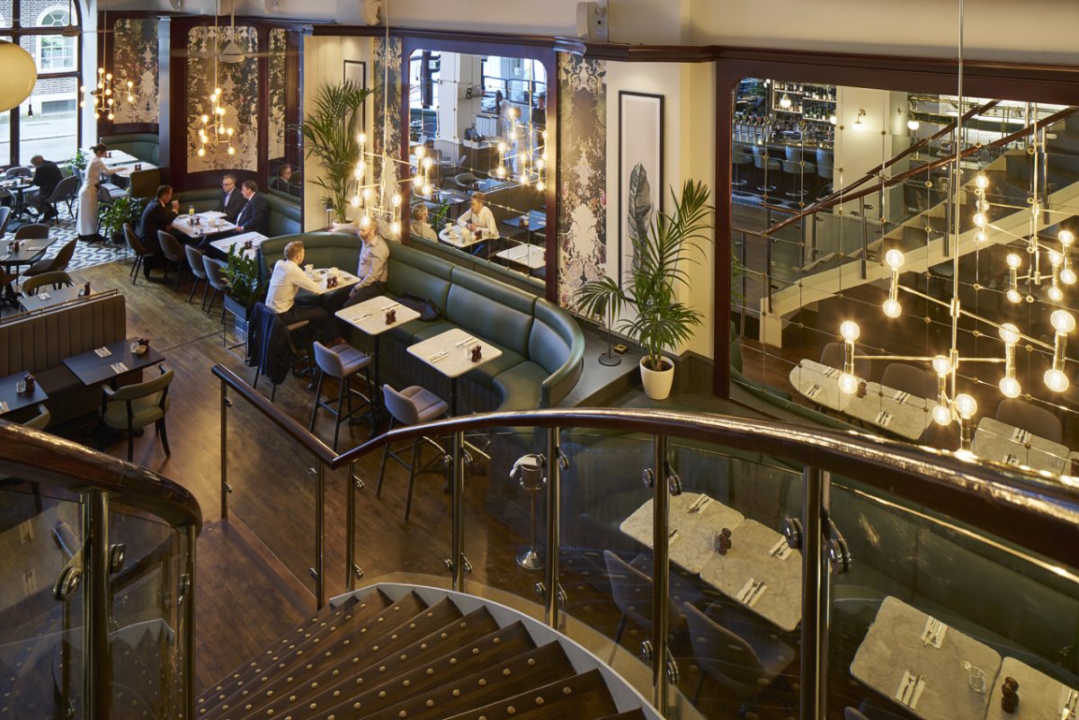
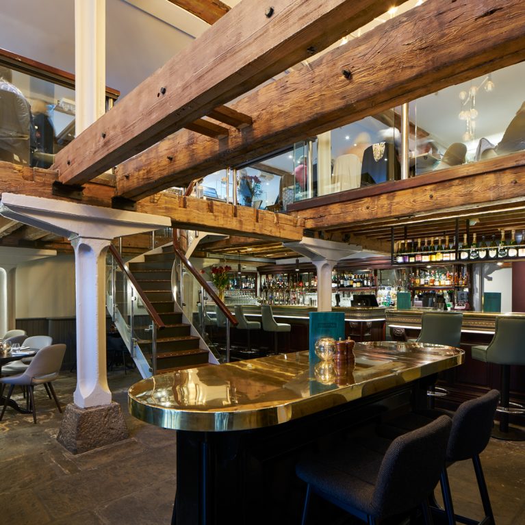
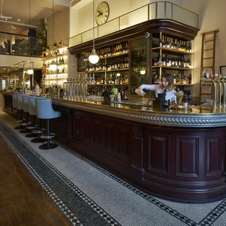
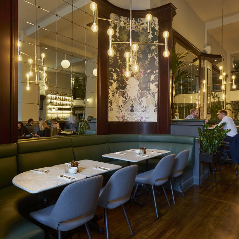
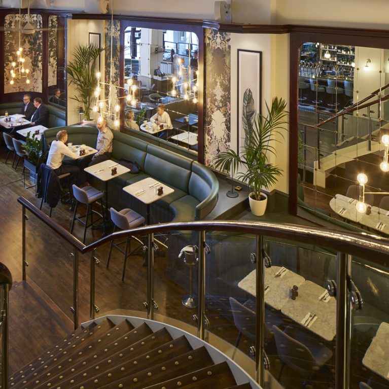
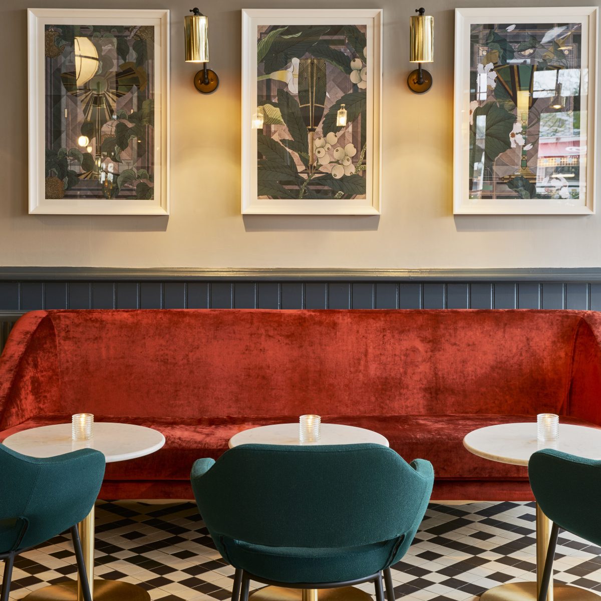
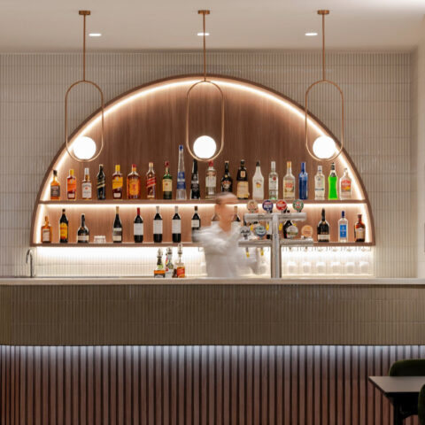
The Old Jewry location, set within the City of London’s historic banking district, is defined by scale and vertical height. The design strategy here maximizes the double-height volume, using a large curved mahogany bar to steer customer flow from the front door into the main hall. Verticality drives every detail: full-height mirrored walls and bespoke illustrative wallpaper panels by Scottish studio Timorous Beasties line the perimeter to reflect light back into the space. A wide timber staircase connects the ground floor to split-level dining platforms, giving diners visual access across the entire room.
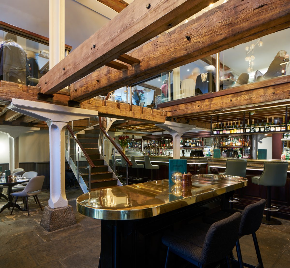
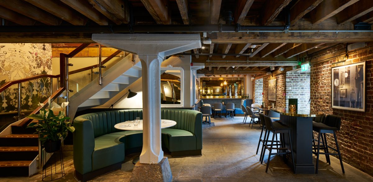
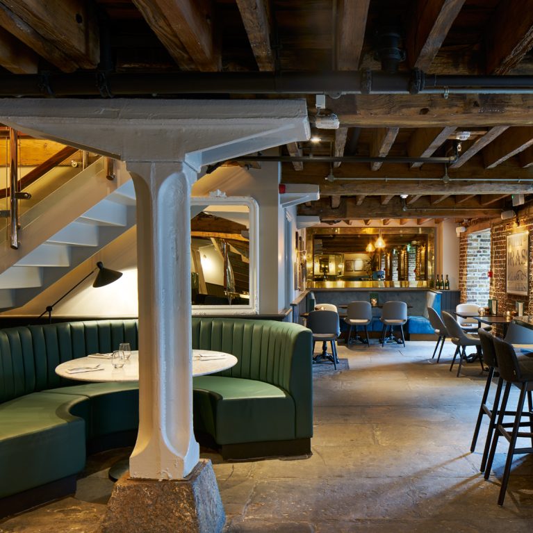
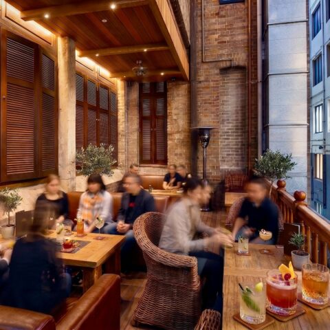
West India Quay presents the exact opposite structural setup. Housed inside a Grade II-listed former sugar warehouse in the Docklands, this site features low timber ceiling joists, original exposed brick, and heavy structural pillars. Rather than fighting the tighter overhead clearance, the design works within the original warehouse grid. Polished brass island counters, low-slung lighting, and deep green leather banquettes sit directly alongside raw brick surfaces, turning the lower ceiling height into an asset by creating an intimate, atmospheric lounge setting.
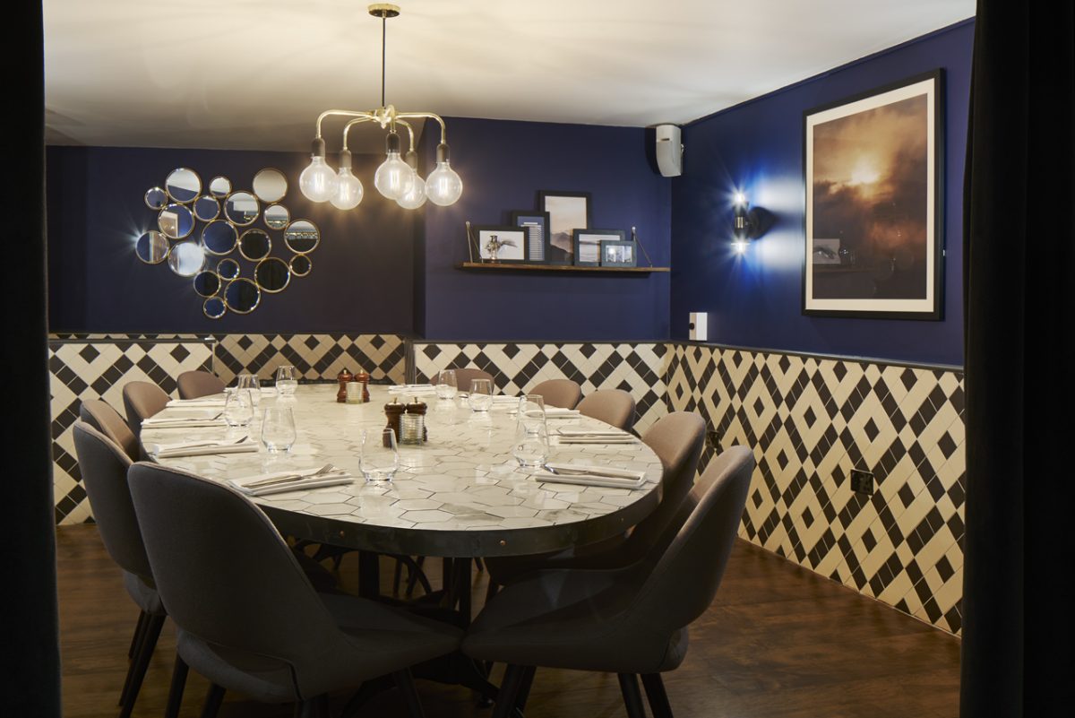
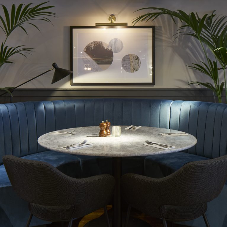
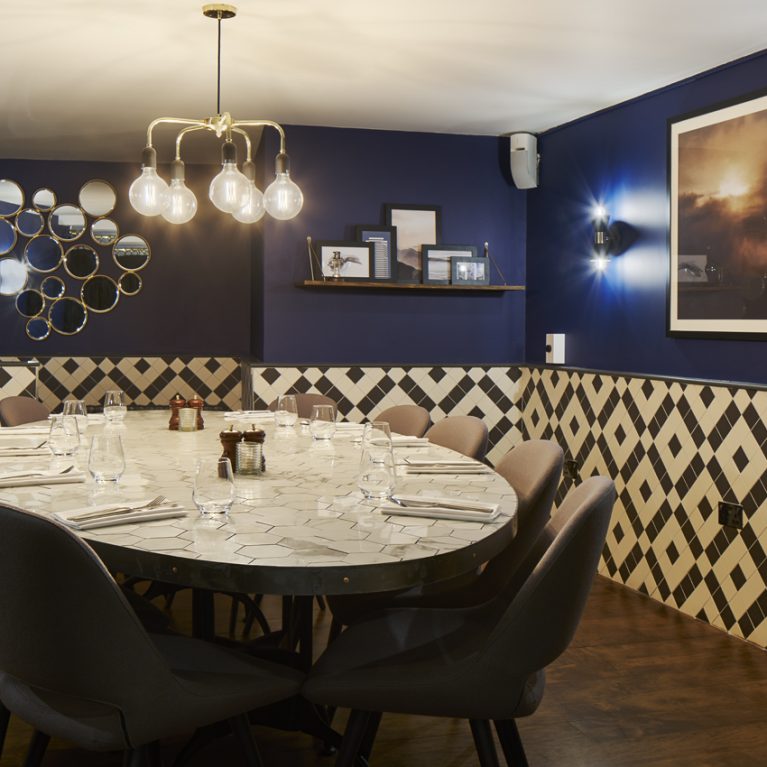
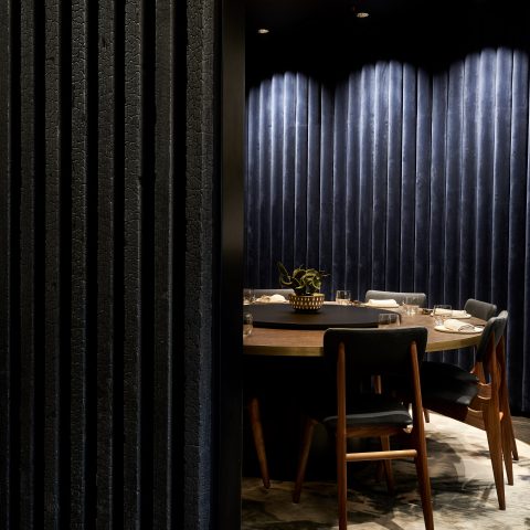
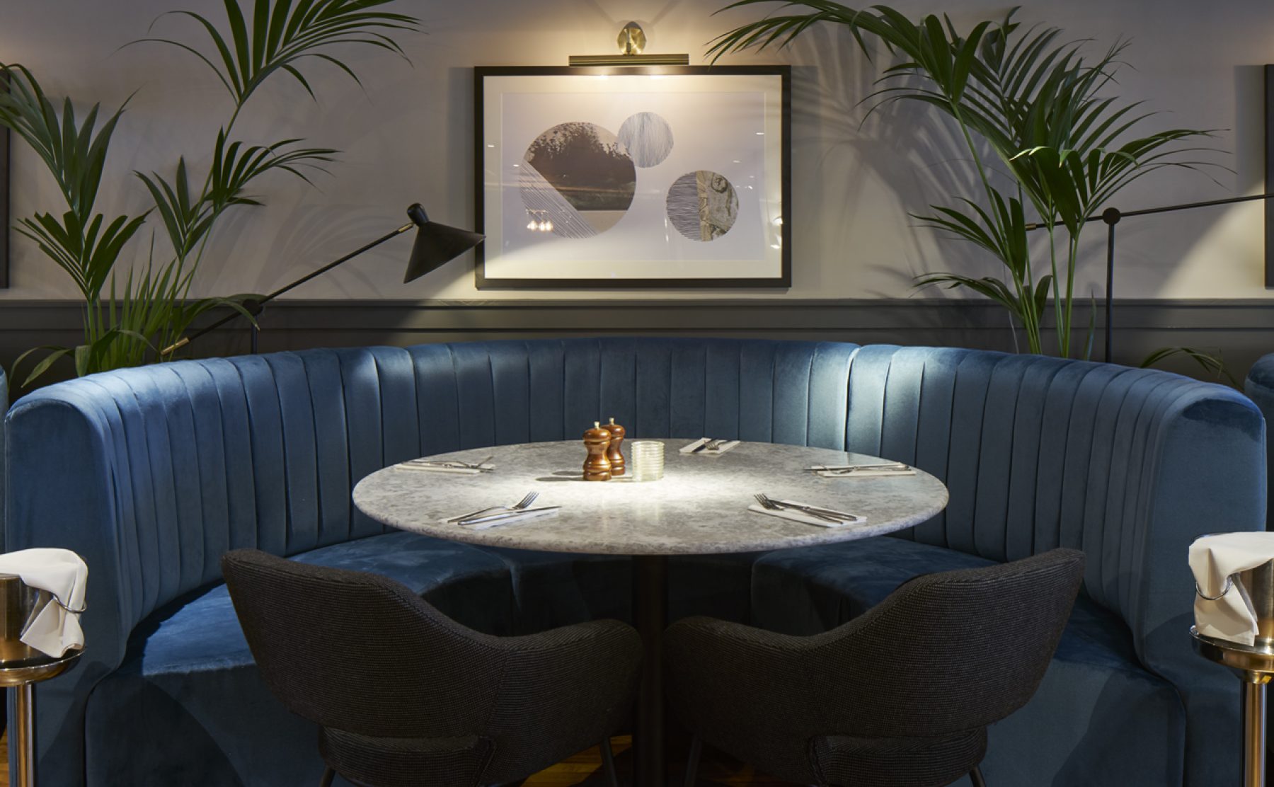
Across both venues, the main layout strategy relies on flexible spatial zoning rather than rigid walls to organize movement. Curved banquettes, changes in floor finishes, and targeted lighting divide the floor plan into distinct settings—ranging from high-energy bar perimeters to a private dining room framed by geometric tile wainscoting and dark blue walls. Successfully proving this approach in both a tall civic building and a compact warehouse provided Mitchells & Butlers with an adaptable kit of parts, now being applied to new and remodeled sites in Bath, Bristol, Nottingham, Glasgow, Cambridge, Windsor, and Leeds. Design Clarity has created a completely modern ‘grounded grandeur’ concept true to the brief for a client craving a cocktail of ideas; a design refresh that is considered, elegant and quintessentially British.