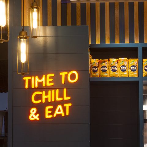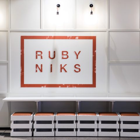
Visual Identity & Cafe Design
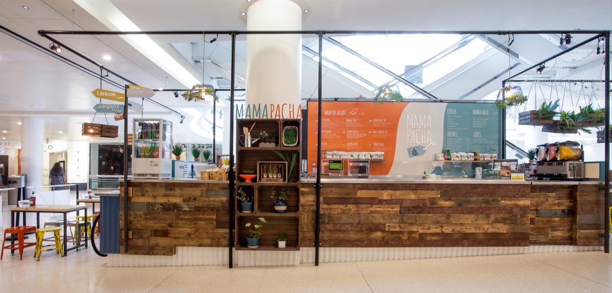
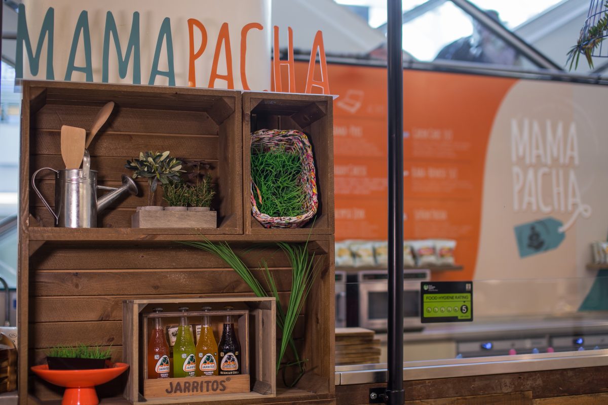
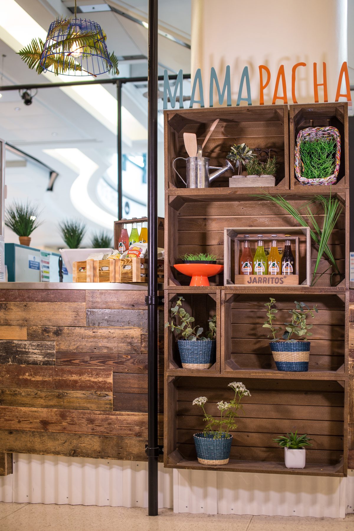
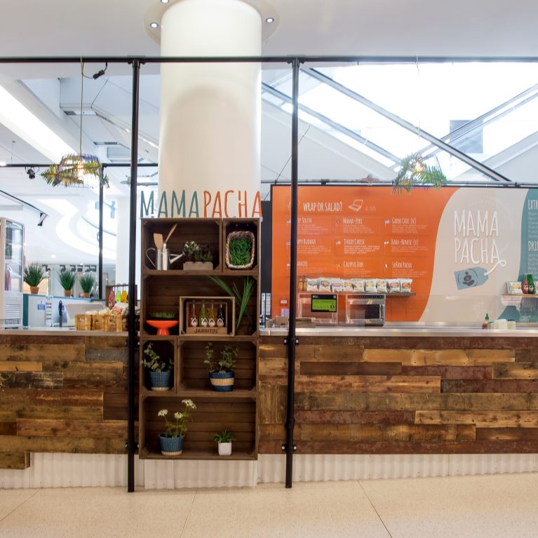
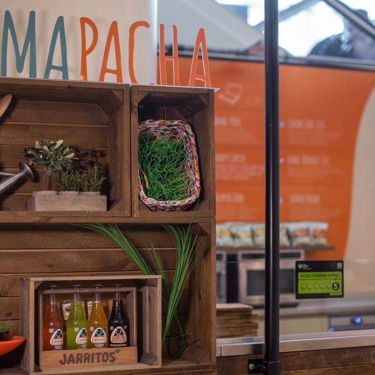
The spatial and brand architecture for Mama Pacha introduces a layered, experiential environment that reinterprets the traditional high-street cafe through the lens of a bustling, hawker-style street market. Design Clarity delivered an integrated creative solution for this site, naming the venue and hand-drawing the entire visual identity before translating that graphic narrative into a highly tactile physical interior.
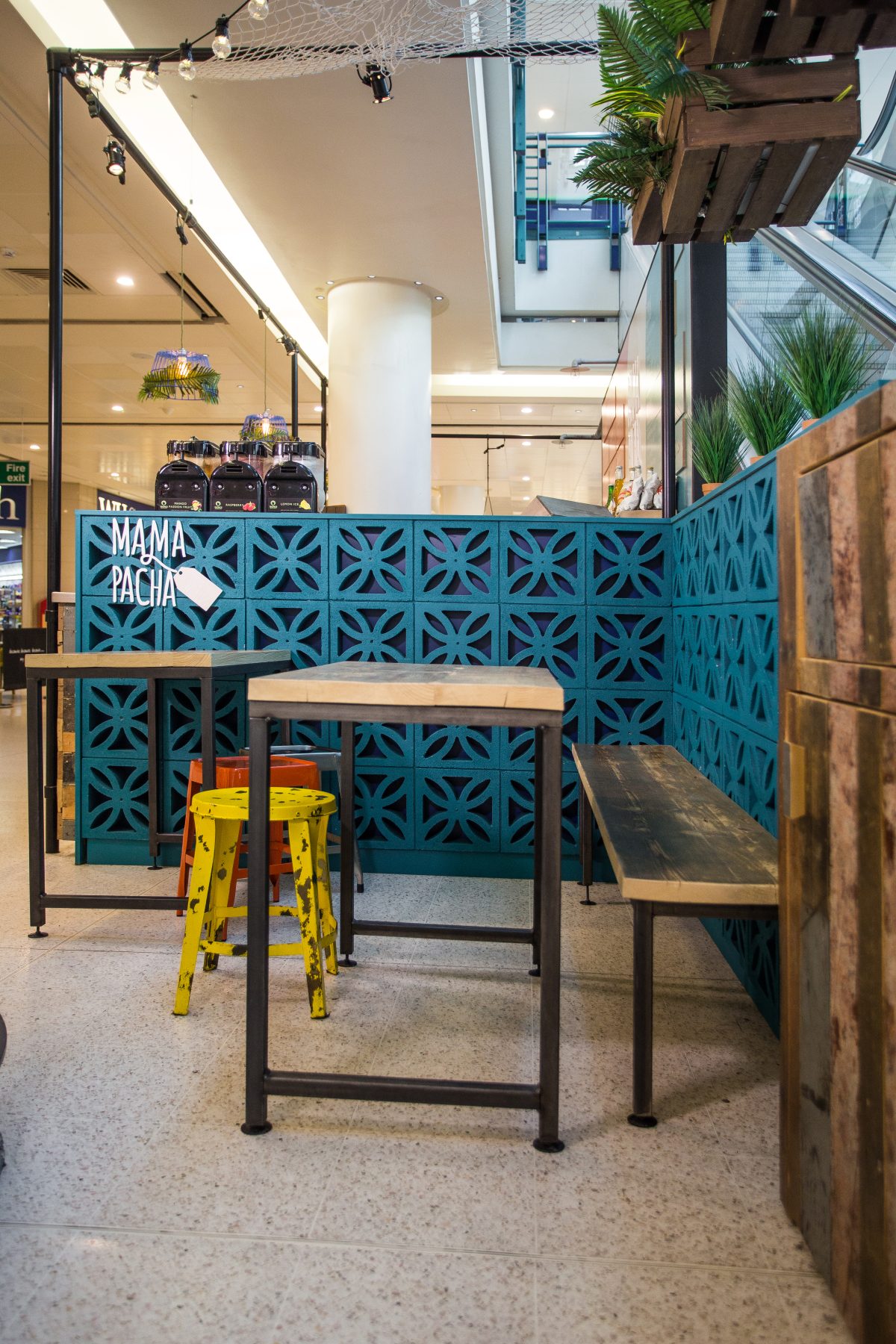
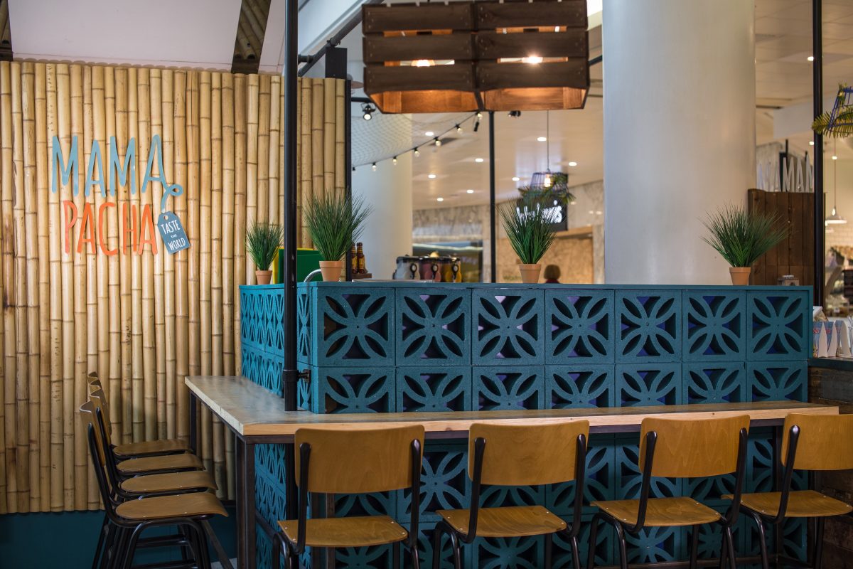
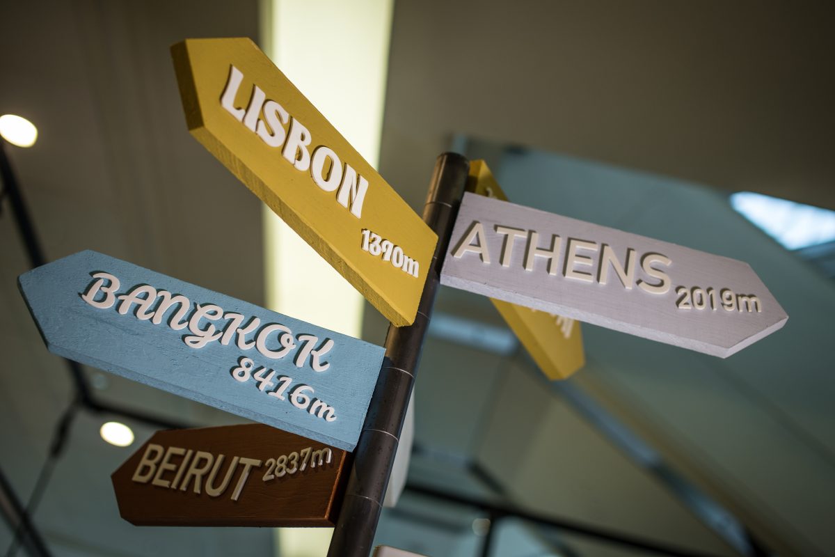
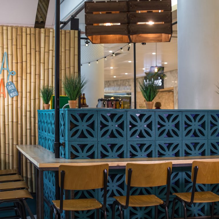
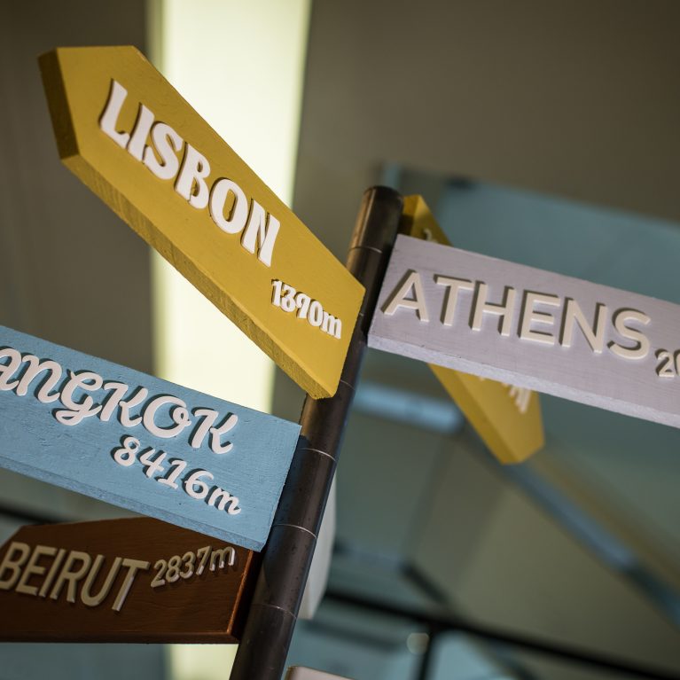
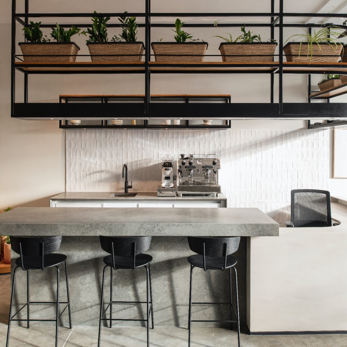
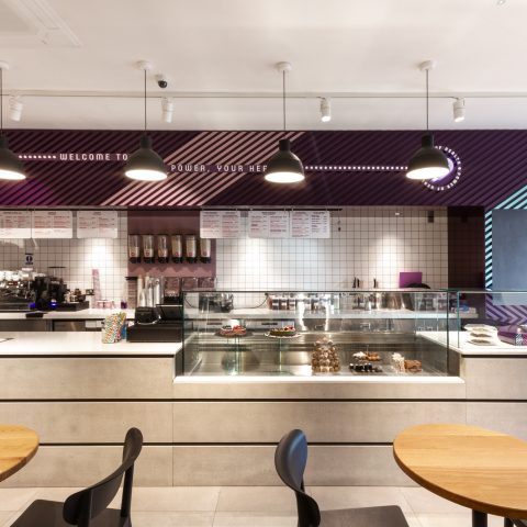
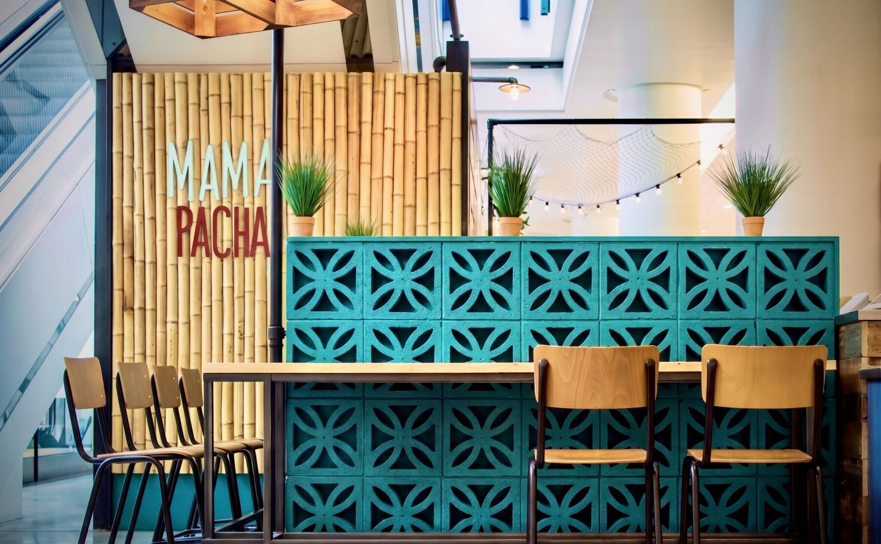
The design draws inspiration from the energy, raw materiality, and spatial abundance of international street-food stands across Mexico, Asia, and South America. The architectural layout strips away conventional commercial boundaries to recreate a lively marketplace forum, enabling patrons to break away from standard corporate routines. A central, open-front service counter wrapped in reclaimed timber planks and white subway tiles handles high-velocity lunchtime traffic, keeping industrial beverage apparatus and preparation zones completely visible to arriving customers.
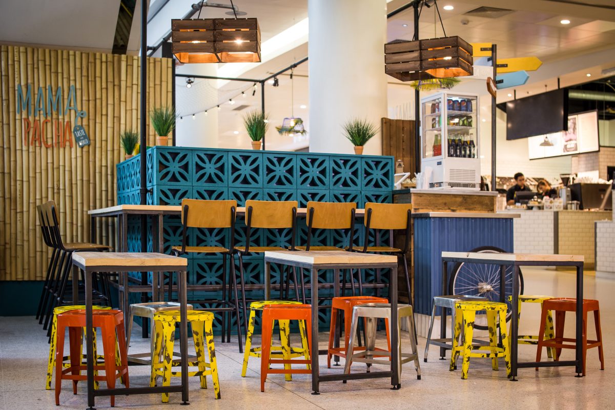
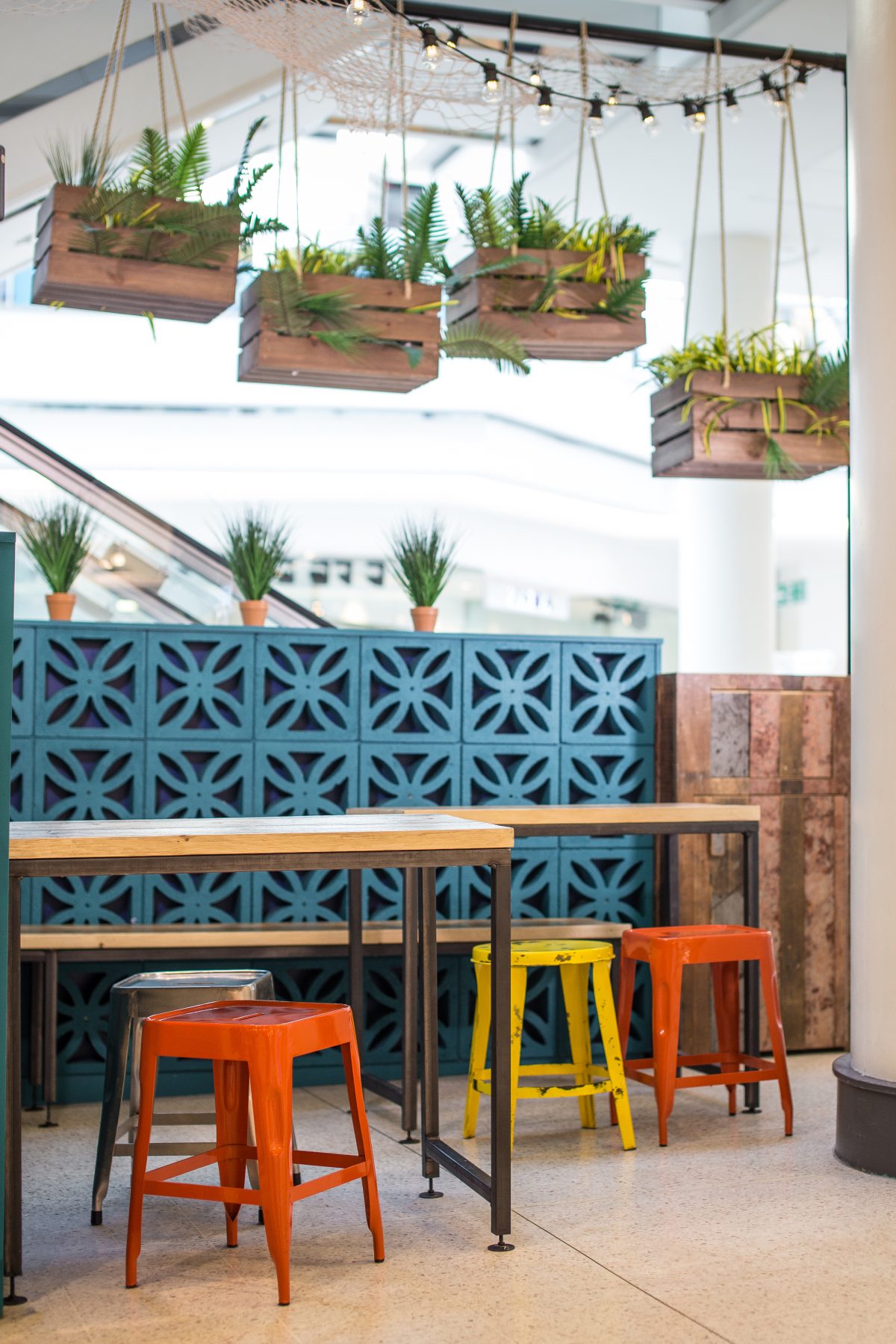
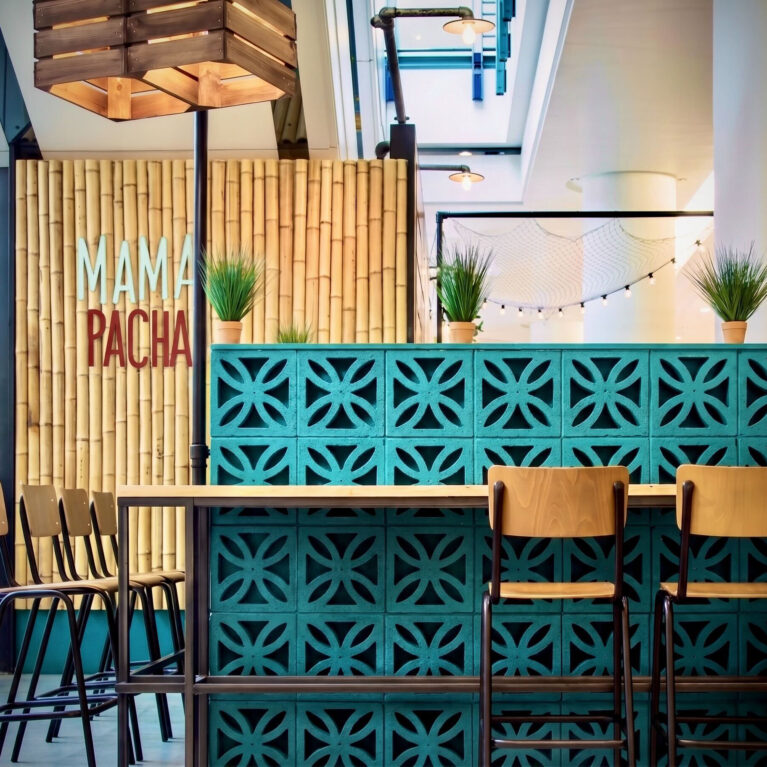
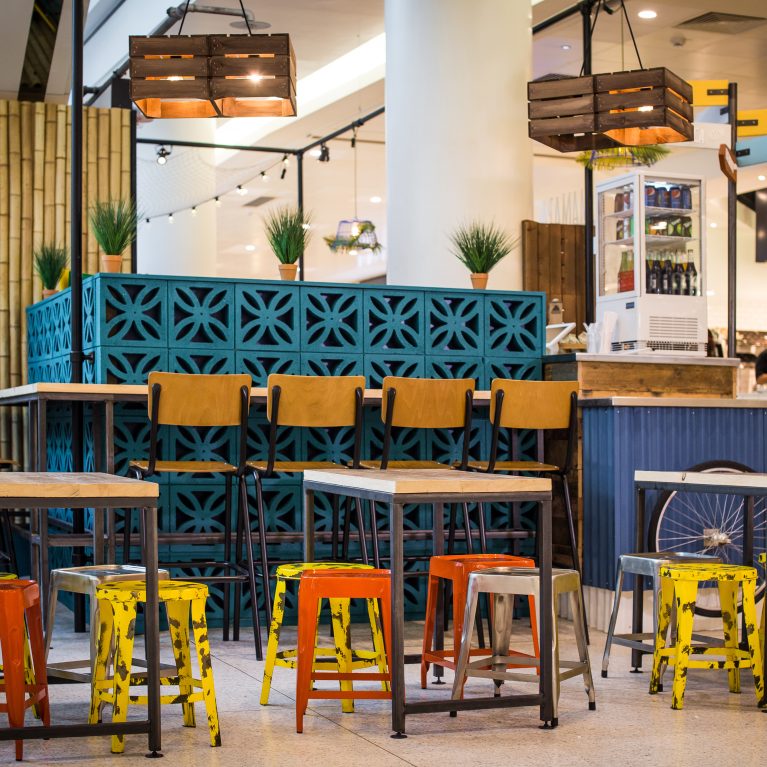
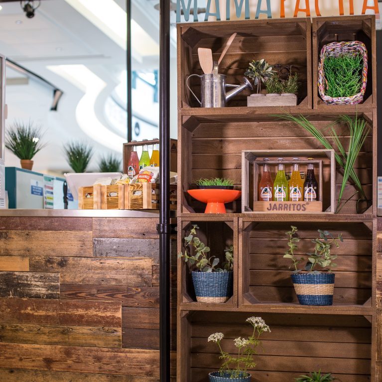
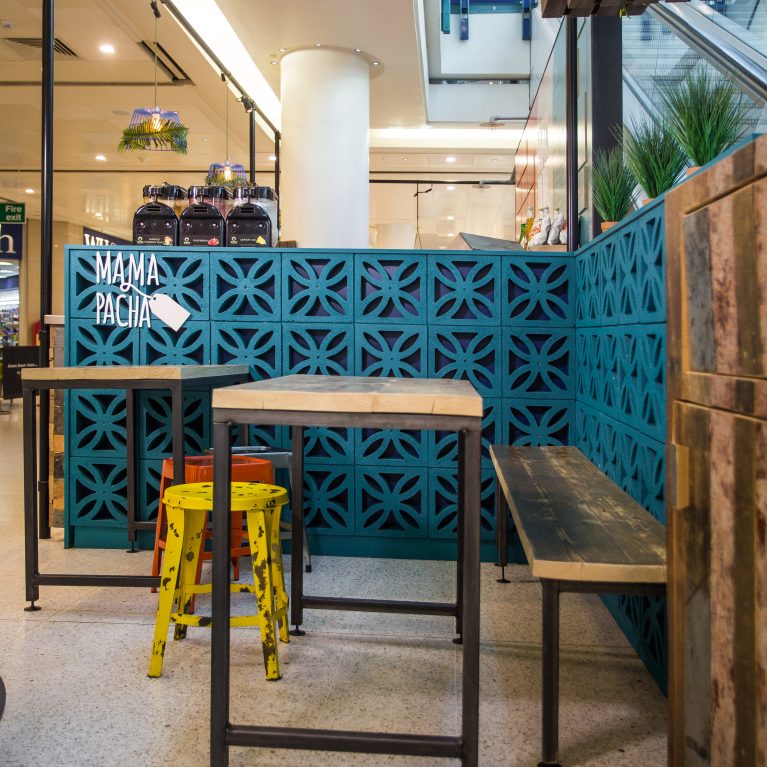
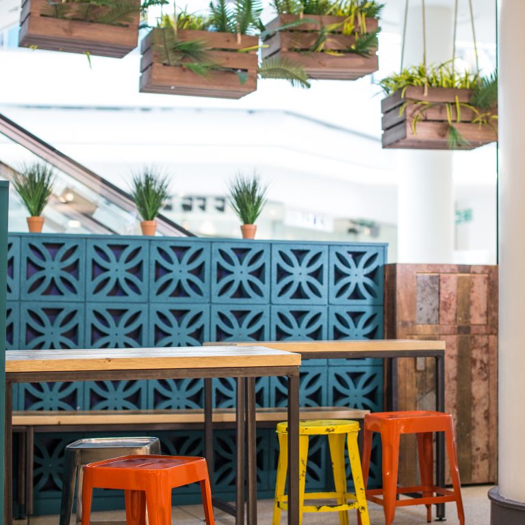
The floor plate organizes casual dining configurations around a series of structural interventions that zone the open space without isolating diners. Custom concrete breeze blocks finished in a vibrant turquoise lacquer are paired with full-height bamboo wall paneling, forming robust architectural screens that anchor built-in timber bars and industrial plywood seating. Overhead, the vertical volume is compressed using suspended timber produce crates packed with trailing greenery alongside exposed festoon filament lighting. By balancing raw, memory-evoking textures with durable commercial utility, the scheme establishes an immersive culinary ecosystem within a modern urban shell.