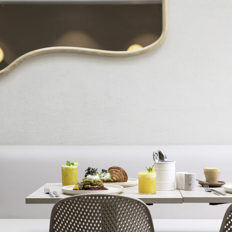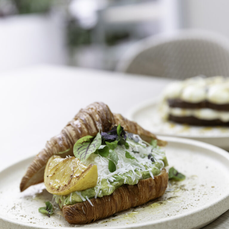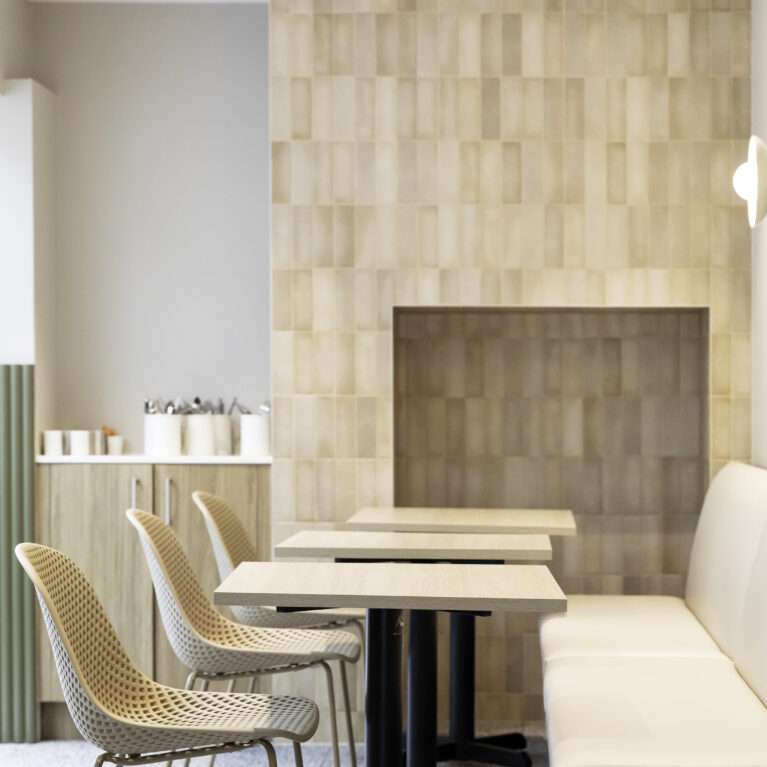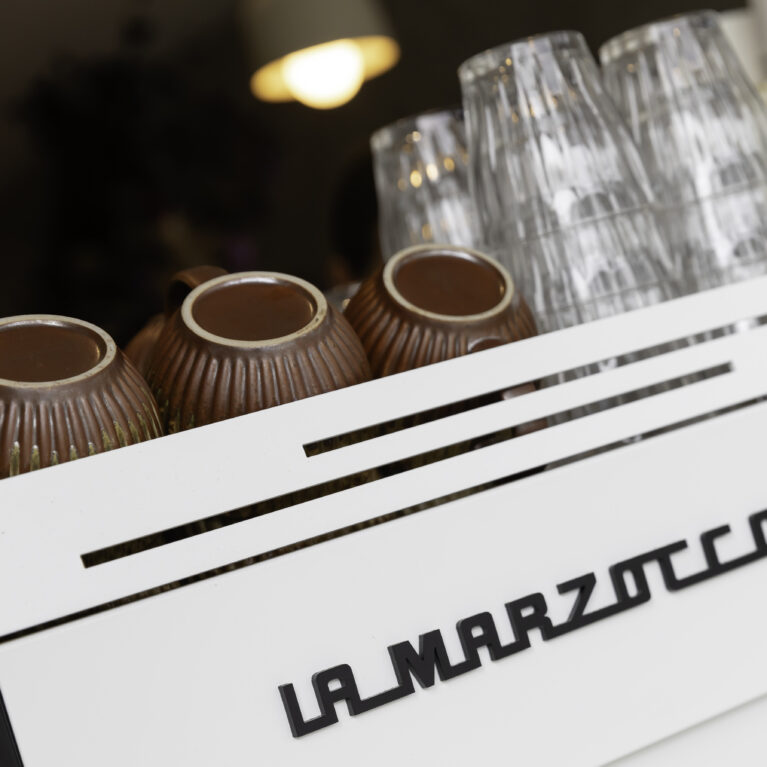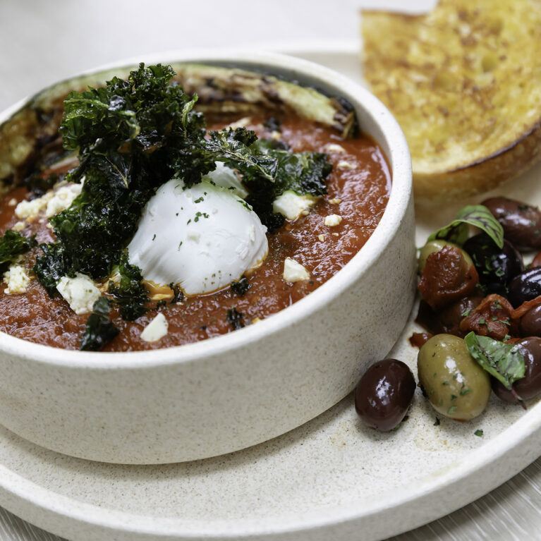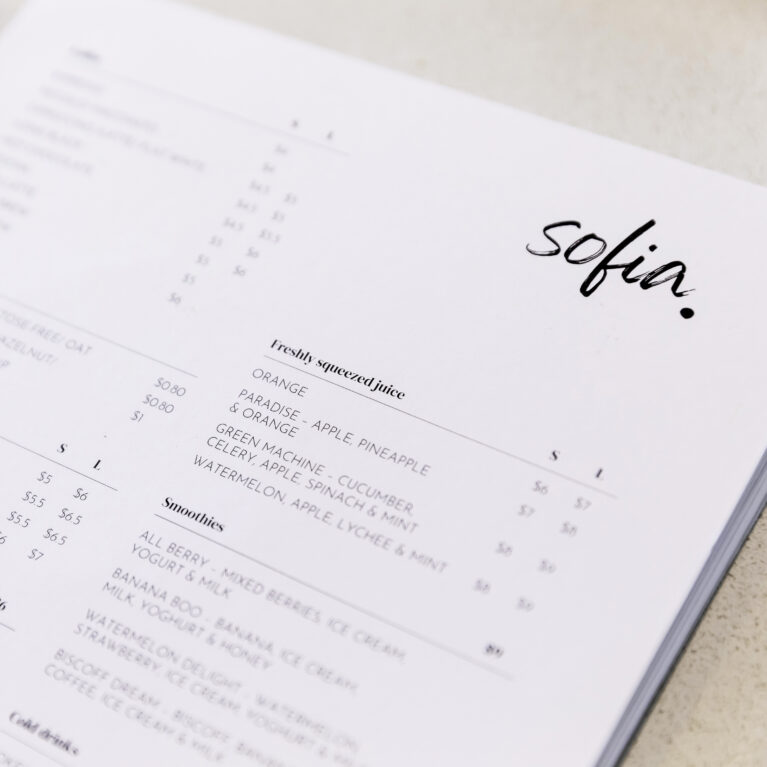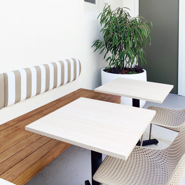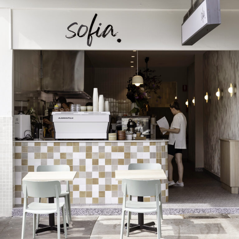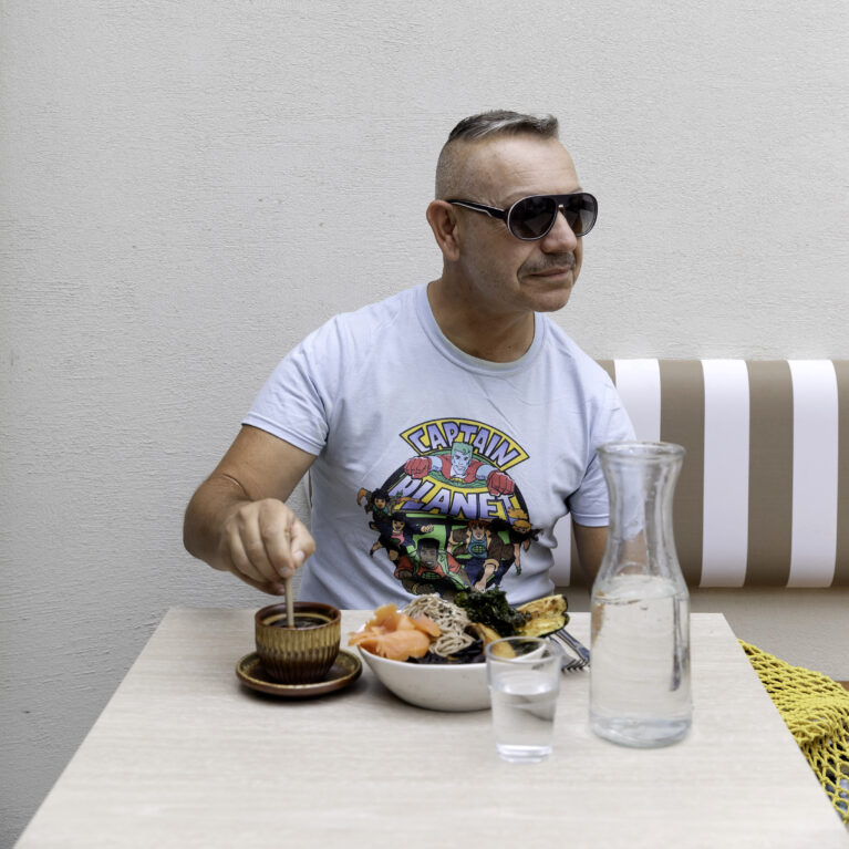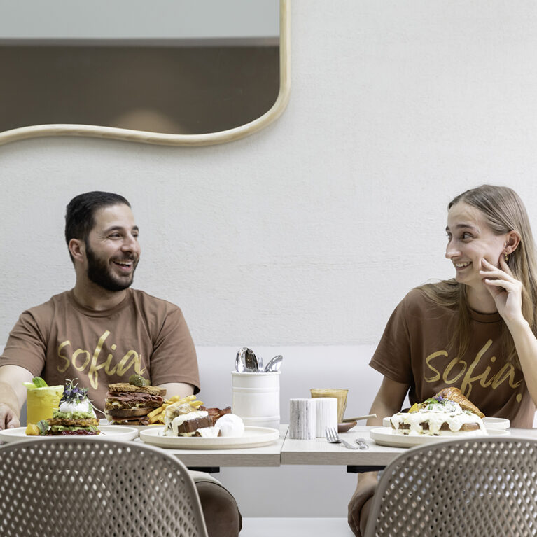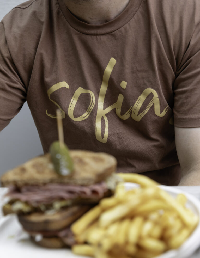
This image highlights the café’s cohesive branding and design. The handwritten "Sofia" logo mirrors the café’s honest, welcoming vibe, while the earthy brown t-shirt connects with the café’s neutral, natural palette. Paired with a well-presented meal, it exemplifies a unified customer experience that blends branding, interiors, and culinary offerings seamlessly.
Sofia’s rebranding reflects a thoughtful shift toward simplicity and authenticity. The handwritten-style logo, resembling a personal signature, reinforces the café's friendly and approachable ethos. Seen here on a rich brown t-shirt, the branding aligns with the café’s earthy colour palette, which runs consistently throughout the interiors.
The image also emphasises the café’s attention to detail, showcasing a freshly prepared meal. The warm tones of the dish complement the neutral palette of the branding and space, creating a seamless connection between the visual identity and culinary presentation. Together, these elements work to craft an environment that feels cohesive and inviting—a perfect representation of Sophia’s modern yet personable appeal.

