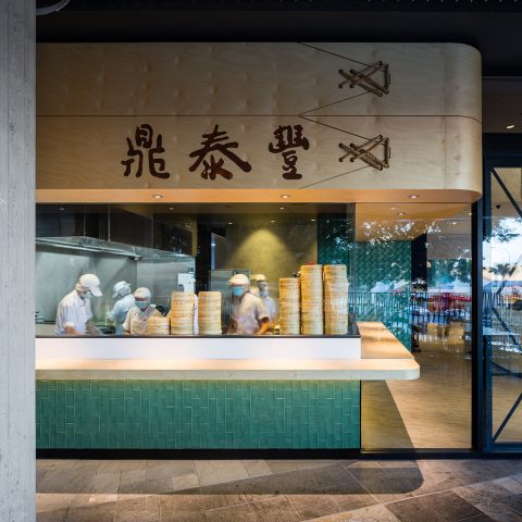
A transportive refined dining experience for Sydney
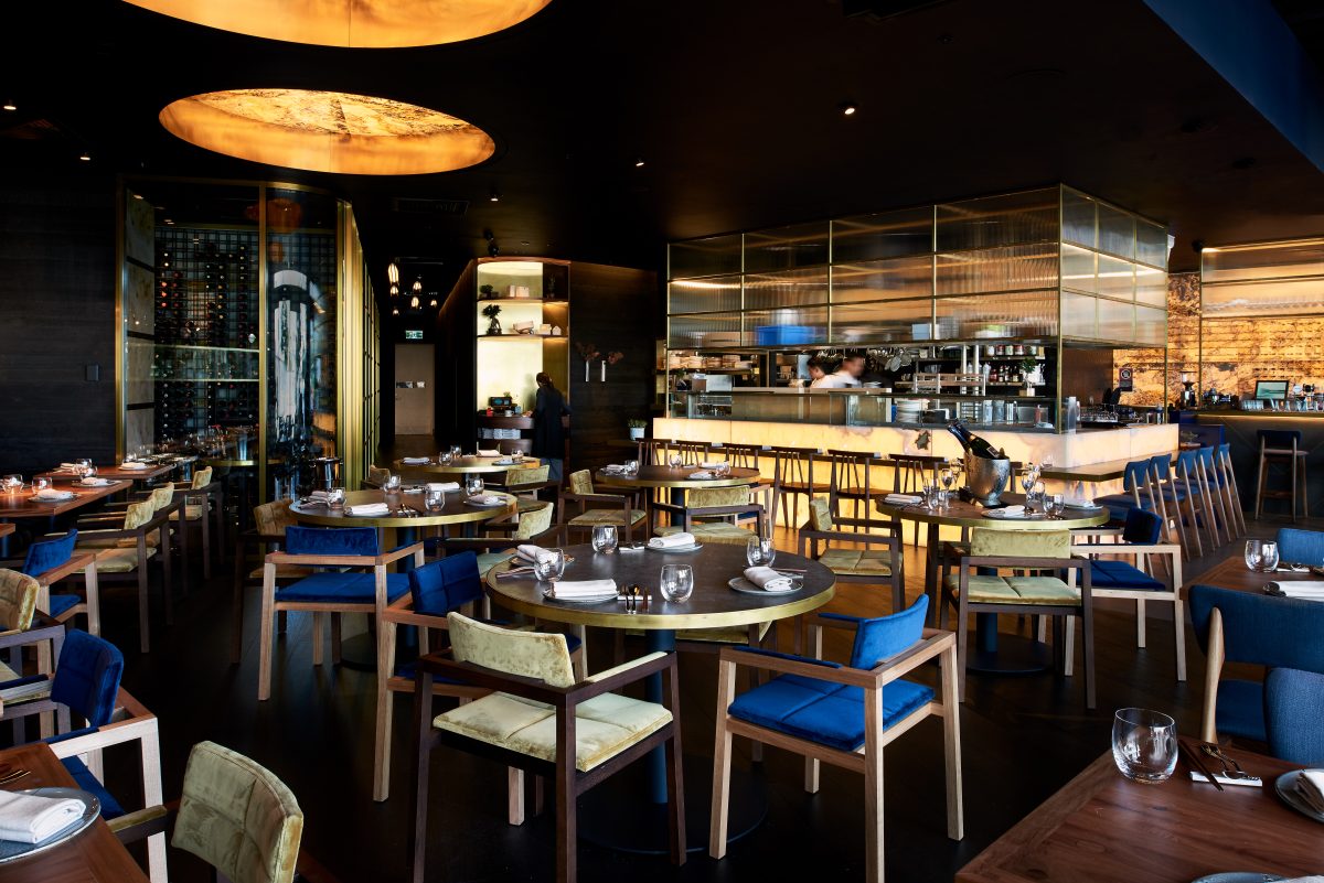
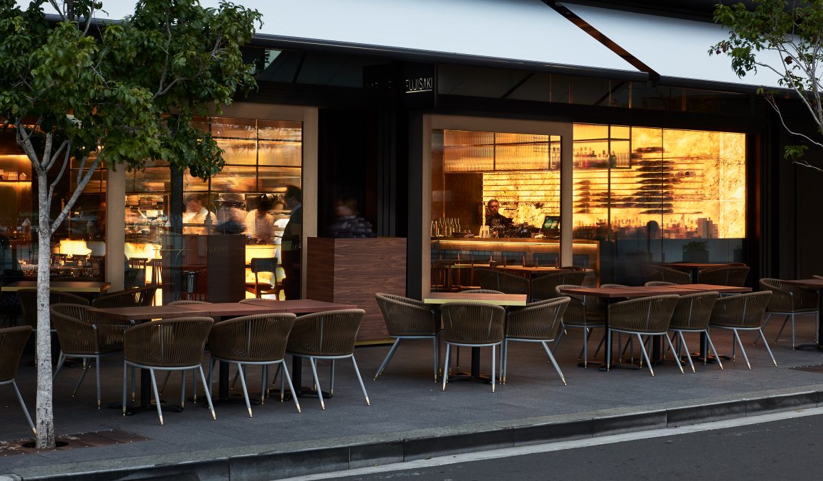
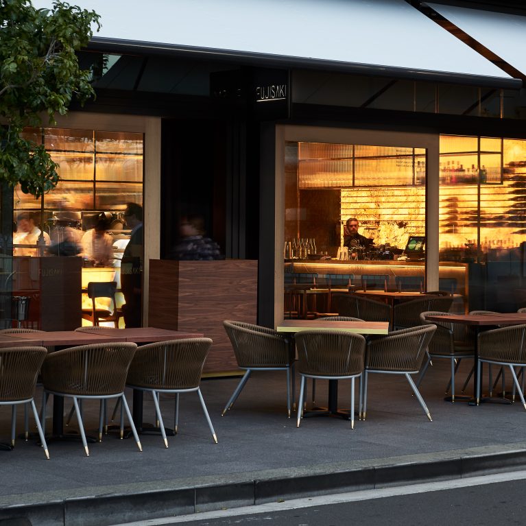
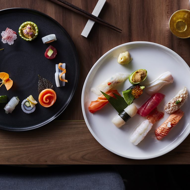
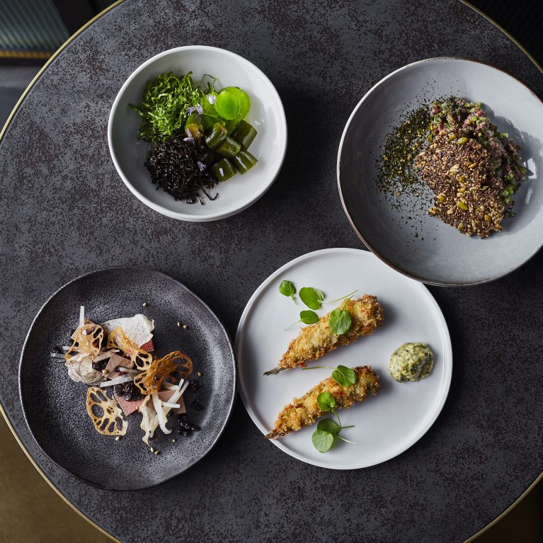
Lotus Dining’s lavish destination restaurant and bar at Sydney’s Barangaroo delivers a transportive, high-end Japanese dining environment that masterfully leverages sweeping harbor views through a flexible 146-seat indoor-outdoor floor plan. The spatial journey and unified brand identity, executed simultaneously by Design Clarity, center on the foundational values of nurturing, generosity, and integrity. Initiated through an immersive collaborative workshop, the design translates four creative pillars—Authenticity, Quality, Innovation, and Respect—into a seamless physical and graphic landscape where age-old cultural rituals are reinterpreted for a premium city waterfront site.
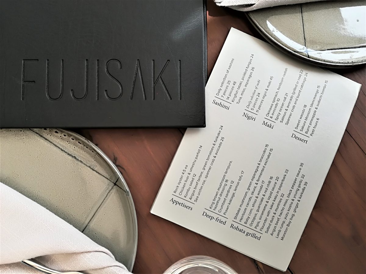
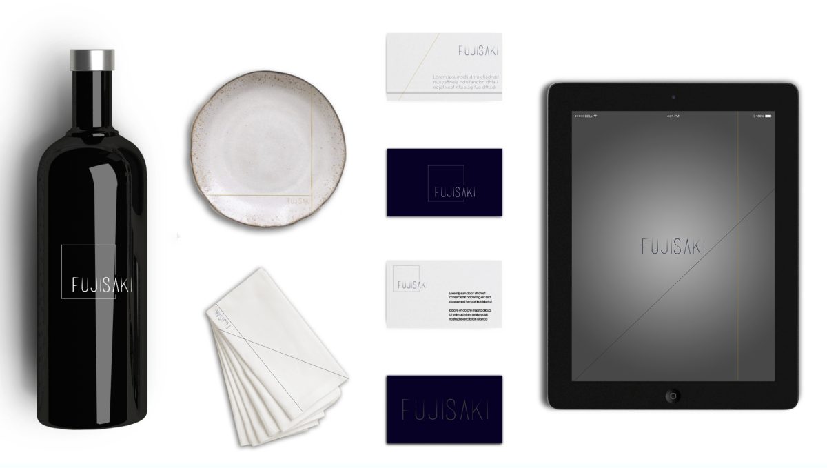
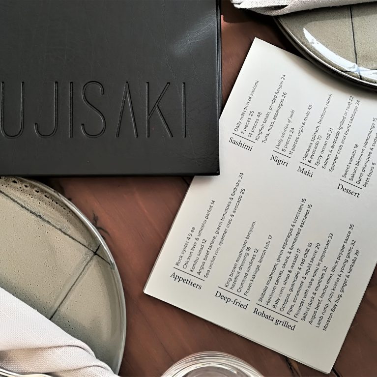
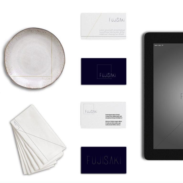
To anchor the graphic identity, the team defined “Focus” as the heart of the brand attitude, ensuring the typography stands alone in its elegant simplicity to let the innovative culinary program act as the hero. The resulting brandmark uses an ultra-slim, elongated sans-serif typeface emphasizing linear precision and negative space, where the traditional crossbar of the letter “A” is replaced with a sharp, open apex to mimic minimalist Japanese joinery. This clean graphic logic transitions flawlessly across physical and digital mediums, appearing as deep tone-on-tone debossing on the heavy-grain black leather menu binders, gold-foil engravings on premium matte-black business cards, and a crisp user interface on table-service digital ordering tablets.
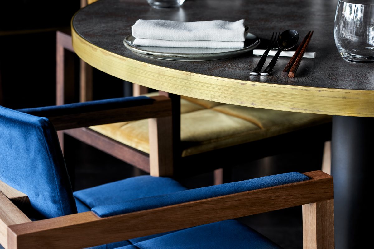
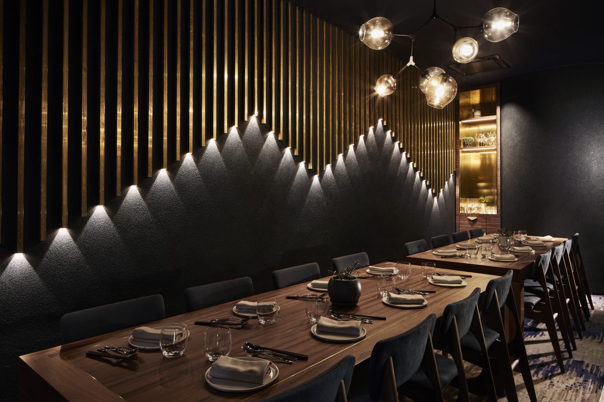
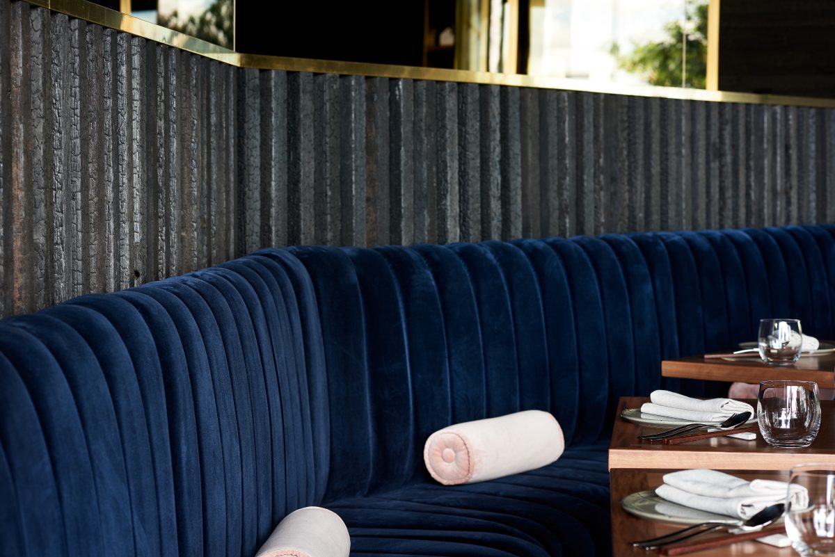
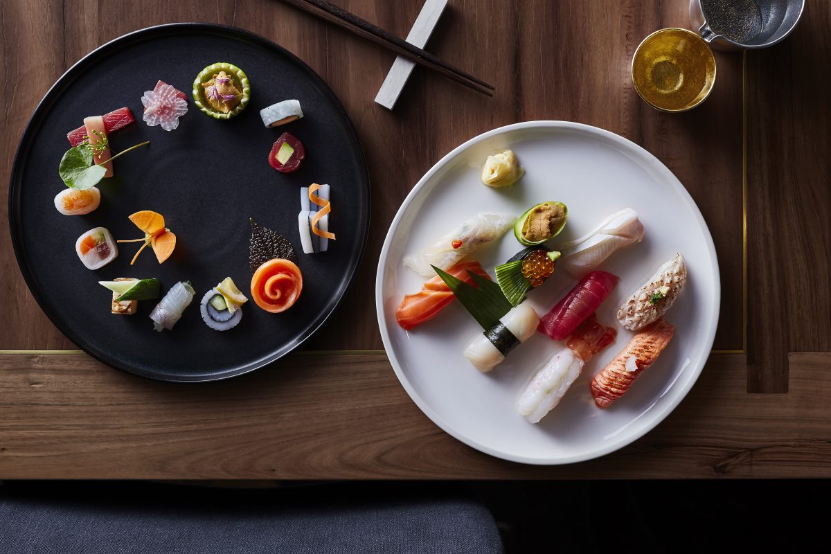
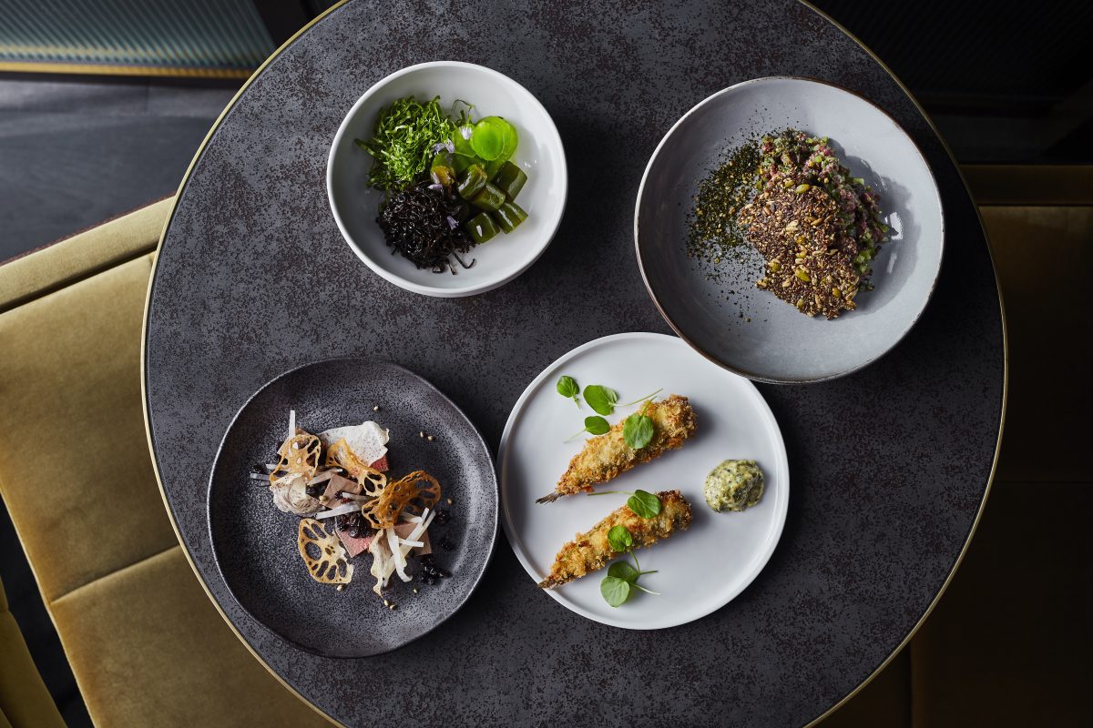
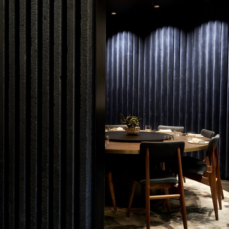
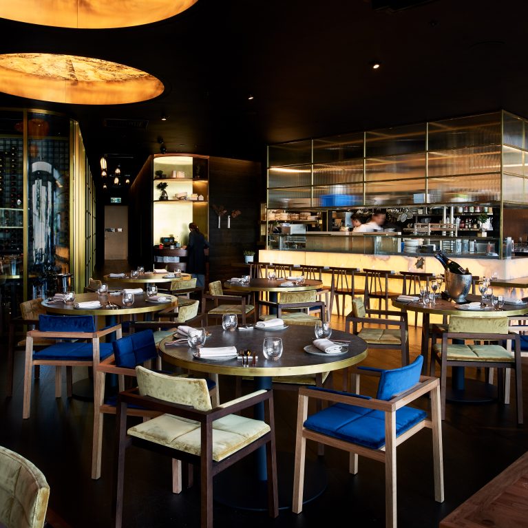
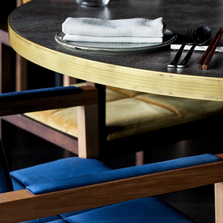
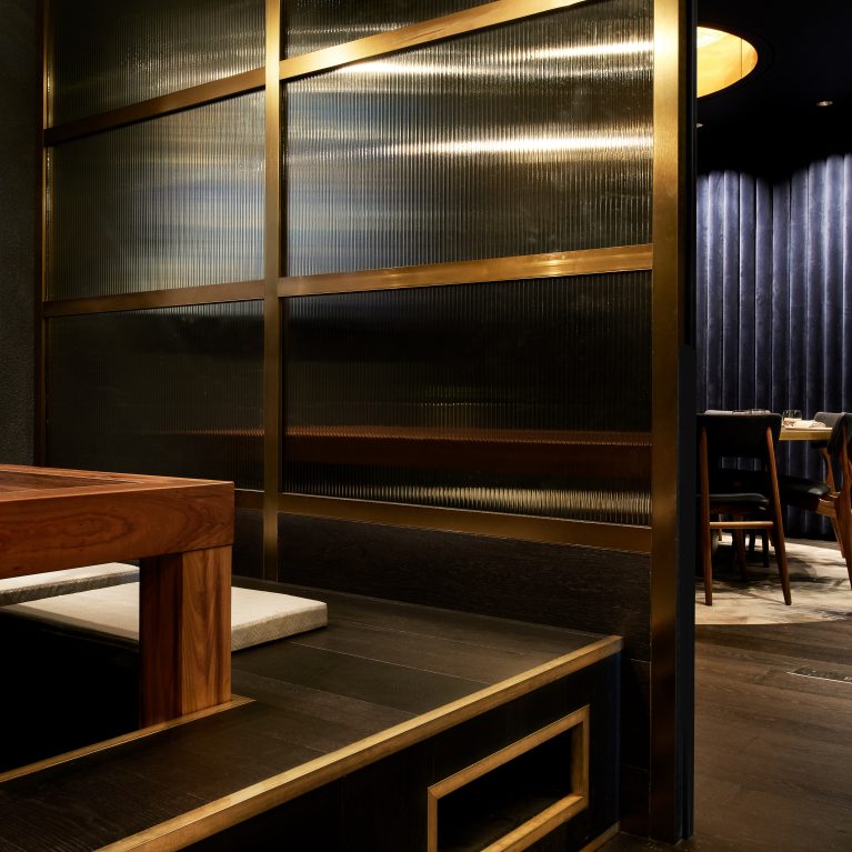
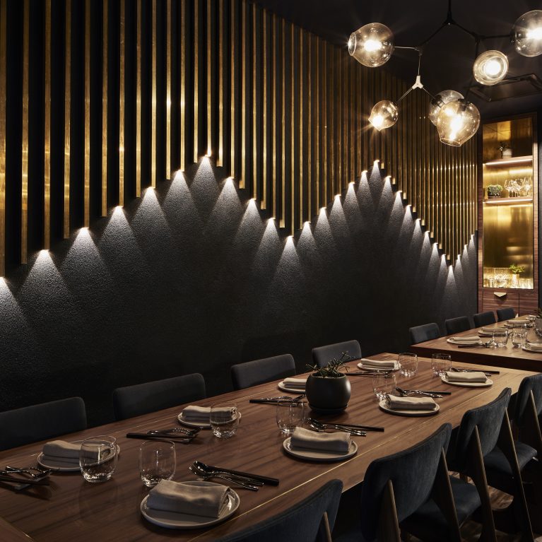
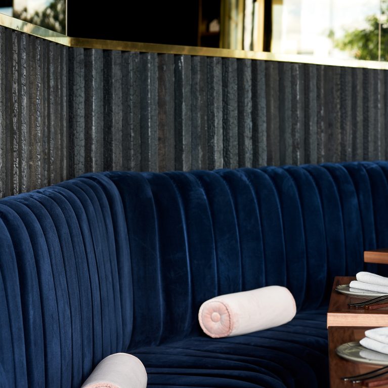
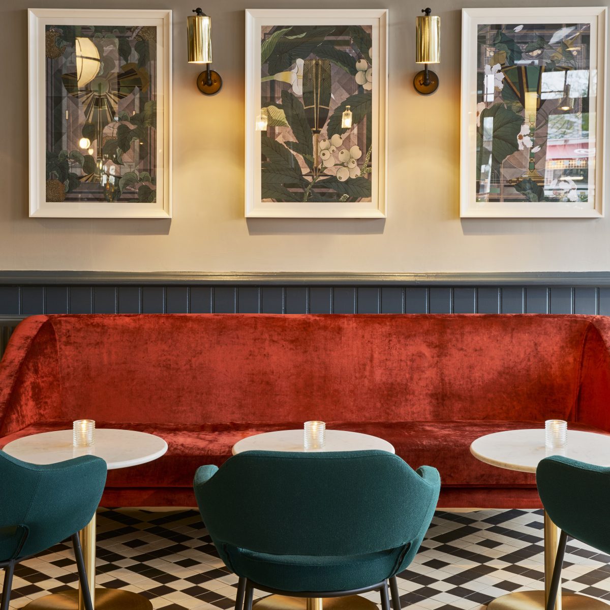
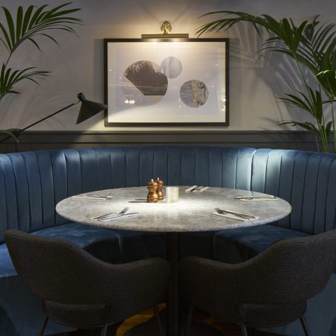
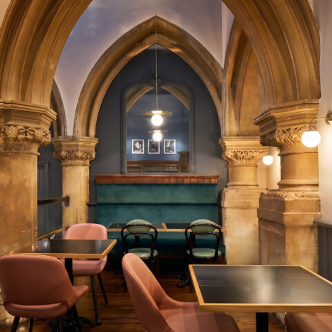
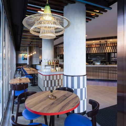
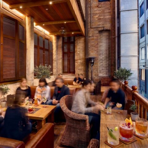
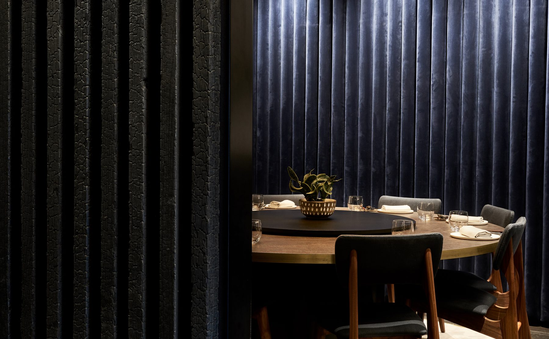
The physical interiors mirror this graphic restraint, balancing high-impact food theater with quiet pockets of luxury across a raw seafood bar, a robata grill, and three secluded private dining spaces. Authenticity is expressed using a rigorous selection of stone, water, timber, and fire. Guests dine on stone-composite tables bound in brushed brass, seated on plush royal blue and mustard velvet banquettes beneath a dark ceiling canvas punctuated by monumental, gold-leaf domes that cast a dramatic, warm ambient glow over the room.
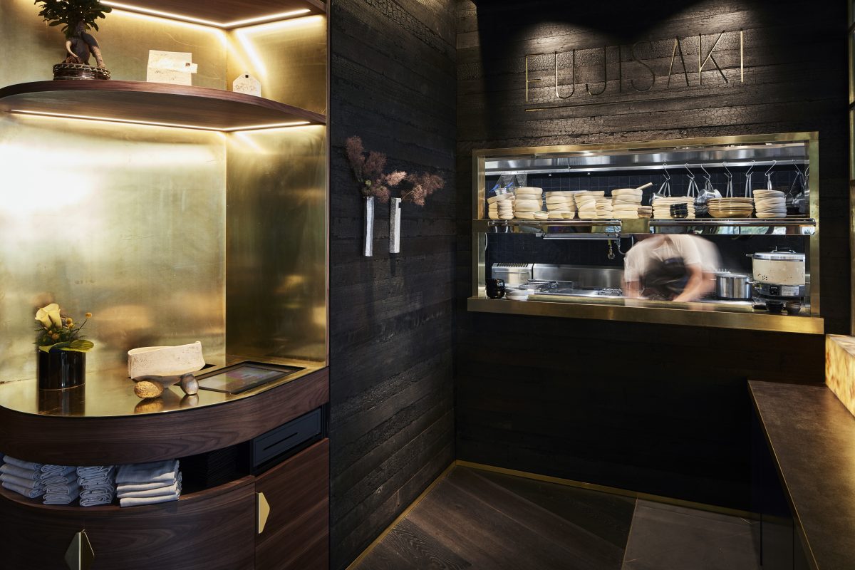
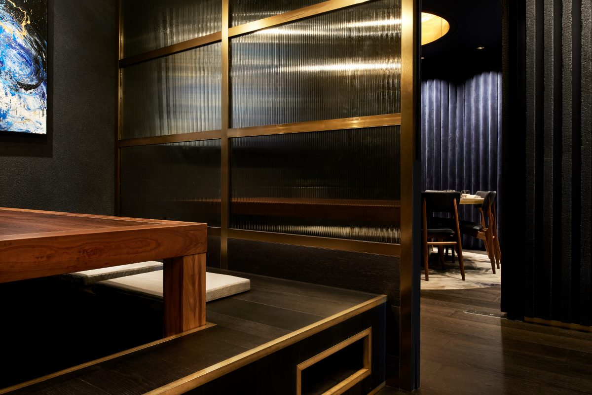
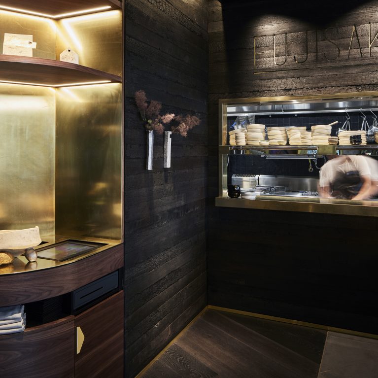
Every architectural touchpoint reinforces this feeling of escapism and cultural fusion. Deep charcoal plastered walls and charred Shou Sugi Ban timber paneling establish a rich texture, contrasted by three-dimensional vertical brass wave installations and brass-framed fluted glass screens that blur spatial boundaries. Further elevating this sensory landscape, Design Clarity introduced a bespoke collaboration with Japanese Australian ceramicist Keiko Matsui, whose refined, sculptural porcelain art pieces sit alongside living bonsai trees. This meticulous coordination ensures that the brand’s sophisticated narrative flows cohesively from the architecture of the entry portal straight down to the guest’s immediate dining interface.