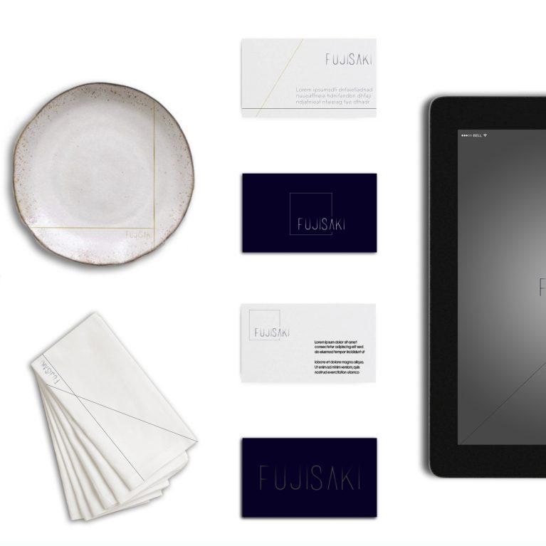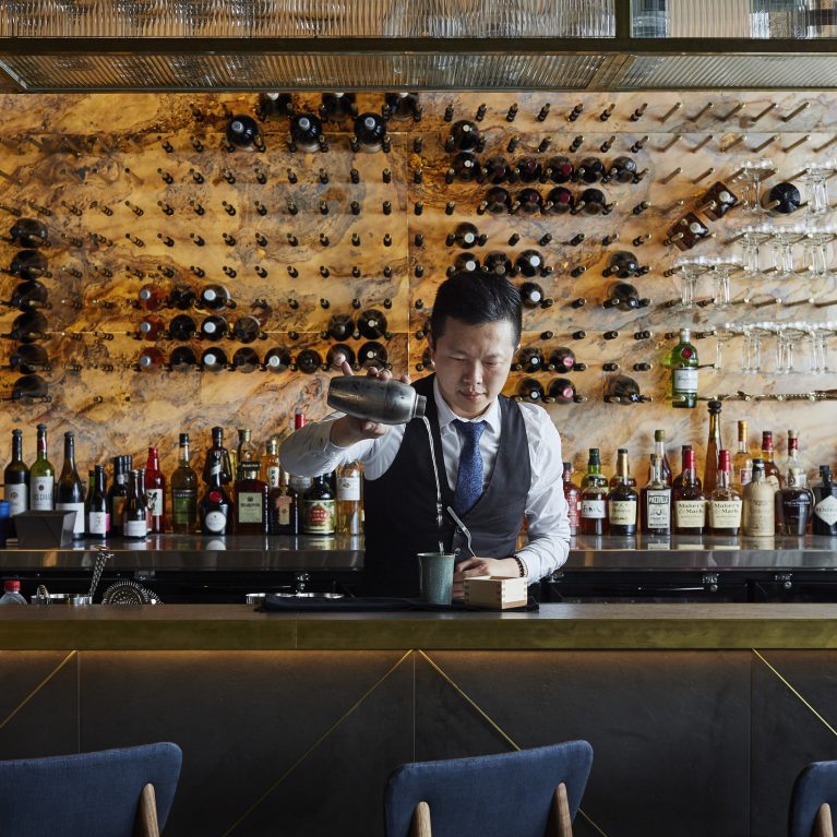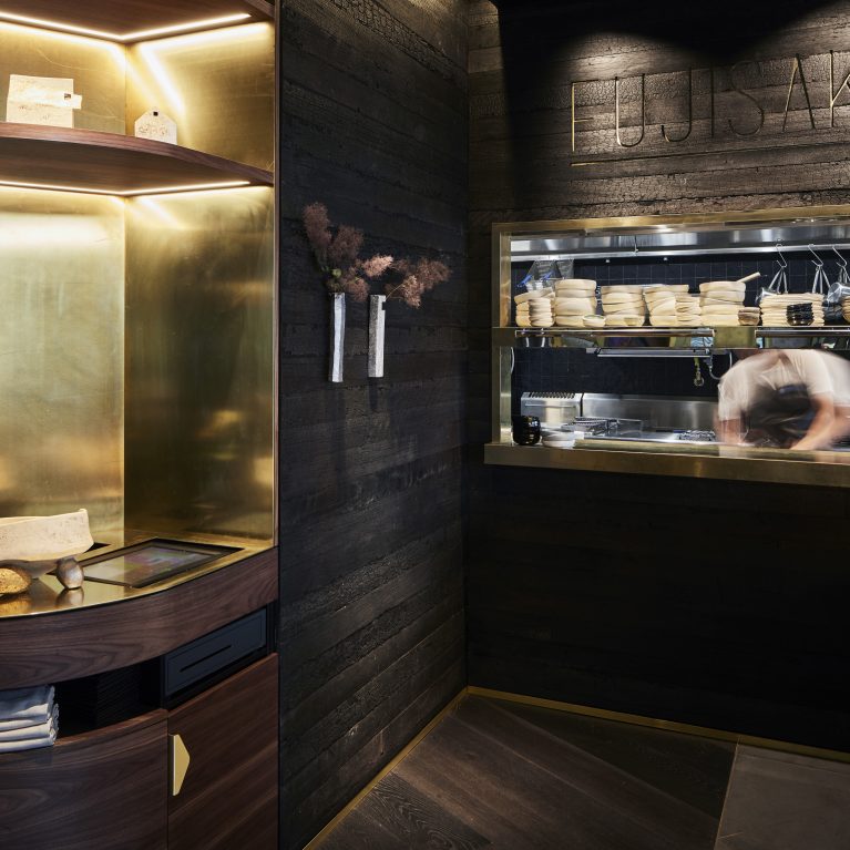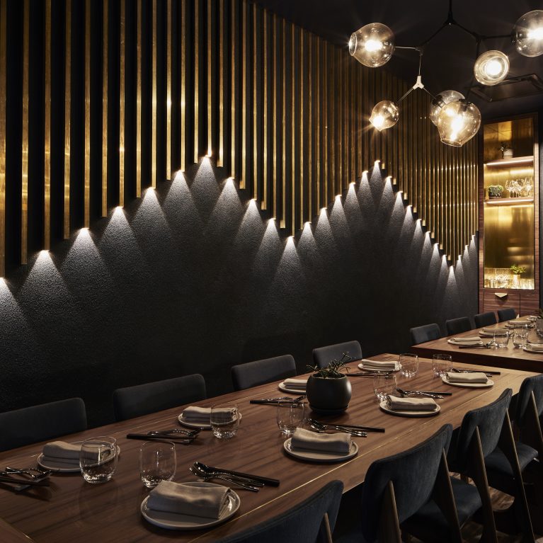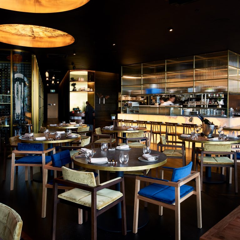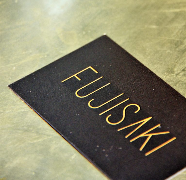
The tactile branding touchpoints extend the venue's sophisticated architectural narrative to a micro scale, utilizing premium material contrasts and precision debossing techniques to leave a lasting, high-end impression.
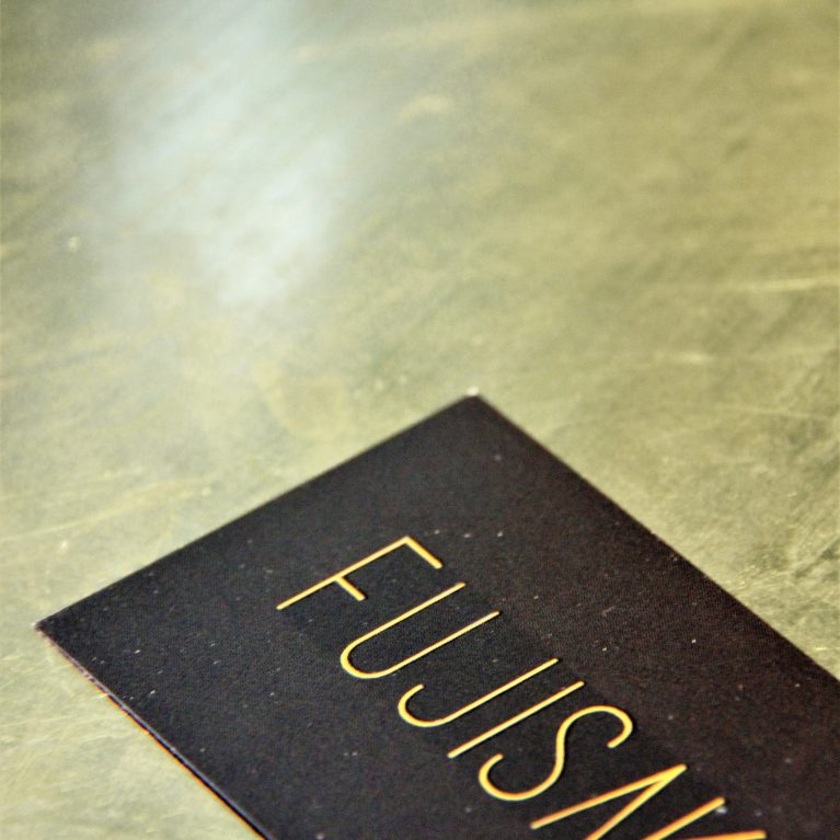
The close-up vignette highlights a premium business card crafted from heavy-weight, ultra-matte black cardstock. The custom minimalist typography is precisely debossed into the paper fibers, revealing a rich, metallic gold foil lining buried deep within the crisp letter cutouts. This luxurious contrast between the non-reflective black paper and the shimmering gold script mirrors the broader restaurant palette.
The card rests on a smooth, industrial concrete-look countertop that showcases subtle, swirling trowel textures and natural color variations under directional overhead spotlighting. This deliberate pairing of raw, rugged structural backgrounds with refined graphic luxury beautifully captures the underlying design philosophy that anchors the entire commercial hospitality venue.