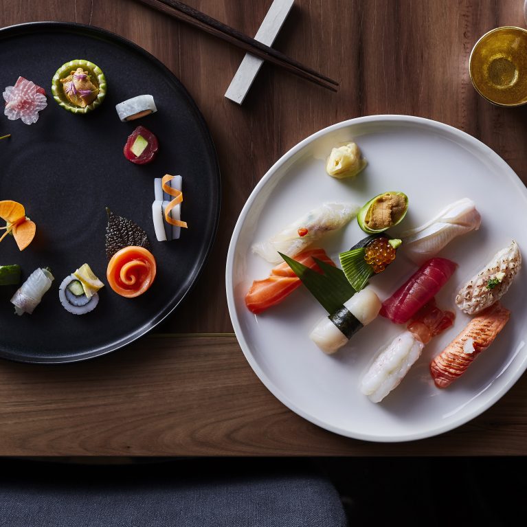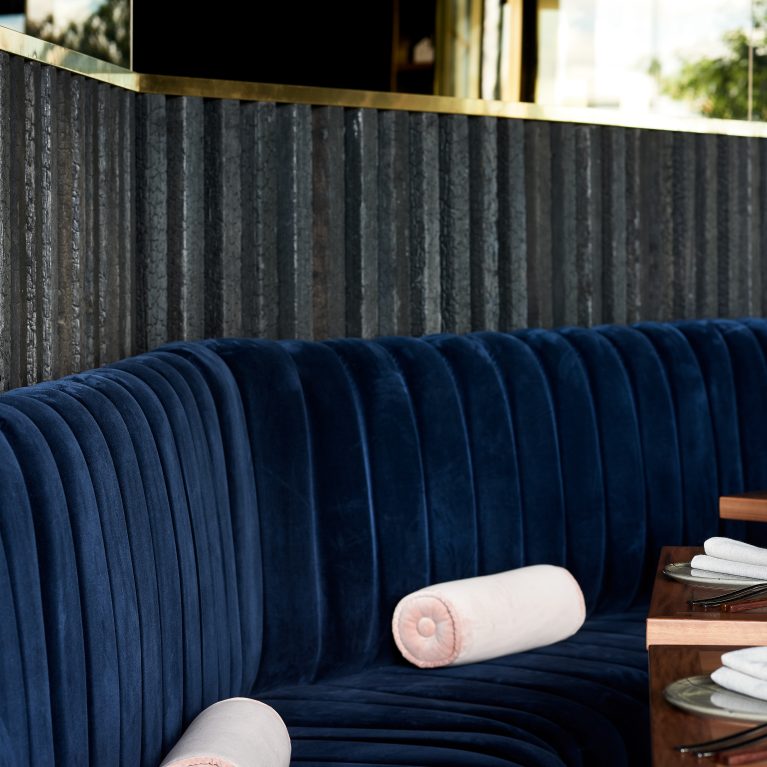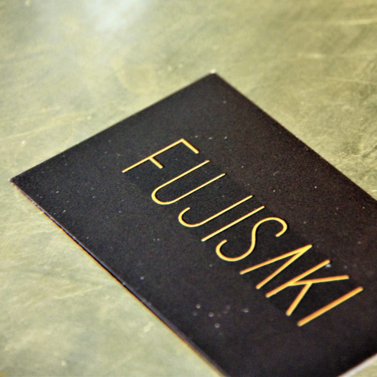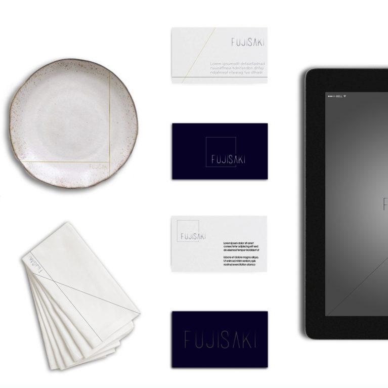
The graphic branding architecture applies clean, structural geometries to the visual identity system, communicating the fine-dining venue's sophisticated approach through an elegant, high-contrast typographic treatment.
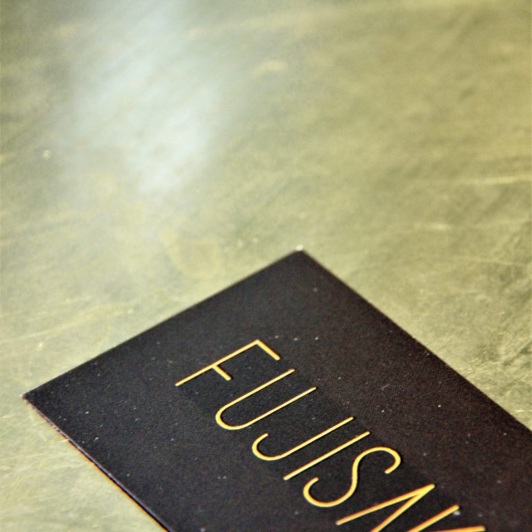
The branding suite features a custom-designed logo utilizing an ultra-slim, elongated sans-serif typeface that emphasizes linear precision and negative space. The geometric execution replaces the traditional crossbar of the letter "A" with a sharp, open apex, mimicking the minimalist lines often found in contemporary Japanese architectural framing. This subtle design detail transforms standard text into a distinct graphic icon.
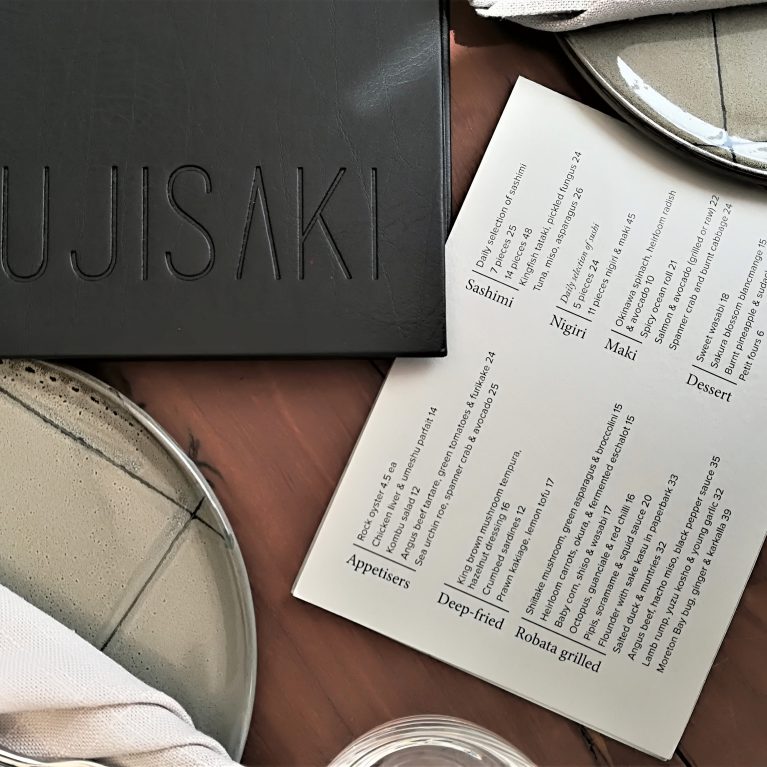
Rendered in a deep charcoal black against a solid, stark white backdrop, the high-contrast logo layout is engineered for maximum versatility across multiple brand touchpoints. A slender, deep-tinted line underlines the primary branding block, grounding the typographic composition and establishing a crisp, modern visual anchor that translates effortlessly from large-scale exterior signage to tactile leather menu covers.