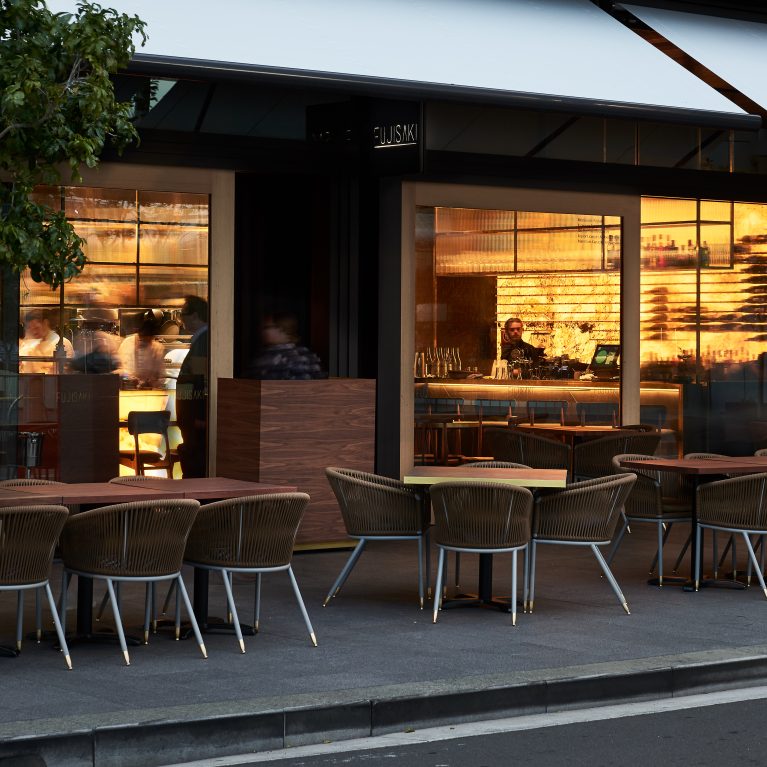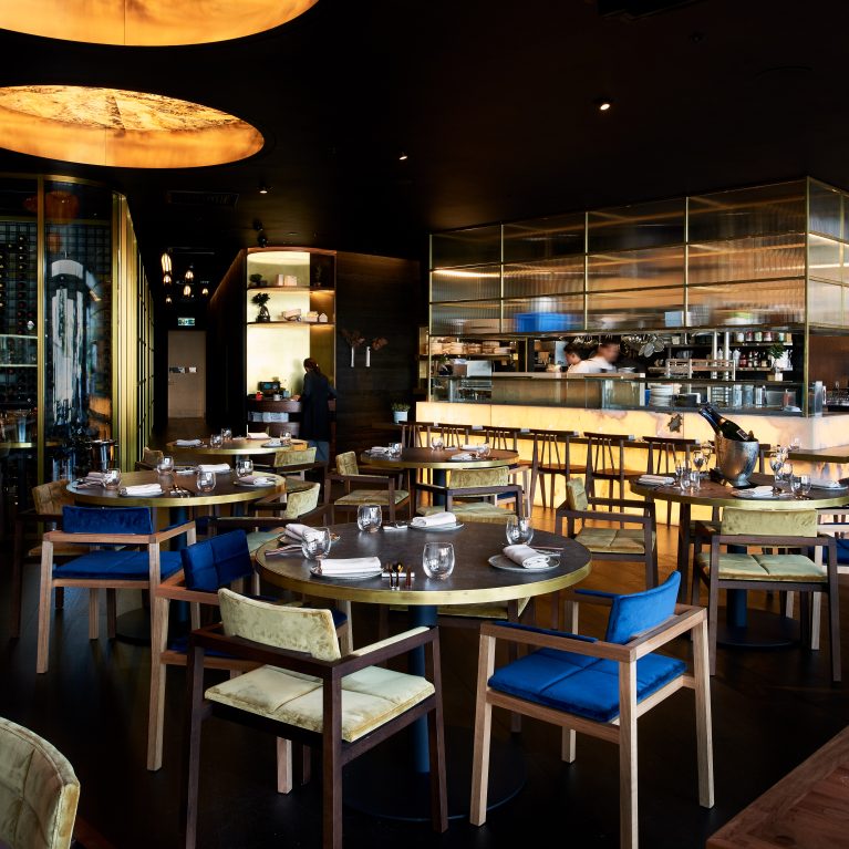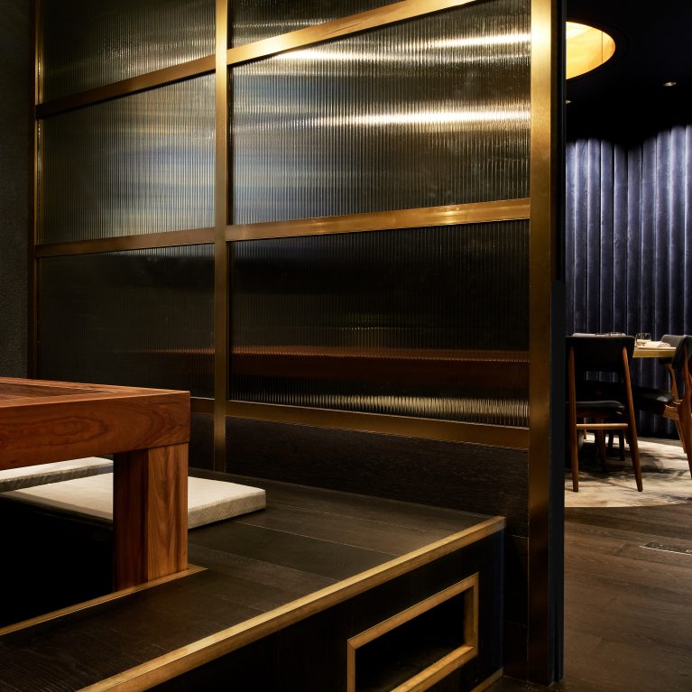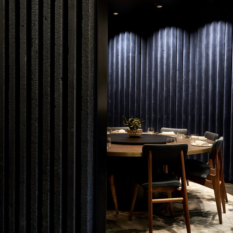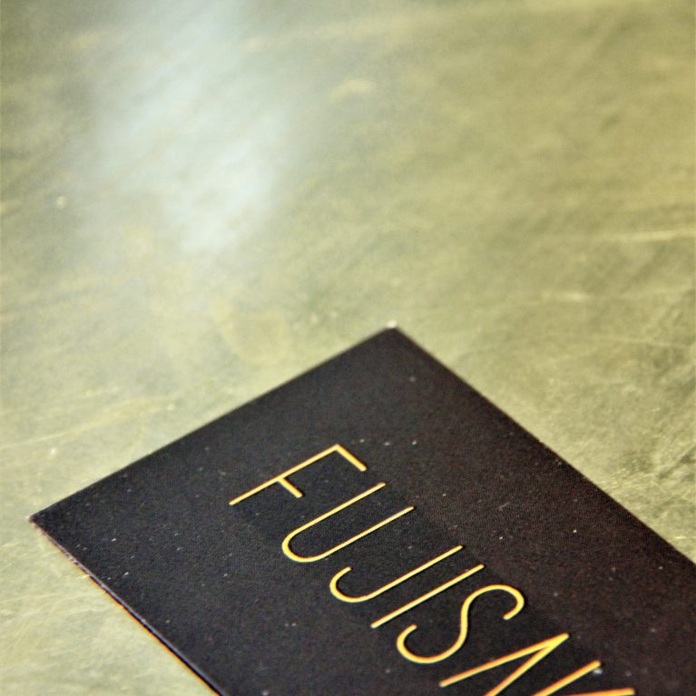
The print and stationary touchpoints synthesize the venue's tactile spatial values into a hands-on customer greeting ritual, combining heavy grain cowhide finishes with thick cream paper stocks to frame the specialized culinary program
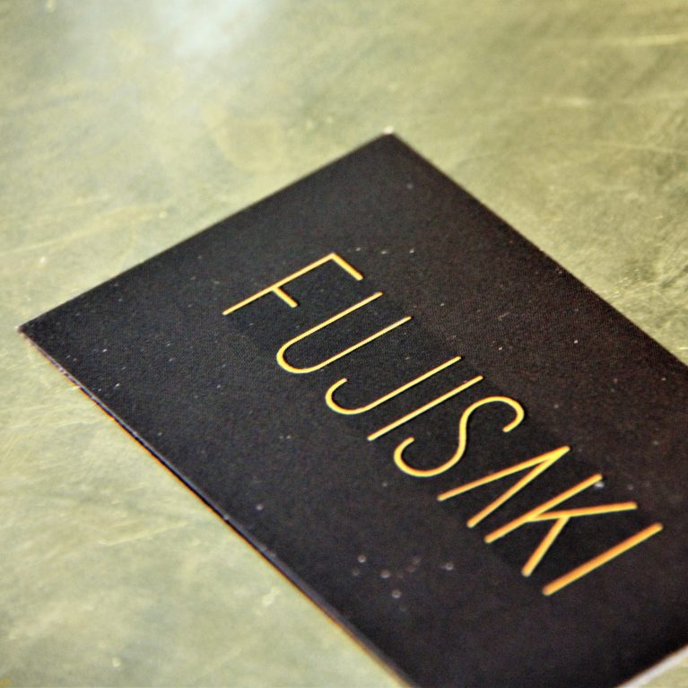
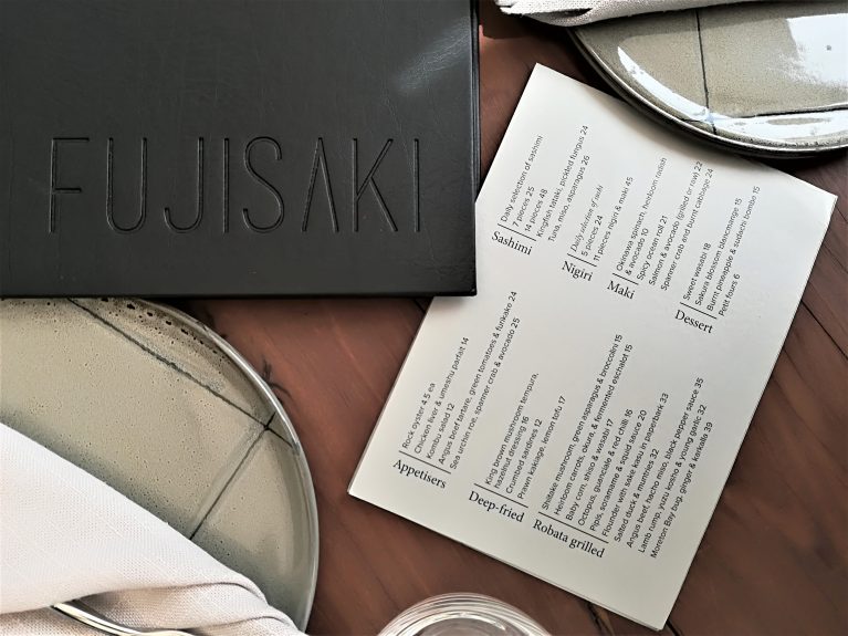
The top-down perspective highlights a premium leather menu folder finished in a deep, matte charcoal tone. The minimalist brand name is debossed cleanly into the center of the leather cover, omitting all ink or foil fills to allow the physical indentation and cast shadows to outline the linear letters naturally. Placed next to the binder is a crisp, off-white cardstock menu sheet detailing the multi-course meal selections in a clean, sans-serif typography layout.
The stationery pieces are arranged across a solid wood dining surface flanked by handcrafted ceramic dinner plates. These large plates feature a light, volcanic ash glaze with fine black intersecting lines, paired with tightly folded cream linen napkins that match the organic textures of the table arrangement. This deliberate material coordination reinforces the cohesive luxury branding that flows throughout the venue.