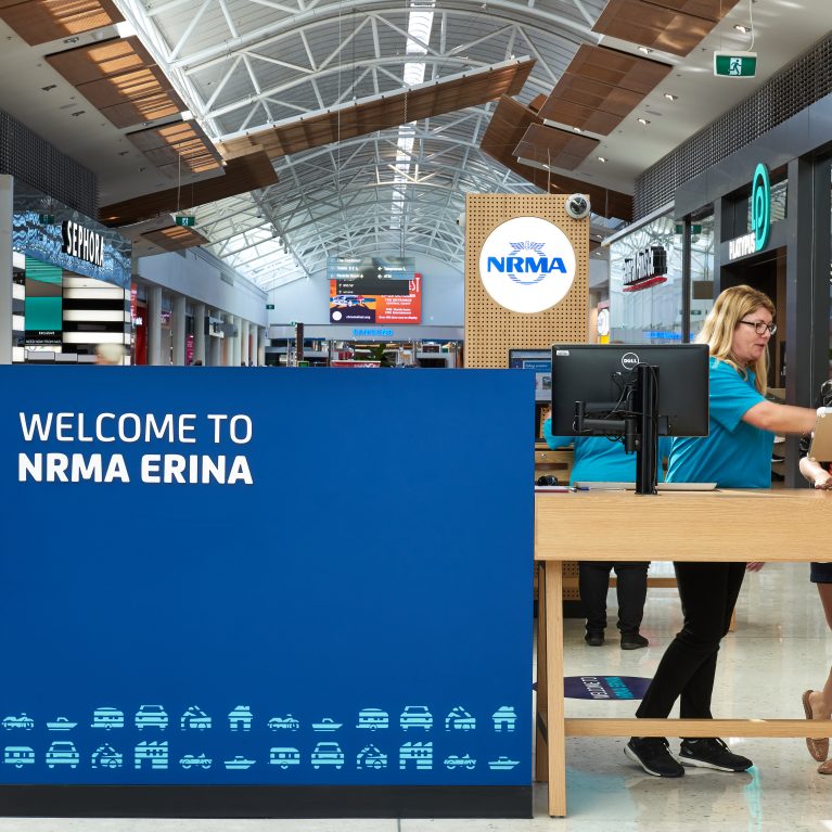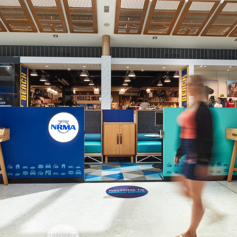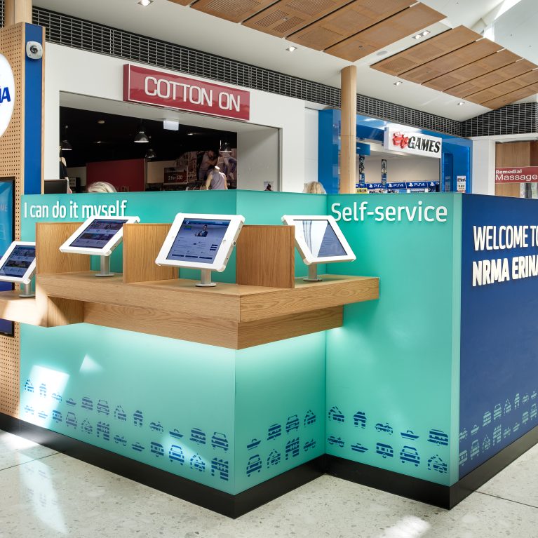
A precise placement of touchpoints makes digital banking processes more intuitive for users of varying technical abilities. By isolating the self-service hardware within an organized perimeter zone, the layout encourages direct interaction without creating spatial confusion or pedestrian congestion.
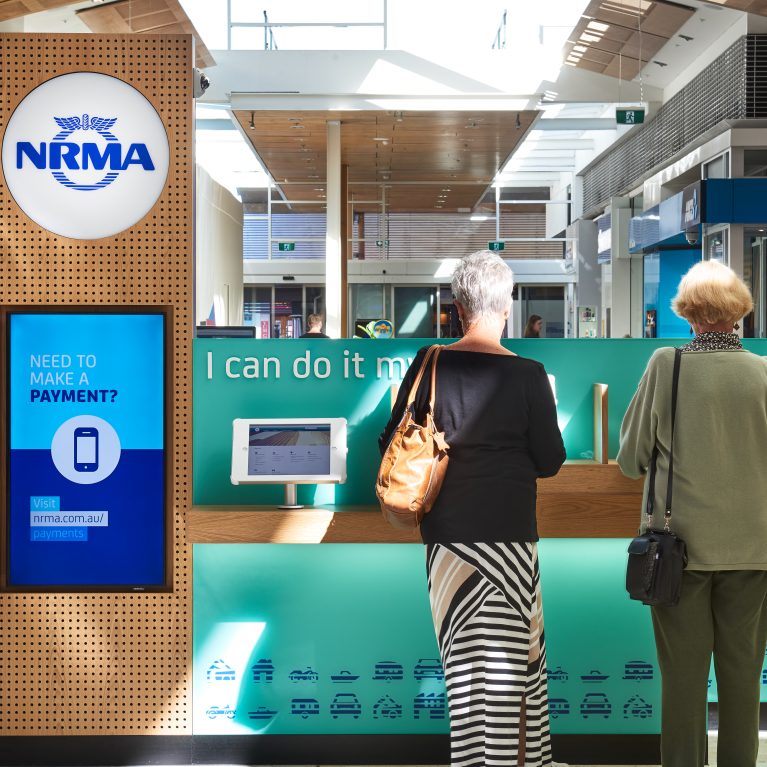
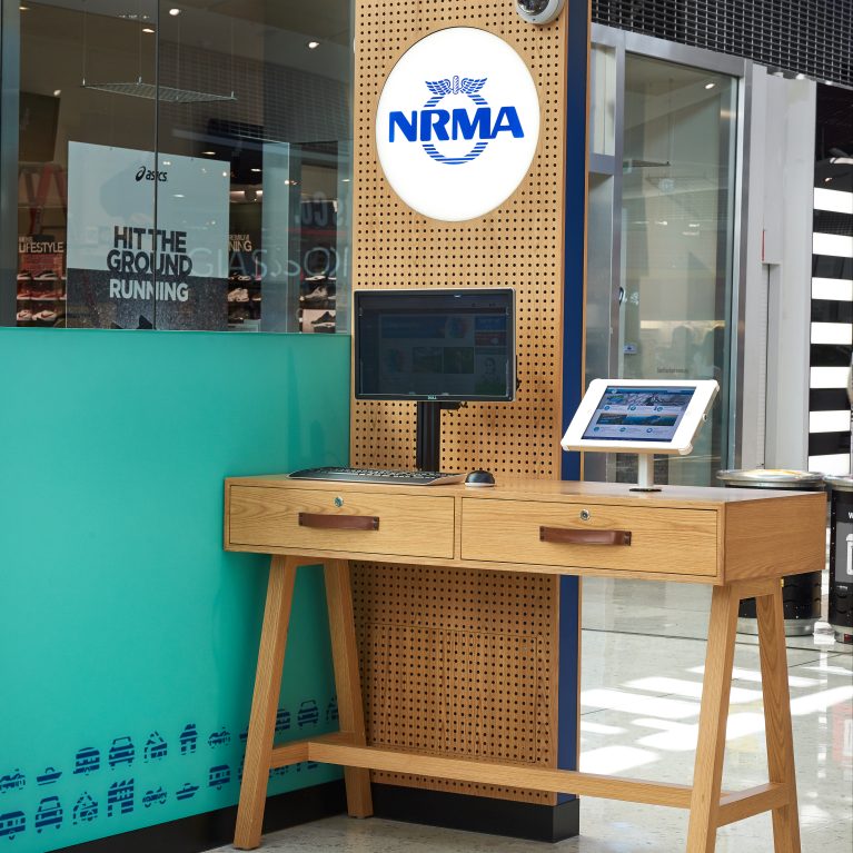
White-framed digital screens mount securely onto low timber shelf ledges, which feature protective wooden dividers to shield confidential transactions from the main corridor view. Directly behind the screens, dimensional white lettering sticks out from a matte teal backdrop, offering clear and immediate wayfinding information from a distance.
The contrast between the warm wood paneling, crisp white hardware, and bold color blocking helps break down the intimidating feel of banking technology. This design strategy supports a frictionless customer experience, ensuring that independent tasks can be completed quickly and without confusion.