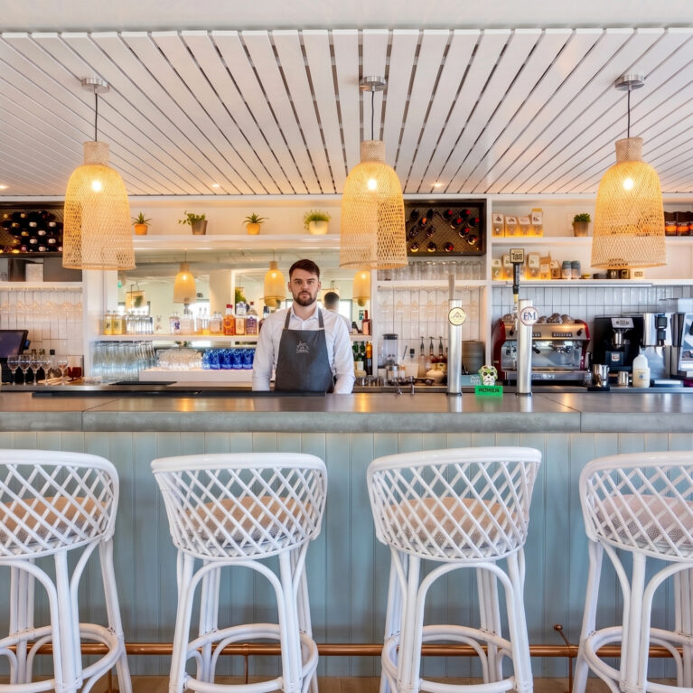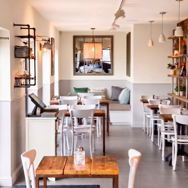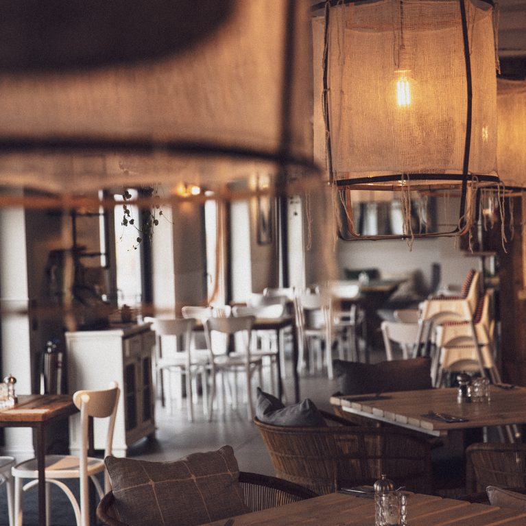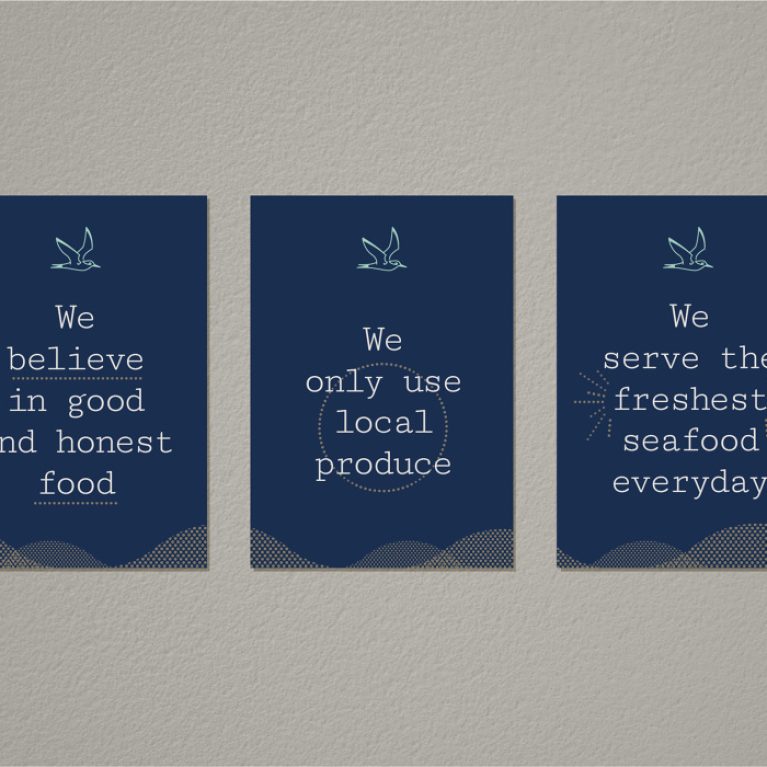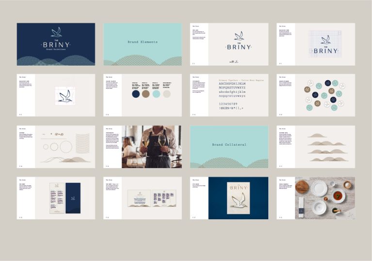
The brand guidelines establish a structured visual framework that coordinates all physical and digital touchpoints for the venue. This system defines the precise application of color palettes, typographic layouts, and linear icon variants, ensuring the relaxed, coastal-referenced aesthetic remains cohesive across uniforms, menus, and environmental graphics.
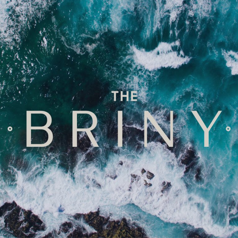
The identity matrix is organized into a modular grid system layout across sixteen distinct style tiles. The corporate color swatches specify a marine-inspired palette, grouping deep navy blues and soft seafoam teals alongside sand-toned neutrals to ground the visual language in the restaurant’s beachfront context. Typography standards outline the hierarchical pairing of a clean, spaced sans-serif logotype with a functional typewriter-style slab serif font for body text.
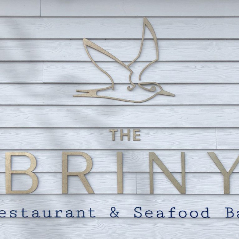
The guidelines also dictate the precise geometry of the secondary brand assets. This includes specifications for the line-drawn flying seagull icon, an array of circular typographic stamp badges, and fluid wave topography patterns designed for print backgrounds. Real-world application tiles integrate photography of staff uniforms and flat-lay table settings, demonstrating how the graphic identity directly informs the material selection of the physical interior architecture to create a unified brand experience.