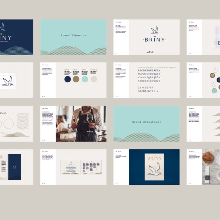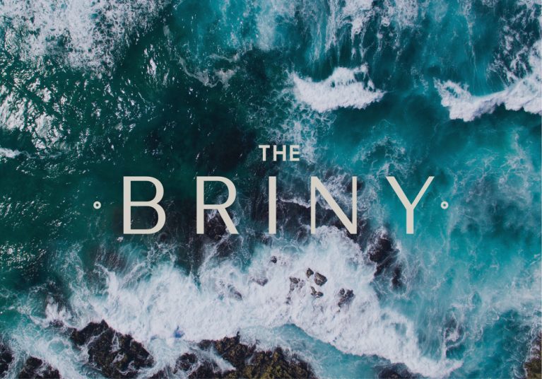
The visual identity introduces the venue's coastal narrative using high-contrast typography overlaid on natural maritime textures. This graphic element establishes the tone for the physical environment, using deep oceanic hues to ground the clean, minimalist branding that defines the restaurant’s public face.
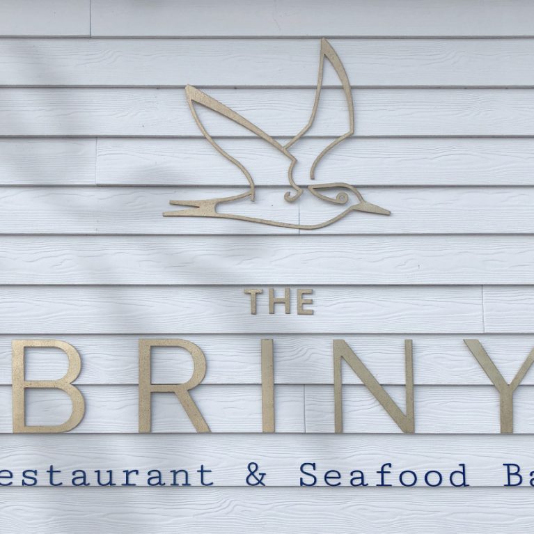
The brand mark employs a tracked, geometric sans-serif typeface in a crisp off-white tone, ensuring maximum legibility against a complex background. Symmetrical dot accents flank the main logotype, framing the title and adding a refined, naval-inspired detailing to the layout.
The backdrop consists of an aerial photograph capturing a high-energy surf line where deep teal water breaks into white foam over dark coastal rocks. This organic texture brings natural motion and a rich color palette into the branding collateral, directly referencing the venue’s immediate beachfront context. By pairing a structured, modern layout with raw, unedited nature photography, the graphic language mirrors the broader interior concept: a thoughtful balance of clean commercial functionality and rugged, unpolished seaside textures.