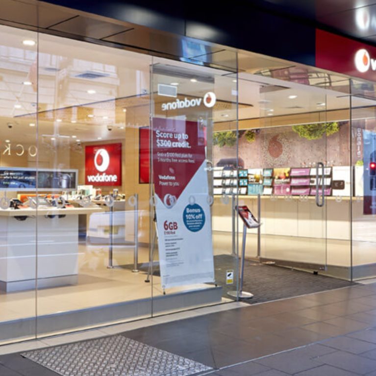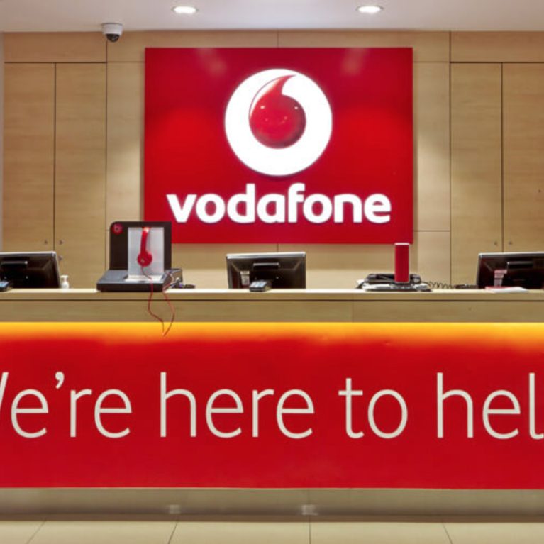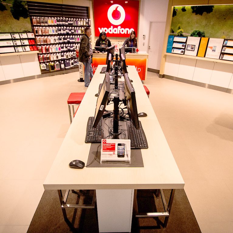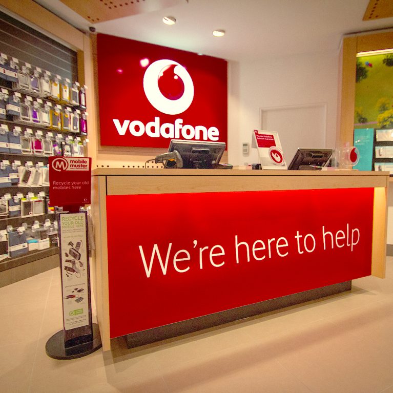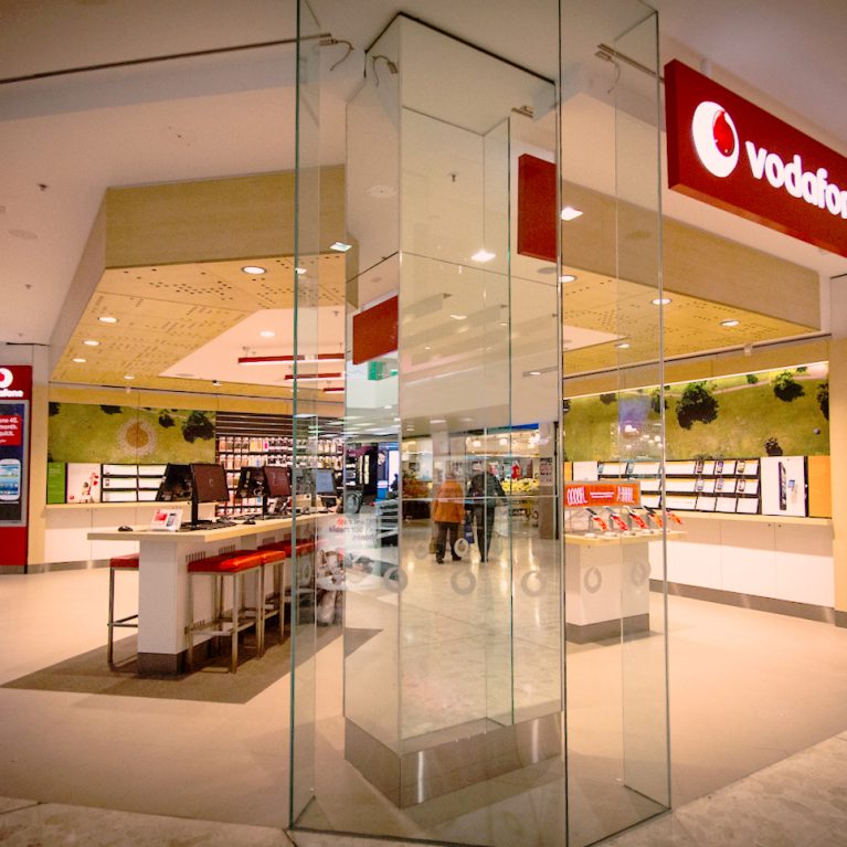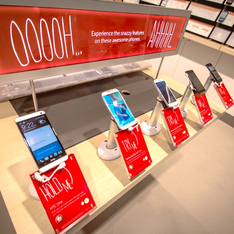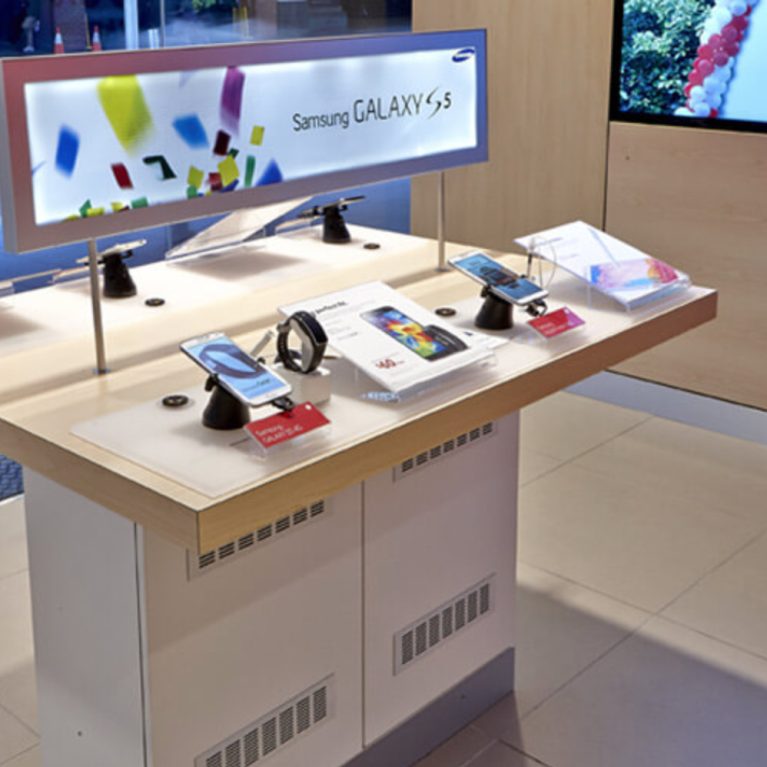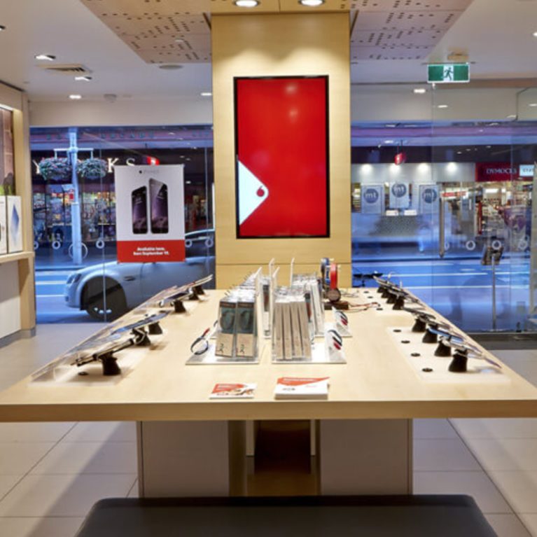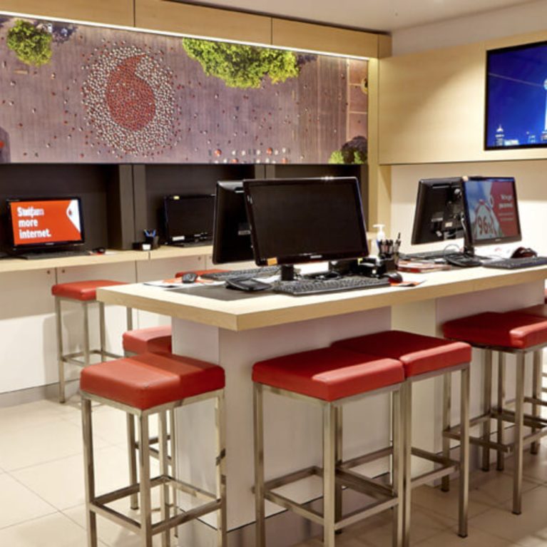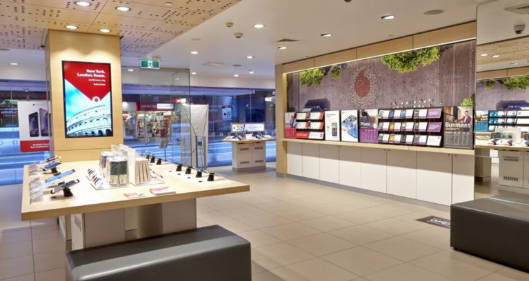
The store’s design centers around a clean, open layout that enhances customer flow and interaction. A long, light beige counter in the foreground, displaying mobile phones and accessories, anchors the space, while a light wood-toned ceiling adds warmth and acoustic comfort. Strategic lighting and varied displays create a balanced, welcoming environment for customers to explore products and services.
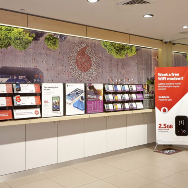
In the foreground, the long counter stretches across the width of the store, showcasing a variety of mobile phones and accessories on display. Further into the space, additional displays present phone models, service plans, and promotional materials, providing easy access to information. Behind the counter, horizontal wall-mounted displays hold brochures and brand visuals in a vibrant color palette, drawing attention without overwhelming the minimalist design.
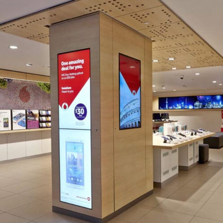
The floor, finished in light beige and gray squared tiles, complements the bright, open feel of the space. Light beige walls maintain an airy ambiance, while the ceiling’s light wood-toned acoustic panels soften sound and add visual warmth. A modern gray bench in the foreground corner offers a comfortable seating option for visitors.
Large integrated screens display images of popular cities and brand promotions, adding dynamic elements to the store. This well-lit, organized design emphasizes ease of navigation and product engagement, creating a seamless and modern retail experience.

