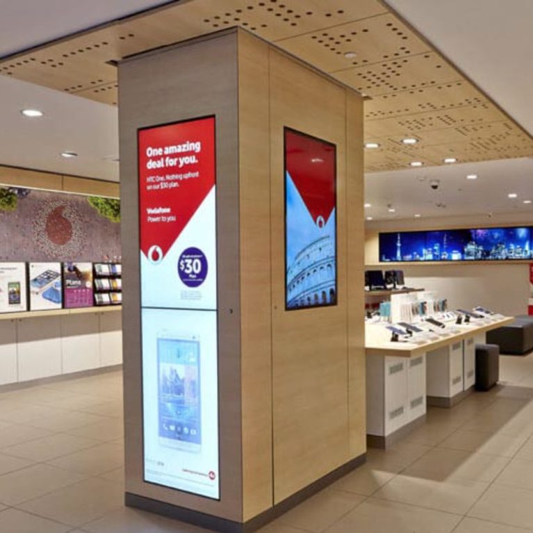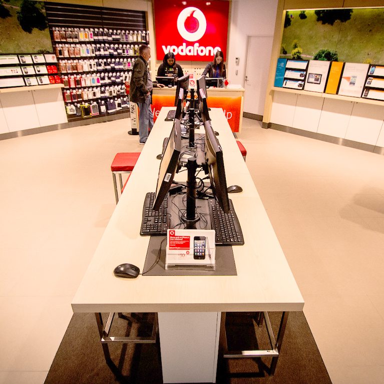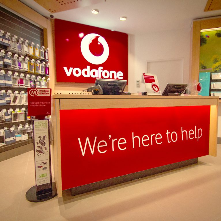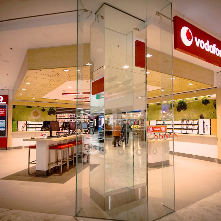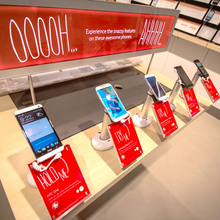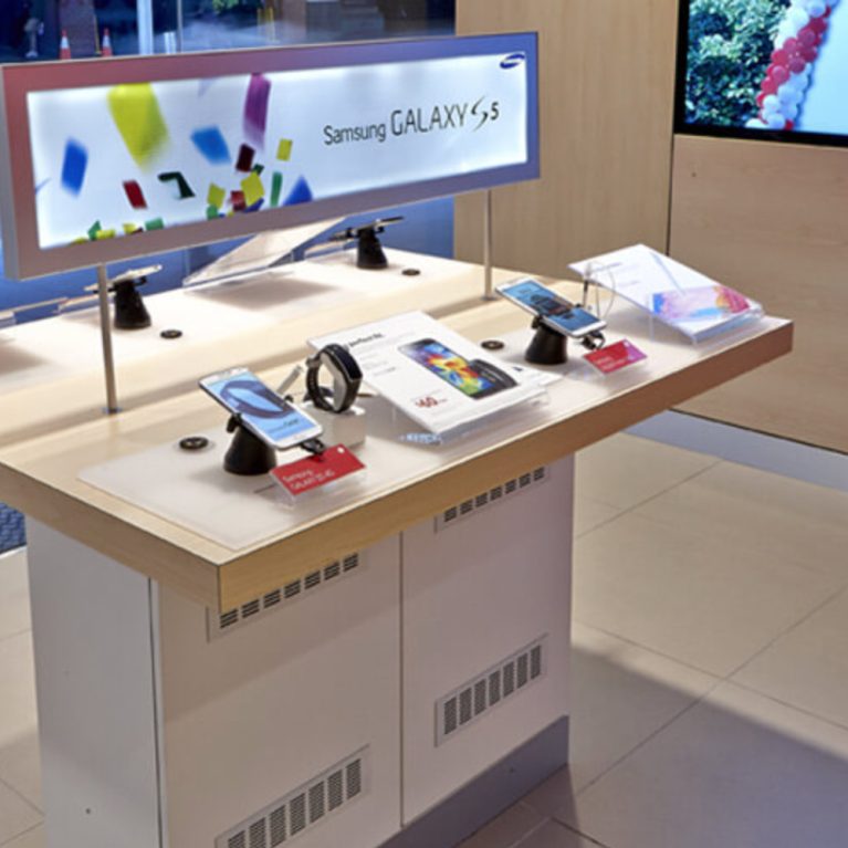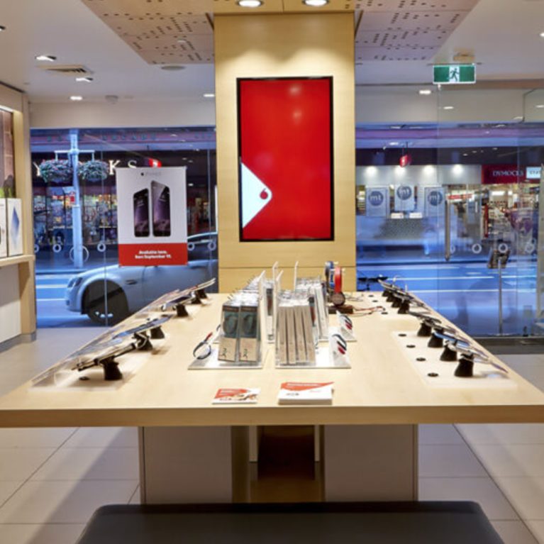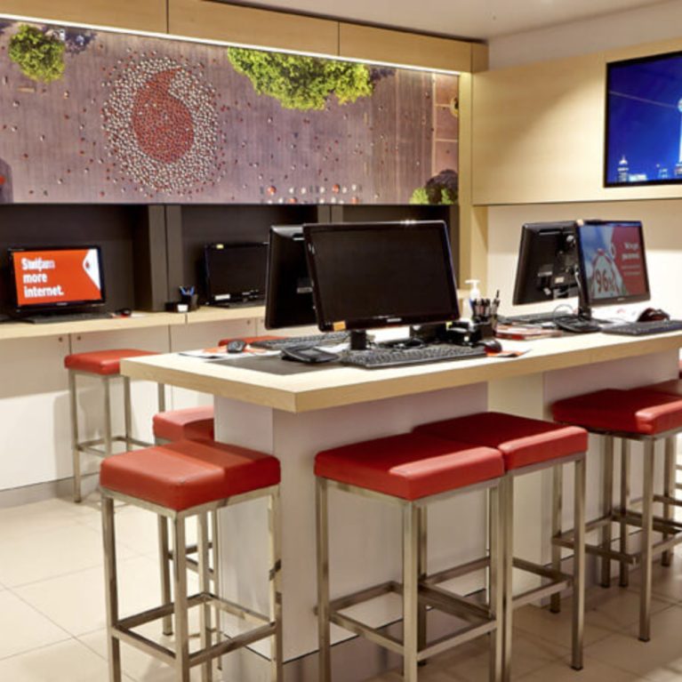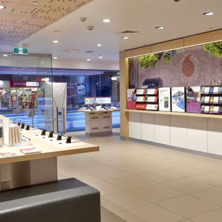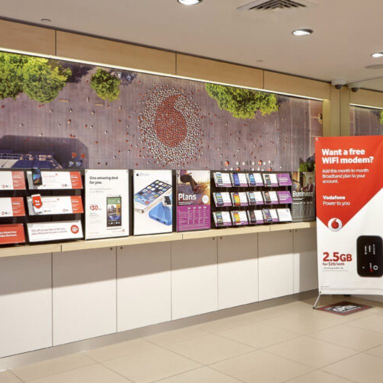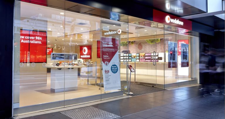
The shopfront of the Vodafone retail store creates an inviting, accessible space with expansive glass doors and windows that highlight the store's modern interior design. The layout and prominent red and white branding attract attention, while interactive displays and stand-up posters offer a glimpse into the store's offerings.
The large glass storefront reveals the store's light and airy interior, featuring a predominantly white and light beige color scheme that enhances visibility and accessibility. Red and white Vodafone branding, including logos and signage, stands out against the neutral background, providing a strong visual anchor. Inside, displays of mobile phones and electronic devices are arranged in an organized layout, with interactive screens showing promotional content and product information.
Stand-up promotional posters with graphics and text add further engagement points for customers, visible from the exterior. The dark gray or tinted light brown tiled surface outside complements the store's clean, contemporary look. Blurred figures of pedestrians moving along the sidewalk emphasize the store’s accessibility within a busy urban environment. The overall design of the shopfront is modern and welcoming, drawing passersby into a bright, customer-friendly space.

