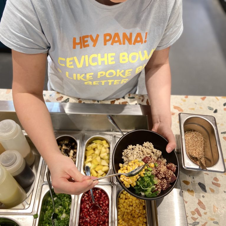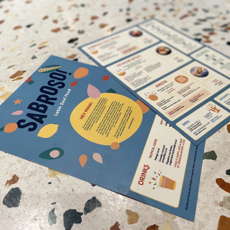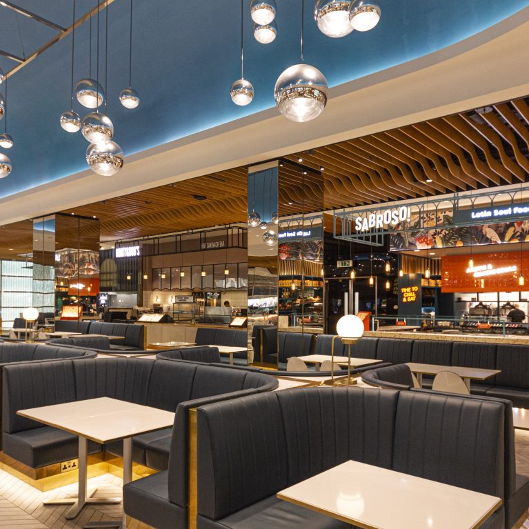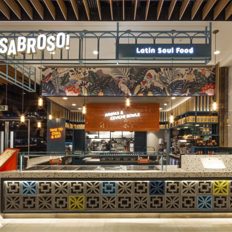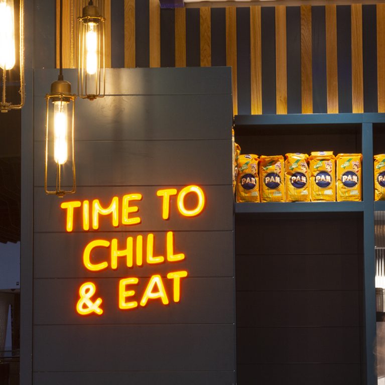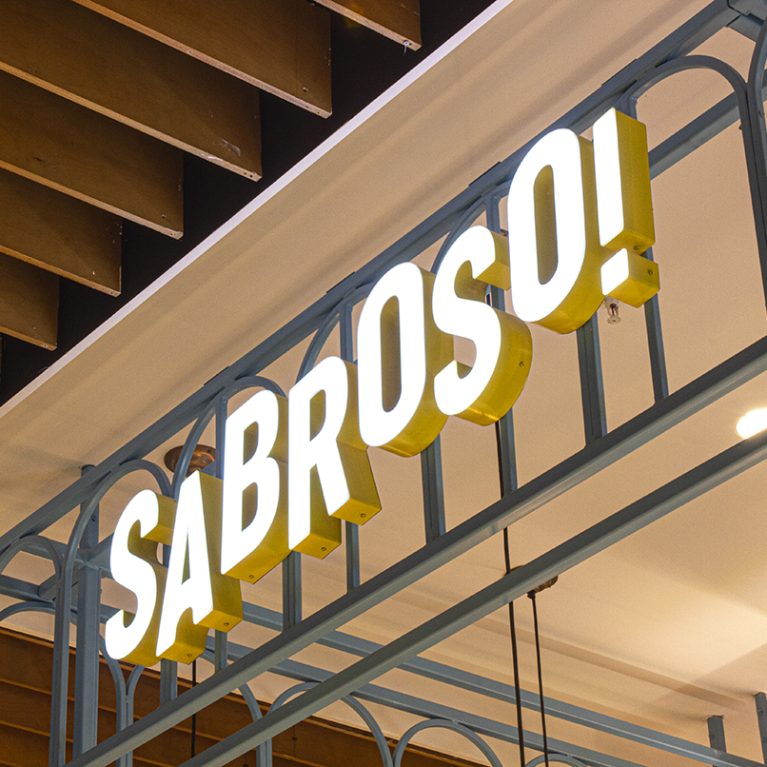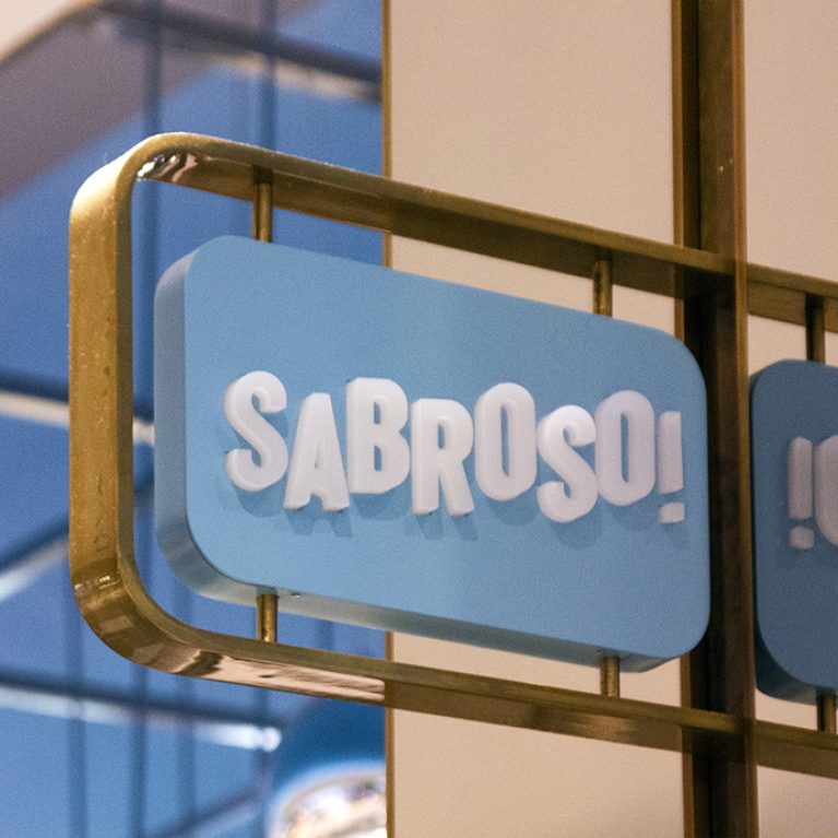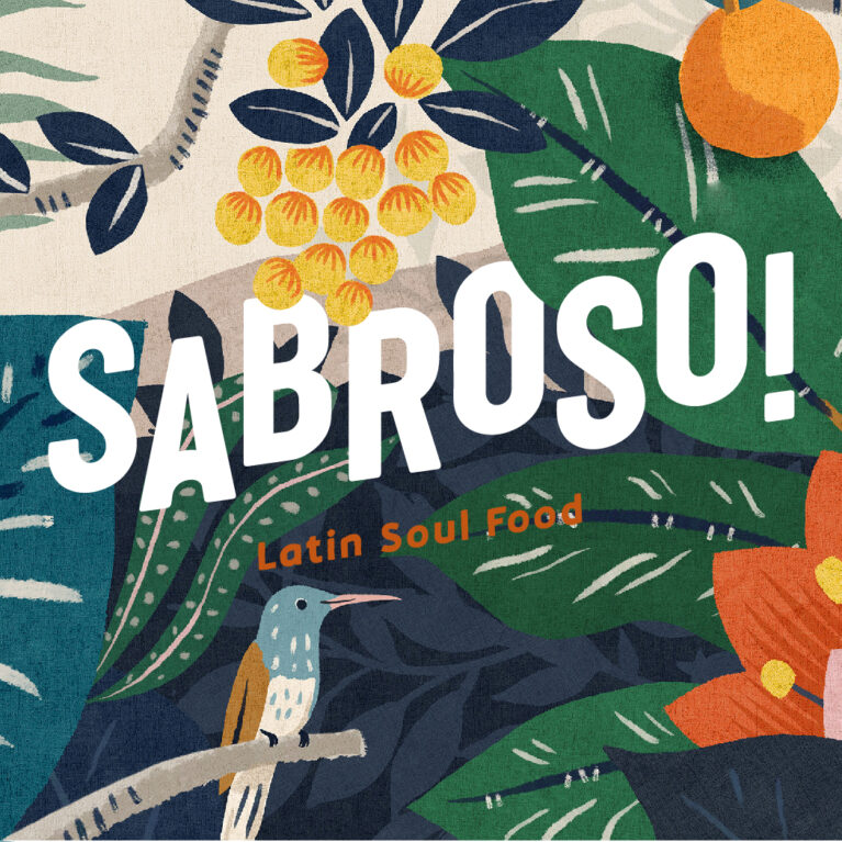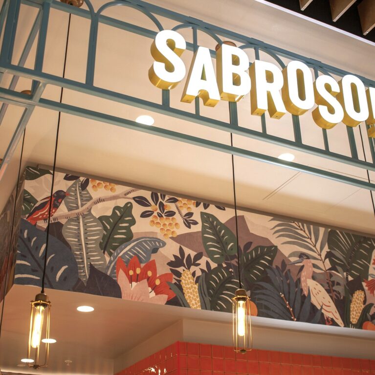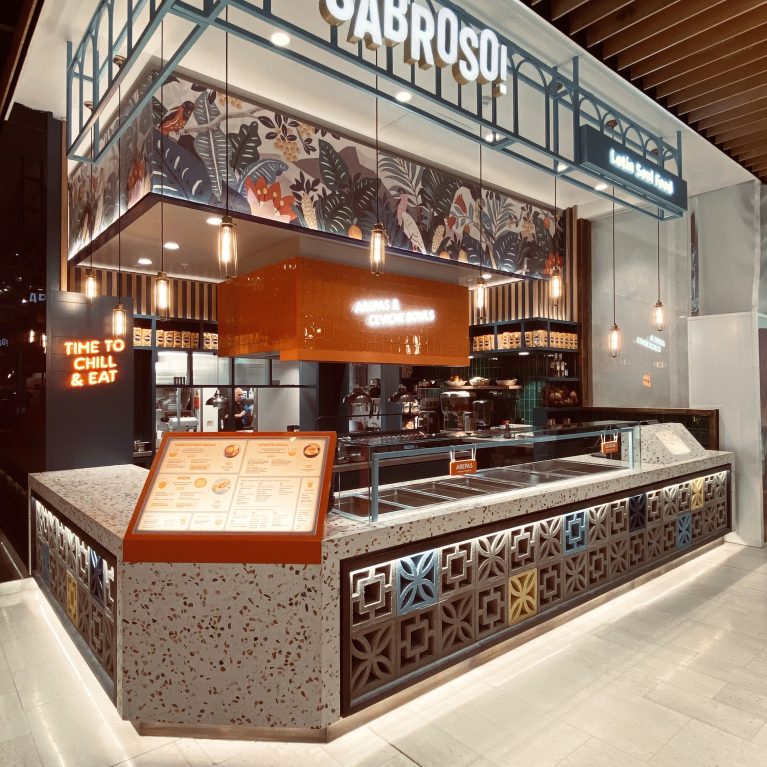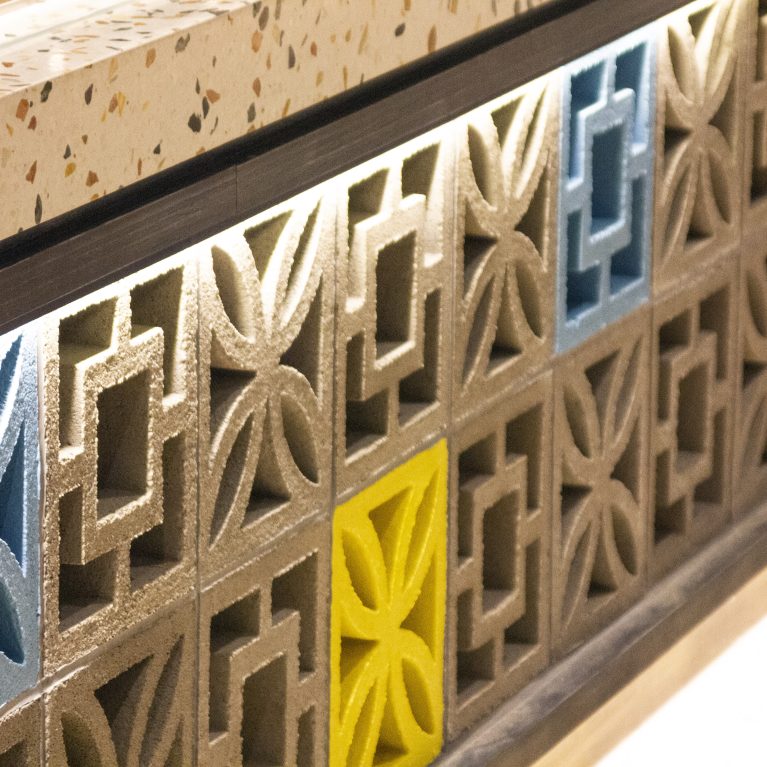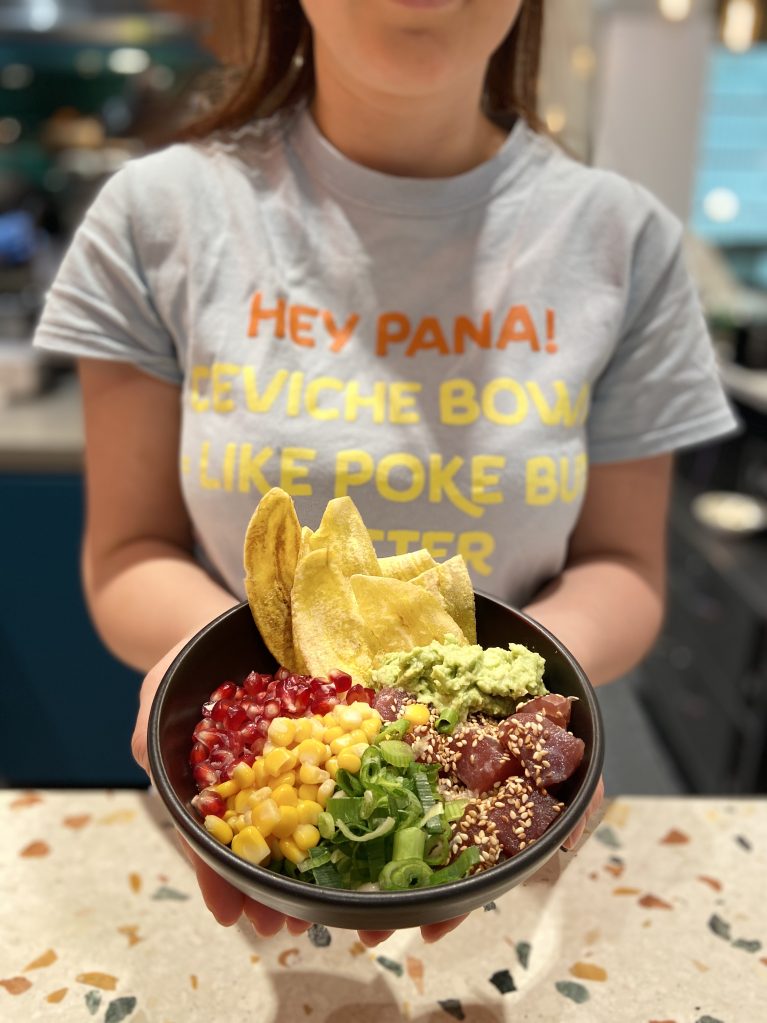
The design extends beyond architecture into the brand's graphic identity and customer interaction. Typography used in staff uniforms mirrors the interior's playful tone, while the terrazzo counter provides a neutral, high-quality backdrop that highlights the color and freshness of the Venezuelan ingredients.
Visual identity is reinforced through custom apparel featuring witty, bold typography that engages the customer directly. This "tone of voice" is a key design element, ensuring the brand's personality is felt throughout the service process. The apparel uses a color palette derived from the interior—soft blues and vibrant yellows—to maintain a cohesive visual experience across all touchpoints.In the foreground, the food is presented in matte black bowls that contrast with the vibrant colors of the ingredients.
The polished terrazzo countertop serves as a functional and aesthetic surface for this interaction; its multi-colored stone chips echo the variety of the menu. This shot captures how the material choices and graphic design work together to frame the product, creating a consistent brand story from the physical environment to the final point of sale.