Sabroso!

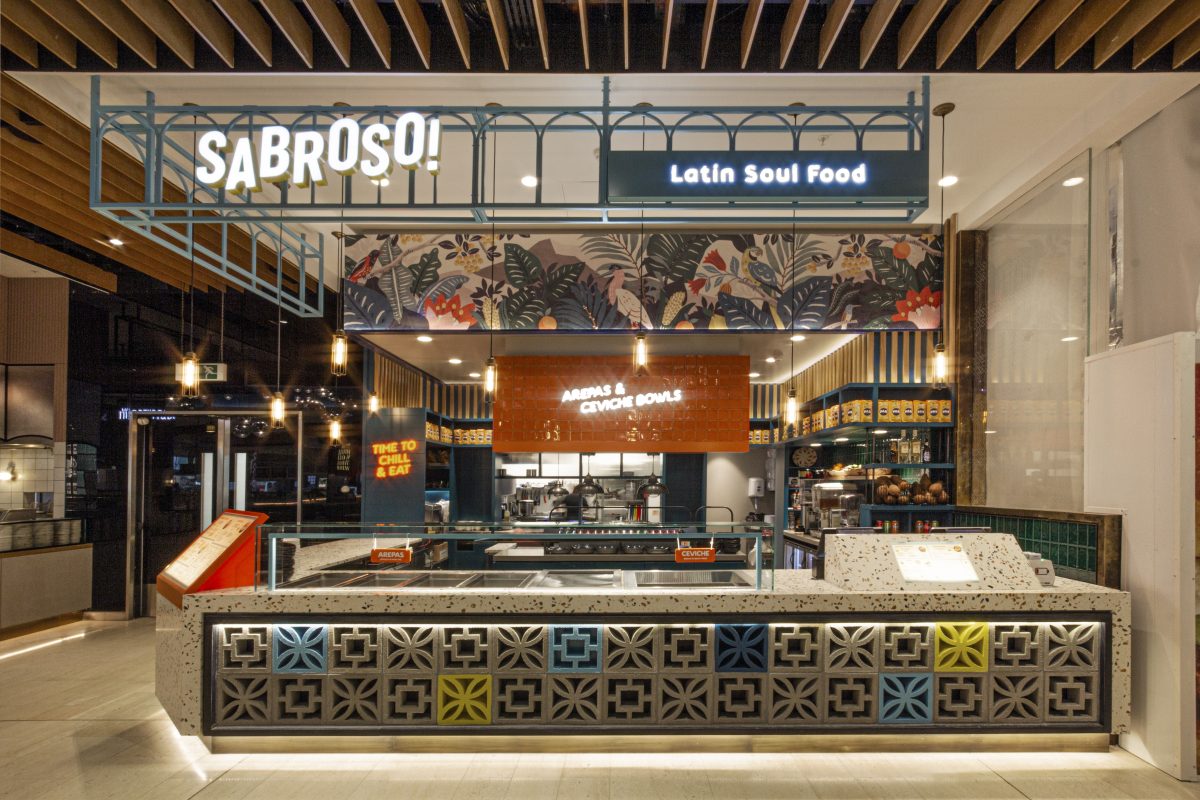
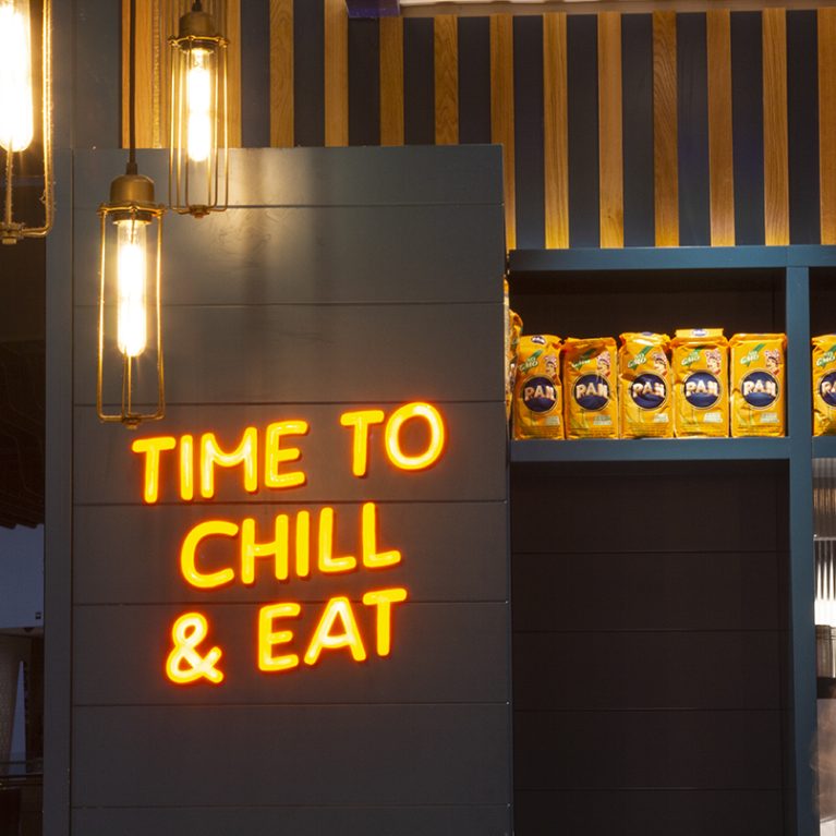
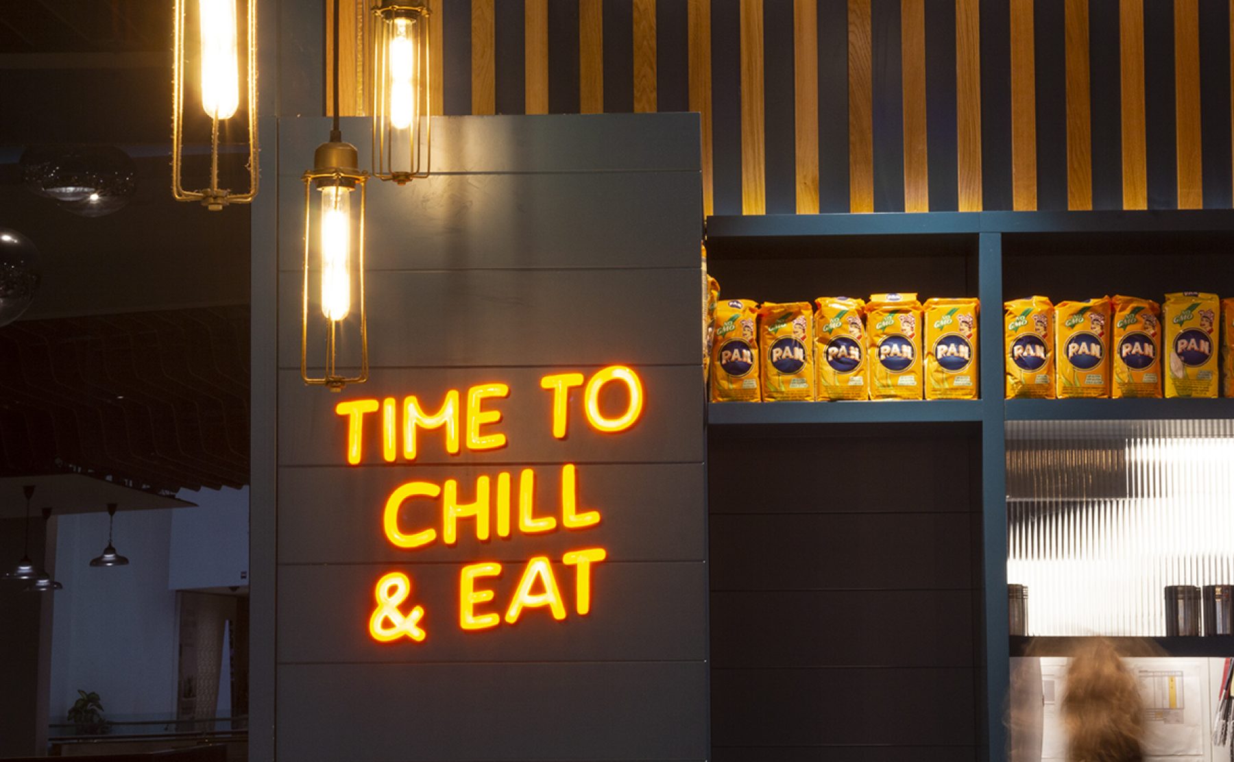
Neon brand messaging paired with industrial pendants and retail display.

Sabroso! is serving up authentic Venezuelan street food to tempt UK tastebuds.

Foodie duo, Joes-Luis and Gabriel Gonzalez, from Lima London Group have launched a new fast casual brand serving Venezuelan arepas and fresh ceviche bowls. Retail design and branding by Design Clarity.

Sabroso! is serving up authentic Venezuelan street food to tempt UK tastebuds. A new fast casual grab’n’go concept with a witty, laid back personality to the brand.

The brothers are keen to regain the Michelin star earnt at Lima – their Peruvian fine-dining restaurant in London. See an interview by Big Hospitality magazine.
The brand essence is all about happy, healthy, good quality products and open, friendly service. Westfield London is the first site for Sabroso! where diners can create their own flavours, trying the tasty and addictive arepas – a childhood staple from the streets of Caracas. Exotic yet familiar, delicious and easy. This is happy, colourful comfort food with a definite feel-good factor.

Originally named Caracas the named changed late in the build process to Sabroso! – Spanish for ‘tasty’.
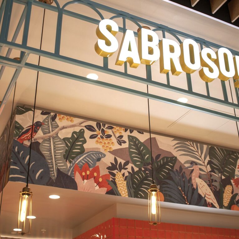
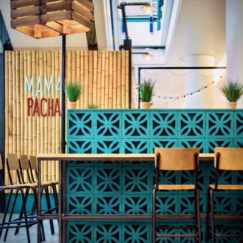
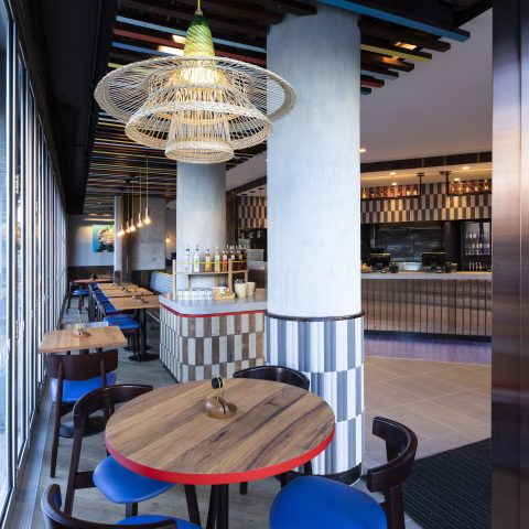
Bright coloured terrazzo counters fit the new brand personality. Bold glazed tiling, coloured breezeblocks, timber detailing, Amazonian wallpaper graphics and quirky messaging come together to make this a standout first site for Sabroso!

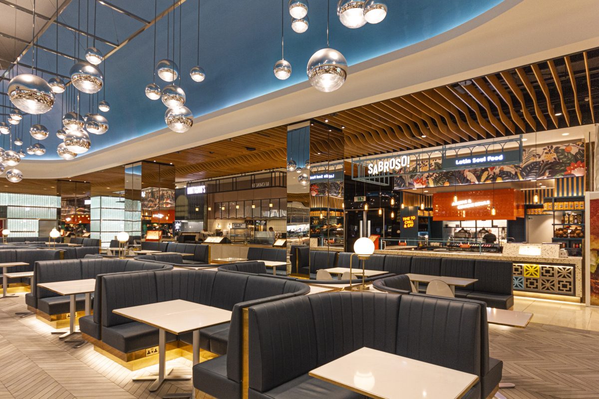
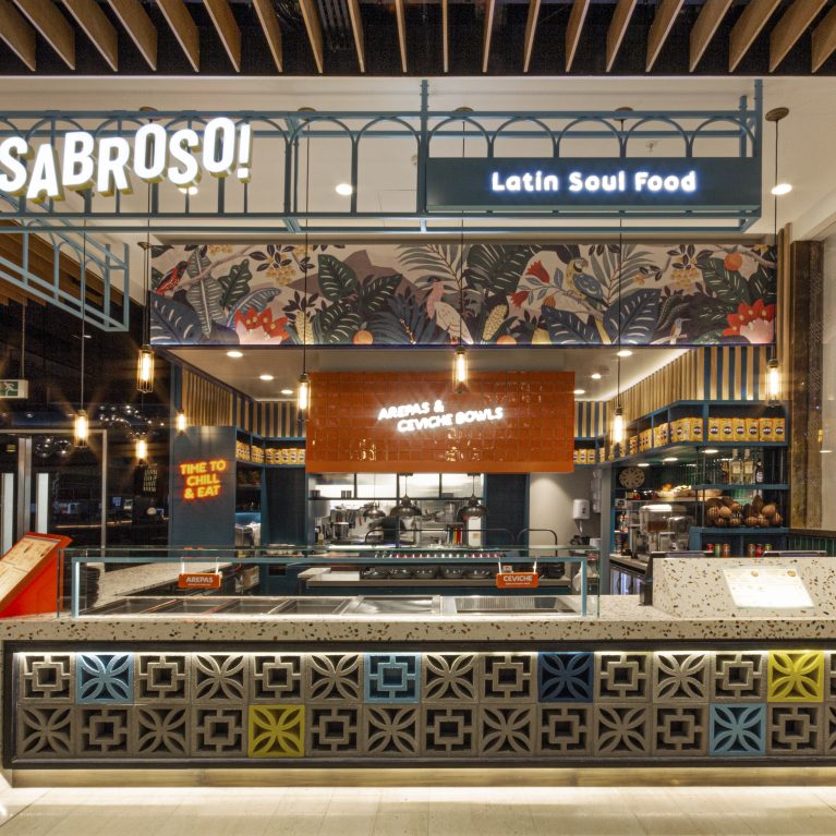
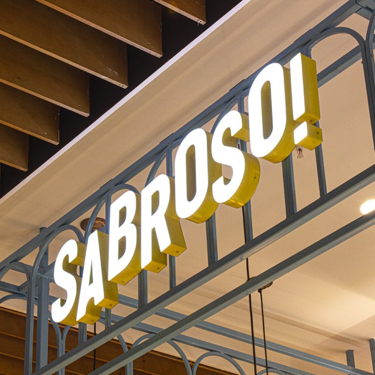
The shopfront is defined by a material palette that references Latin American architecture through a modern lens. A prominent metal gantry anchors the brand's identity, while the counter serves as the primary touchpoint for customers, balancing heavy masonry textures with the cleanliness of polished stone surfaces.

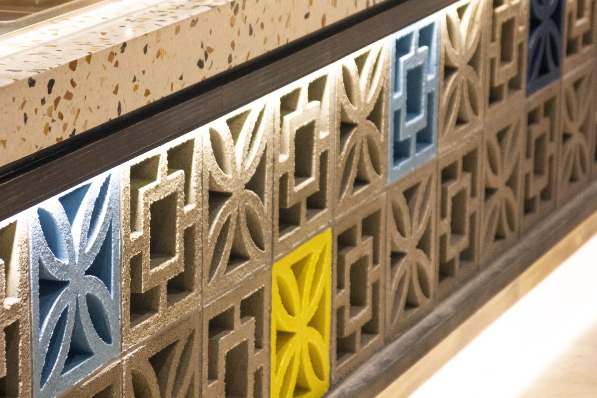
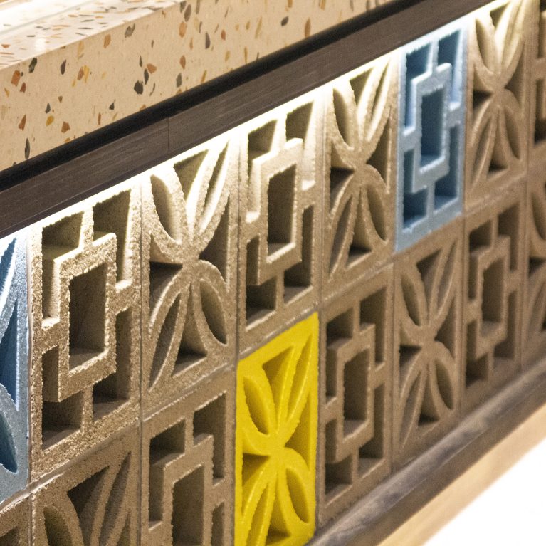
This detail highlights the tactile contrast at the heart of the design concept. By pairing industrial concrete blocks with refined terrazzo, the counter bridges the gap between rugged street aesthetics and a high-end commercial finish. Integrated LED strip lighting emphasizes the geometric depth and shadows within the masonry.

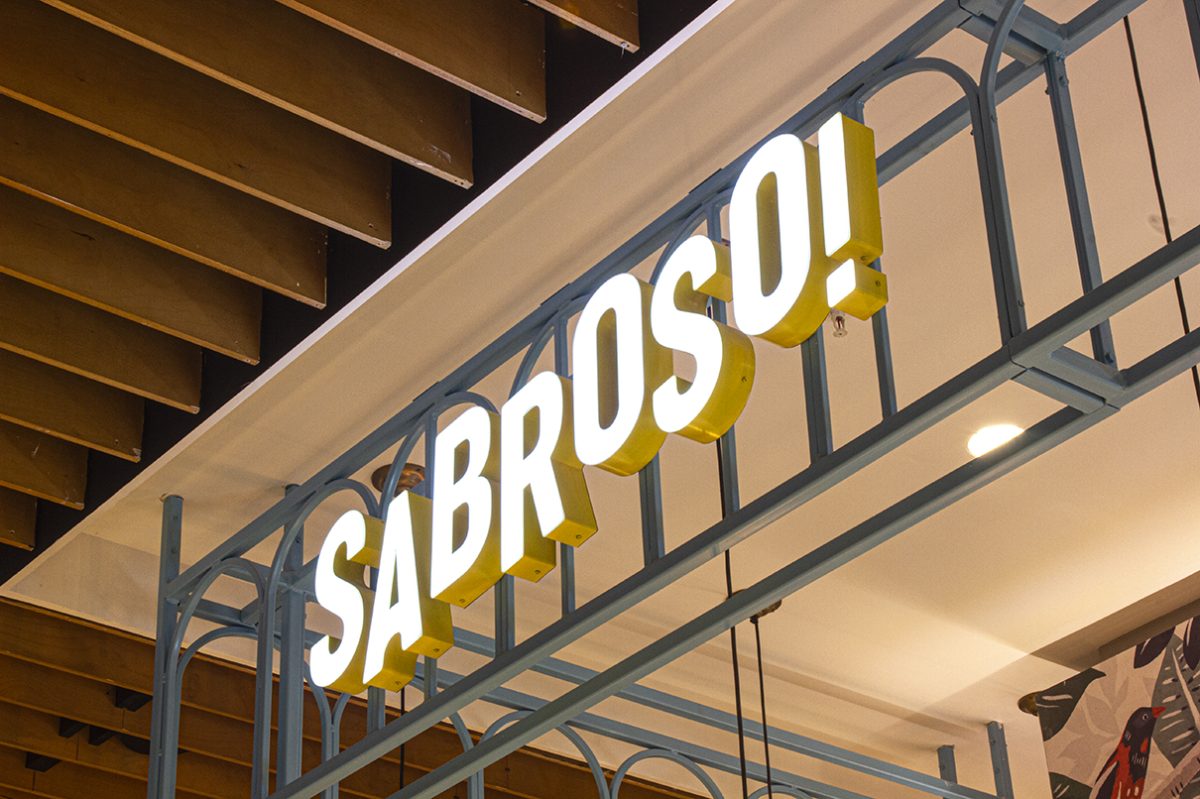
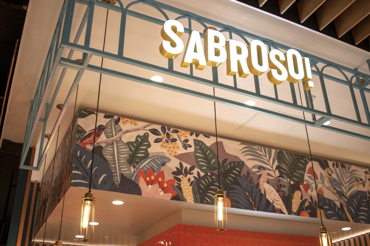
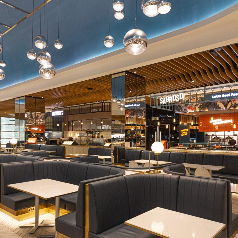
High-level signage is integrated into a bespoke architectural gantry, ensuring brand visibility within the expansive food court. This industrial framework allows the identity to sit forward from the unit, while the mix of metal and timber textures overhead establishes a clear vertical boundary for the brand's footprint.

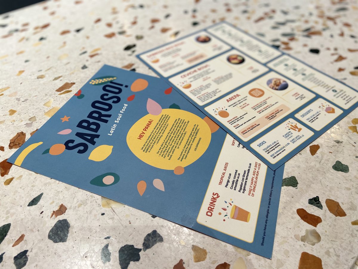
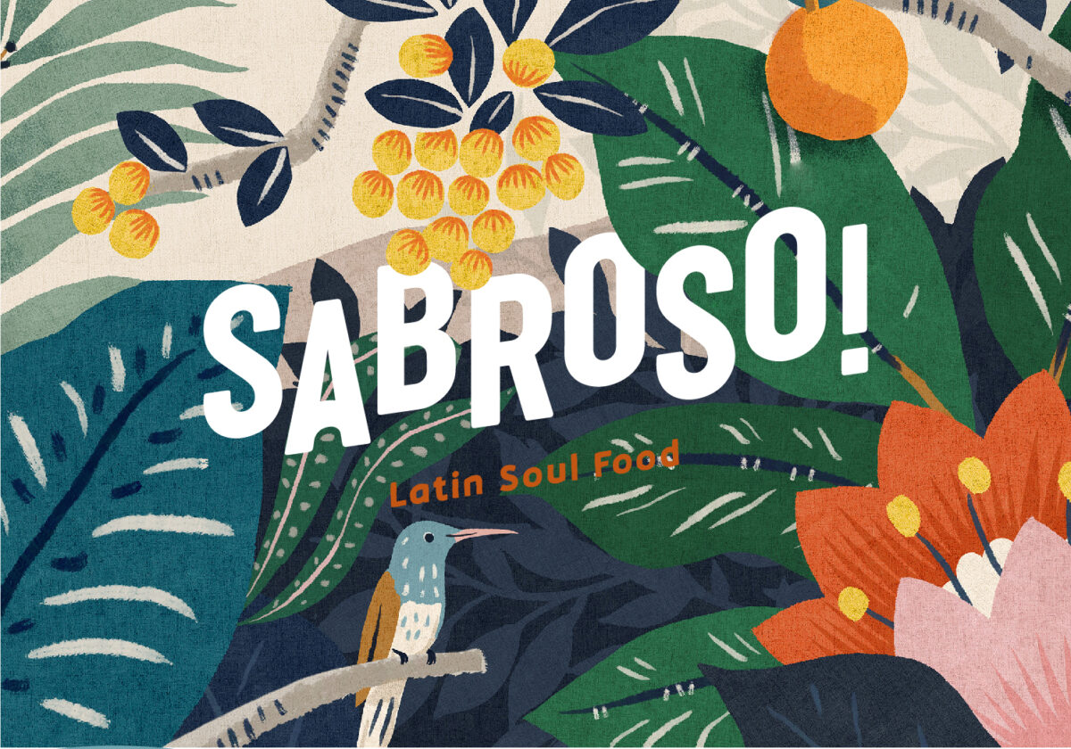
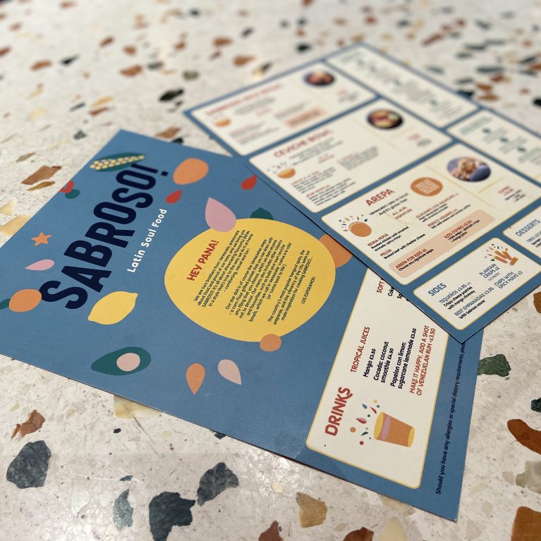
The brand’s graphic language uses organic shapes and a tropical palette to tell the story of Venezuelan street food. These printed materials are designed to be intuitive and engaging, mirroring the modular nature of the physical space. The contrast between the vibrant paper stock and the stone counter reinforces the project’s layered material approach.

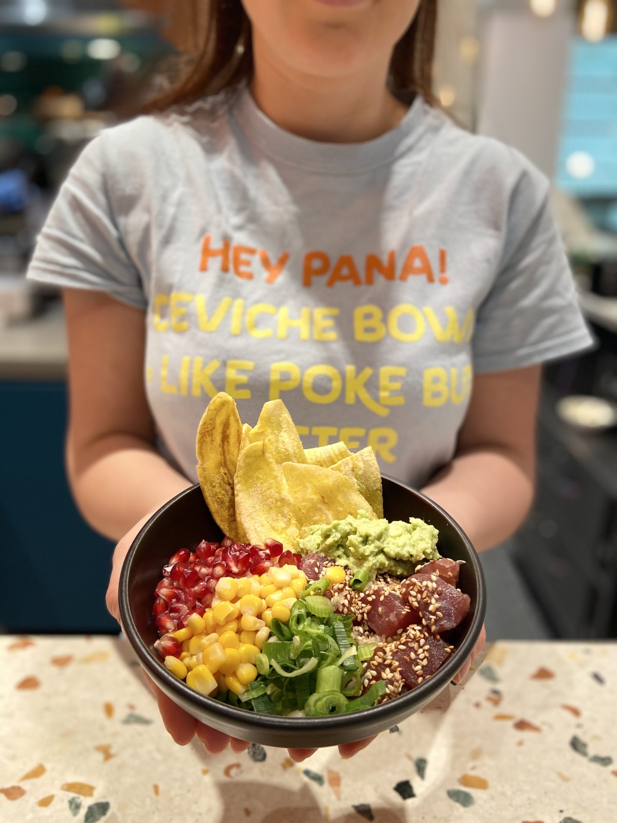
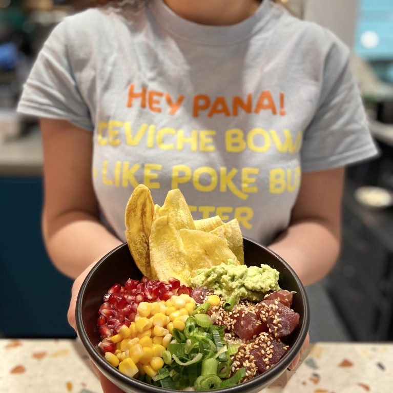
The design extends beyond architecture into the brand's graphic identity and customer interaction. Typography used in staff uniforms mirrors the interior's playful tone, while the terrazzo counter provides a neutral, high-quality backdrop that highlights the color and freshness of the Venezuelan ingredients.

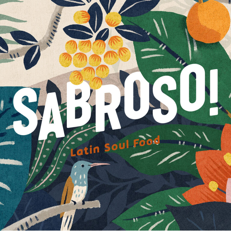
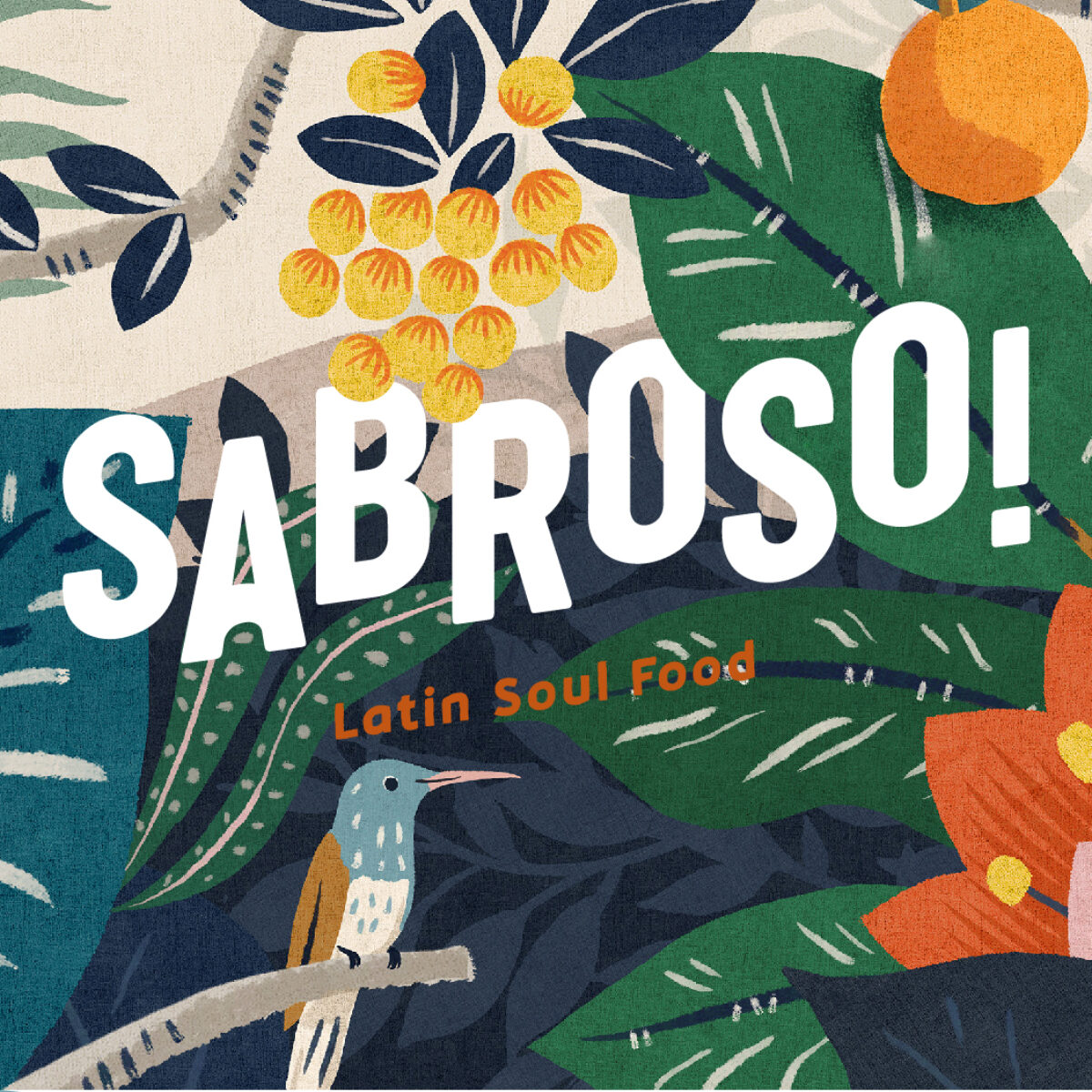
The custom graphic artwork defines the brand's visual identity, using organic textures and a vibrant tropical palette to articulate the Venezuelan street food narrative. The hand-drawn composition integrates native flora and fauna with a playful logotype, establishing a rich illustrative layer that directly informs the physical interior wall treatments.

The high-level shopfront design establishes the brand’s spatial boundaries within a busy food court. A custom metal gantry lifts the primary signage forward, while a horizontal band of dense botanical wallpaper brings organic pattern and tropical color into the upper architectural volume.

The unit is designed to hold a strong presence within a high-density communal dining area. By coordinating the brand’s warm timber and industrial metal elements with the mall’s existing booth seating, the design creates a seamless transition from the service counter to the consumer’s final destination.

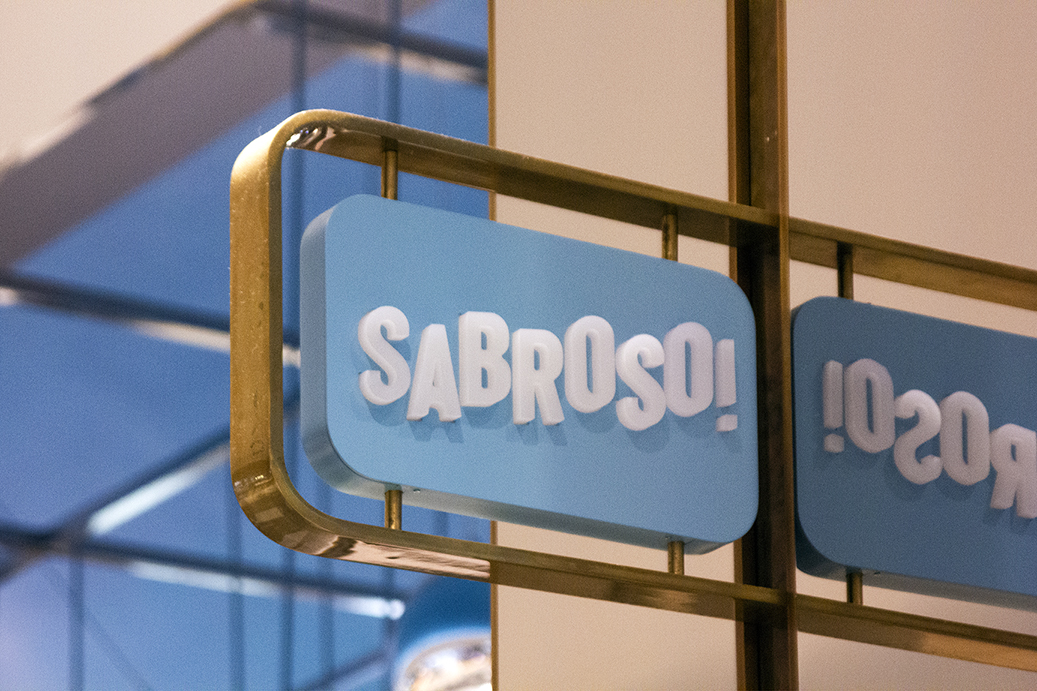
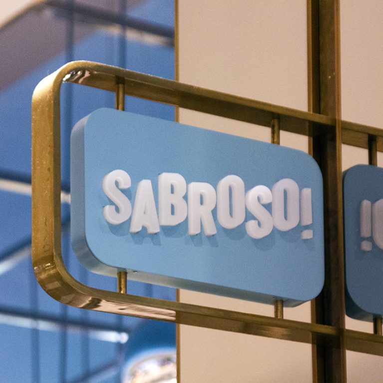
Secondary signage utilizes projecting lightboxes to ensure brand visibility from multiple approach angles within the mall. This element introduces refined brass detailing, elevating the industrial aesthetic of the shopfront. The use of curved geometry and soft illumination provides a sophisticated contrast to the more rugged, masonry-based textures found at counter level.