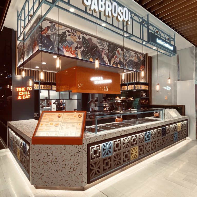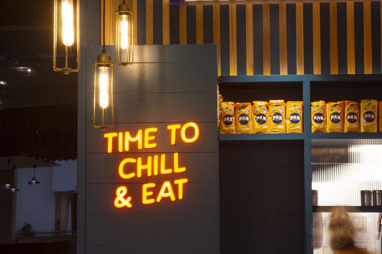
The interior utilizes vertical surfaces to communicate brand personality through neon typography and curated product displays. Layered lighting—from warm Edison-style pendants to vibrant light boxes—creates a textured, atmospheric corner within the unit. These elements work together to transition the space from a functional kitchen into an inviting dining environment.
A charcoal-grey timber wall serves as a backdrop for the "Time to Chill & Eat" neon sign, casting a warm orange glow that draws customers into the seating area. To the right, recessed shelving finished in navy blue houses a rhythmic display of authentic Venezuelan ingredients, reinforcing the brand's culinary heritage. This retail-inspired feature is framed by vertically oriented timber slats, adding architectural depth and a sense of height to the space.
The lighting scheme combines decorative and functional roles; caged glass pendants provide a warm, low-level amber light that complements the neon’s intensity. Behind the counter, corrugated glass panels partially obscure the kitchen view, softening the industrial environment while allowing movement and light to pass through. By mixing high-contrast colors with raw materials like wood and glass, the design achieves a layered, urban aesthetic that feels personal and curated despite its retail setting.