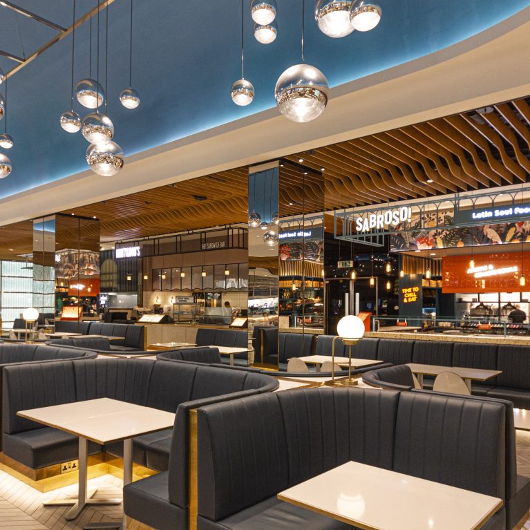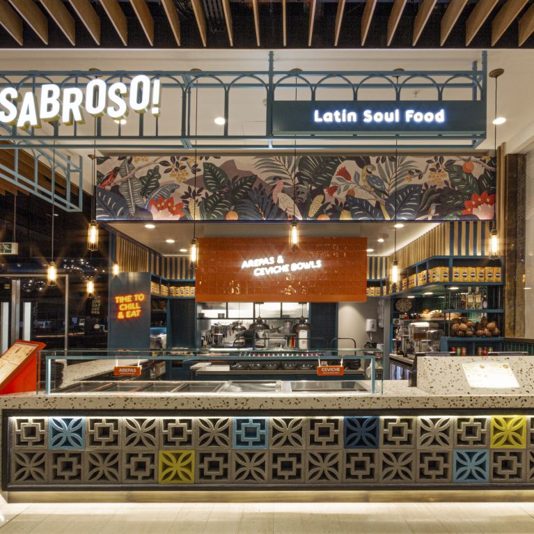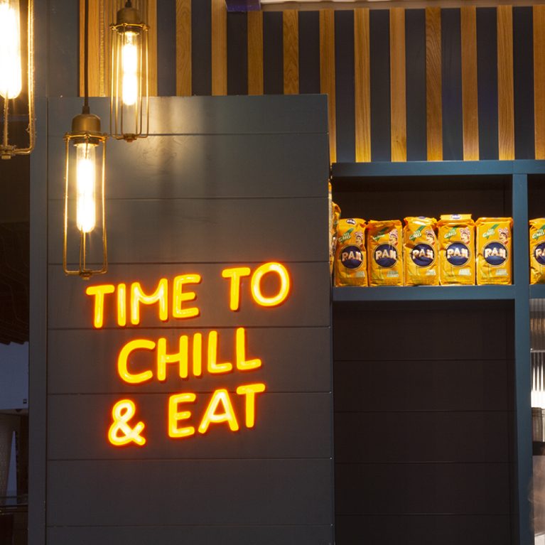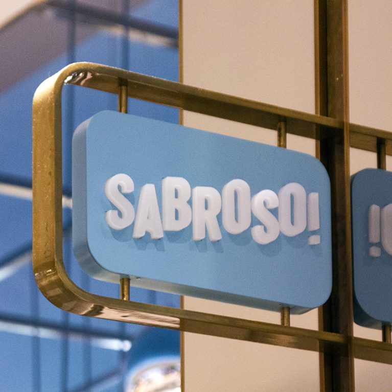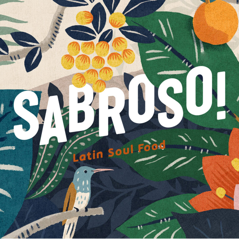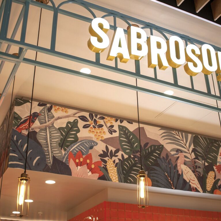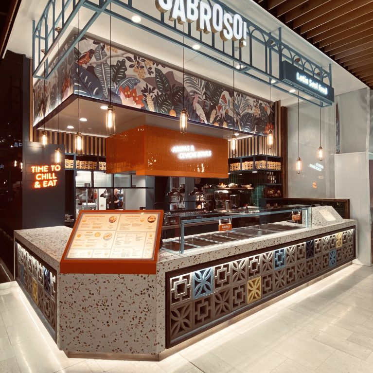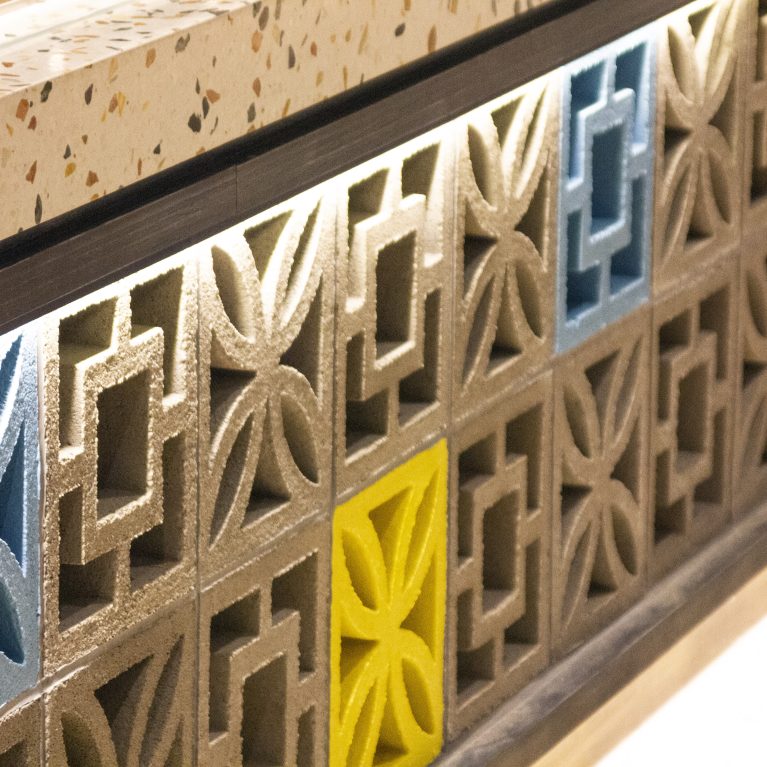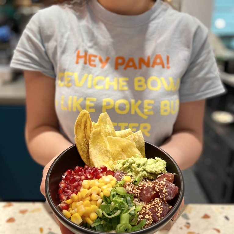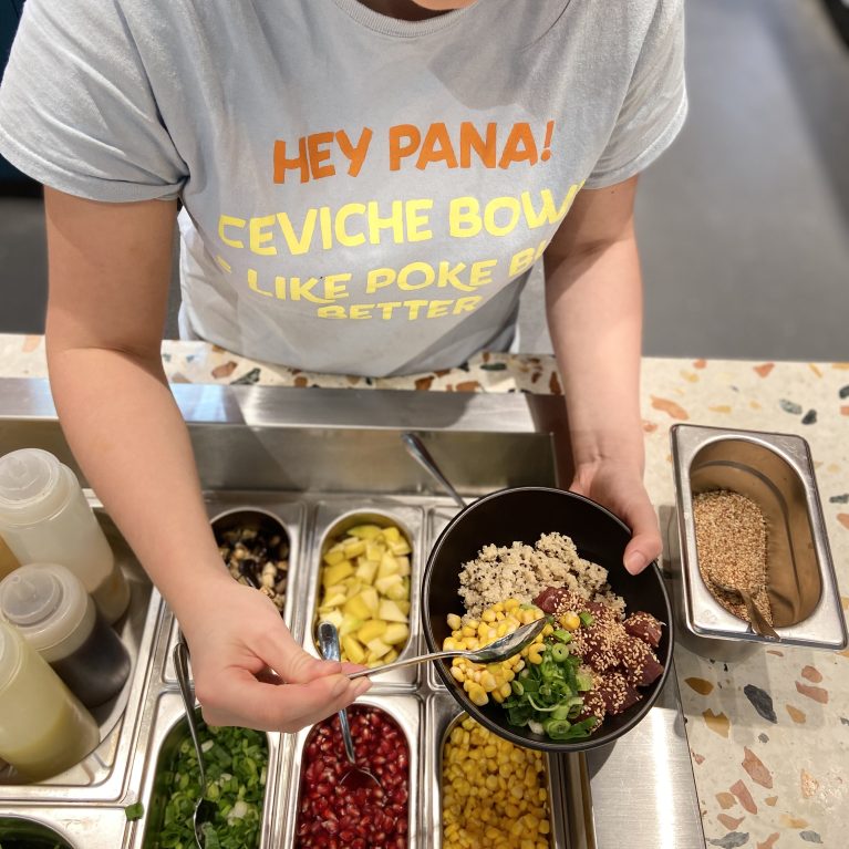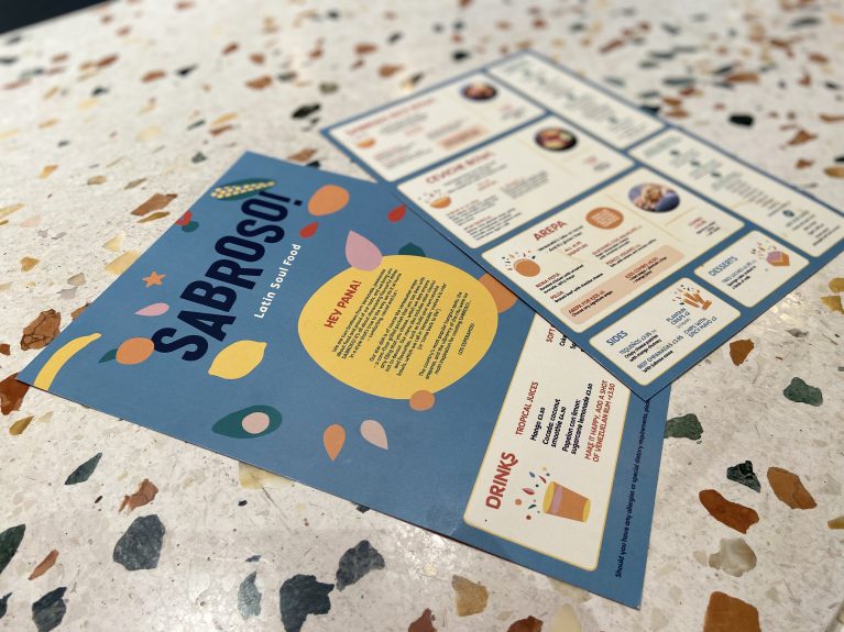
The brand’s graphic language uses organic shapes and a tropical palette to tell the story of Venezuelan street food. These printed materials are designed to be intuitive and engaging, mirroring the modular nature of the physical space. The contrast between the vibrant paper stock and the stone counter reinforces the project’s layered material approach.
The menu design employs a clear, grid-based layout to simplify the ordering process for a fast-paced environment. Playful illustrations of ingredients—like avocados and citrus—are scattered across a bold blue background, introducing a sense of movement and hand-crafted authenticity. This visual style references South American street art while maintaining the legibility required for a commercial retail setting.
The choice of matte-finish card stock provides a tactile quality that complements the textured terrazzo surface beneath. By using consistent typography and color hits from the interior palette, the collateral acts as a portable extension of the environment. Every piece of communication, from the brand story on the reverse to the simplified price lists, is curated to feel energetic and accessible, ensuring the brand identity is cohesive across both digital and physical touchpoints.