Symmetrical front elevation of the main food service assembly.

Power Of Health

Creating a Powerful and Healthy Londoner

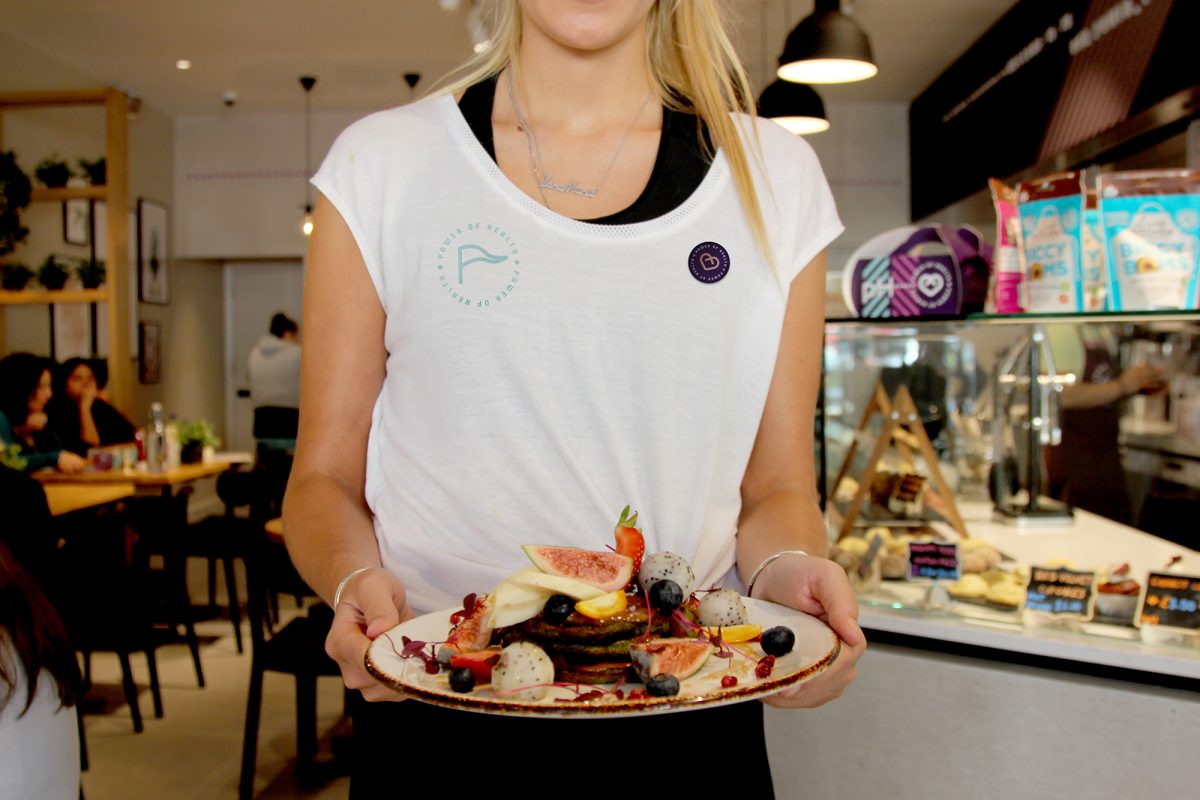
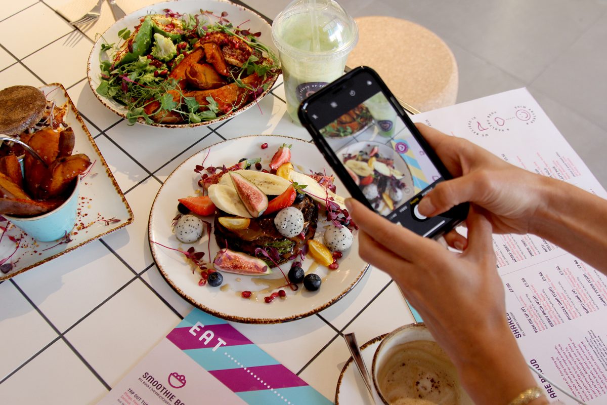
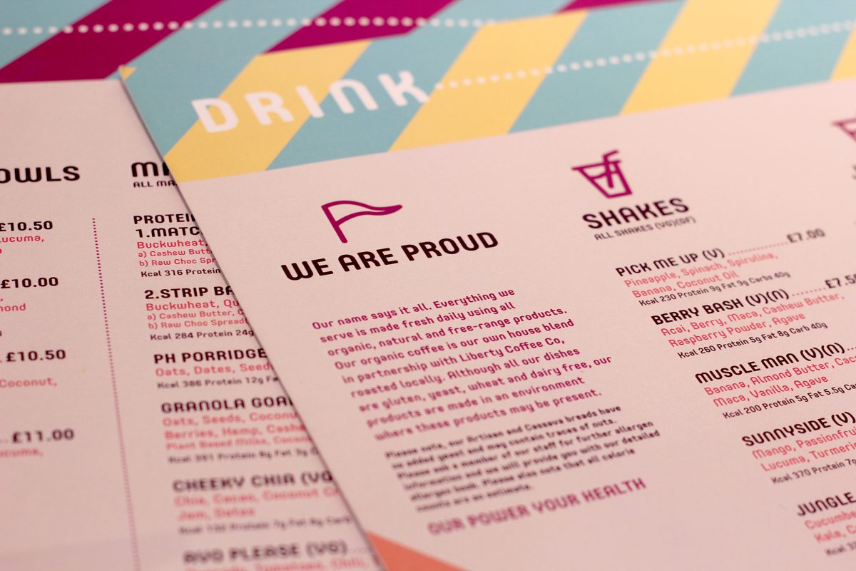
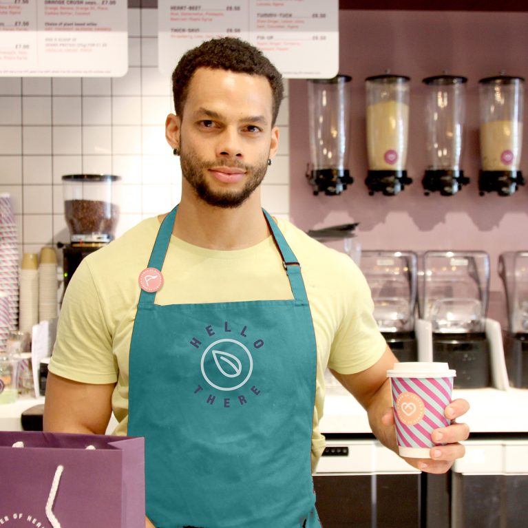
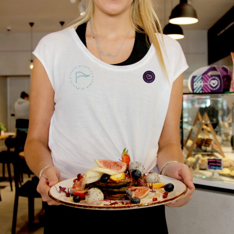
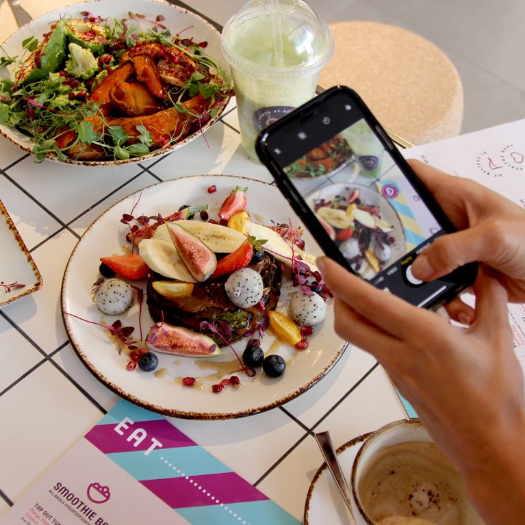
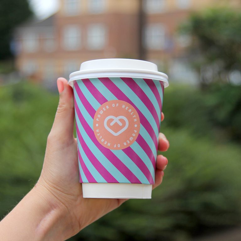
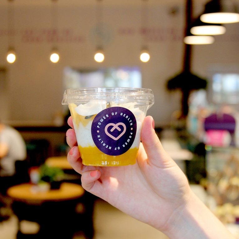
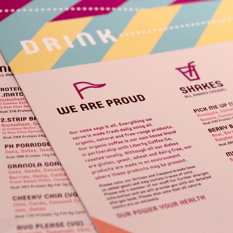
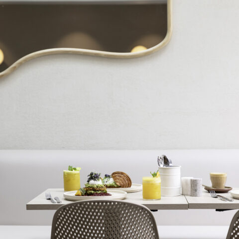
Power of Health is a dynamic health brand and food store with a strong focus on catering to consumers with various food allergies and dietary requirements. A brand, offering dine-in and takeaway service from breakfast to dinner, celebrating healthy and tasty lifestyle.

Tessa Michaelides, the founder of Power of Health, asked Design Clarity to create a name, brand and interior concept for her dream making sure we consider the scalability aspect since there were ambitious expansion plans for the future.

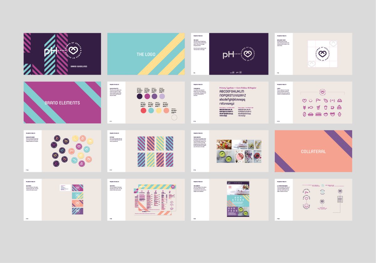
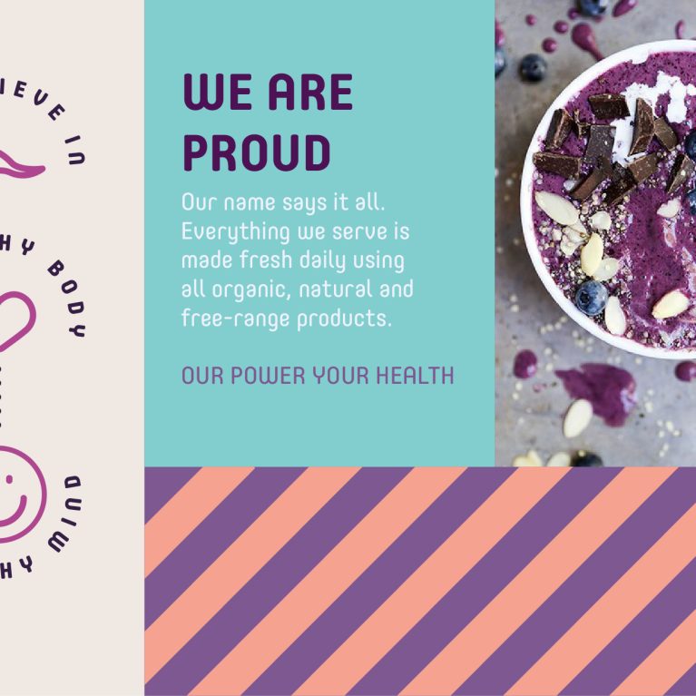
In order to come up with a suitable name, branding and interior concept, we started out with our brand creation workshop where we studied the target customers, competitors and the brand personality (ie Honest, Exciting, Creative). It was decided that this brand would be different than the ones with the similar offer in the market – representing a positive healthy lifestyle rather than sterile and boring.

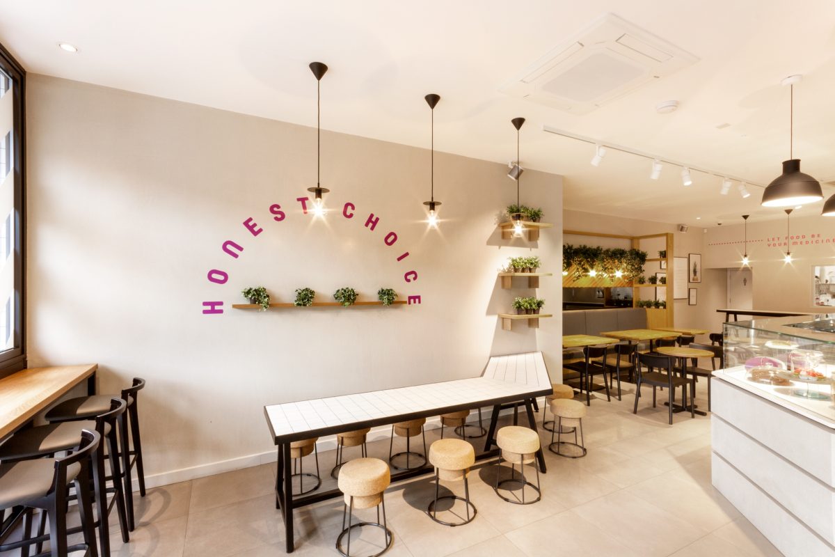
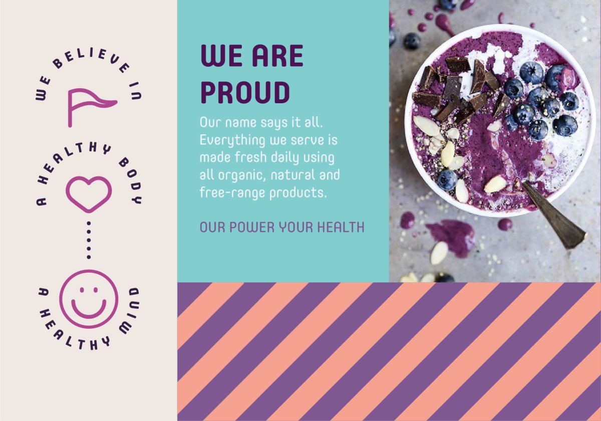
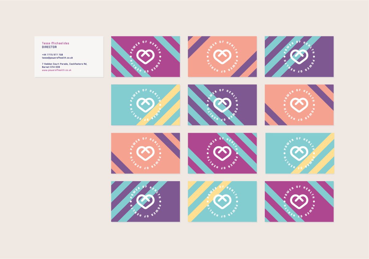
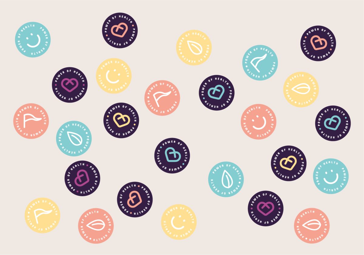
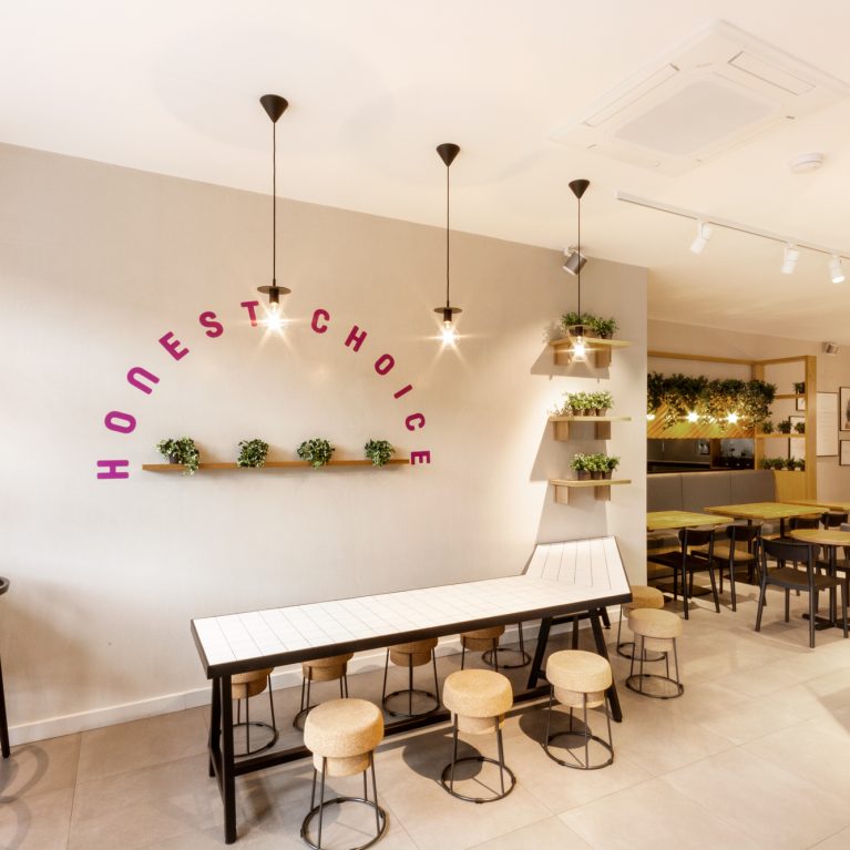
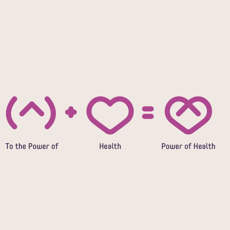
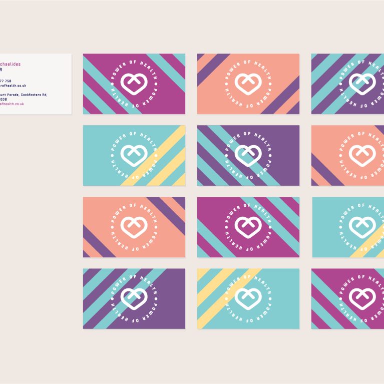
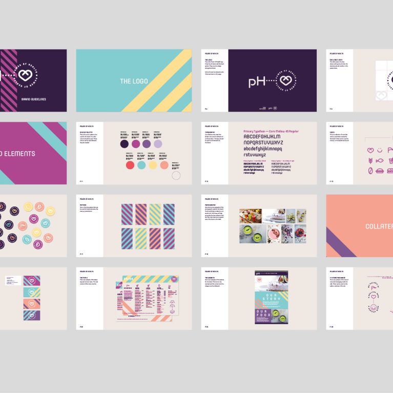
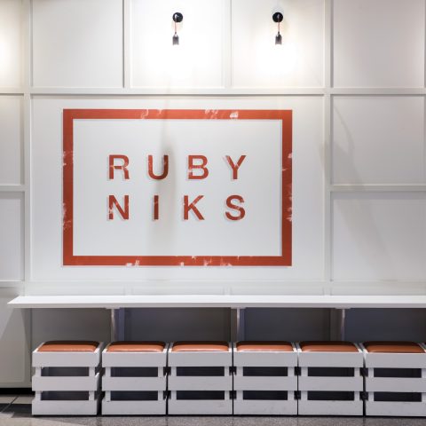
Based on the findings of our workshops, ‘Power of Health’ was decided as the name of the brand and our designers came up with unique branding and interiors concepts to support the essence ‘Honest Choice’. 3 brand personality traits shaped the concept below;

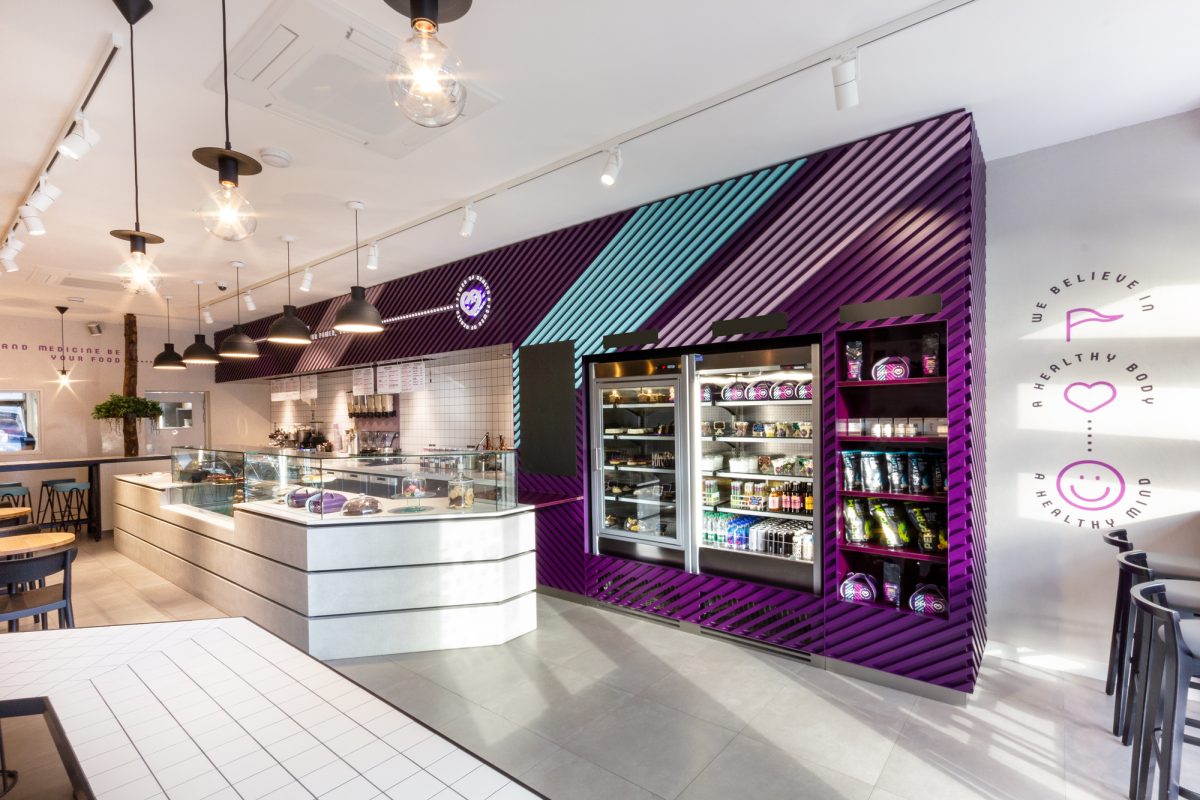
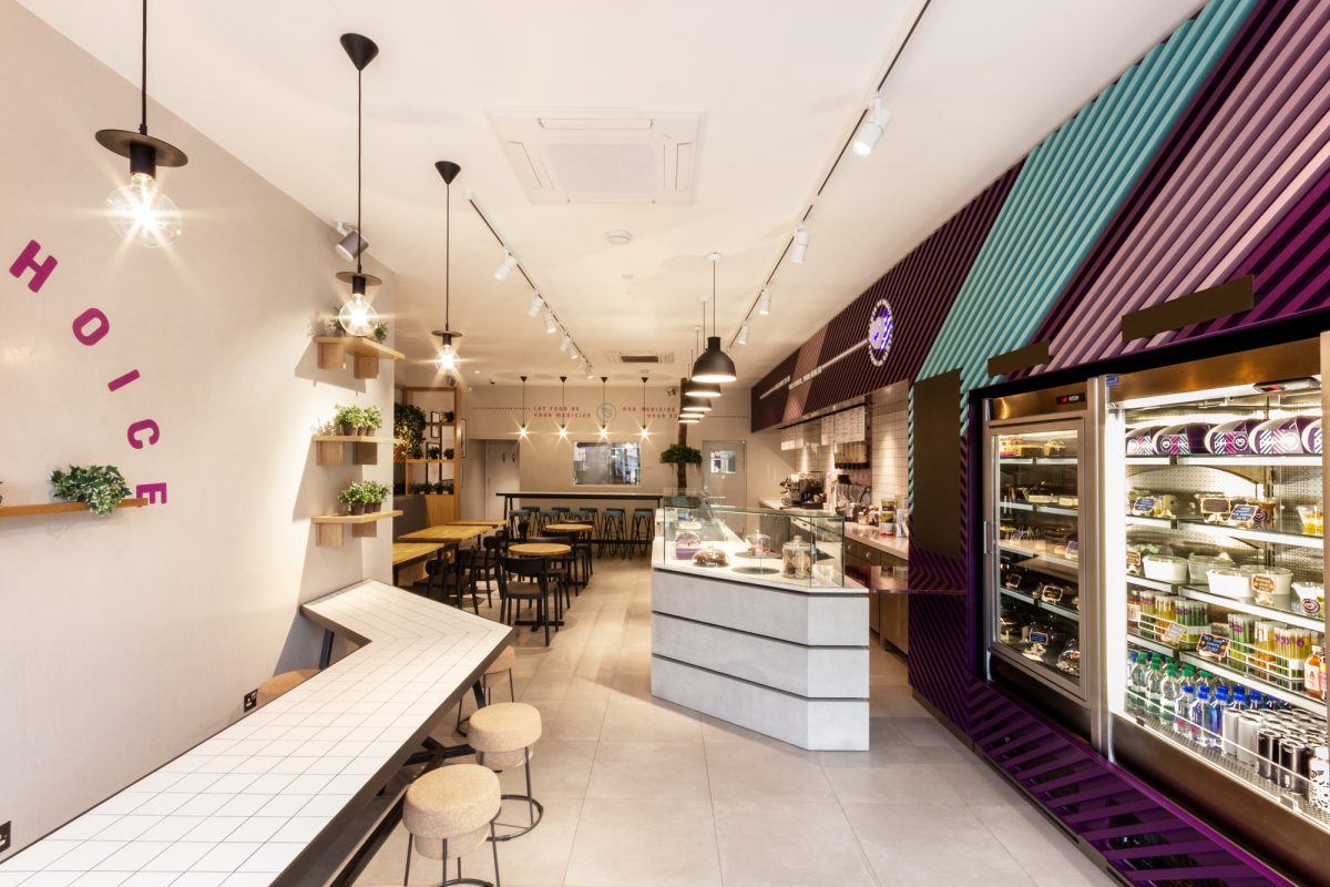
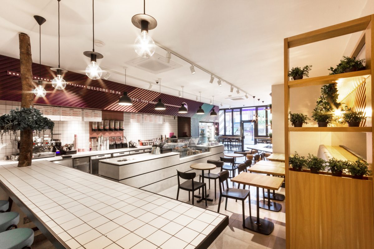
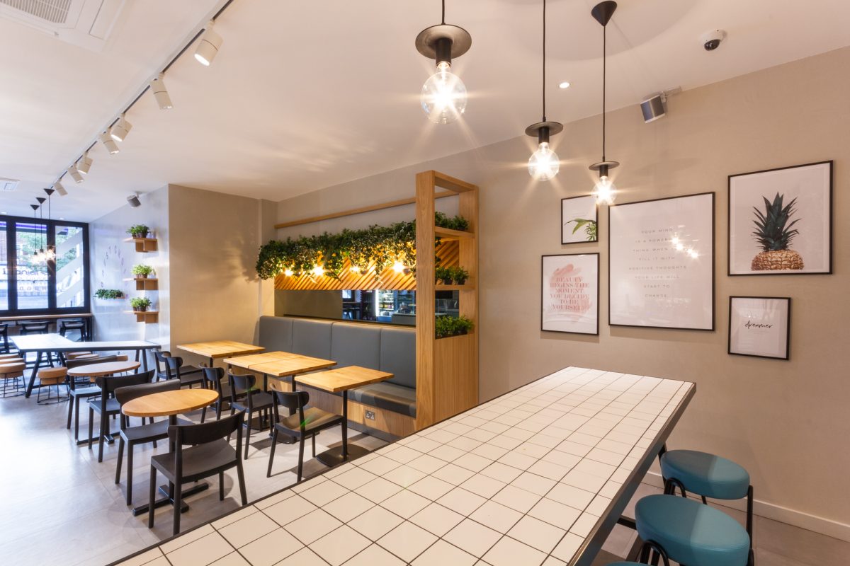
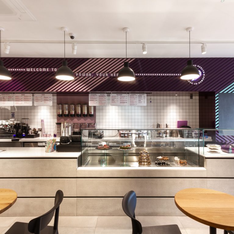
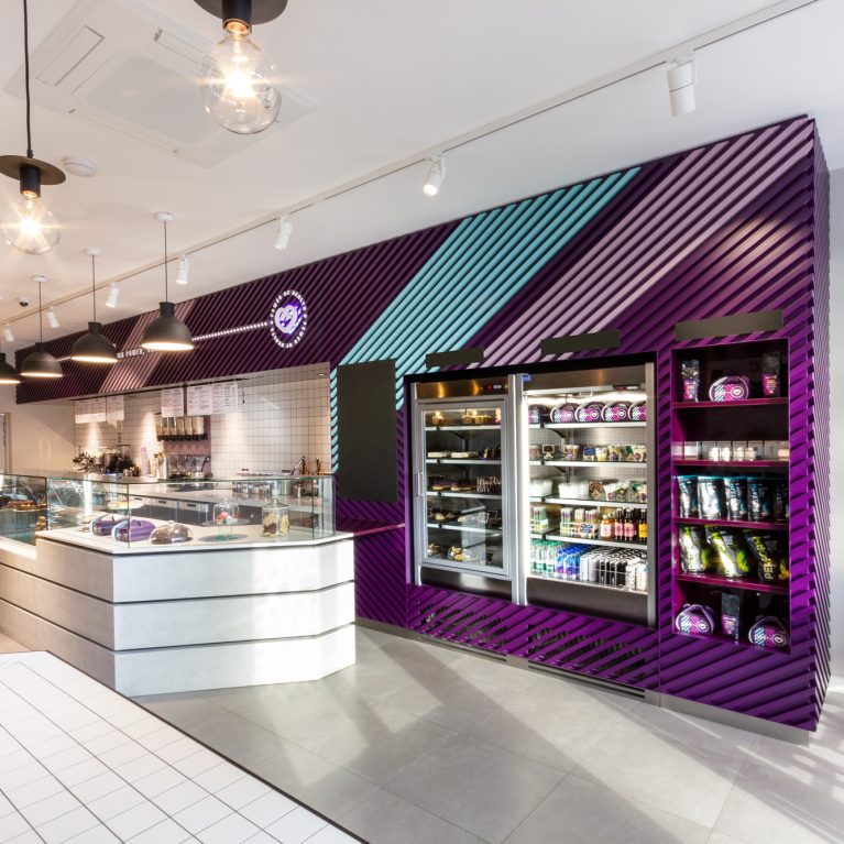
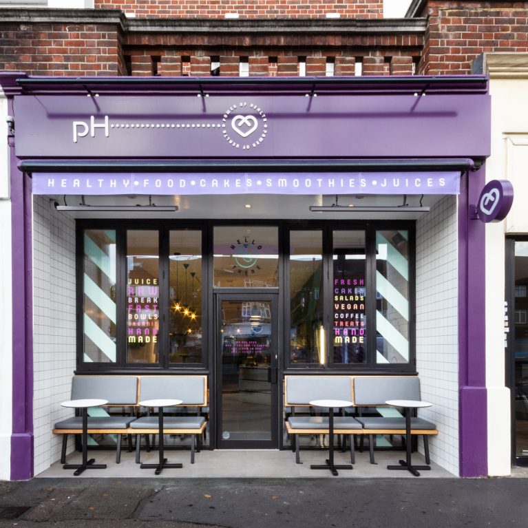
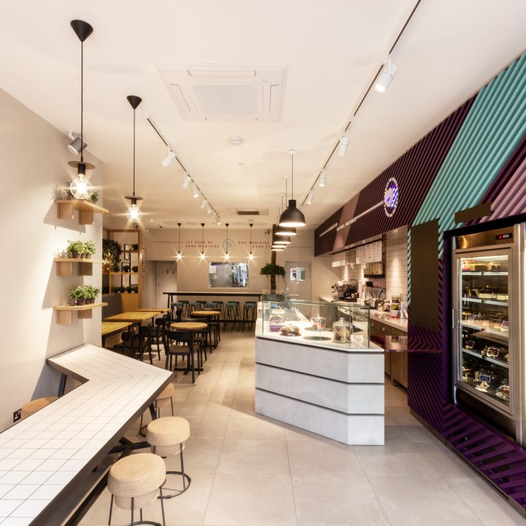
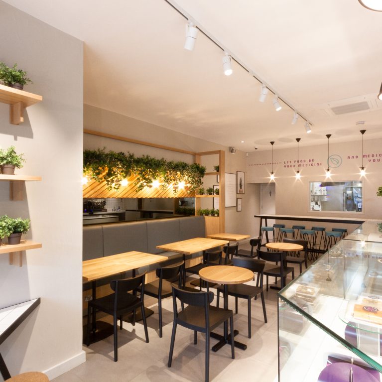
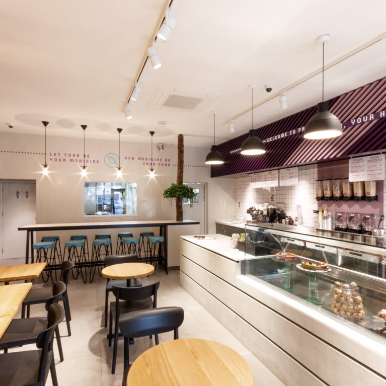
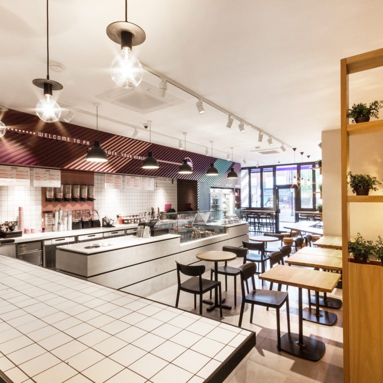
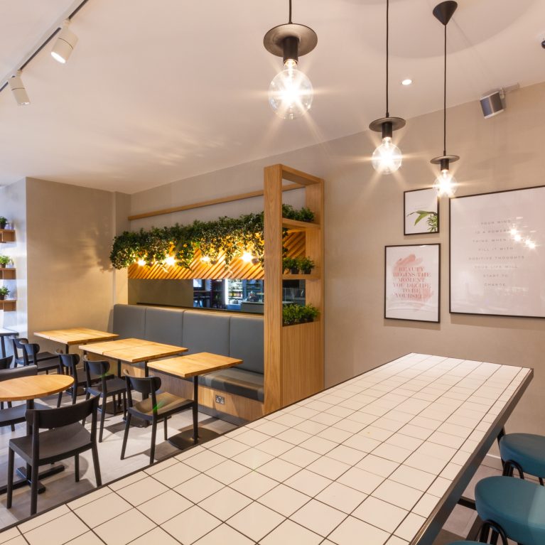
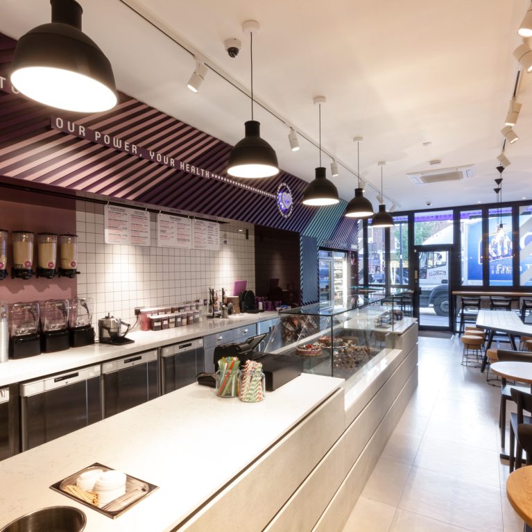
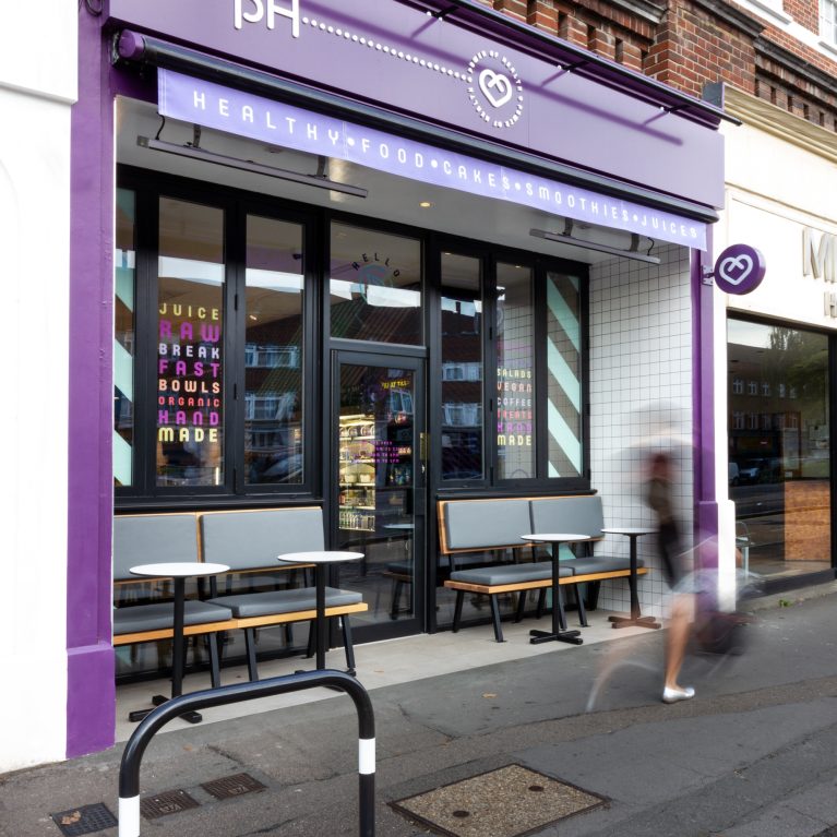
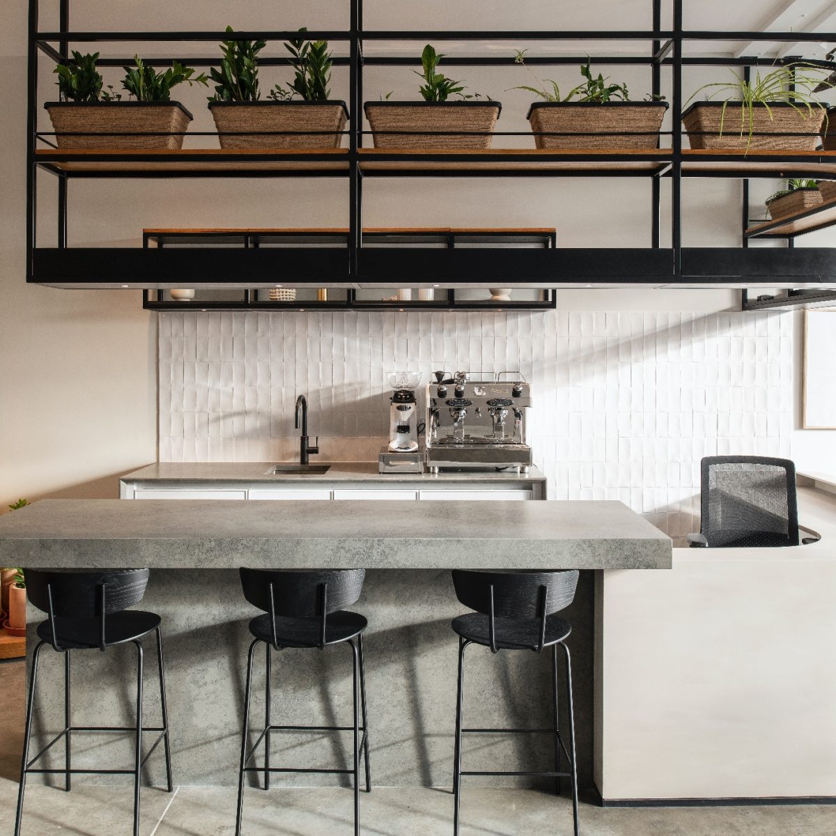
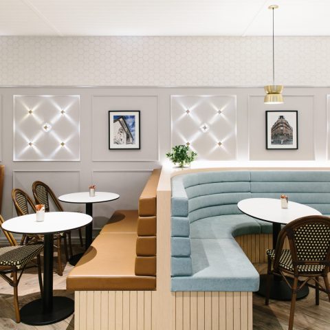
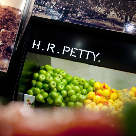
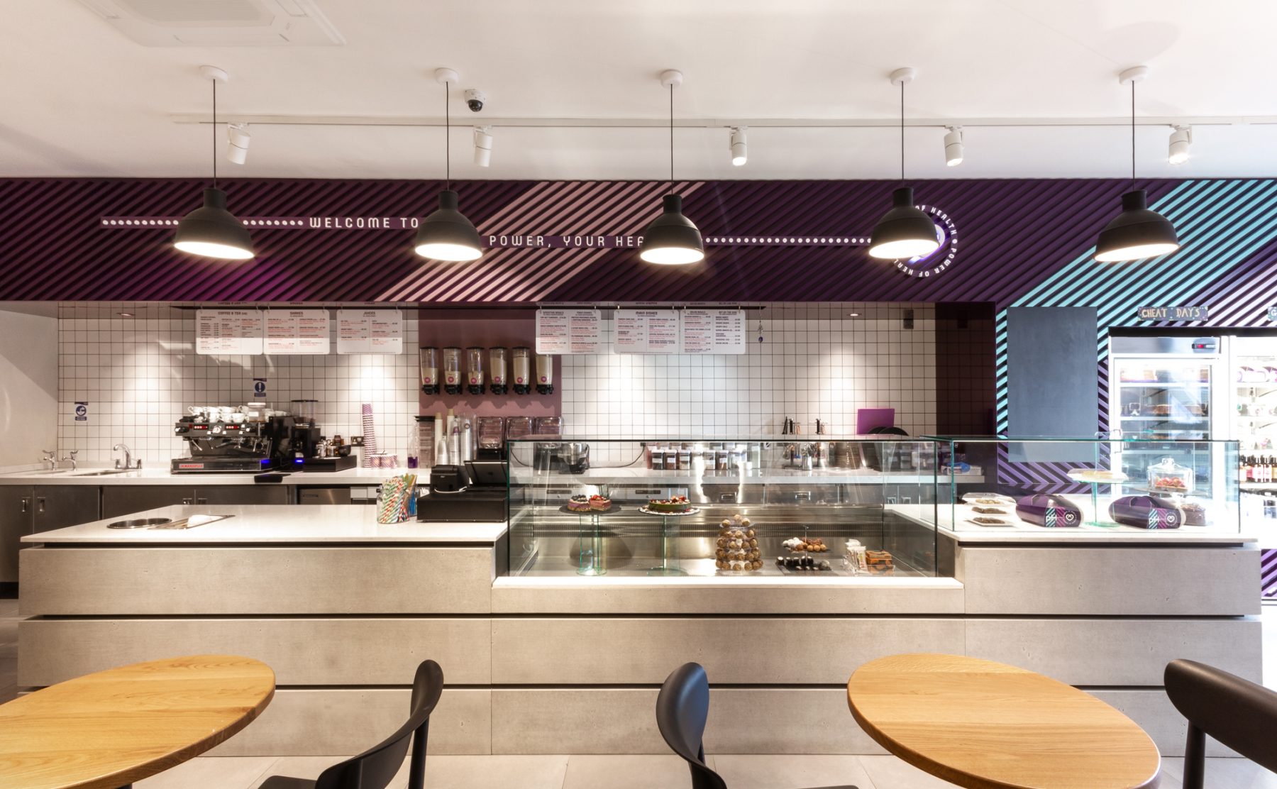
Honest: The combination of natural materials and open shopfront create an inviting environment, whilst the viewing panel through to the prep kitchen sparks interaction with the chefs & showcases the creative theatre behind the menu.
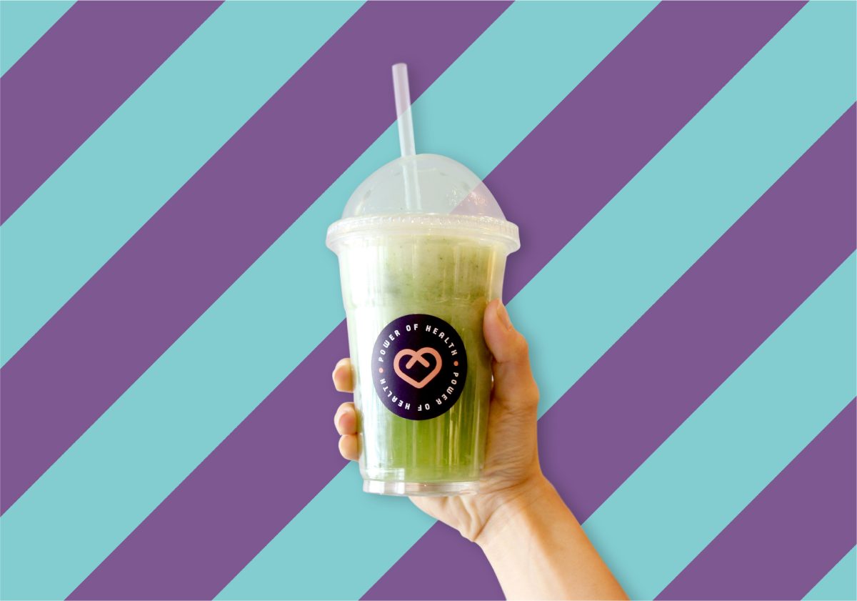
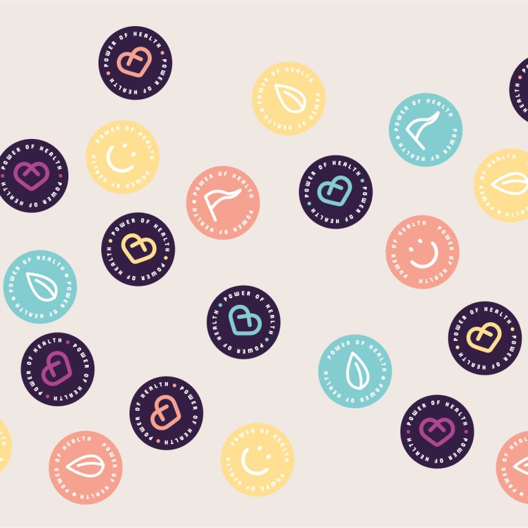
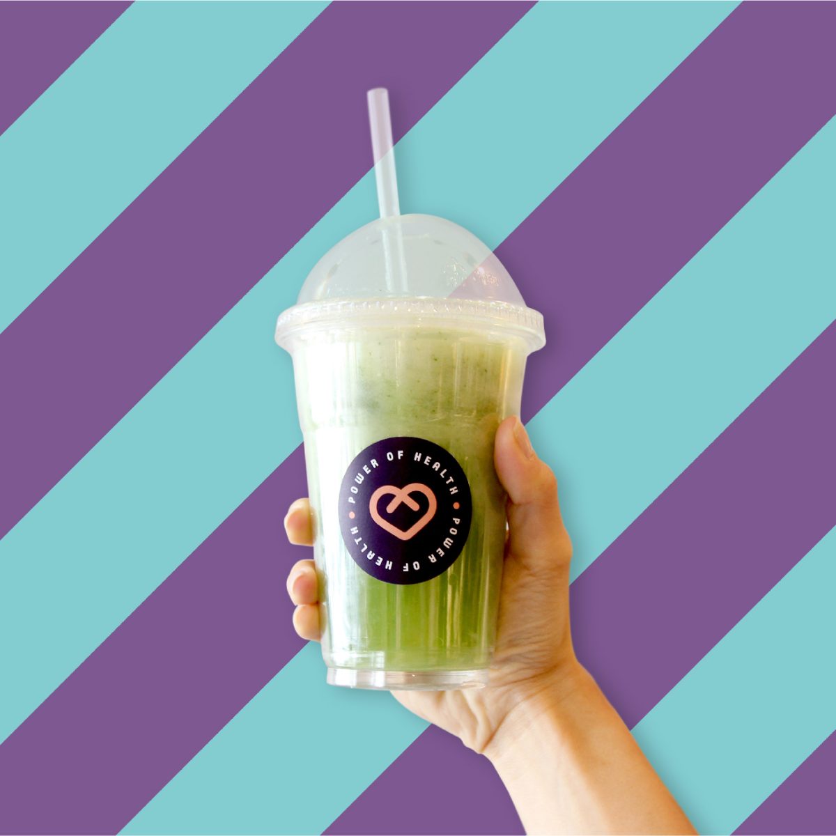
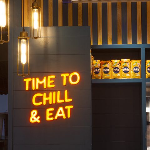
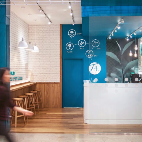
Exciting: The use of a vibrant colour palette and striking diagonal patterns are used to attract & engage, creating a unique interior look & feel.
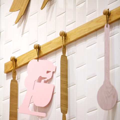
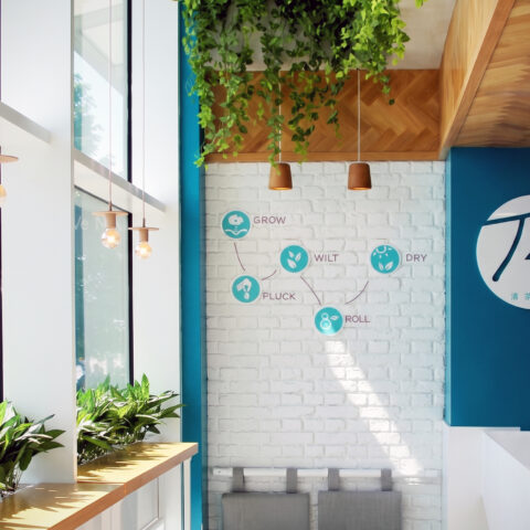
Creative: With a strong focus on the food offer, DC designed a feature counter display aiming to showcase the café’s colourful and creative creations.  With an emphasis also on education, a ‘Workshop table’ has been incorporated, a flexible area used to hold group nutrition workshops, tasting sessions, events and more.

As a result, Power of Health turned into a loved brand not only attracting the locals but also health and food lovers from all over London. There is already demand for new locations and we are ready for new adventures with this hot brand in town.

The main service area features a long white counter paired with a bold, branded retail wall to manage customer flow. This layout separates ordering from grab-and-go shopping, keeping paths clear during peak hours. The bright design creates an energetic, welcoming atmosphere that highlights health and wellness.

The exterior facade uses bold brand colours and high-contrast finishes to maximize street visibility and attract foot traffic. A symmetrical entrance layout blends indoor operations with outdoor seating, creating an inviting threshold. This design firmly establishes the health brand's energetic identity within the local streetscape.

The interior relies on a highly disciplined, linear spatial strategy to master a deep and narrow footprint. By aligning active retail and relaxed dining zones along parallel axes, the blueprint choreographs a seamless customer journey. This layout drives impulse grab-and-go purchases at the front while protecting the relaxed cafe atmosphere further inside.

The mid-store zone establishes a soft transition from the high-energy front counter to a more relaxed, stationary dining experience. By weaving lush biophilic elements into the structural layout, the design fosters a health-focused micro-environment. This layered approach creates an acoustic and visual buffer, inviting customers to slow down and linger.

The entrance-level dining space utilizes a strong focal wall to instantly communicate the brand's core values to arriving guests. By pairing large-scale typography with a centralized communal table, the layout fosters a casual, social atmosphere. This open arrangement encourages high-turnover seating while maintaining an energetic hospitality experience.

The deep interior perspective reveals a structured transition from busy retail service to relaxed, stationary seating zones. By stretching the horizontal counter line deep into the footprint, the layout establishes a rhythmic guidance system for customers. This spatial architecture ensures smooth movement throughout the entire footprint.

Looking toward the glazed shopfront reveals how the deep interior maintains a strong connection to natural street light. The spatial planning uses open-frame furniture and low-profile partitions to divide the narrow room without creating dark corners. This strategy keeps the long layout feeling airy, bright, and visually connected.

The front-of-house service counter acts as the primary human touchpoint where the brand’s lifestyle message comes to life. By matching uniform colors directly with the interior materials, the design creates a seamless visual connection. This strategy ensures the hospitality team feels like an extension of the space.

The main dining room uses a clever mix of seating heights to break up the long floor plan into intimate zones. By changing furniture types from low tables to a high communal bench, the design naturally guides different customer behaviors. This variety creates an energetic but comfortable atmosphere across the small cafe.

The presentation of the menu items acts as a crucial culinary touchpoint that completes the brand's healthy lifestyle philosophy. By serving vibrant, meticulously styled dishes, the food itself becomes a dynamic design element within the cafe. This experiential detail reinforces the space's commitment to raw, wholesome, and premium nutrition.

The interior surfaces and menu layout are deliberately engineered to support a highly visual, digital-first marketing strategy. By selecting materials that serve as graphic backdrops, the design encourages customers to document their experience in real-time. This interactive layer seamlessly expands the brand’s lifestyle footprint far beyond the physical shopfront.

The deep interior view highlights a spatial strategy designed to handle quick takeaway traffic and relaxed dining at the same time. Stretching the service line down the deep floor plan separates busy customers from quiet seating areas. This clear division makes the narrow room feel spacious and highly efficient.

The brand identity extends beyond the physical walls of the cafe through meticulously coordinated, high-impact takeaway packaging. By transforming everyday disposables into vibrant marketing assets, the design ensures the lifestyle concept remains highly visible outdoors. This strategic branding loop turns every customer into an active mobile ambassador.

The grab-and-go packaging relies on full transparency to transform the fresh food into an active layer of merchandising. By showcasing the natural ingredients inside, the product helps communicate the healthy wellness message. This layout coordinates the retail inventory directly with the bright, modern finishes of the cafe interior.

The print collateral acts as a vital typographic layer that reinforces the cafe's health-focused philosophy directly at the dining table. By using clear graphic icons and a structured layout, the menus make complex nutritional choices easy for customers to navigate. This system bridges the gap between digital brand identity and physical hospitality.

The brand’s graphic system functions as a visual philosophy statement that bridges digital media and physical touchpoints. By organizing corporate values into a structured grid layout, the design instantly communicates a commitment to healthy living. This clear framework forms the baseline for all physical marketing and interior signage.

The visual identity centers on a minimalist icon system that breaks down complex health concepts into clear, playful symbols. By treating branding like a mathematical equation, the design communicates the cafe's core mission instantly. This smart graphic language forms the foundation for all interior signage and packaging details

A unified pictographic language replaces text-heavy menus with intuitive, universally accessible visual markers. By styling raw dietary categories into a structured icon matrix, the design accelerates customer decision-making at active ordering points. This graphic tool anchors the physical store environment and print collateral to simplify the guest journey.

A modular stationery system uses shifting color combinations to showcase the dynamic, energetic nature of the health brand. By spreading the core visual elements across a matrix of different backdrops, the design keeps the identity fresh and highly engaging. This flexible print strategy directly mirrors the layered, multi-toned architectural surfaces found within the cafe space.

The takeaway container blends into the cafe's large-scale wall patterns, turning a simple product into a part of the interior architecture. This matching style makes sure the brand's identity stays strong whether a customer is dining inside or carrying their drink down the street. The layout uses high-contrast colors to catch eyes instantly in busy public spaces.

A scatter layout of circular brand seals demonstrates the flexibility of the cafe's secondary graphic assets. These modular round labels serve as dynamic finishing details across a wide variety of unbranded takeaway containers and paper retail bags. This cost-effective branding technique injects casual energy into everyday operational packaging.

A comprehensive brand guideline coordinates every visual touchpoint, ensuring a seamless connection between graphic assets and the physical interior. The system translates the wellness concept into a clear set of design rules for signage, menu print layouts, and digital storefronts. This strategic framework ensures consistency across all retail channels.

The exterior facade uses bold brand colours and high-contrast architecture to maximize street visibility and attract foot traffic. A symmetrical layout blends indoor operations with outdoor seating, creating an inviting threshold. This design firmly establishes the health cafe's energetic lifestyle identity within the local streetscape.