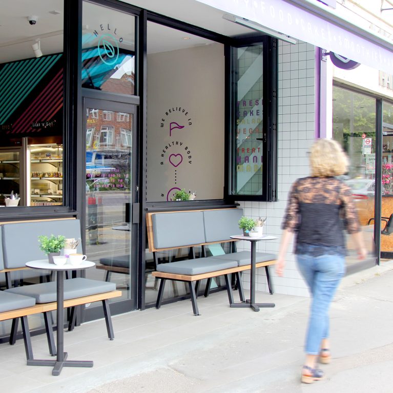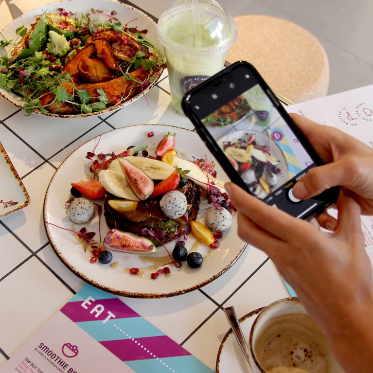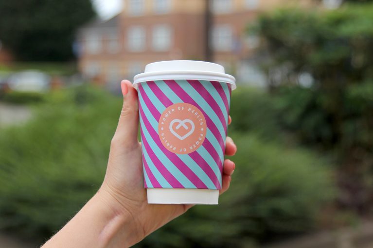
The brand identity extends beyond the physical walls of the cafe through meticulously coordinated, high-impact takeaway packaging. By transforming everyday disposables into vibrant marketing assets, the design ensures the lifestyle concept remains highly visible outdoors. This strategic branding loop turns every customer into an active mobile ambassador.
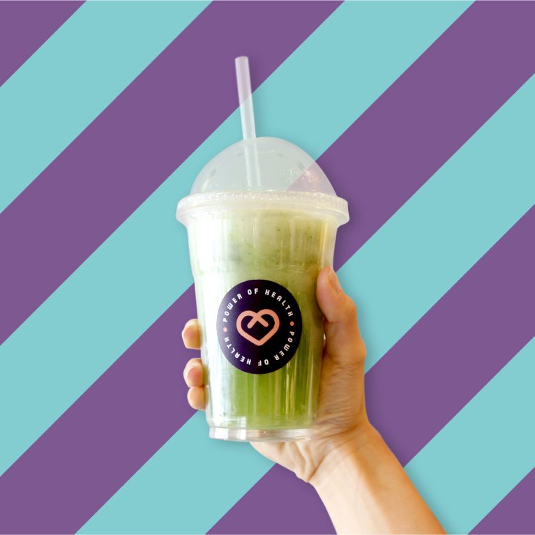
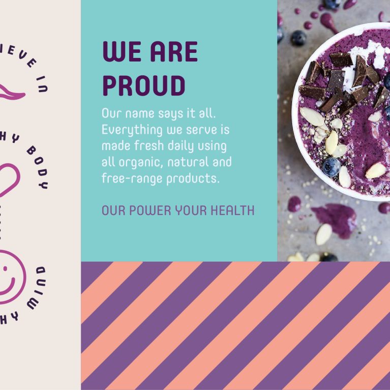
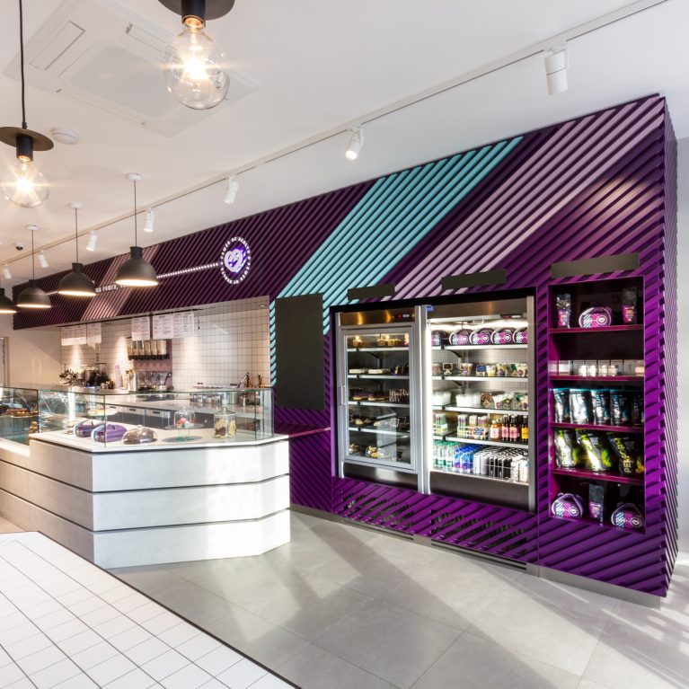
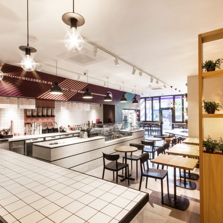
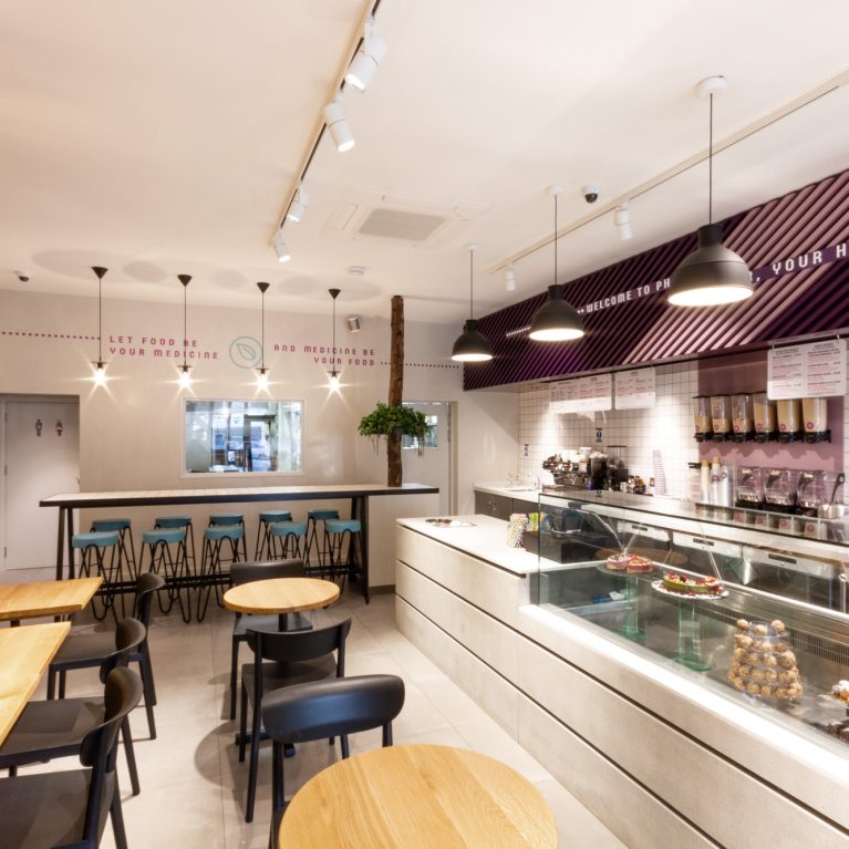
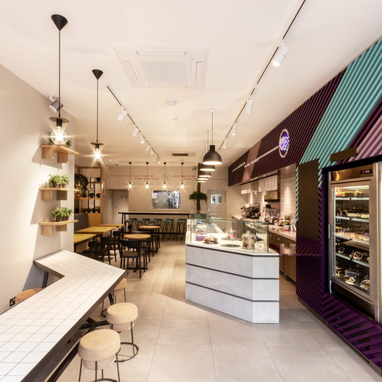
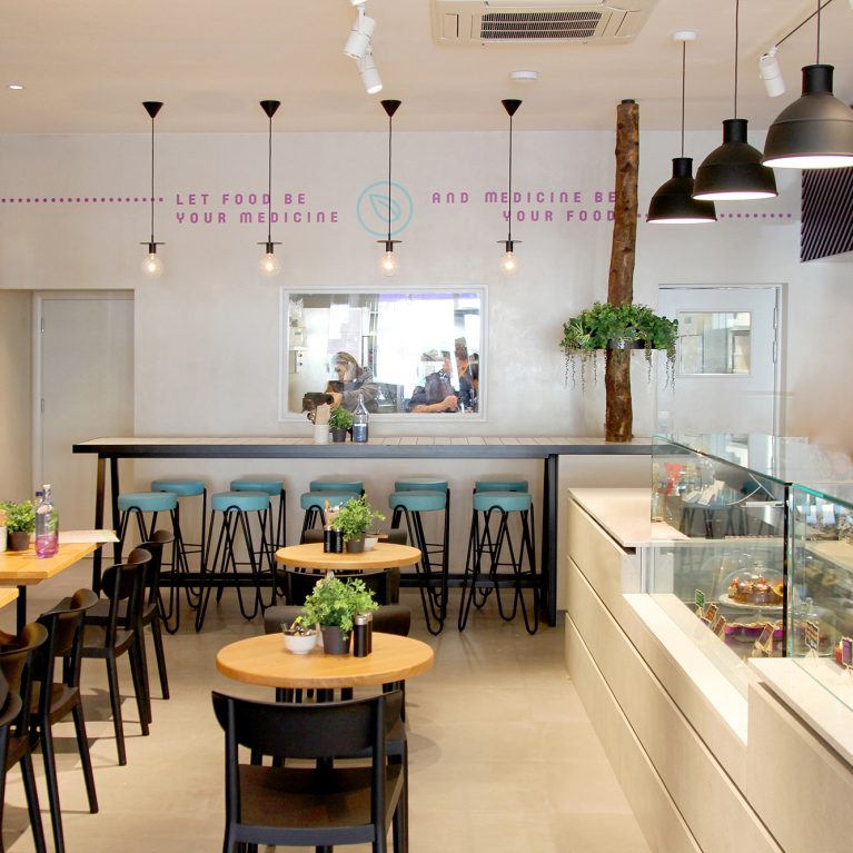
The insulated paper cup utilizes a striking, dual-color diagonal stripe pattern that mirrors the architectural timber slat installations found inside the store. Repeating this specific purple and teal graphic motif creates an instant visual connection to the café’s dynamic front-of-house service counter and menu boards. The bold geometric styling ensures high recognition against neutral urban backdrops.
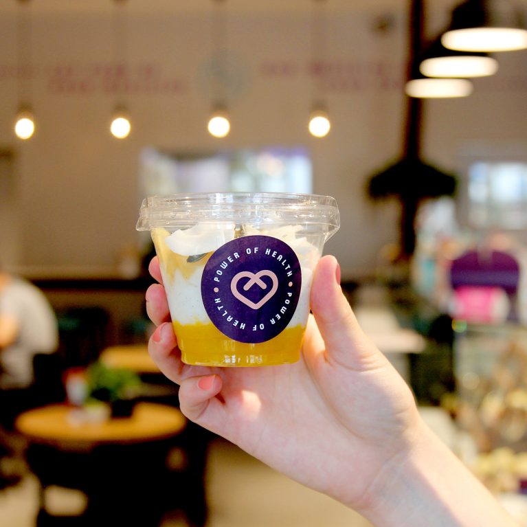
Centred on the cup, a circular peach-colored label features the brand's core heart icon framed by clean, minimalist typography. The matte finish of the paper wrap provides a tactile texture while preventing slipping, balancing consumer comfort with graphic clarity. This thoughtful alignment of interior geometry and graphic packaging delivers a seamless, multi-sensory brand experience.