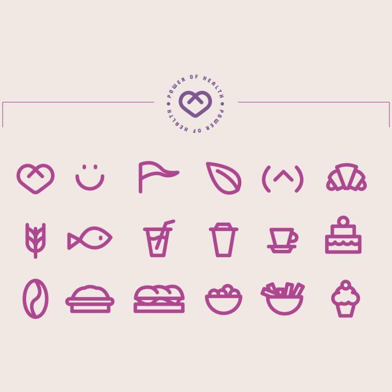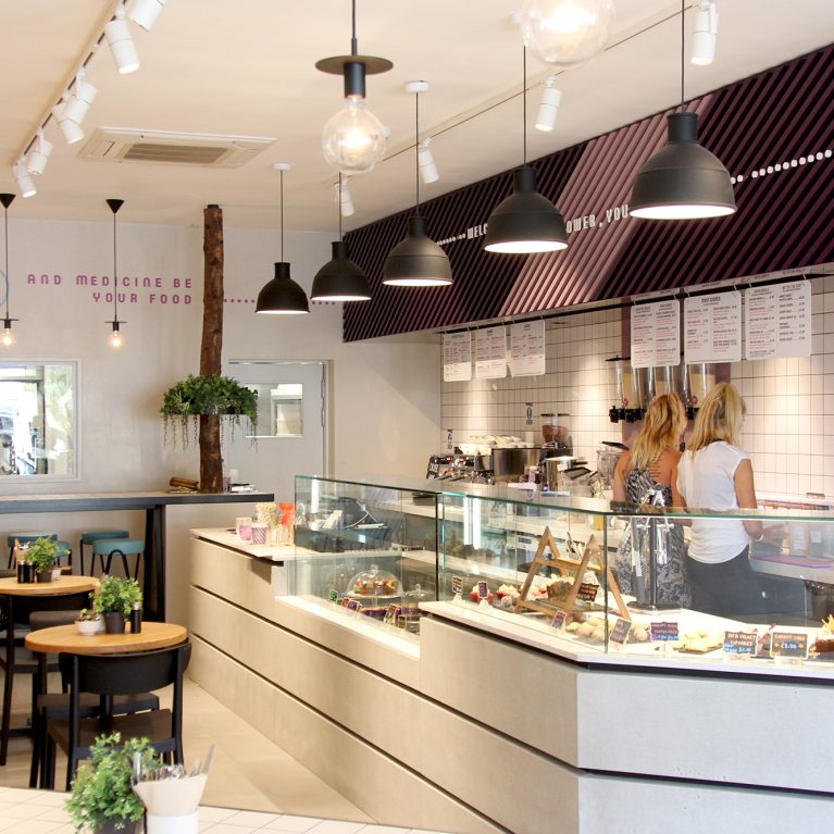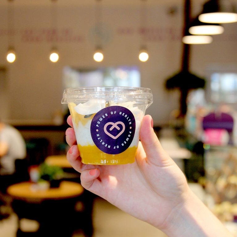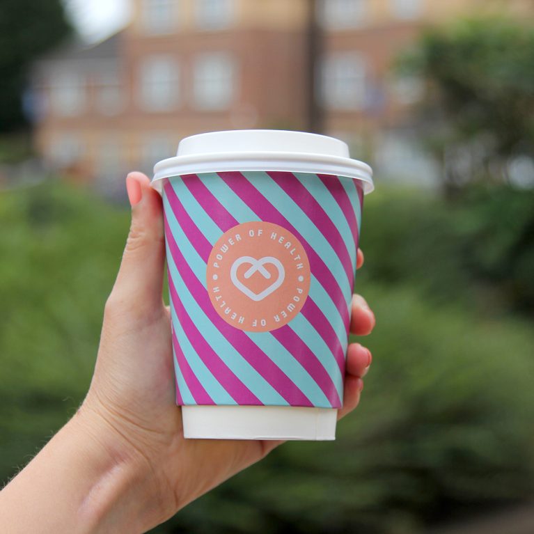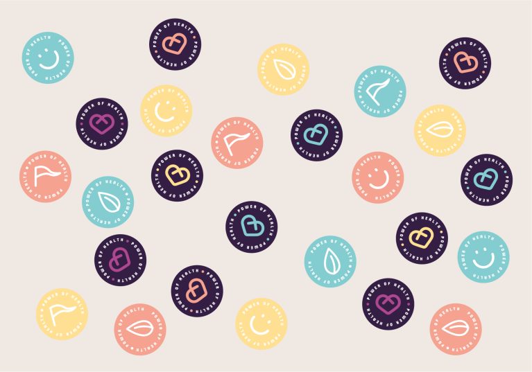
A scatter layout of circular brand seals demonstrates the flexibility of the cafe's secondary graphic assets. These modular round labels serve as dynamic finishing details across a wide variety of unbranded takeaway containers and paper retail bags. This cost-effective branding technique injects casual energy into everyday operational packaging.
The layout showcases a mixed assortment of circular stickers rendering the custom brand iconography across a diverse, wellness-focused color palette. Deep violet seals feature the main intersecting heart logo, while lighter pastel discs in peach, teal, and soft yellow highlight individual line-art icons like leaves and smiley faces. This color and symbol variety allows the packaging system to shift fluidly to denote different product categories or dietary parameters.
The clean white typography and minimalist lines ensure the graphics remain legible when shrunk down onto micro-labels or applied to textured surfaces. Set against a clean neutral background, the collection illustrates how a playful, kit-of-parts graphic approach can create infinite visual combinations. This integrated system bridges the gap between digital asset kits and real-world, fast-paced retail merchandising.