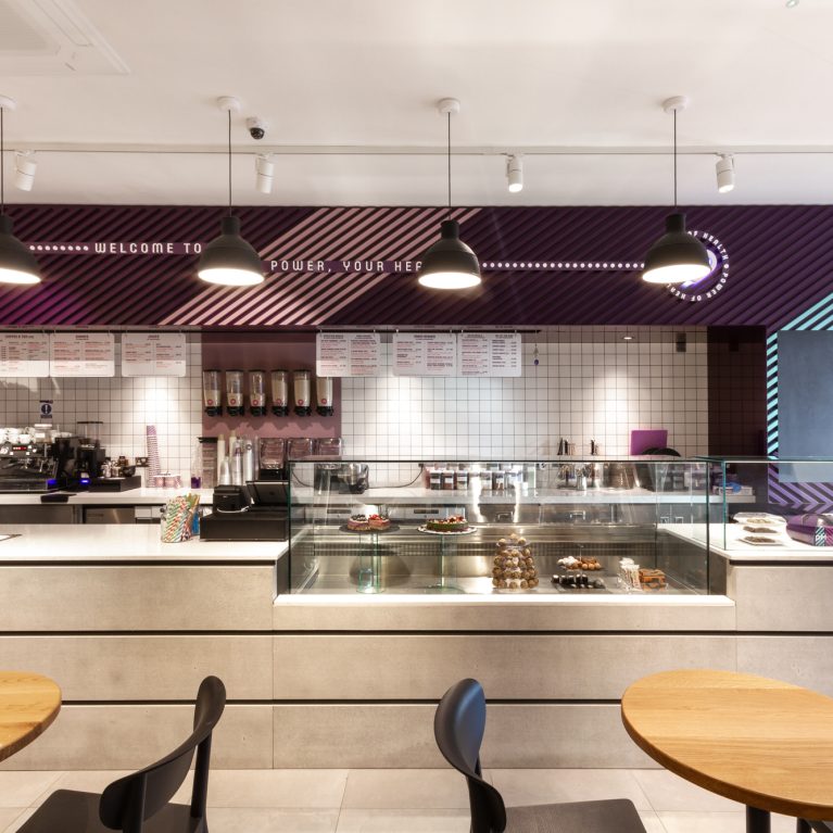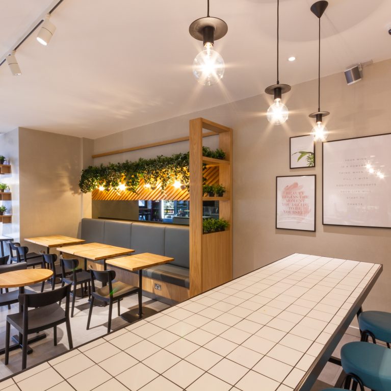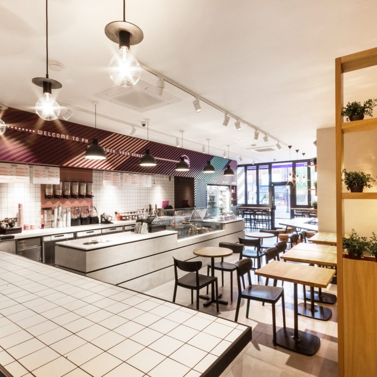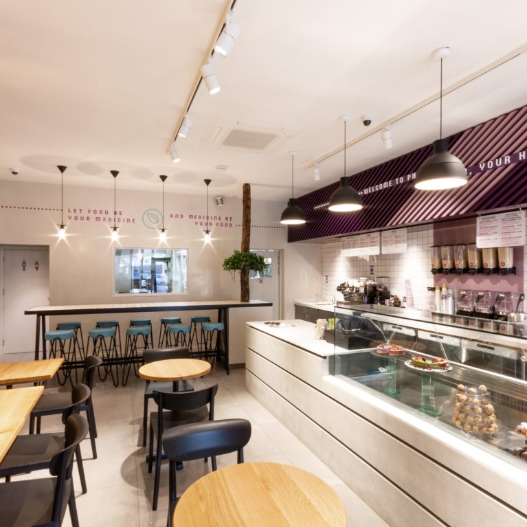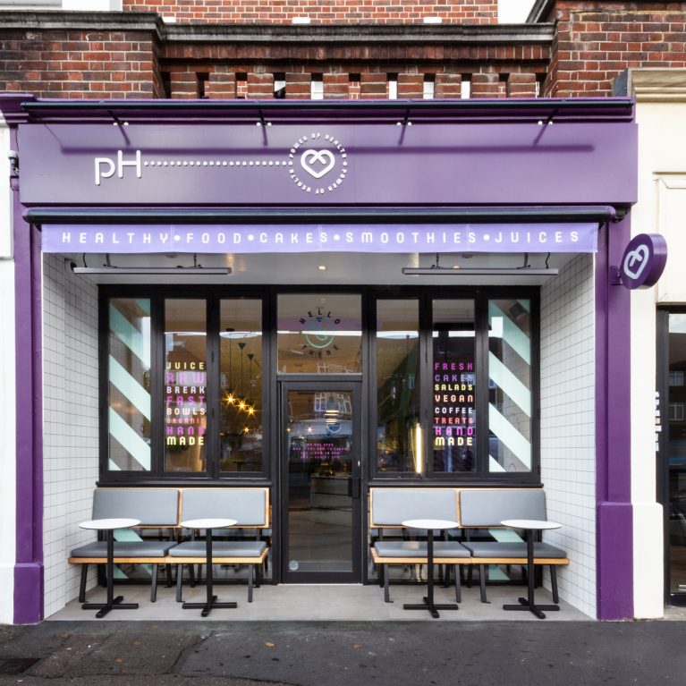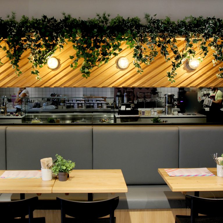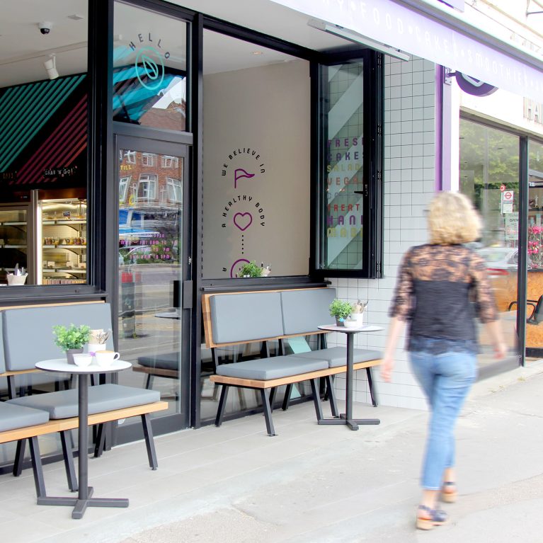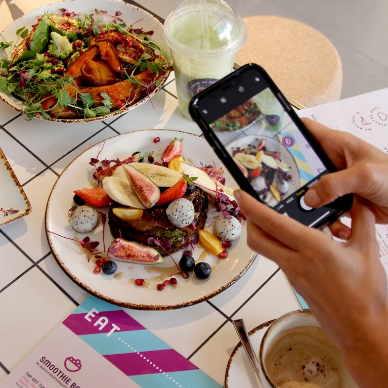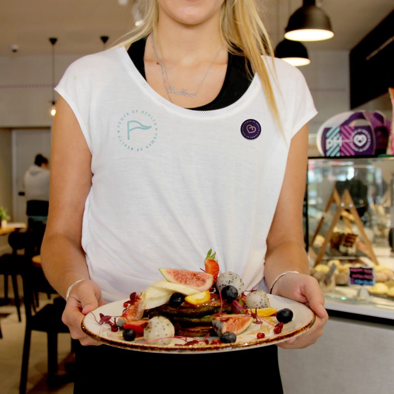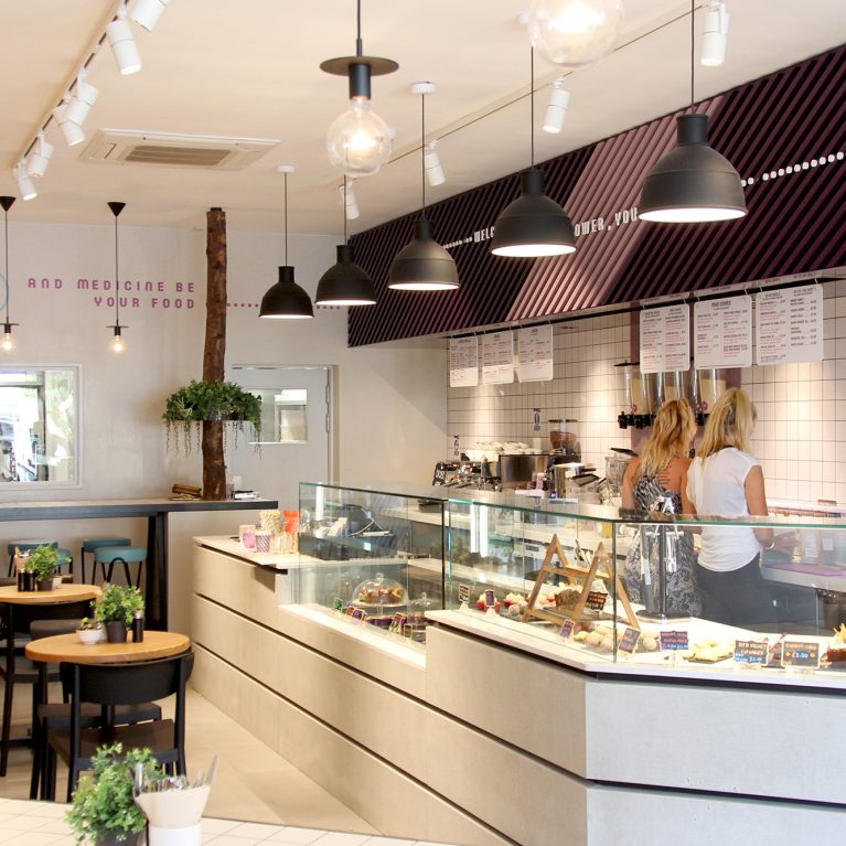
The front-of-house service counter acts as the primary human touchpoint where the brand’s lifestyle message comes to life. By matching uniform colors directly with the interior materials, the design creates a seamless visual connection. This strategy ensures the hospitality team feels like an extension of the space.
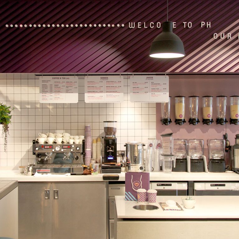
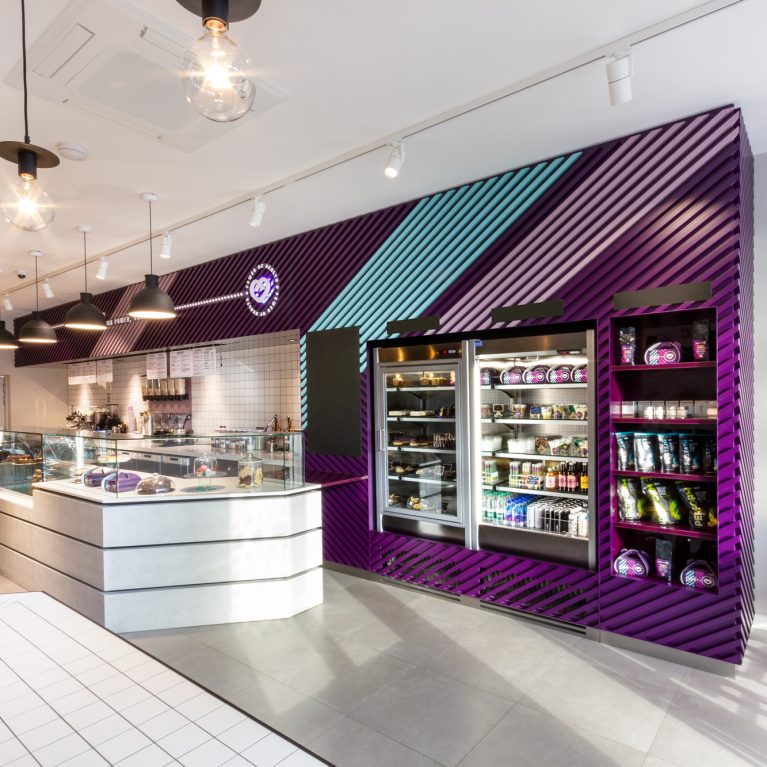
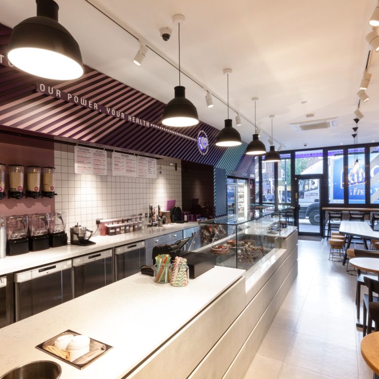
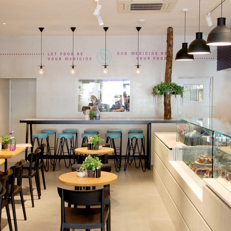
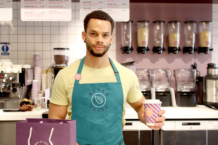
The staff aprons use a rich teal fabric embroidered with the circular brand graphic, linking back to the geometric timber wall accents. This deliberate choice of color breaks up the crisp white grid tiles that line the commercial espresso and blending stations. Behind the counter, a custom purple wall section organizes ingredient dispensers to keep the work area tidy and functional.
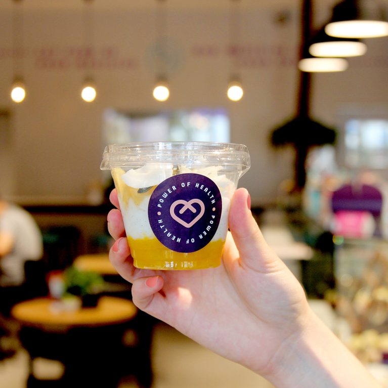
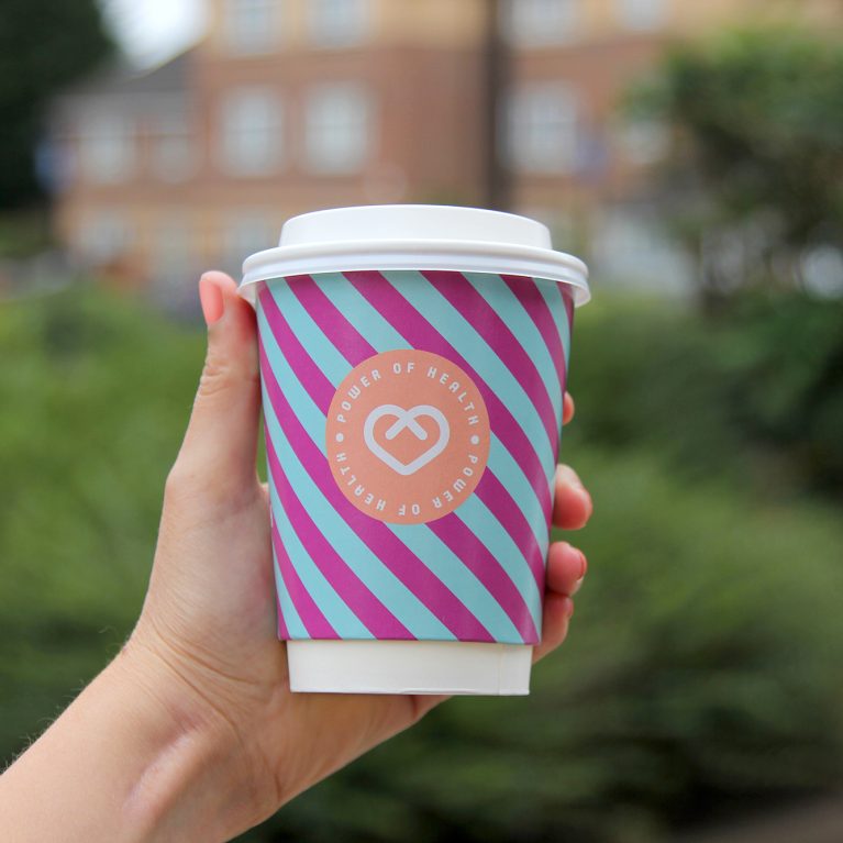
Every piece of takeaway packaging, from the striped paper cups to the violet paper bags, uses the corporate color scheme. This consistent styling turns everyday cafe items into mobile billboards that spread the brand identity beyond the storefront. The mix of durable tiles, organized equipment, and branded packaging highlights a professional, highly polished retail operation.