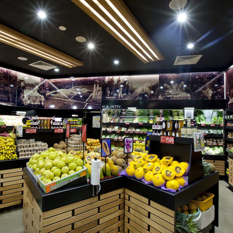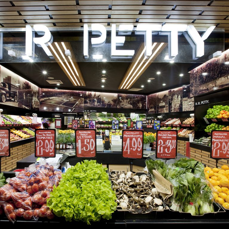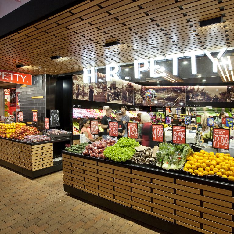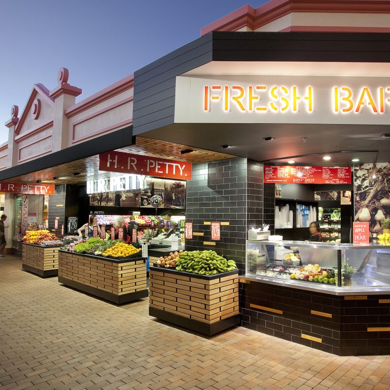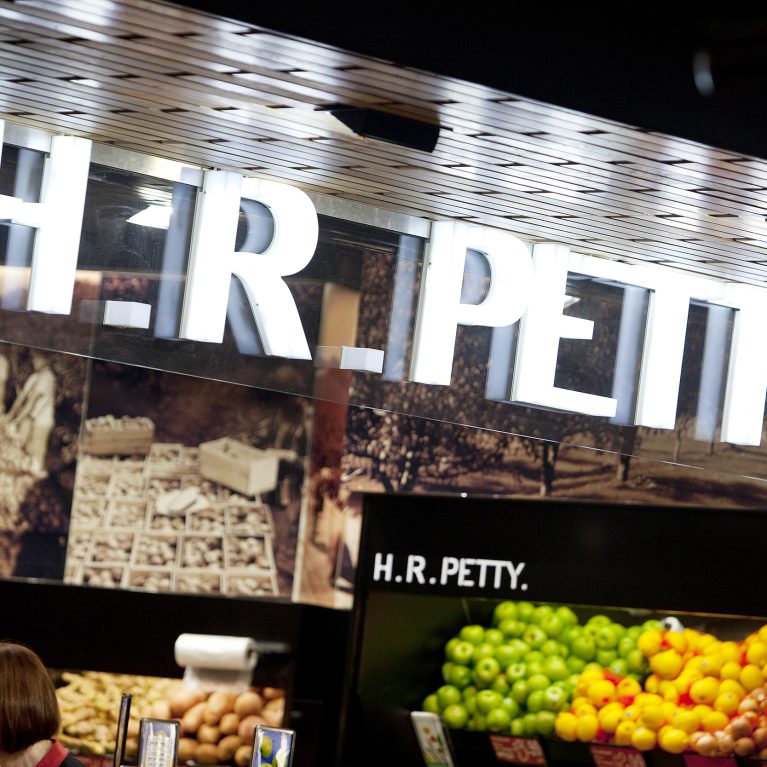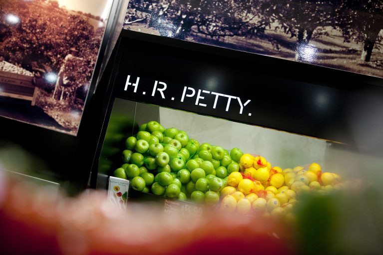
A dark, minimalist display unit highlights the natural colors of fresh apples and lemons by placing them against a matte black background. This simple, cost-effective retail layout uses history-focused imagery and sharp lettering to link the brand's farm roots with a clean, modern store look.
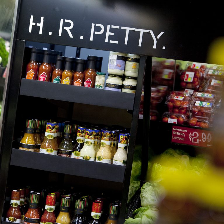
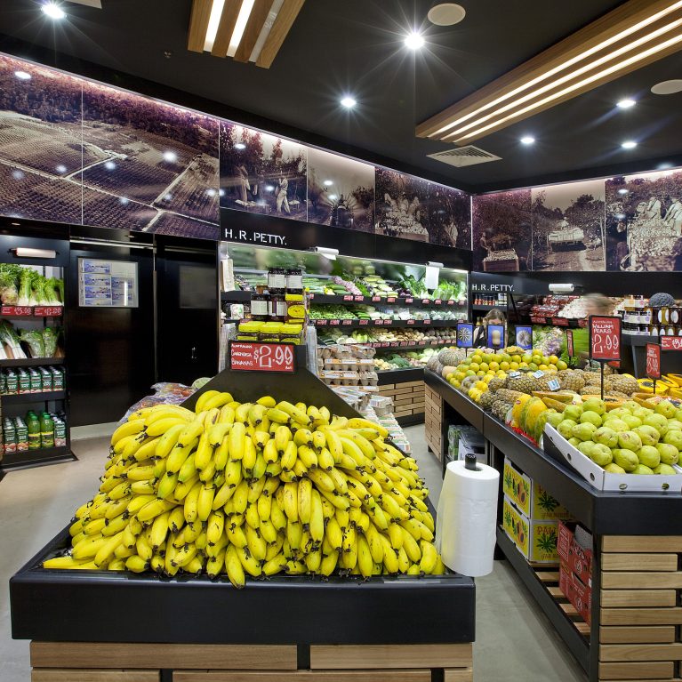
The display feature uses deep black cabinetry panels to create a strong, neutral backdrop that makes the stacked fruit colors stand out. Clean, white block lettering spelling the company name is fixed directly above the produce bin, lit by hidden overhead spotlights that prevent distracting glare on the food below.
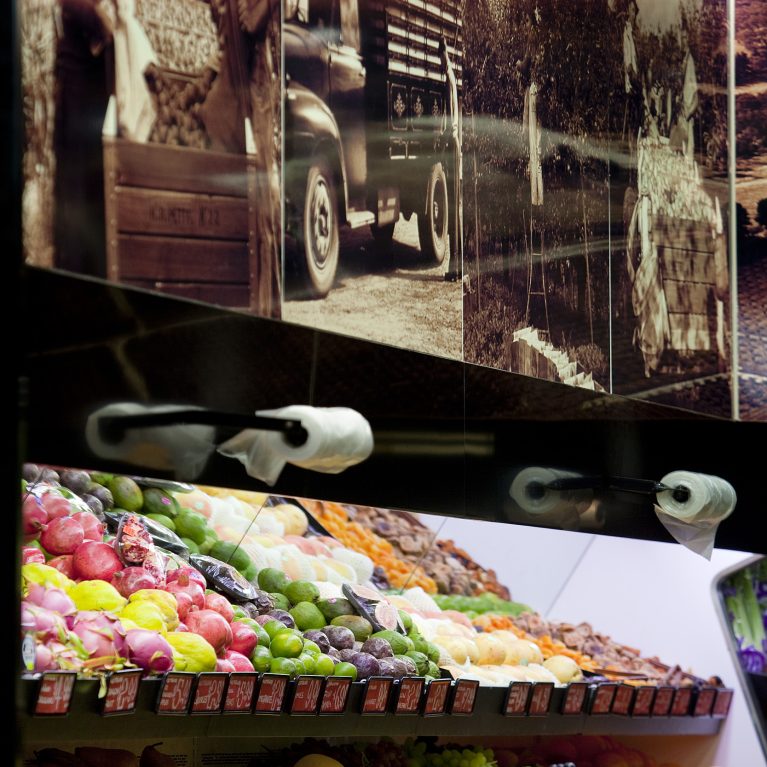
Above the main fruit stand, large black-and-white photographs of the original family orchard farm line the top bulkhead. This thoughtful design element adds an authentic, personal story to the modern retail layout, grounding the commercial space in the brand's long farming history.