HR Petty
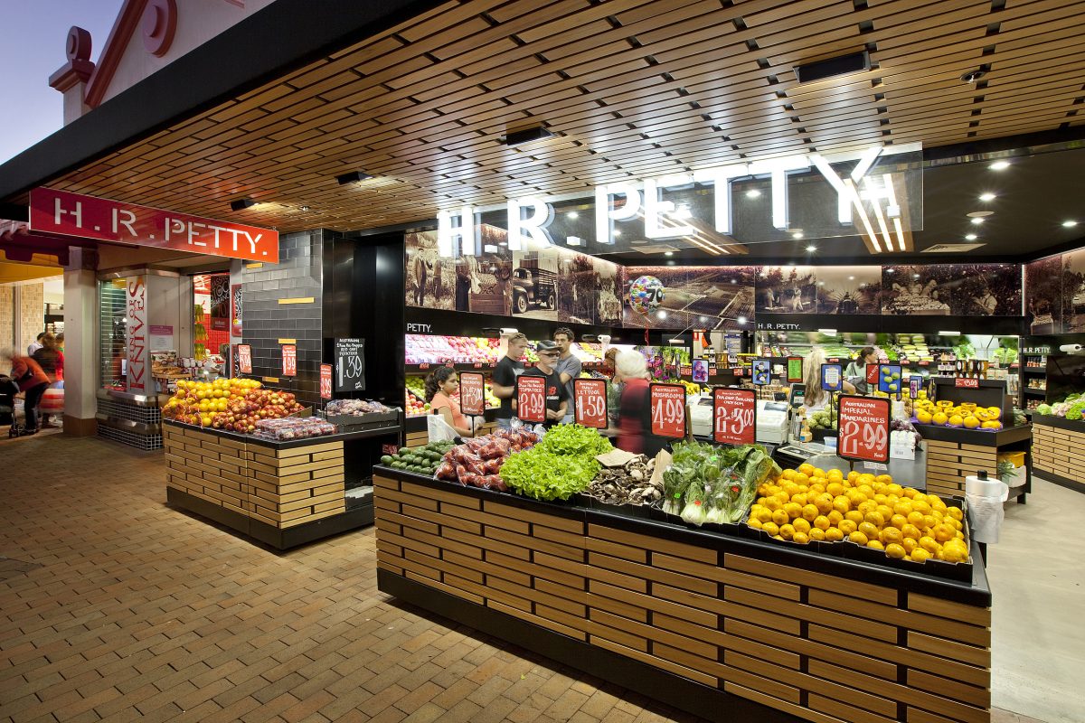
A bright storefront perspective reveals an organized, open layout centered on fresh produce. Large illuminated lettering and timber ceiling details create an inviting entry threshold, balancing a dark background with highly saturated product colors.
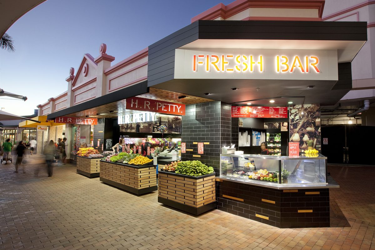
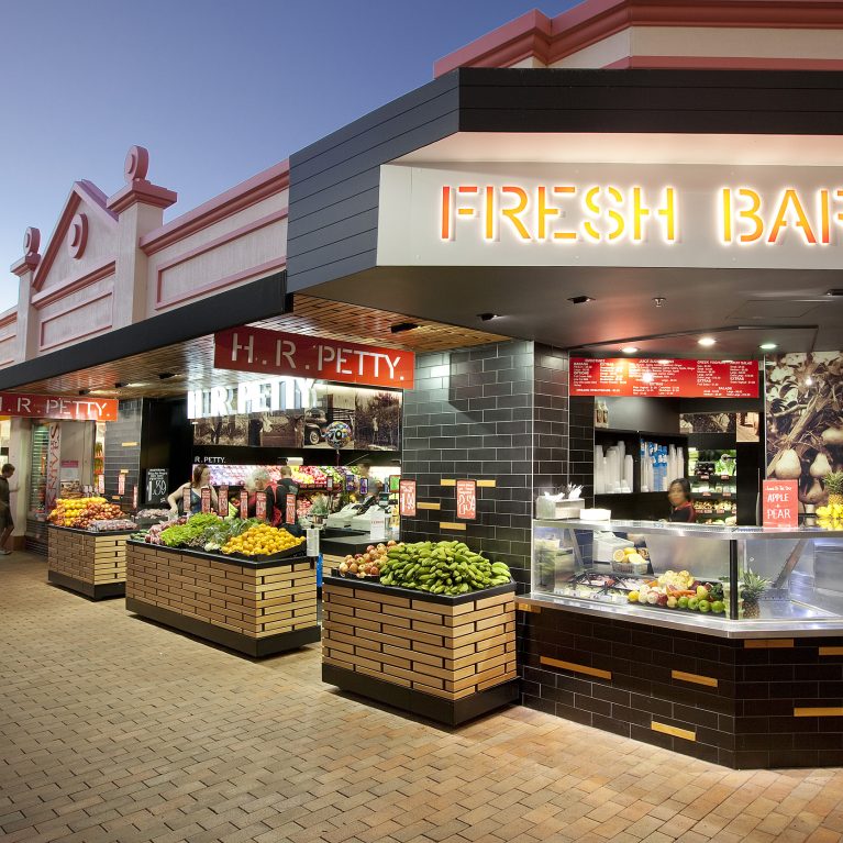
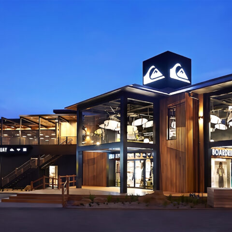
A wide exterior perspective highlights the prominent corner layout of the retail space facing the open-air mall concourse. The architecture integrates an interactive juice bar directly into the storefront boundary, capturing passing foot traffic from multiple directions.
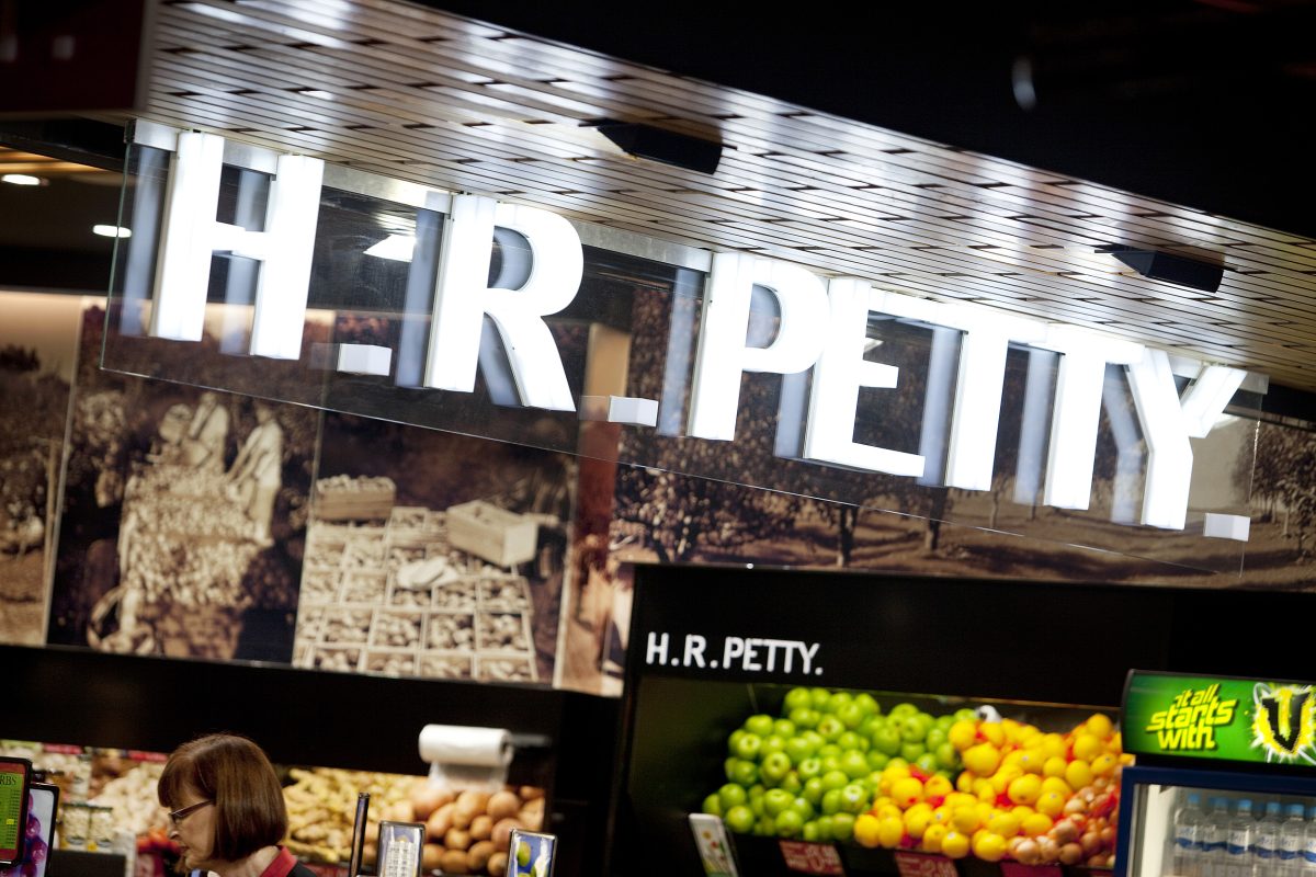
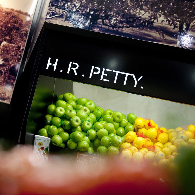
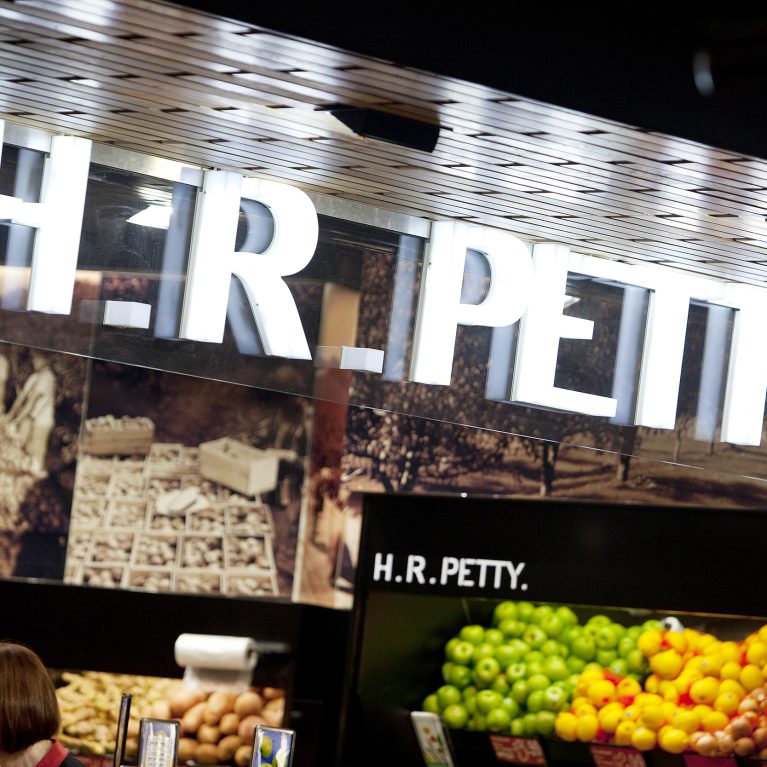
A tight view of the store's entry canopy shows the layered construction of the branding elements. The design positions bright, glowing letters against a textured wood ceiling and vintage imagery to create a clear, high-impact threshold for arriving shoppers.
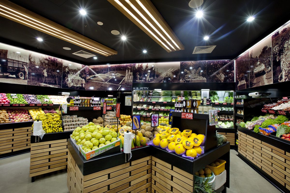
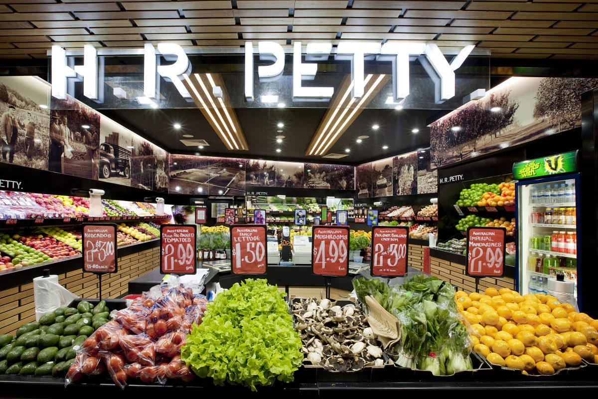
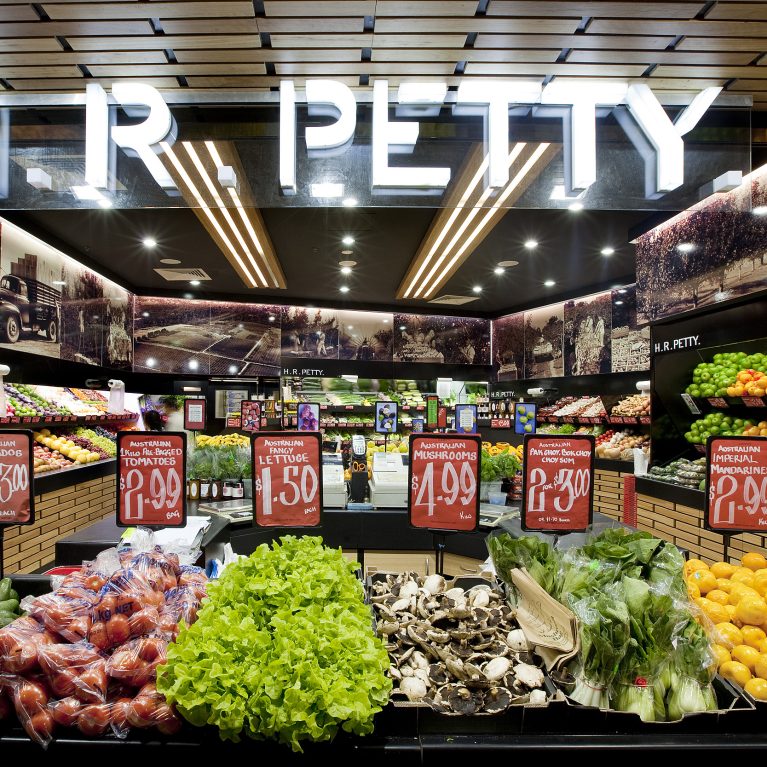
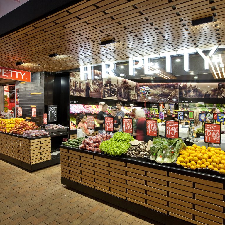
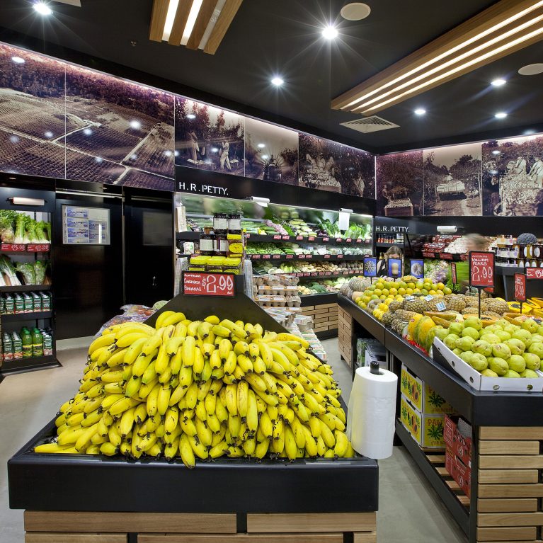
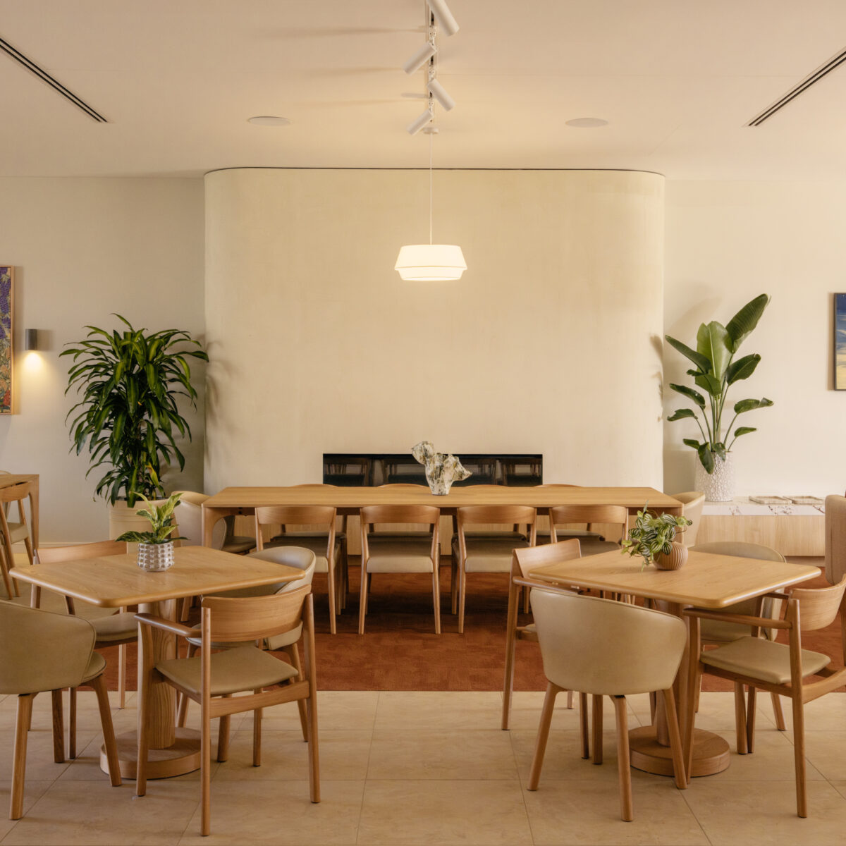
The inner retail floor layout coordinates geometric central display blocks with an expressive overhead lighting setup. This strategic orientation creates a spacious, wrap-around shopping route that guides visitors effortlessly along the colorful produce displays.
An exterior perspective shows how the store's wide, open entrance connects directly with the public mall walkway. The large timber ceiling canopy extends outward, creating a seamless transition that pulls passing foot traffic toward the front produce displays.
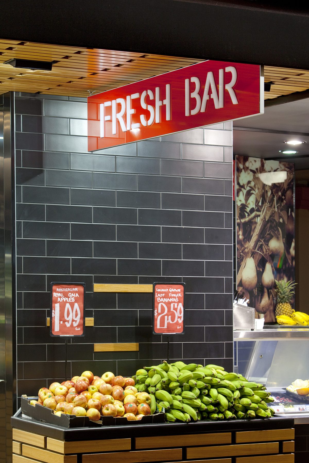
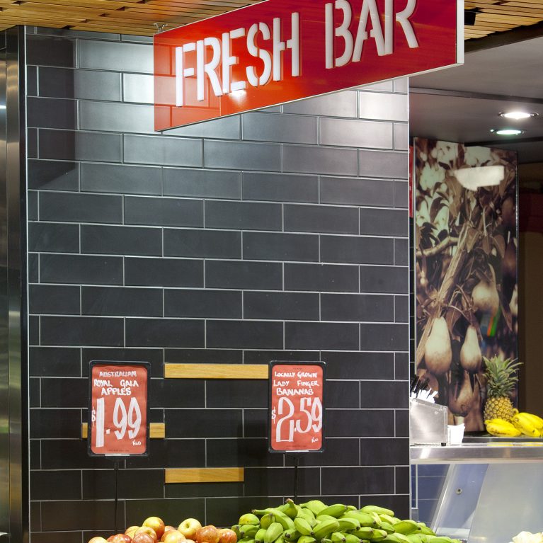
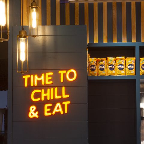
A specialized service node utilizes a dark, textured tile backdrop to anchor the dedicated juice and snack counter. The sharp material transitions help define a clear destination within the open floor plan, drawing customers toward the ready-to-eat produce offerings.
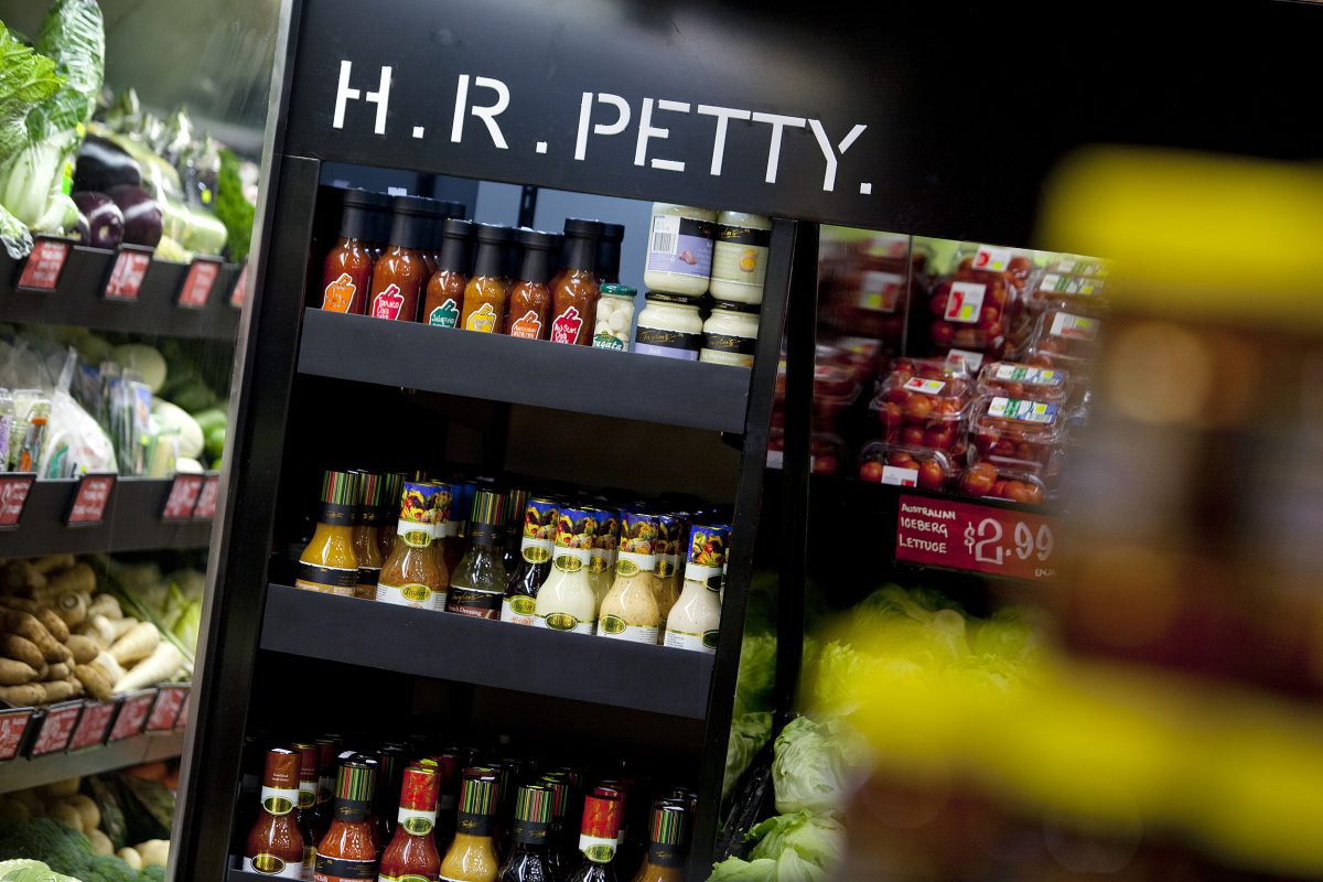
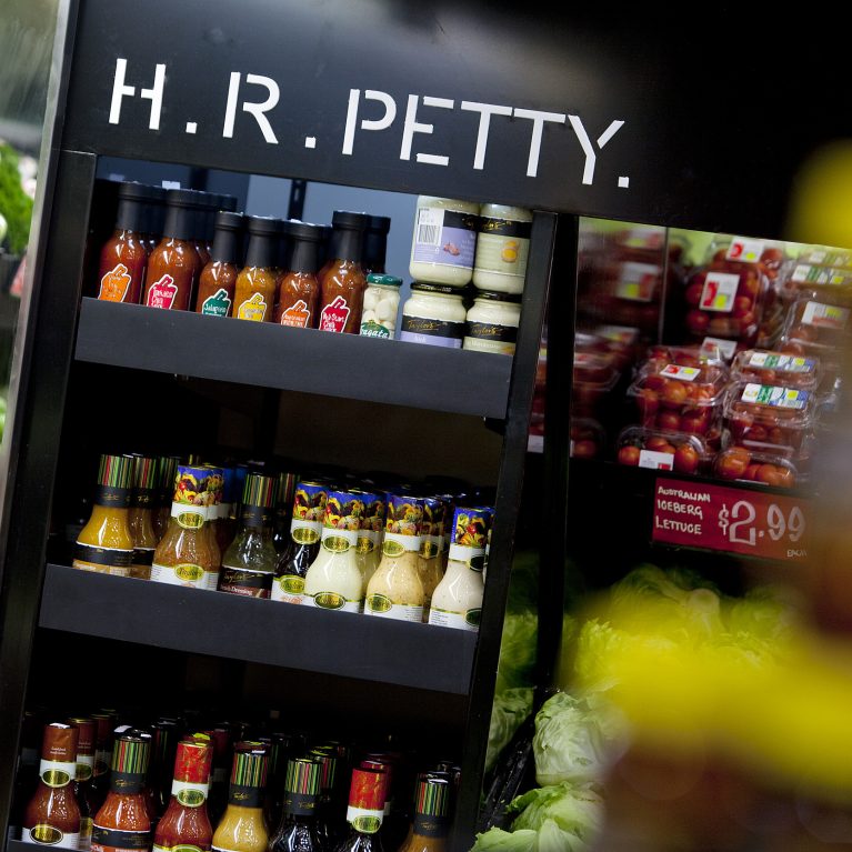
A slim, double-sided shelving tower utilizes a dark finish to organize specialty grocery items efficiently. This clever layout insertion structures the walking paths, giving shoppers quick access to complementary products right next to the fresh produce aisles.
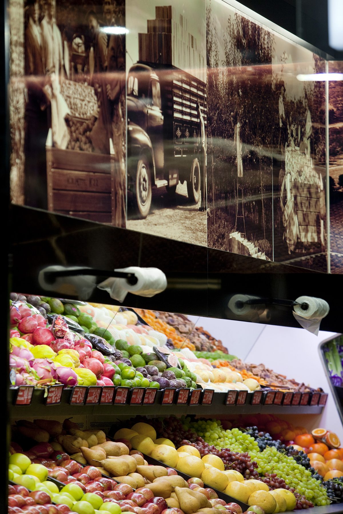
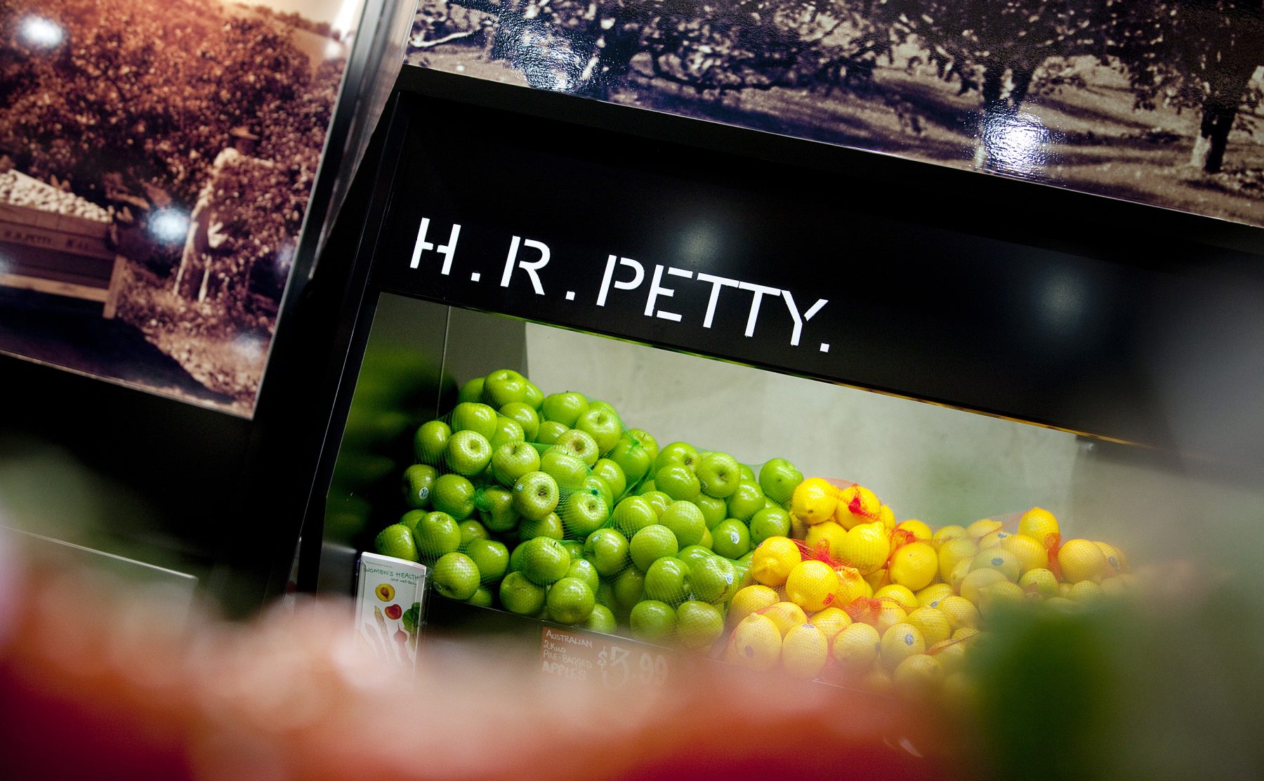
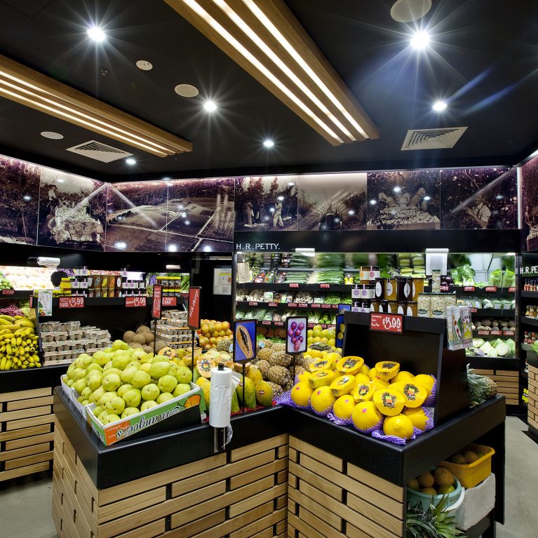
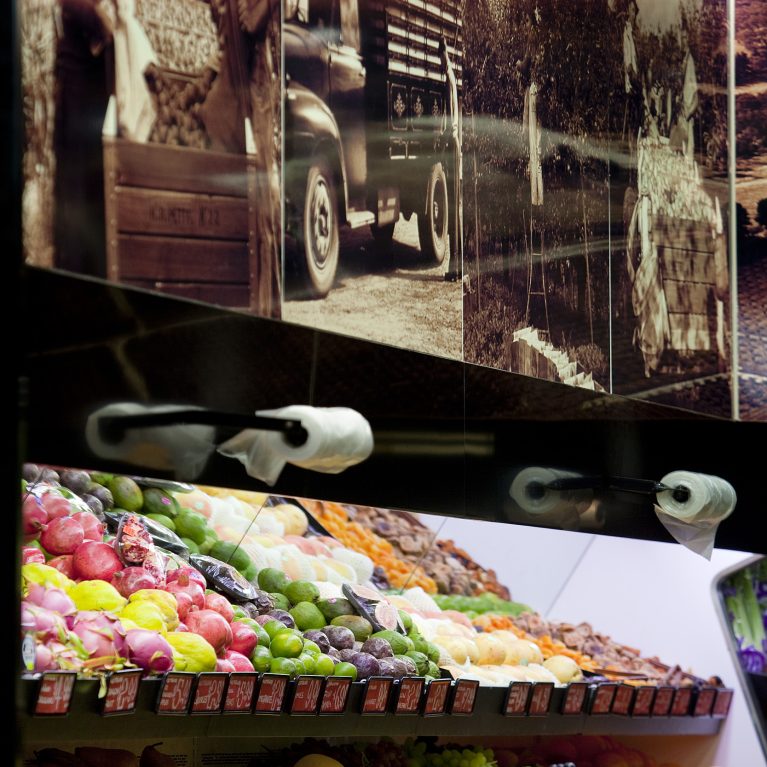
A vertical perspective illustrates how historical farm graphics hang directly above the main fresh produce racks. This layout uses structured lighting to guide the shopper's eye from the brand's heritage down to the vibrant colors of the fresh fruit.
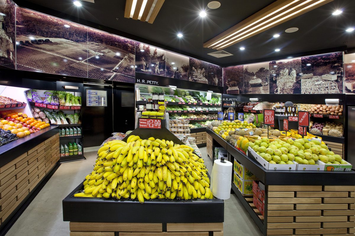
A symmetrical view down the main aisle highlights a central display stand arranged to maximize floor space. The layout uses warm wood textures and balanced overhead lighting to create a spacious path that lets shoppers comfortably view products from all sides.
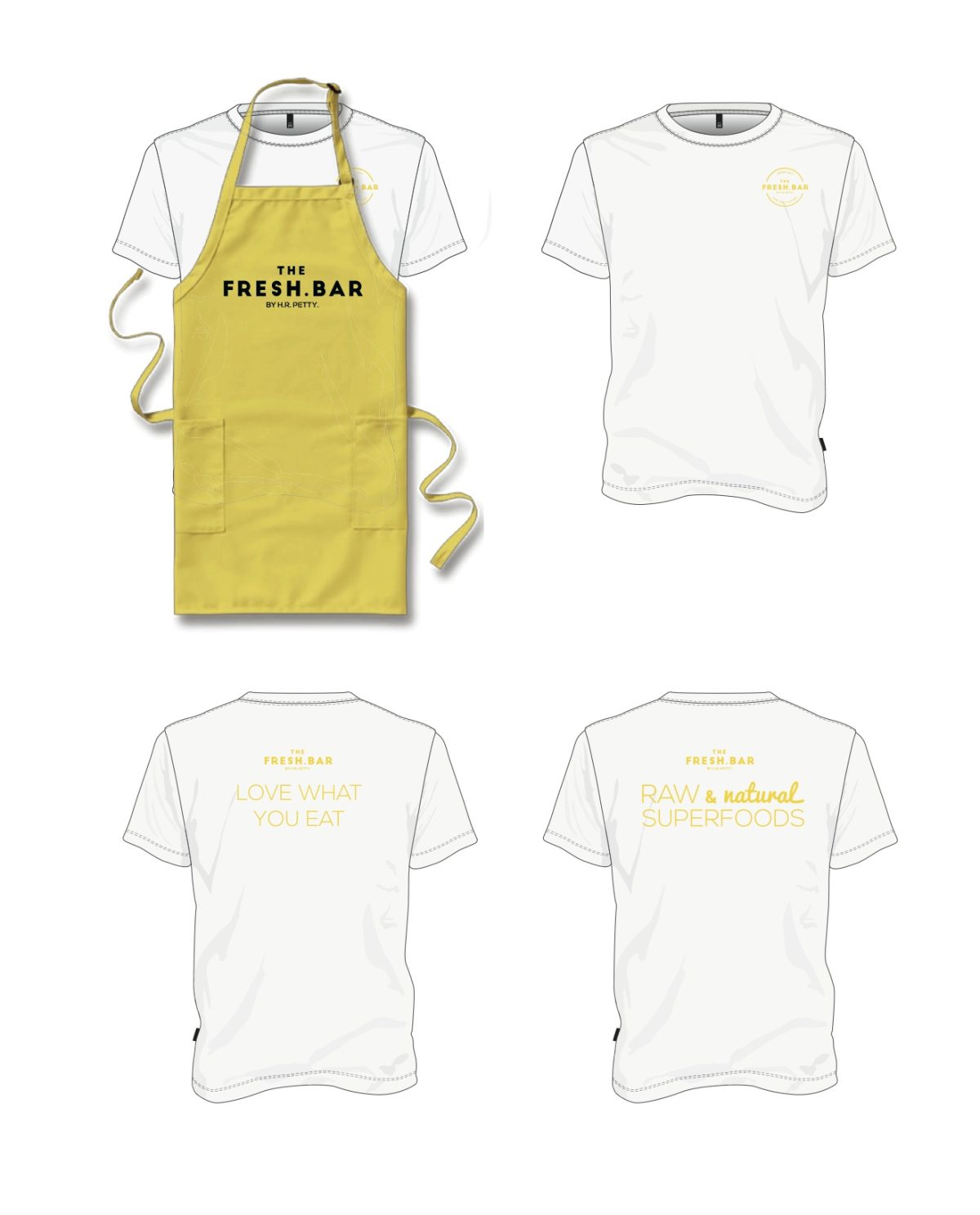
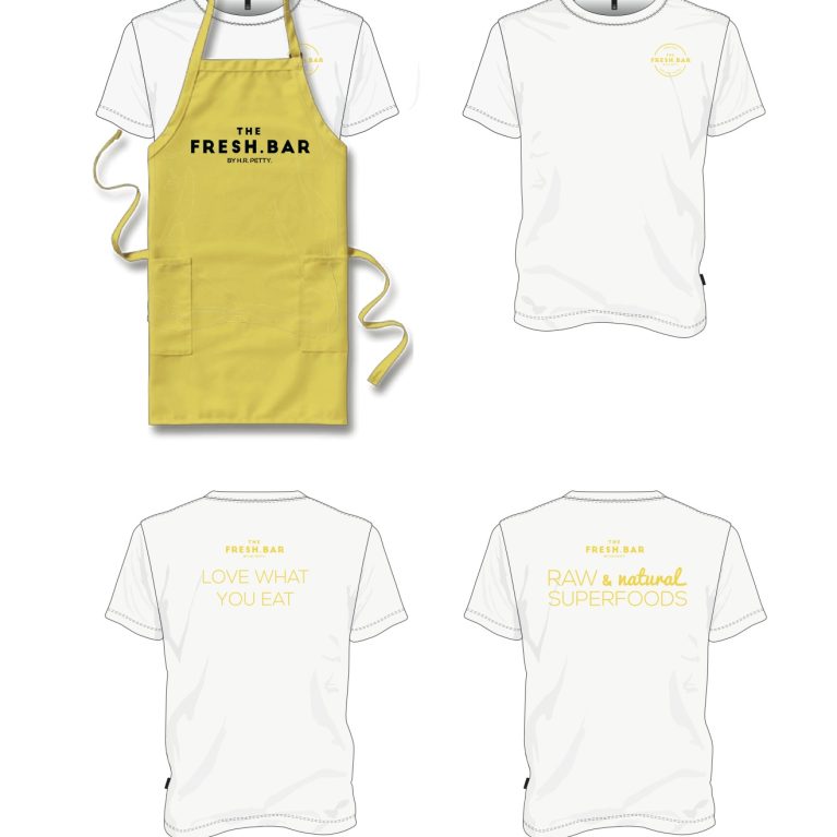
A coordinated staff apparel layout shows how the brand identity translates from the built environment onto employee uniforms. The design uses clean typography and a natural color palette to keep the team's presentation aligned with the fresh, organic style of the store.
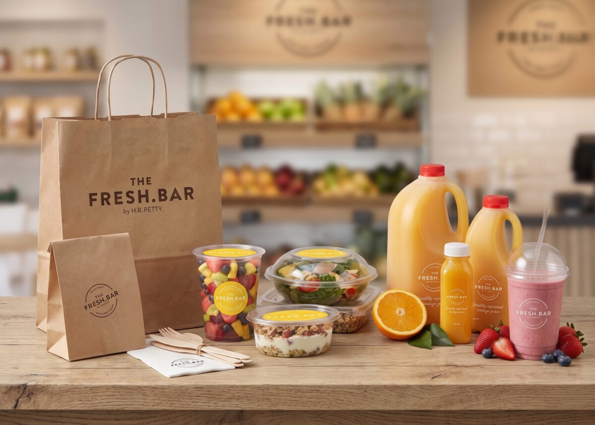
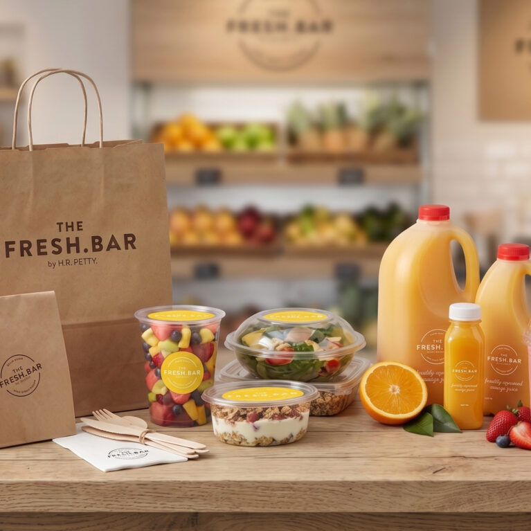
A comprehensive collection of takeaway containers demonstrates how the brand identity extends beyond the store interior to the consumer's hands. The design pairs unbleached, eco-friendly paper items with clear plastic vessels to maintain a clean, wholesome, and professional product presentation.
Project Gallery
The creative process
Lifestyle
With our ultra-cool surfer designers and a diverse mix of multicultural designers across all our studio teams – we deliver international lifestyle concepts from the super cutting-edge game-changers to premium beauty, back-to-basics hardware and luxury homewares. Lifestyle brands demand spaces that embody their ethos. We craft immersive environments that blur the line between retail and […]
Learn more
Visual ID
Design Clarity often asks at the start of the design process- who is your brand? Does it convey the right message to your customers? Do you like what your brand looks like and what it represents? Ok… let’s look at re-branding or refreshing your visual identity… We do everything from name & logo generation to […]
Learn more
You may also like

London
The Ministry,
79-81 Borough Road,
London SE1 1DN, United Kingdom
44 20740 36132
Sydney
Level 3, 223 Liverpool St
Darlinghurst NSW 2010 Australia
61 29319 0933