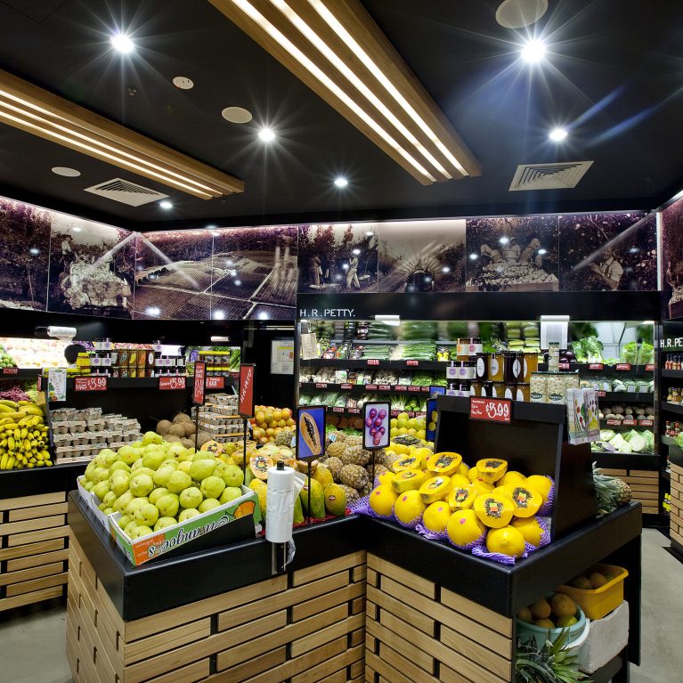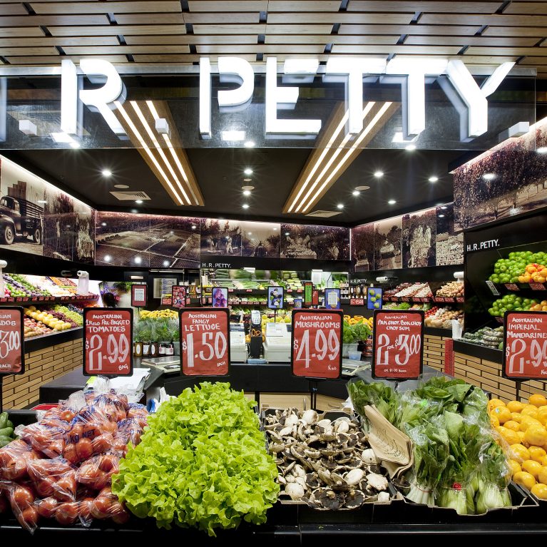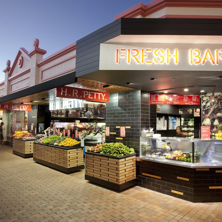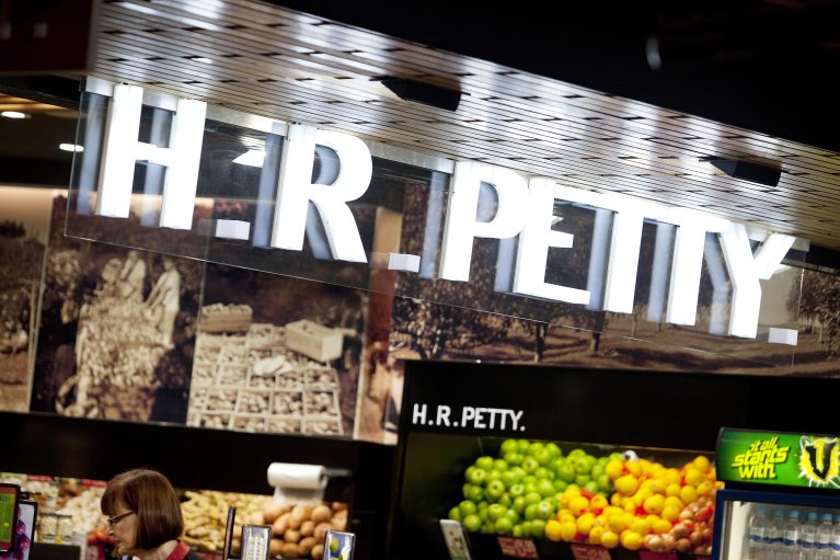
A tight view of the store's entry canopy shows the layered construction of the branding elements. The design positions bright, glowing letters against a textured wood ceiling and vintage imagery to create a clear, high-impact threshold for arriving shoppers.
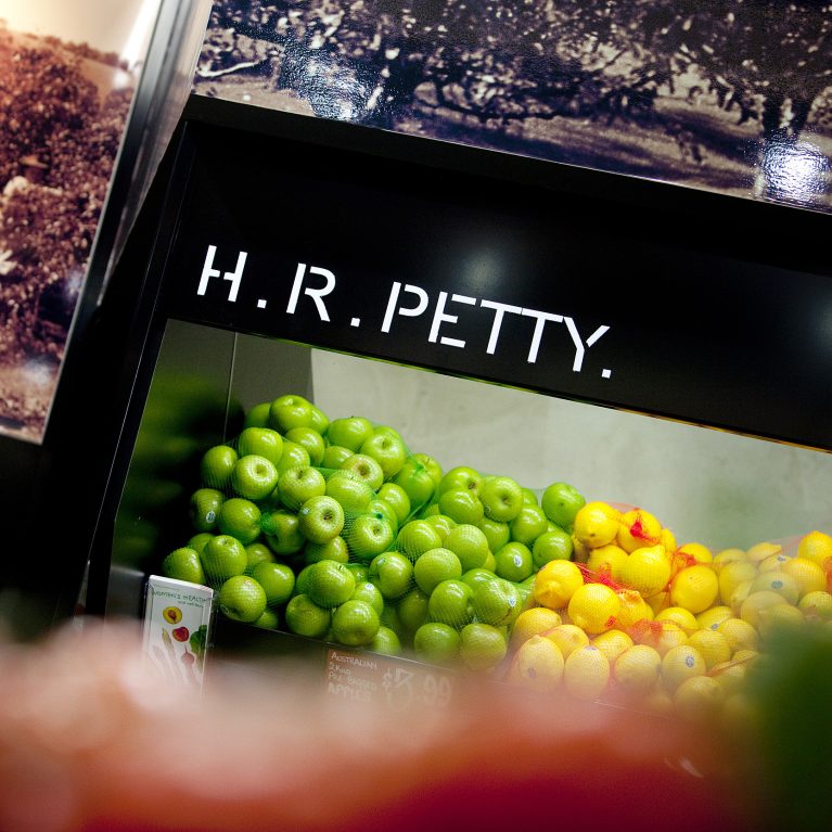
The primary identity uses thick, white acrylic block letters that are lit from within to create a crisp, shadow-free glow. This glowing sign is suspended just below a warm timber baffle ceiling, which introduces a natural texture that breaks up the surrounding dark, open-grid framework.
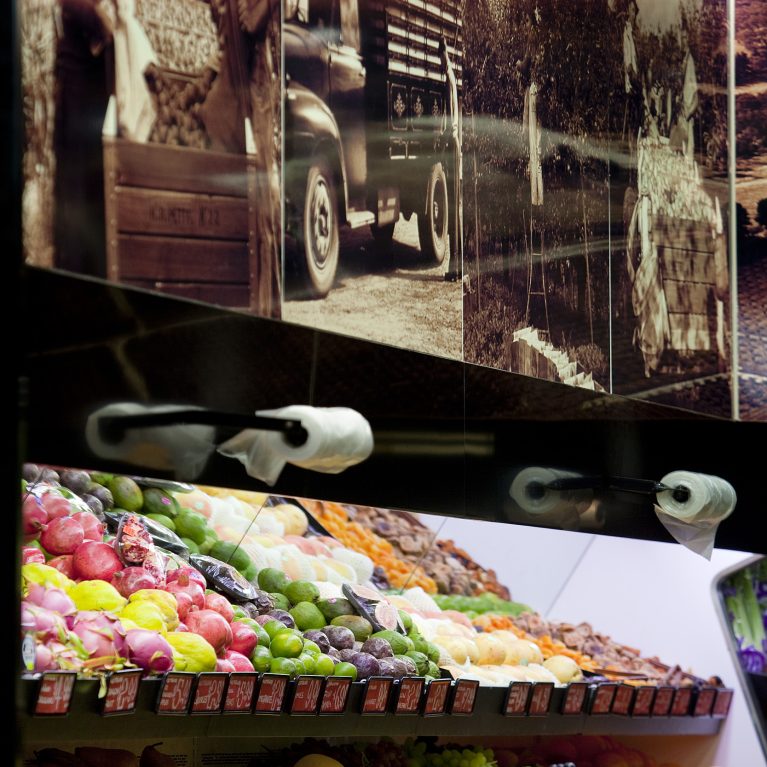
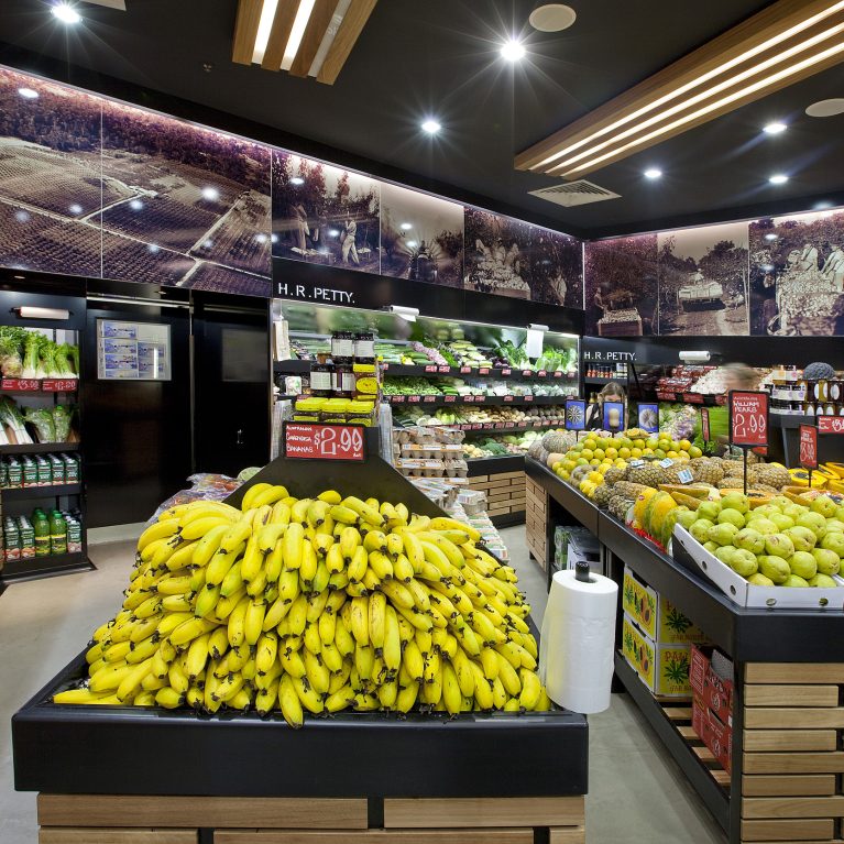
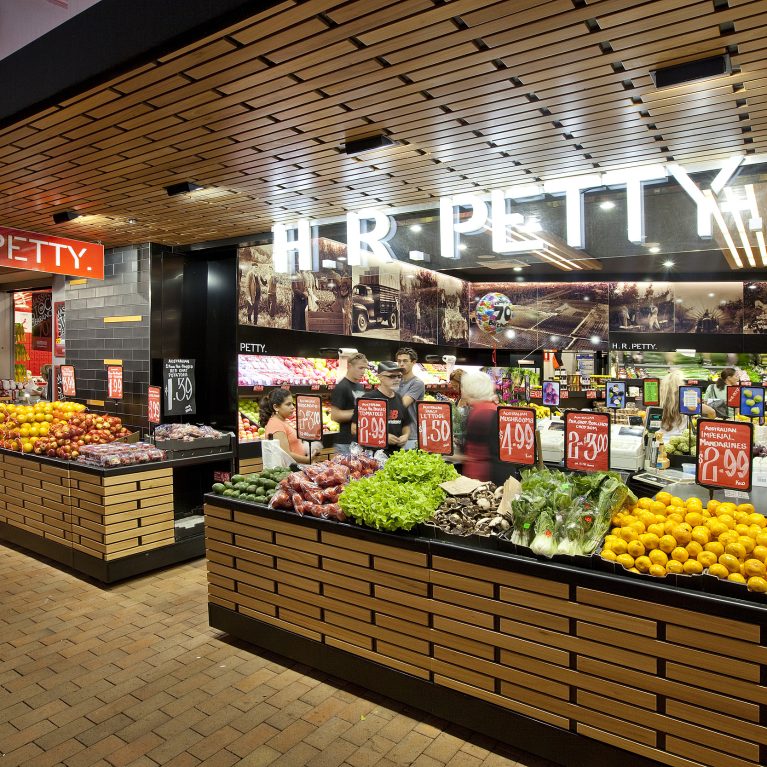
Directly behind the illuminated logo, a continuous band of sepia-toned historical photos wraps across the upper wall bulkhead. This graphic layer sits directly above the lower matte black display stands, forming a visual bridge that links the company's heritage with the clean lines of the modern sales floor.