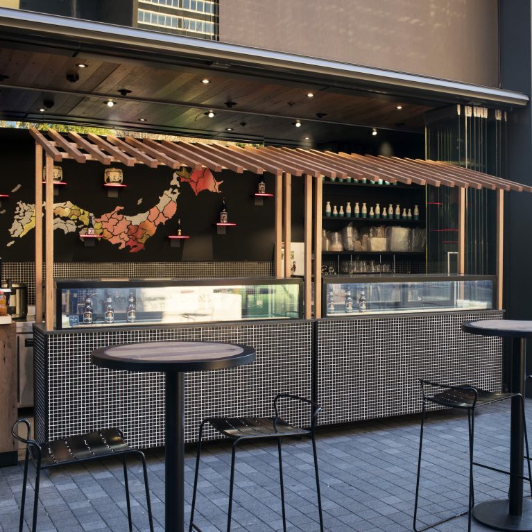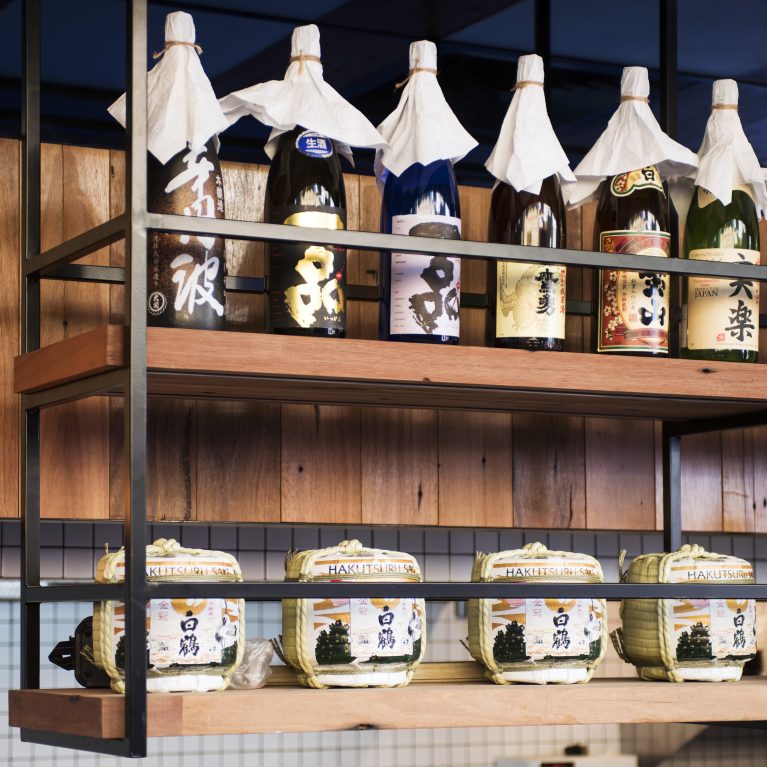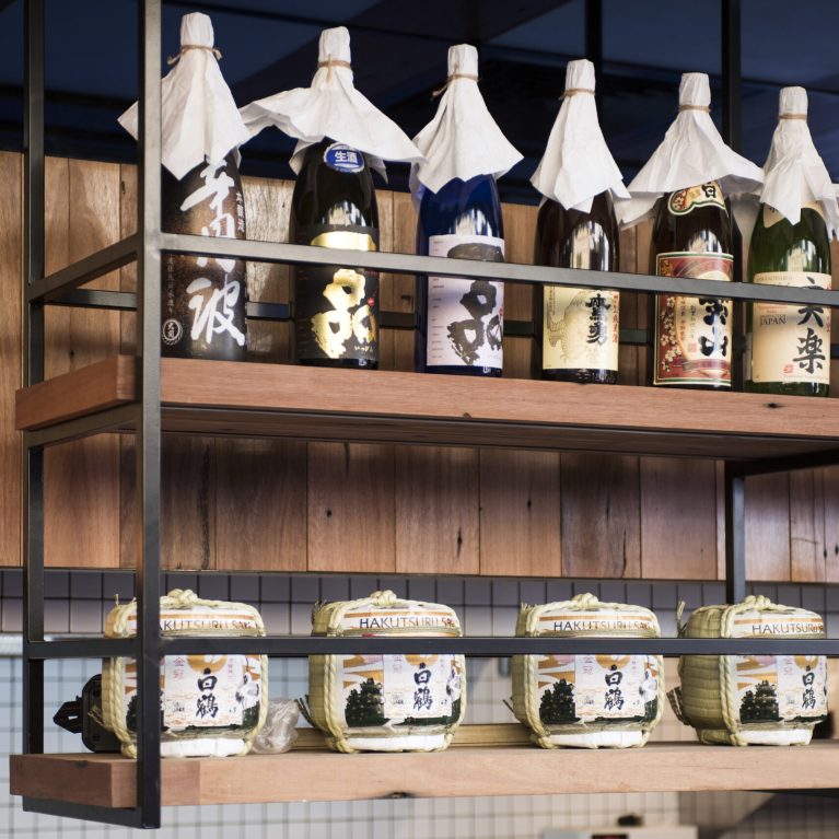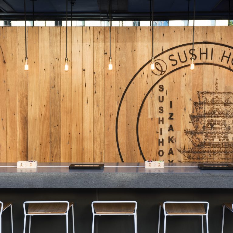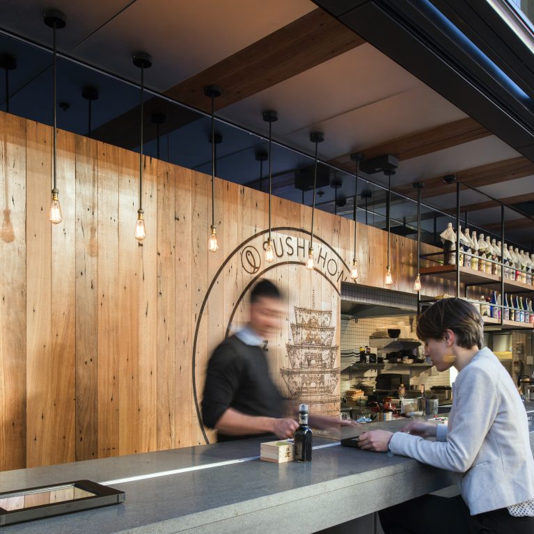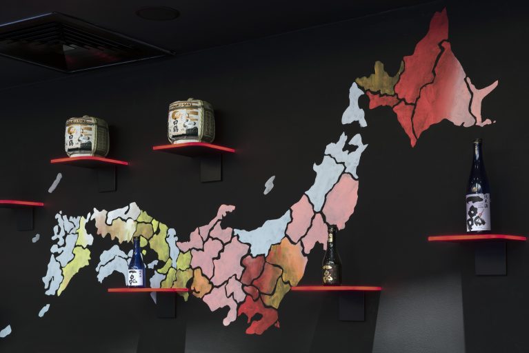
A dedicated cultural display wall uses colorful cartography to communicate the geographical origins of the restaurant's premium beverage menu. By layering floating retail shelves directly over an illustrated map outline, the design turns an empty wall into an educational customer touchpoint. This interactive installation deepens the authentic izakaya experience by anchoring specific sake varieties to their local regions.
The matte black perimeter wall serves as a high-contrast backdrop for a custom painted map of Japan, segmented into distinct regional boundaries. Each region utilizes a unique watercolor gradient—ranging from deep crimson and pastel pink to soft earth tones and pale blues—adding artistic texture to the dark room. Thick black outline details ensure the map reads clearly from a distance, pulling the eyes of diners toward the display.
A series of floating timber shelves painted in a vibrant, lacquer-red accent color project from the wall to hold authentic hospitality inventory. The upper shelves showcase traditional ceramic sake casks wrapped in woven straw, while the lower ledges display premium sake bottles positioned right beside their home provinces. This combination of curated product placement, bold graphic mapping, and floating joinery turns a standard partition into an engaging piece of visual storytelling.