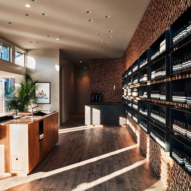
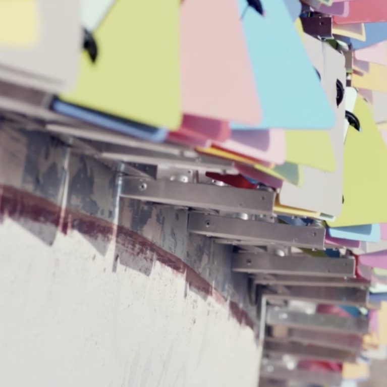
Upon hearing that Aesop’s latest Nolita store was built on 400,000 strips of paper— well, actually the paper, New York Times— we feared that someone could easily huff, puff, and…
Upon hearing that Aesop’s latest Nolita store was built on 400,000 strips of paper— well, actually the paper, New York Times— we feared that someone could easily huff, puff, and…
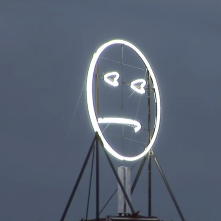
This is emoji writ large. The Fühl-o-meter/Public Face is an interactive art installation that calibrates the mood of the city in which it has been erected with a monumental illuminated…

In this year’s Christmas celebration, Design Clarity Sydney took to the golf course in search of a hole in one, an eagle, a birdie, or anything else we could find….
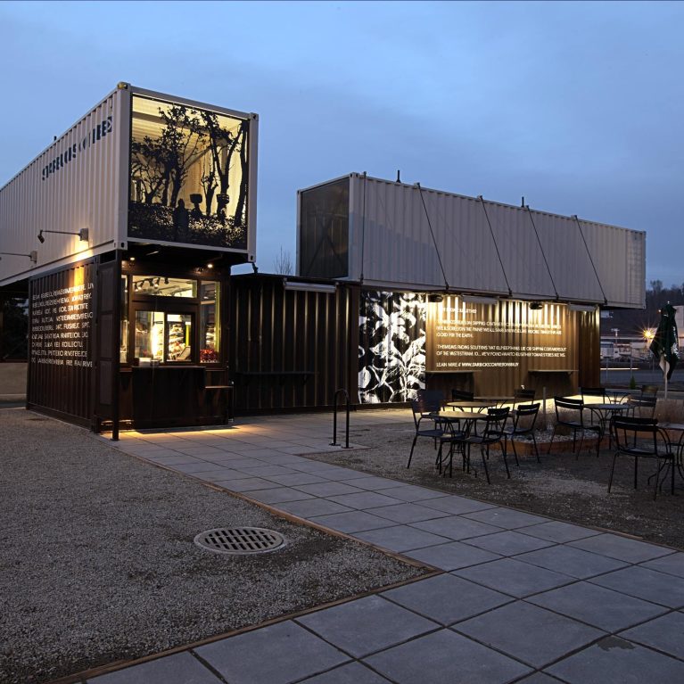
If you happen to be passing through Tukwila, Washington, make a pit stop at Starbucks’ brand new reclaimed shipping container coffee shop. The first in what could possibly be a…
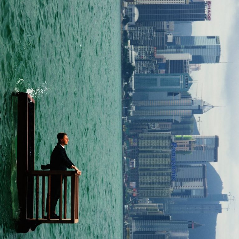
French artist Philippe Ramette believes nothing should ever be fake. His impossible, gravity-defying poses might look like classic Photoshop, but look a little closer and you’ll see evidence that it’s…
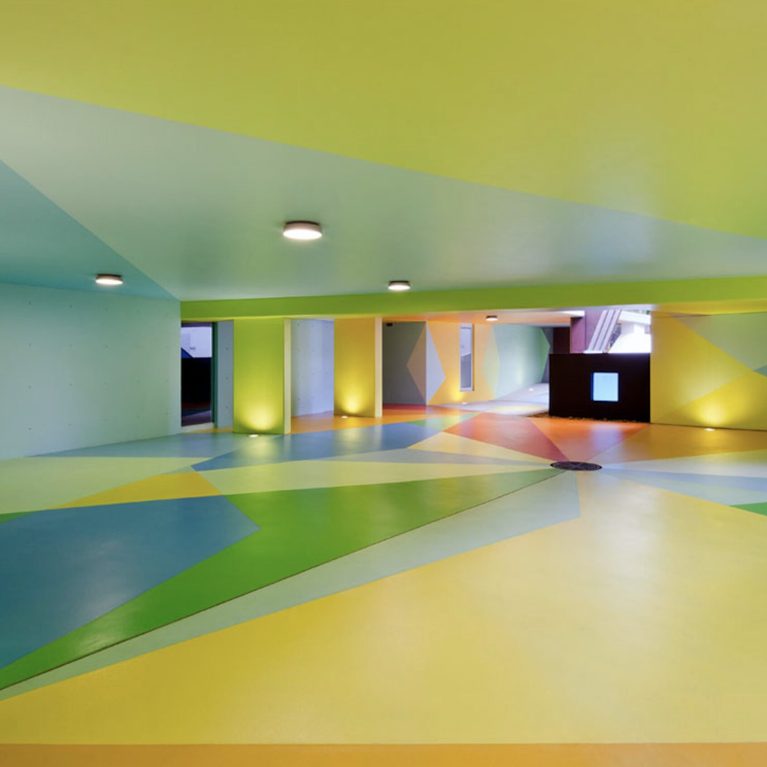
If you ever chat with someone who declares that environment conscious architecture can’t be a beacon of bold, colourful design, direct them to the Pixel Building in Melbourne, Australia. The…
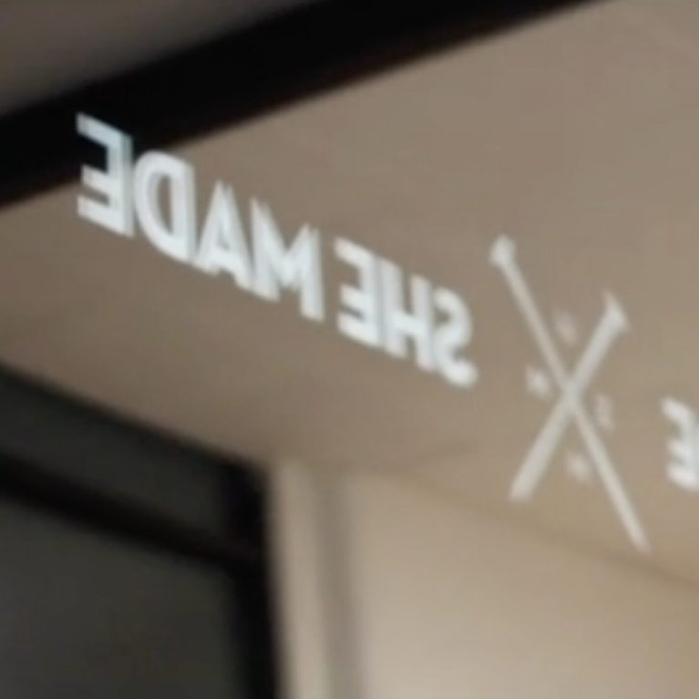
Design Clarity alumni Bent Patterson and Laura Kepreotis recently joined creative forces with two fellow designers to form Sydney-based collective “He Made She Made”. Situated in Darlinghurst, their soon-to-be-open gallery…
Channel 4′s “intelligent” sister-channel, More4, has undergone a stylish metamorphosis at the hands of London-based design and motion graphics studio, ManvsMachine. With an effervescent colour palette reflecting the vibrancy of…
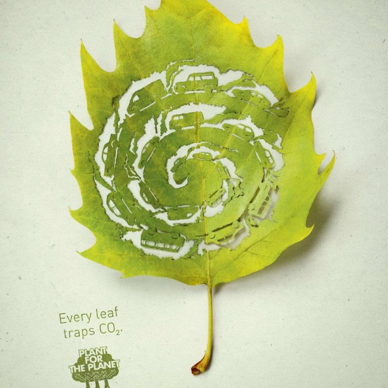
A wonderfully executed ad campaign by Legas Delaney Hamburg for Plant for the Planet, using cut leaves symbolizing their ability to absorb CO2. Beautiful work….
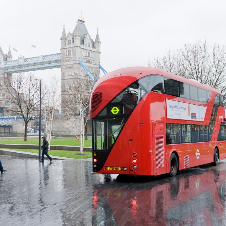
British designer Thomas Heatherwick has updated the look of London’s trademark busses – which date back half a century – to give them a modern edge. ‘It has been 50…
Cornea shattering, iris exploding; Craig & Karl‘s latest large-scale mural literally rips your eyeballs from their optic nerves and smashes them around with colourful fury and rage. 72DP – as…
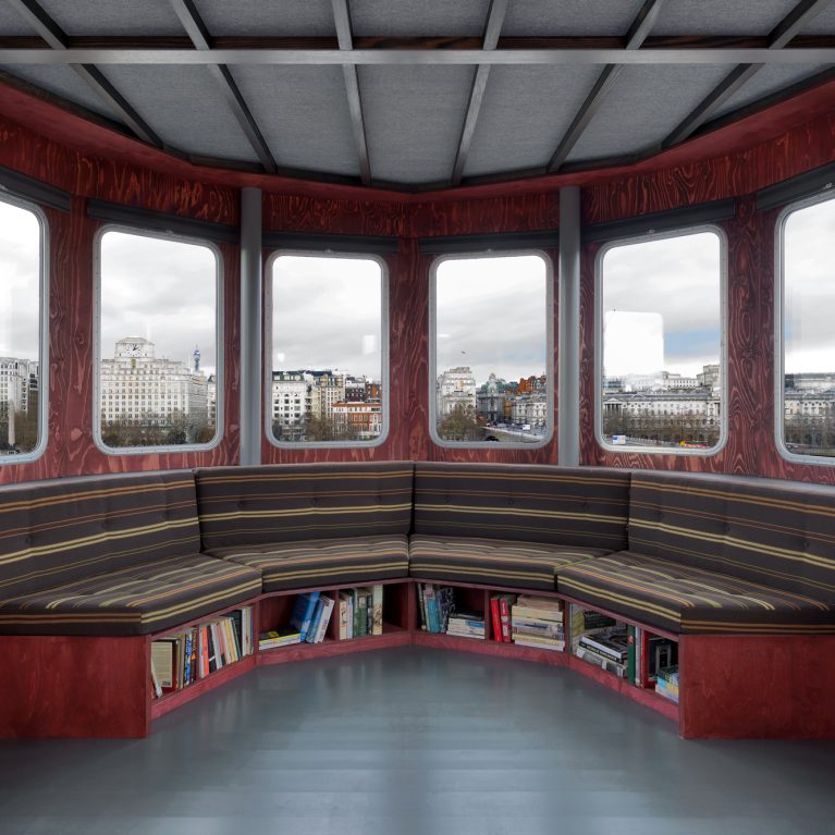
High up on the roof of Queen Elizabeth Hall, South Bank, a small vessel will perch throughout 2012. Described as an observatory, a retreat and a studio, ‘A Room for…
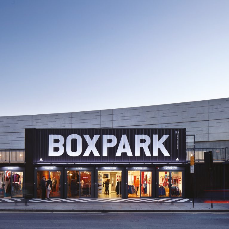
Boxpark in London’s Shoreditch brings ‘more than sixty carefully chosen fashion, arts and lifestyle brands’ to the derelict land around the similarly blocky Shoreditch station. The concept is simple and…
Looking for a break from the London cold to the even chillier Amsterdam the team at DC London stumbled across the following… Located at Amsterdam’s Damrak, hotel The Exchange opened…
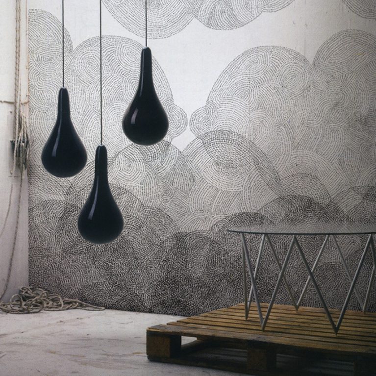
Minakani, is the Paris-based studio by Frédéric Bonnin and Cécile Figuette, who create wonderful whimsical patterns, mainly for textile but not exclusively. 2 years ago, they’ve launched their walldecor offering…

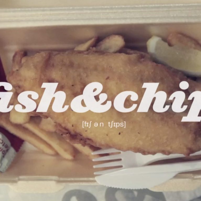
Mobile Vendors High streets cluttered with chains are meaning opportunities for street food, pop-ups and food trucks. Little capital, resources, or planning are required. Chefs have greater freedom to try…
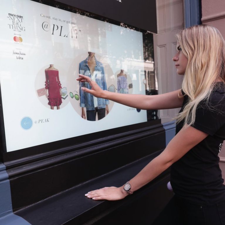
Sportsgirl has created an integrated shopping experience with the launch of its brand new digital concept, ‘Window Shop’. Melbourne consumers can now shop the windows of the infamous Chapel St…
We get very excited when we see great typography! And we get even more excited then we see a great mix of typography, photography and videos like in this amazing…

Canadian Designer and Illustrator Jag Nagra created these gorgeous characters for a Depression-Era Circus Tea Party he organised with his friend Angela Stephen-Dewhurst for their friends! The World’s Strongest Man,…
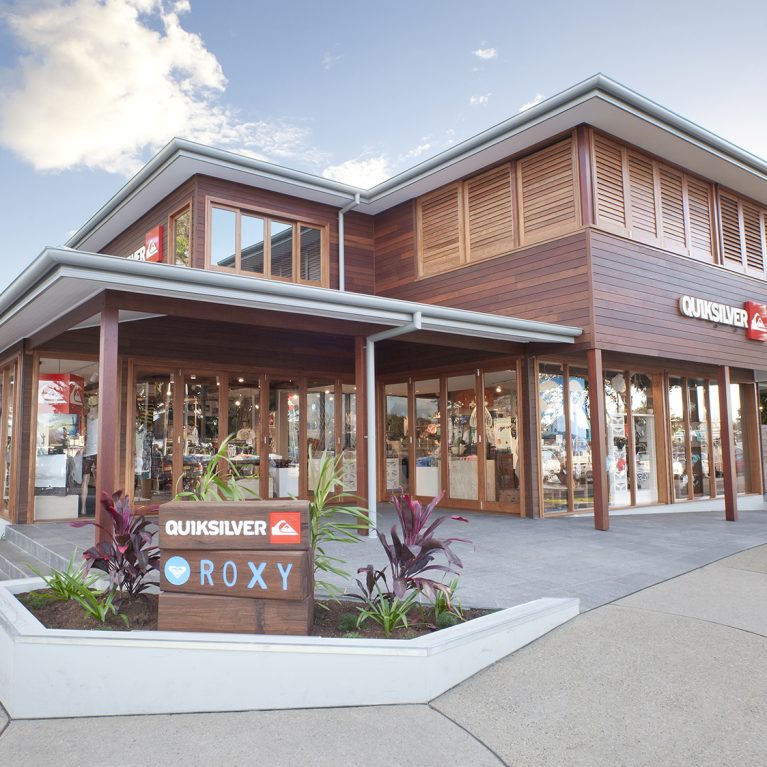
The Design Clarity team is very excited to see the new Byron Flagship Store opening up it’s doors to the public last Monday. We’re extremely thrilled to see the great…
London
The Ministry,
79-81 Borough Road,
London SE1 1DN, United Kingdom
44 20740 36132
Sydney
Level 3, 223 Liverpool St
Darlinghurst NSW 2010 Australia
61 29319 0933