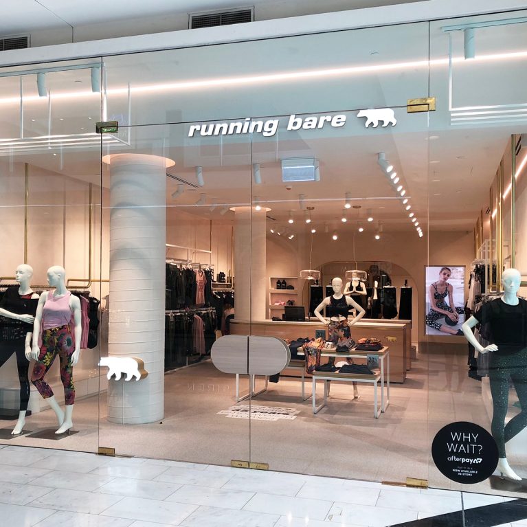
Latest Running Bare store opens in Chatswood. After Running Bare Bondi Beach, this is the second store showcasing the new generation design for the activewear brand. Another great build from…
Latest Running Bare store opens in Chatswood. After Running Bare Bondi Beach, this is the second store showcasing the new generation design for the activewear brand. Another great build from…
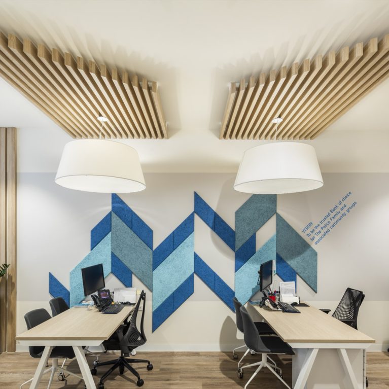
The strategic evolution of the Police Bank retail concept addresses a critical challenge in modern consumer finance: remaining deeply relevant to a shifting, tech-driven demographic while fully preserving the trust and legacy built with long-standing, generational members. Rather than settling for a standard transactional office, the overarching spatial brief demanded a complete cultural pivot toward...
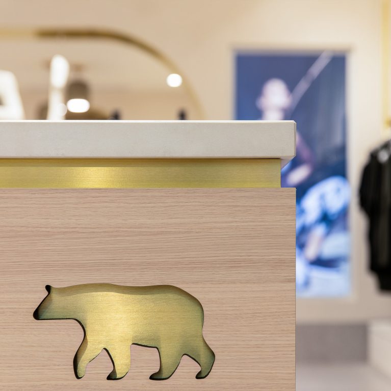
Running Bare have been empowering women since 1983, giving fitness minded, feminine, fashion-forward females the self-belief and confidence to look good and feel great. At Design Clarity, we are proud of our collaboration with the brand over the past few years. This next generation store design creates a “premium” vibe while infusing a comfortable and...
Bank of Heritage Isle is launching their new flagship branch in Hobart! After merging in 2018, Tasmanian mutual bank Bank of Heritage Isle and Police Bank appointed Design Clarity to…
We are moving to a mobile-centric world where the role of the branch will still be a hero component of the member experience. People’s Choice Credit Union asked us to design their Branch of the Future. The objective is to develop a branch design that is captivating and welcoming to the Millennials and Gen Z...
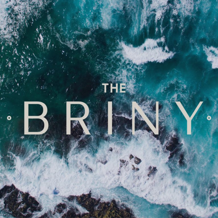
‘The Briny‘ is the latest brand from the well-known family hospitality group that owns ‘Abar Bistro’ in Portsmouth. Design Clarity was given a brief to create a new seafood restaurant brand that is in line with the family values inspired by the Portsmouth culture & produce. The Briny celebrates the rich & vibrant local beauty,...
A brand new Venezuelan street food concept from the Gonzalez Brothers, the creators of Lima, has opened just before Christmas at Westfield London. Design Clarity has been working on the…
With a challenge. Connecting your brand to your target audience Whether you’re building a new brand from scratch or reinventing an established brand – the challenge remains the same. Making…
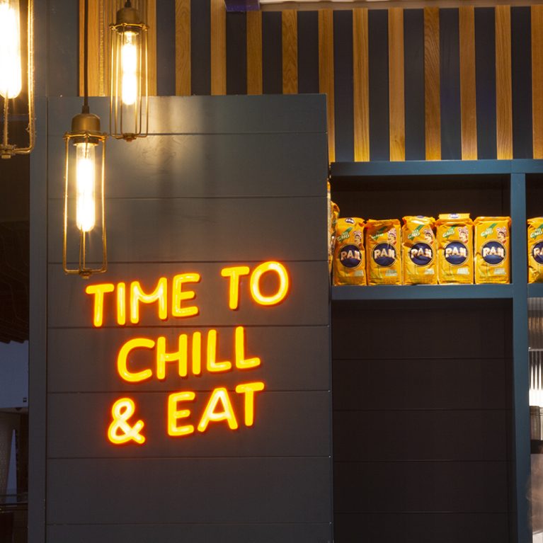
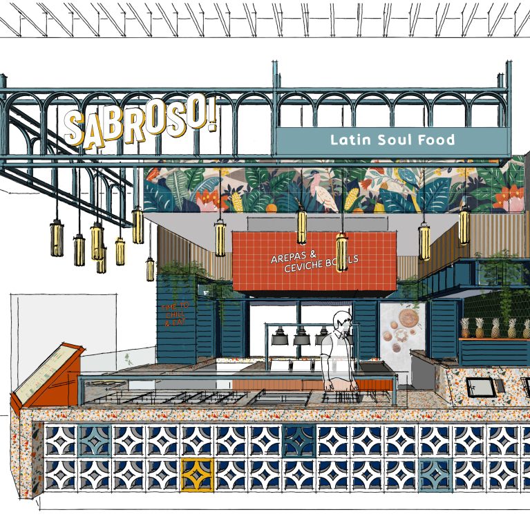
Foodie duo, Joes-Luis and Gabriel Gonzalez, from Lima London Group have launched a new fast casual brand serving Venezuelan arepas and fresh ceviche bowls. Retail design and branding by Design Clarity. Sabroso! is serving up authentic Venezuelan street food to tempt UK tastebuds. A new fast casual grab’n’go concept with a witty, laid back personality...
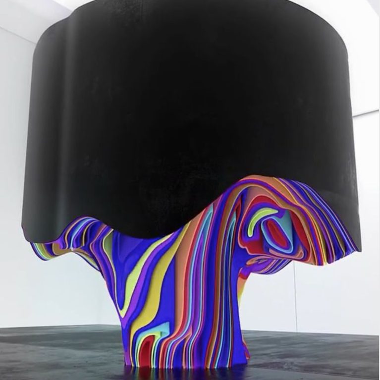
As designers, we are inspired every day. We always look for inspiration to spark the fire for our creative work. We explore new design solutions, keep up with design…
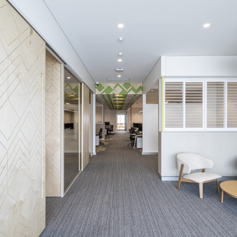
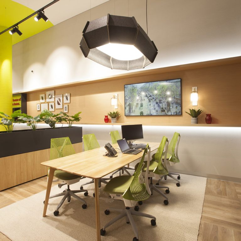
Executed in tandem with the multi-state retail branch rollouts for Police Bank in New South Wales and Bank of Heritage Isle in Tasmania, this comprehensive office relocation project delivers a high-performance workplace for the organization’s central support team. The spatial architecture abandons restrictive corporate silos in favor of an open, agile floor plate that enhances...
2020 has been one of the most unpredictable years of recent human history impacting everyone in life and work. Not only we have seen the global pandemic, but we have…
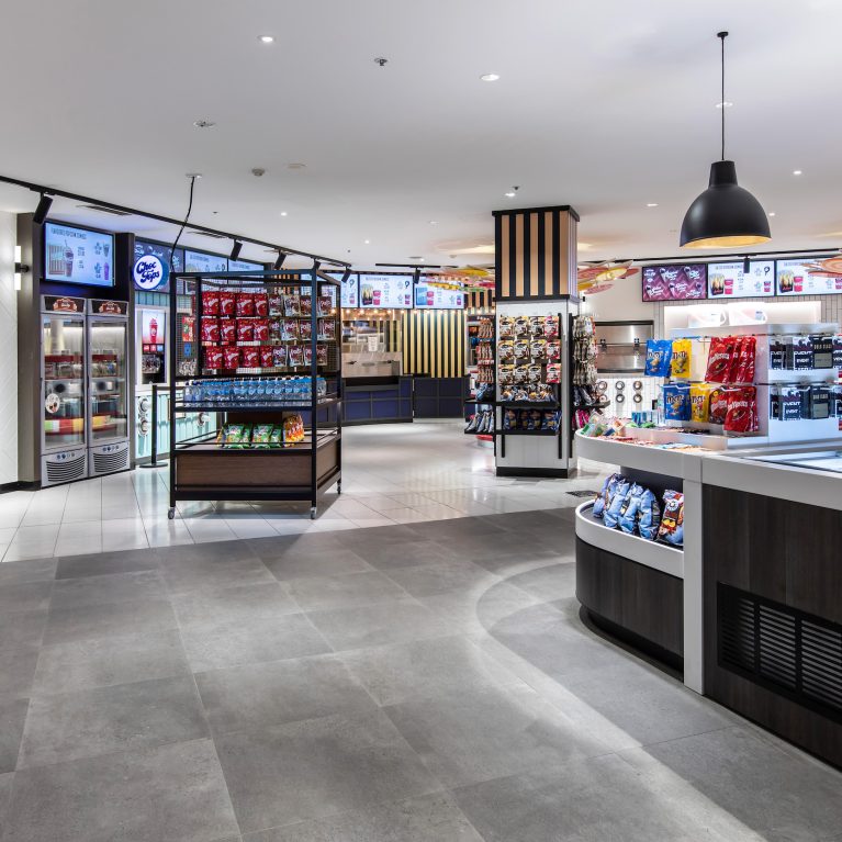
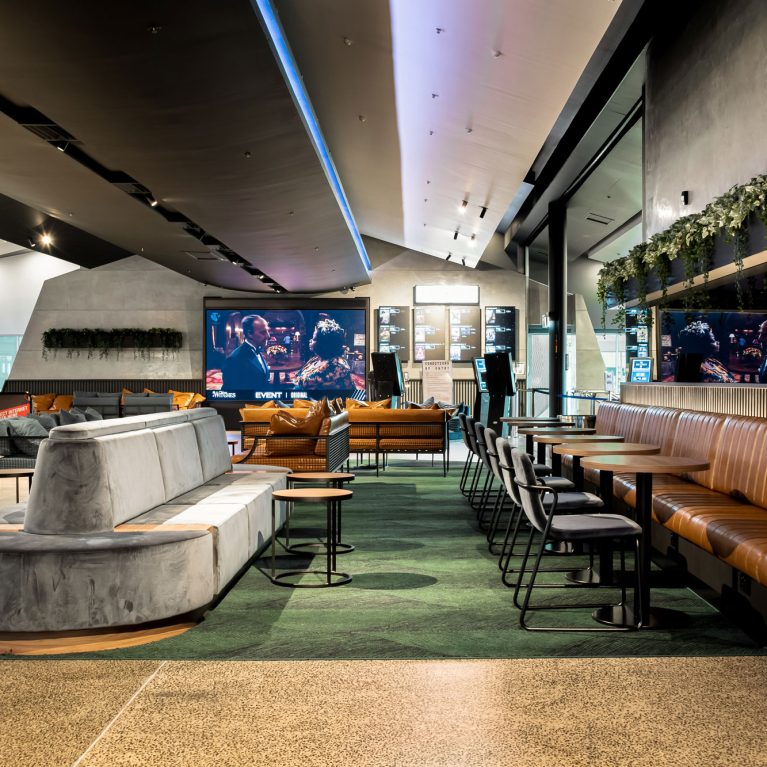
The redesign of the main foyer at EVENT Cinema George Street redefines the traditional cinema candy bar, transforming it into a high-volume, interactive marketplace layout. The architecture shifts the focus from a single point-of-sale counter to an open-plan concourse, driving retail engagement through intuitive spatial design, vibrant color zoning, and strategic lighting. Design Clarity delivered...
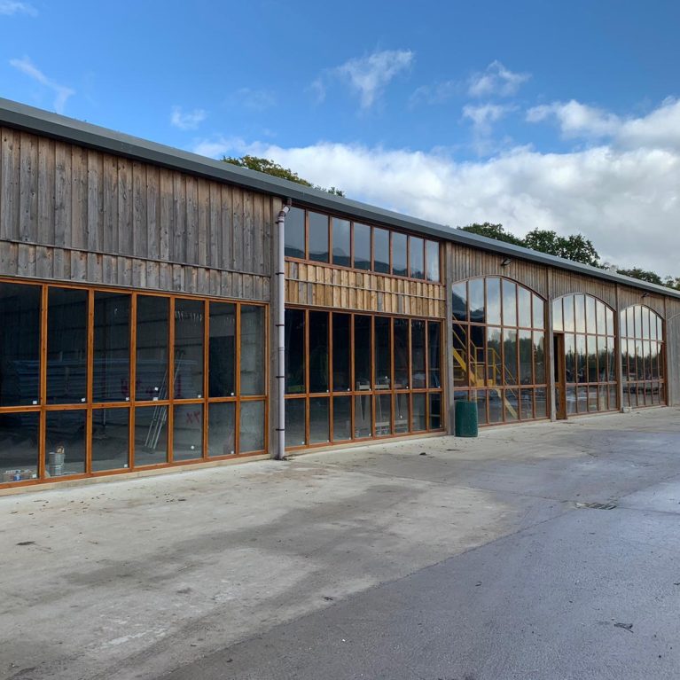
The design brief for the Mason’s Yard project entailed a new headquarters and creative work hub for the fourth-generation family-owned stonemasonry brand, J Rotherham, along with it’s two two…
EVENT Cinemas in Toowoomba opened doors in late 2020 in readiness for the summer blockbuster releases after a major extension and refit. EVENT chose to partner with Design Clarity as design architects for this project. Queensland locals will be able to experience the unique Your Cinema Your Way concept with a choice of new seating...
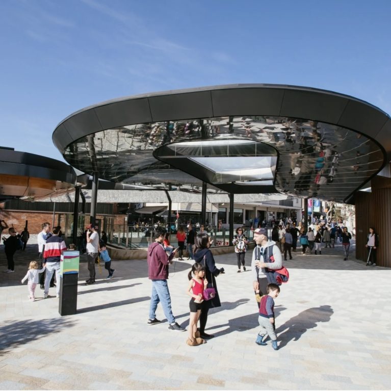
The Canopy is a visionary project by Lane Cove Council, transforming an underused site into a vibrant community hub. At its core, this project integrates a 500-space, multi-level underground carpark, two major supermarkets, community parkland, an adventure playground, and an all-day dining precinct, all designed with sustainability in mind. Located beneath the park level, Coles...

In a world of immediacy, when everybody wants everything now, TIME is the new currency of experience. Our world has never been more technologically-enabled or connected than it is now:…

Privacy Policy Cookies At Design Clarity, we use cookies solely for analytics purposes to gather anonymous information about how visitors interact with our website. This helps us improve…

Where did this material come from? Did it require a lot of energy to extract or to get it to your site? Can it be replaced at the source? Can…
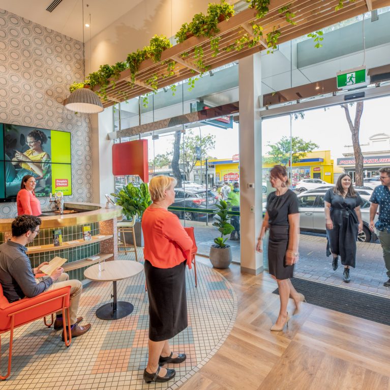
The relocation and transformation of the Norwood People’s Choice into a new Lending and Advice Centre coincided with a brand refresh and a brand new look. This new home for…
London
The Ministry,
79-81 Borough Road,
London SE1 1DN, United Kingdom
44 20740 36132
Sydney
Level 3, 223 Liverpool St
Darlinghurst NSW 2010 Australia
61 29319 0933