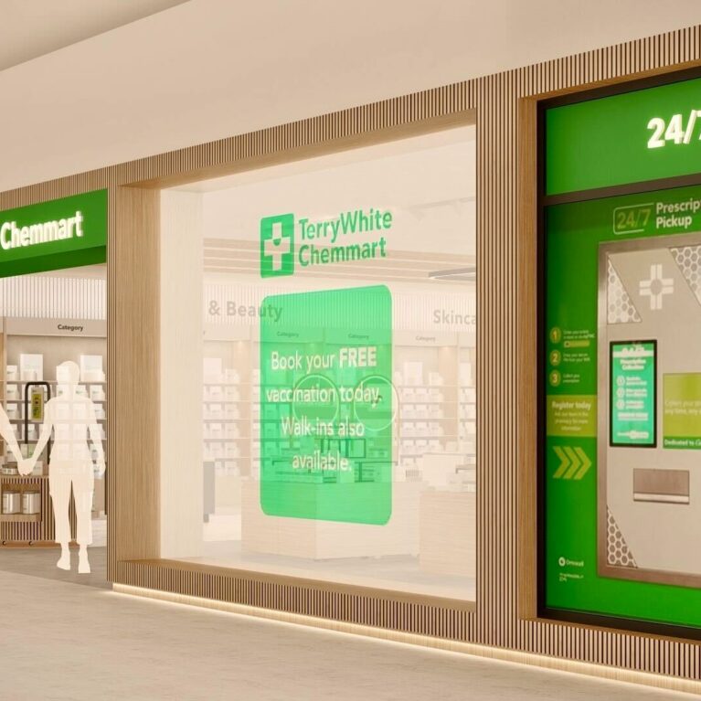
Large illuminated signs and floor-to-ceiling glazing mark the entry point, immediately revealing a spacious interior with mobile timber pods, clear category signage and digital touchpoints. The design sets an organised, welcoming tone from the first step inside.
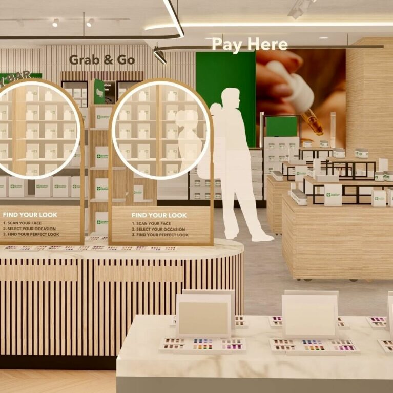
The entrance presents the full scope of the store’s new retail model. Bright green CareClinic and TerryWhite Chemmart signs form a bold fascia, while transparency allows shoppers to see directly into a calm, structured interior. Mobile timber display pods with vertical battens stand in the foreground, showcasing hero products or seasonal offers. Their curved forms and castors let staff reconfigure the layout easily for campaigns or traffic flow, reinforcing the store’s flexible design ethos.
Beyond the pods, neatly aligned shelving for vitamins and the packaging recycle point lead naturally to the Grab & Go and Click & Collect zones. Category markers in green provide instant orientation without clutter, and overhead lighting frames circulation paths. This arrangement demonstrates how visual clarity, adaptable merchandising and integrated services combine to transform the entry experience from a typical pharmacy threshold into an engaging, service-driven welcome space.