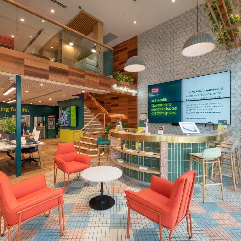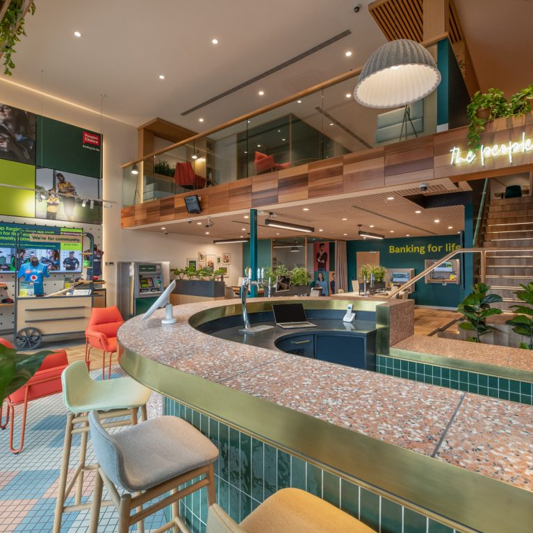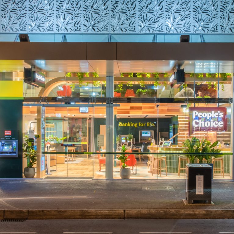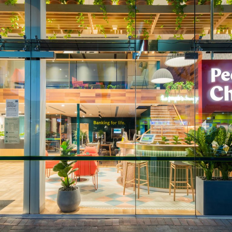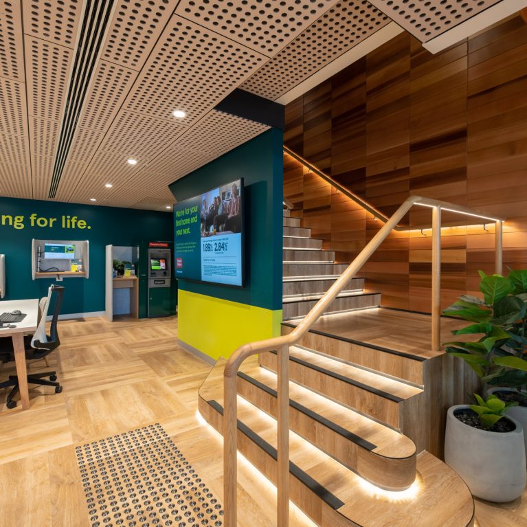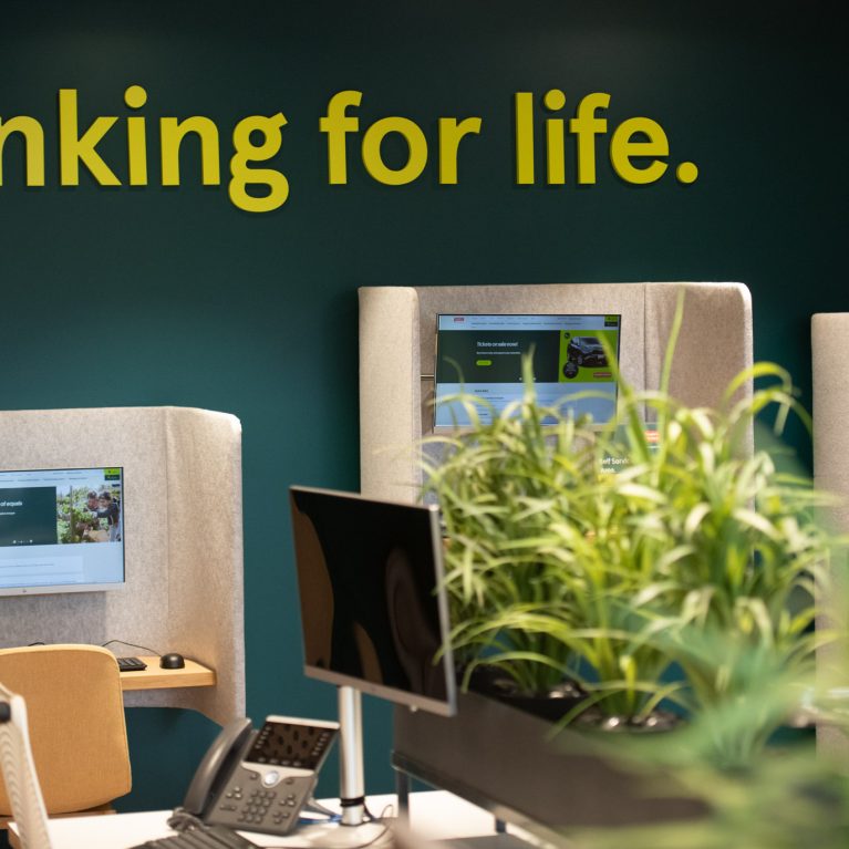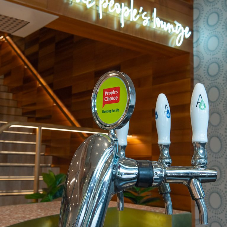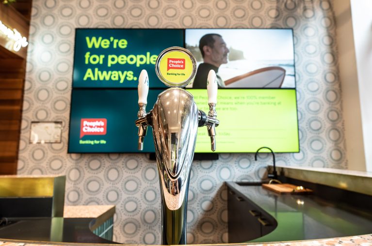
This close-up of the People’s Choice bar tap highlights the classic design of a metallic beer tap with a sleek chrome or stainless steel finish and a white lever for an understated yet refined look. Behind the tap, two large screens mounted on a light beige wall feature video content with the bank's messaging.
The wall itself has a subtle repeating pattern of light gray circles, adding texture without overwhelming the space.
One screen displays the slogan "We’re for people Always," reinforcing People’s Choice’s customer-centered focus. Both screens use a greenish-yellow color scheme, with one featuring a surf-themed image, enhancing the relaxed vibe of the lounge area. Below, a dark countertop provides contrast, grounding the display in a sophisticated palette that balances modern visuals with a welcoming ambiance. This detail showcases the bank’s commitment to creating an experience beyond traditional banking.