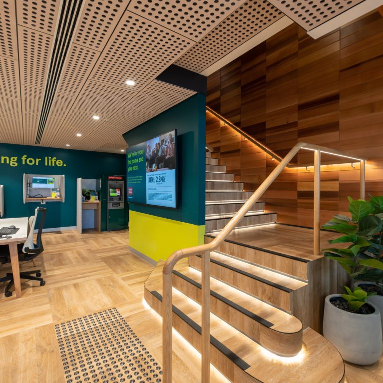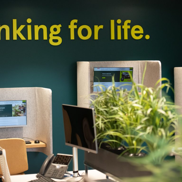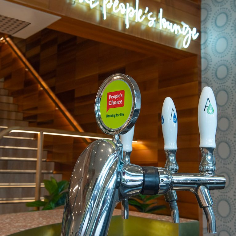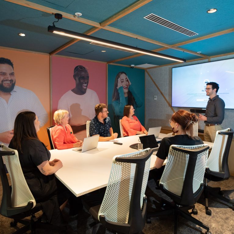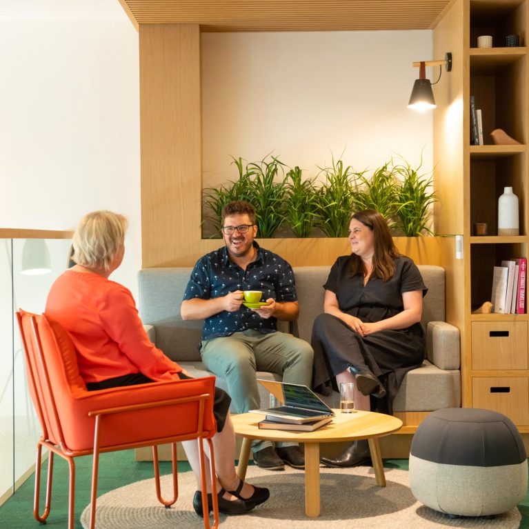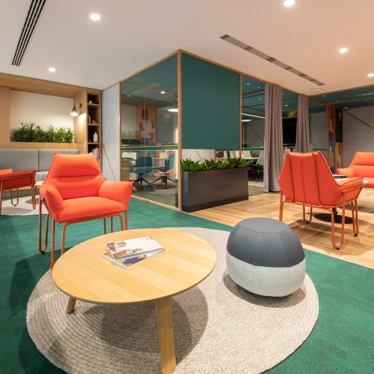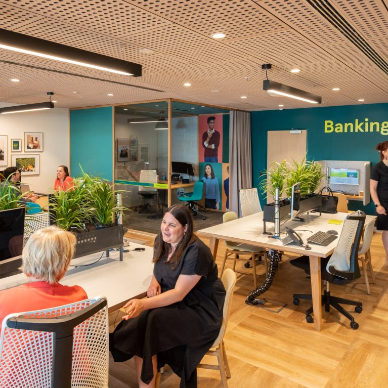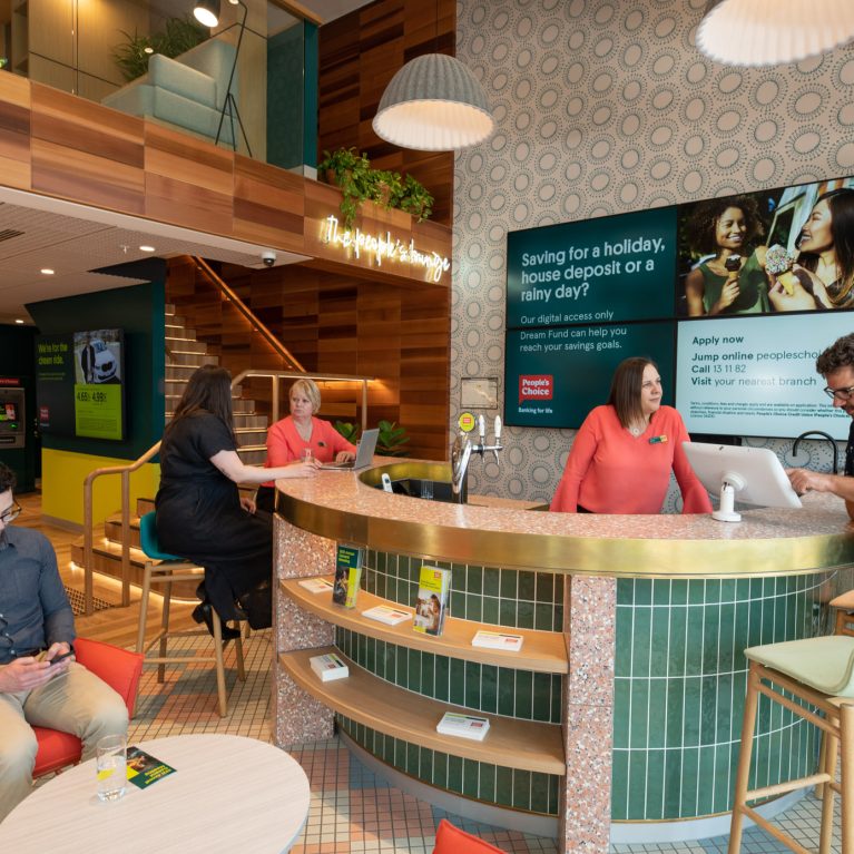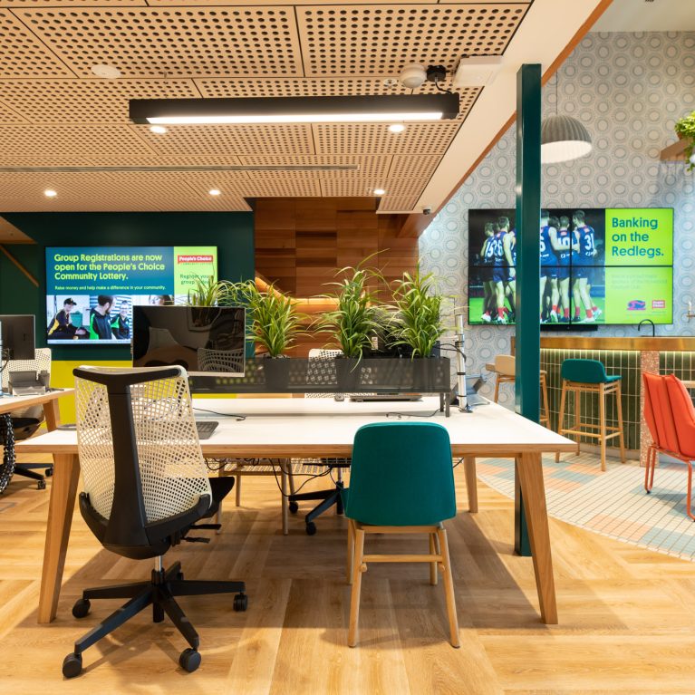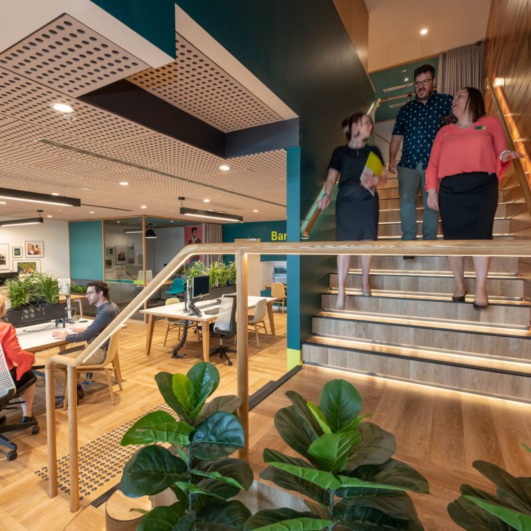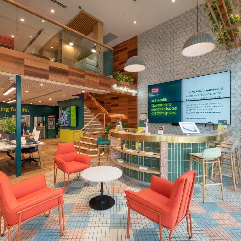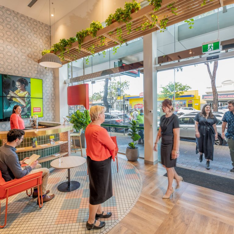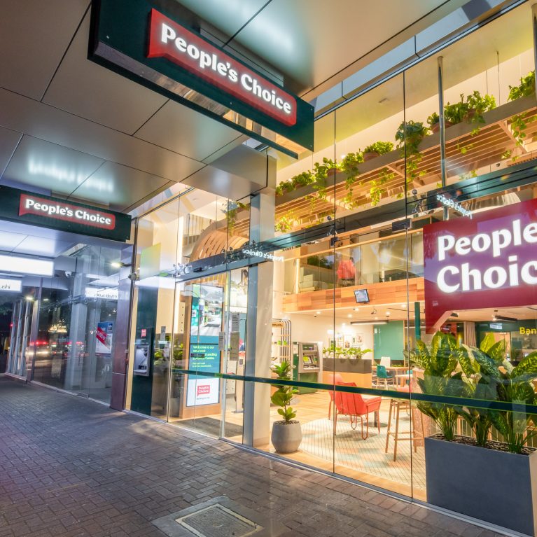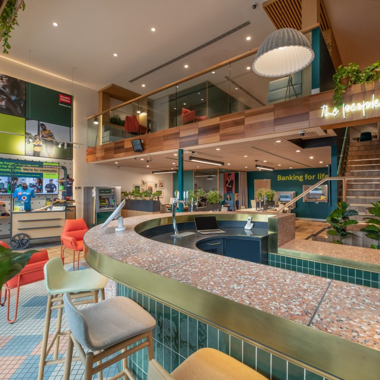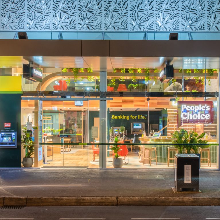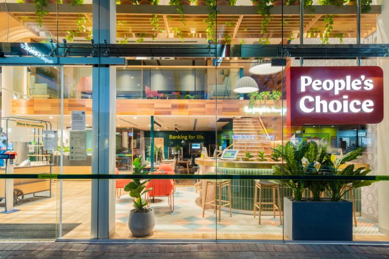
This close-up of the People’s Choice flagship branch captures a modern, vibrant environment crafted for young adults seeking financial advice in a relaxed setting. The floor-to-ceiling glass windows reveal an open, welcoming interior, designed to foster interaction and comfort with a blend of casual seating, natural textures, and ample greenery. This flagship branch redefines the traditional banking experience with a social, community-focused approach.
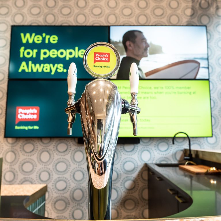
The bank’s interior combines warm wood tones, sage green accents, and muted terracotta shades, creating a cozy, contemporary color palette that appeals to younger customers. A prominent feature is the bar-style counter, equipped with light-colored stools, where customers can relax and chat with financial advisors in a less formal setting. Surrounding the bar area are scattered seating arrangements, including comfortable chairs and tables, giving customers the flexibility to choose a space that suits their needs. This layout encourages a relaxed, communal atmosphere, blending comfort and functionality.
A large, illuminated "People's Choice" sign in bold white letters on a rich maroon-red background stands out against the glass front, reinforcing the brand’s identity and commitment to innovation. The spacious interior, framed by wooden beams and layered structures, adds depth and character to the space, with potted and hanging plants adding a lively, organic touch. The design’s emphasis on greenery complements the warm palette, enhancing the overall inviting feel.
Beyond the seating, a portion of the service counter and cashier area is visible, maintaining essential banking functions within this relaxed setup. The glass storefront, reflecting the ambient lighting from within, allows the bank’s inviting atmosphere to radiate outward, making People’s Choice a standout destination on the street, especially for the young, community-minded customer.

