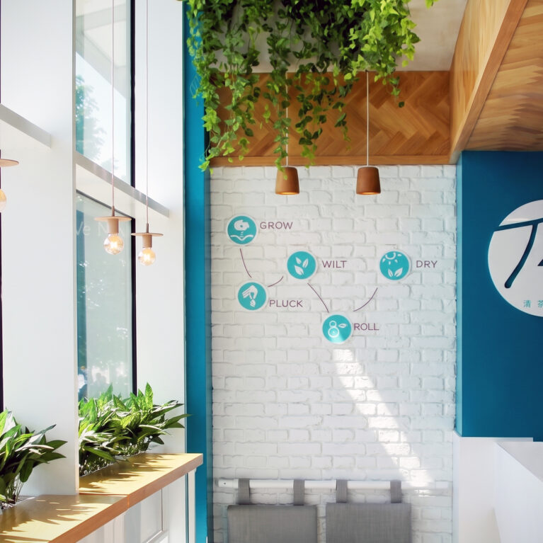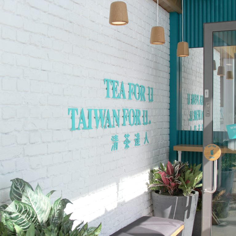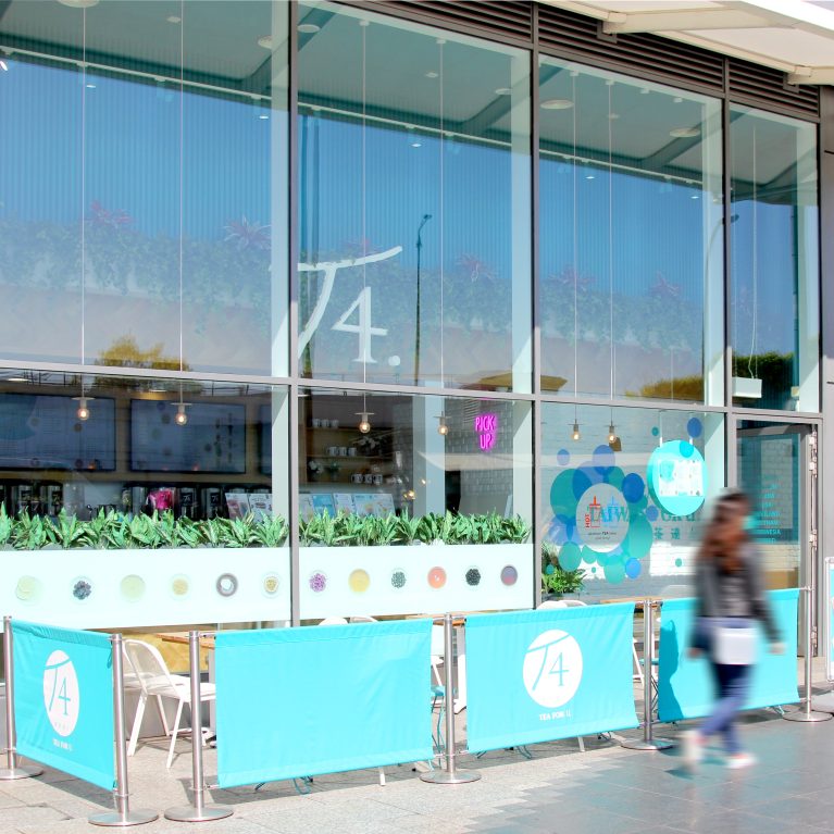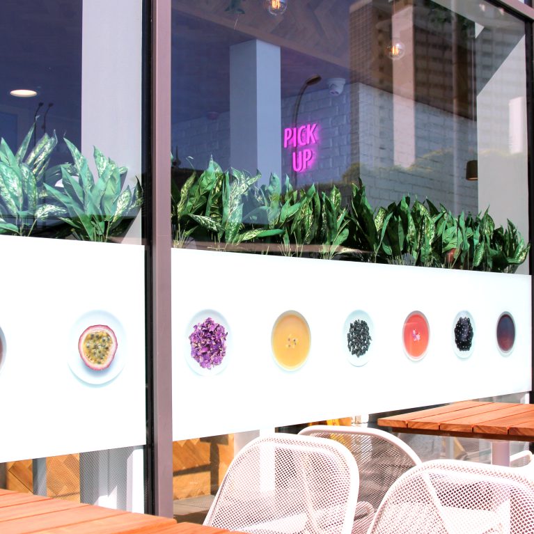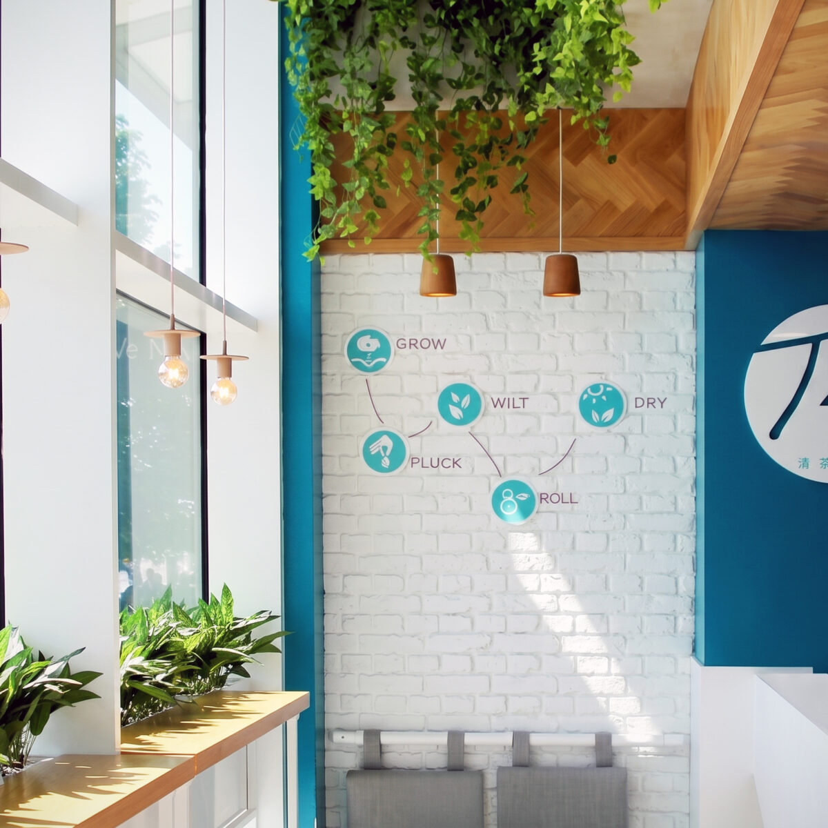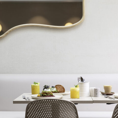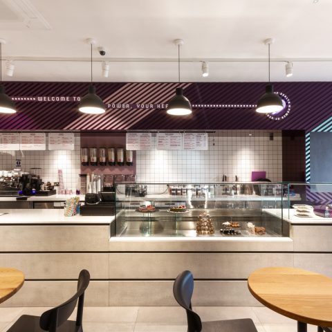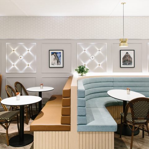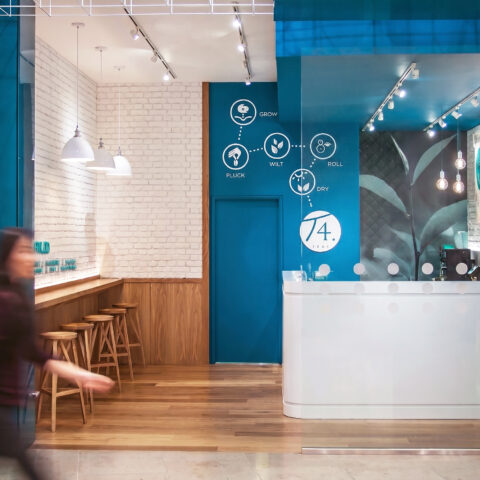
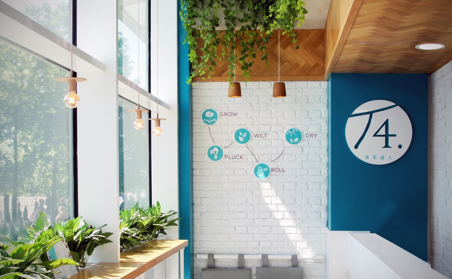
Retail store interior, white brick feature wall, window service counter, hanging ivy planter, industrial bulb pendant lights, circular brand signage.

T4 Tea for you

Latest store for authentic Taiwanese bubble-tea brand

Design Clarity has been working with popular the Taiwanese bubble tea brand T4 since its first UK store launch in 2015. Following on from the extremely popular Westfield Stratford branch, we worked to evolve and expand on the interior concept for the second branch at Westfield White City.

The brief for the Westfield White City store was to streamline the customer ordering experience and allow for internal and external customer seating areas, all within an extremely narrow site.

Graphic brand elements were created for both in-store and printed brand materials in order to enhance the brand communications while supporting brand tone-of-voice.

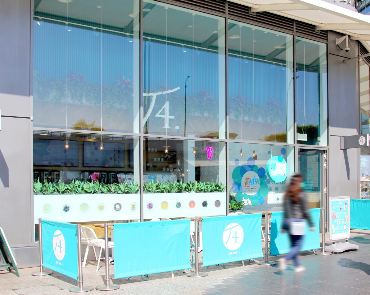
Customers new and old are instantly uplifted and relaxed upon entering the space, thanks to the natural light provided by the open facade and clever use of finishes and graphics.

European Oak and abundant foliage were introduced to the finishes palette to create a natural and inviting welcome to customers and to reiterate the natural ingredients T4 are famous for.
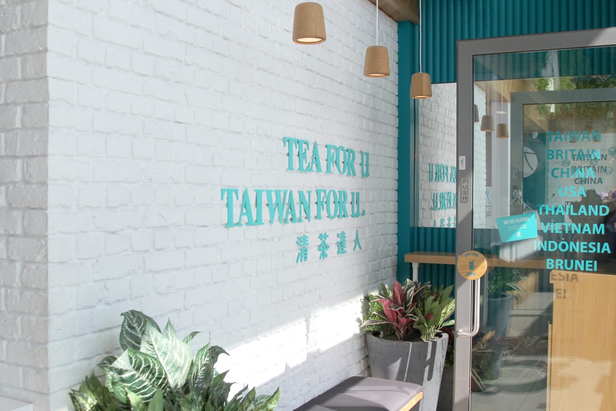
Tactile white masonry and crisp corporate graphics define the transition zone into the compact retail shop. The entrance composition relies on clean material contrasts and structured planters to welcome customers at the building line.

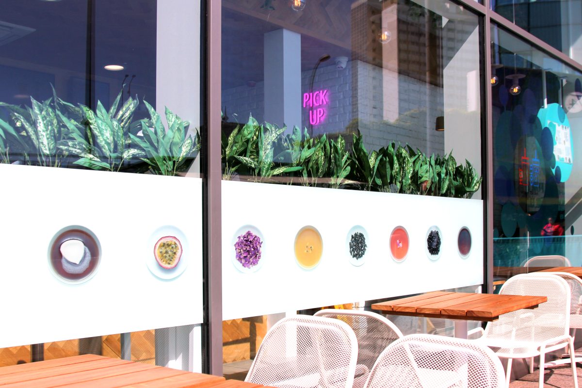
A expansive double-height glass facade establishes a highly transparent commercial threshold along the busy public promenade. The architectural envelope uses bold corporate signage and vibrant pedestrian barriers to define an integrated outdoor dining pocket.

Integrated structural branding and lush indoor greenery intersect along the glass facade to form a functional privacy screen. This design element provides a comfortable sense of enclosure for guests utilizing the outdoor dining space.

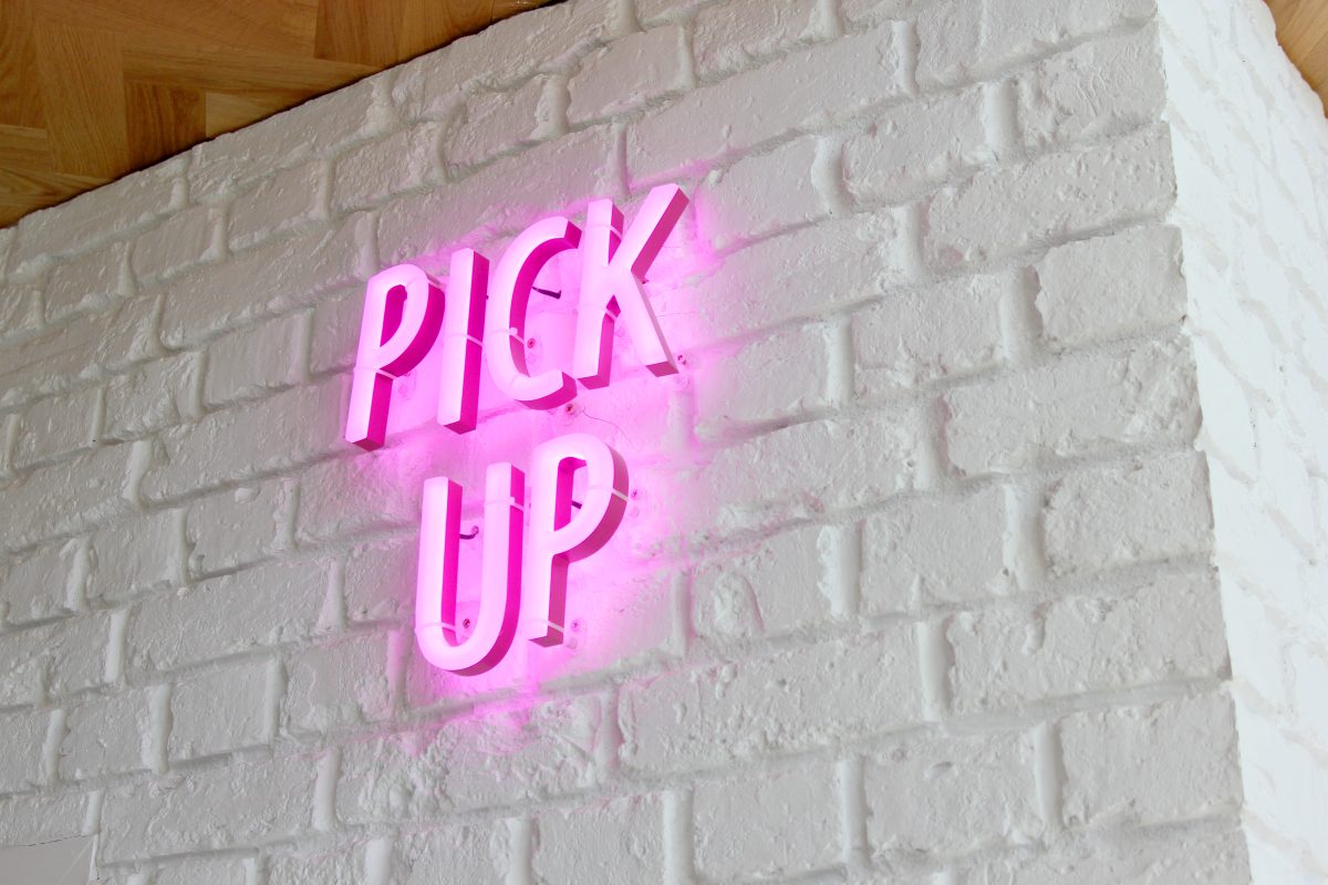
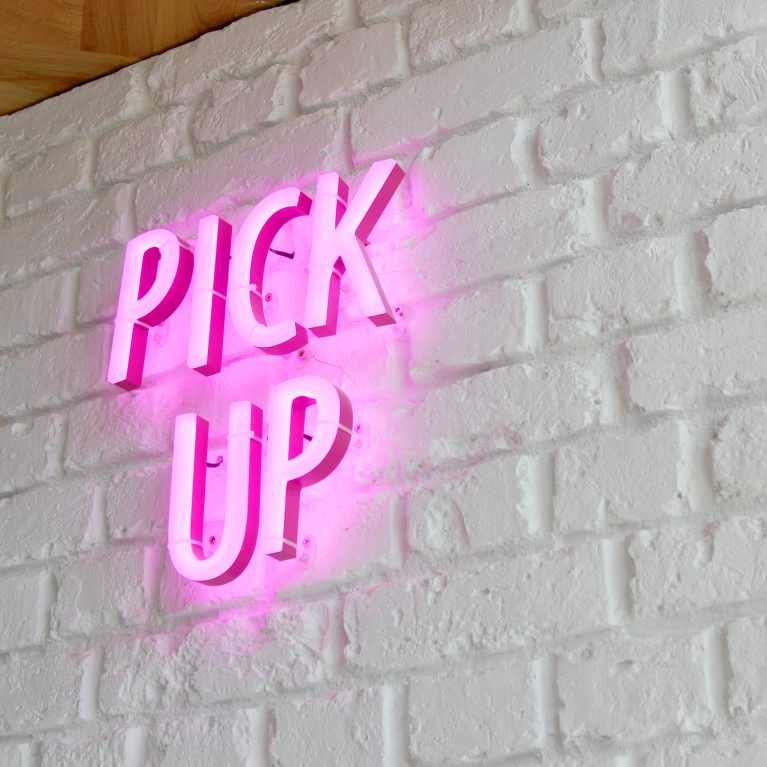
A vibrant pop of color slices through the light neutral palette, establishing an unmistakable directional waypoint inside the beverage station. The glowing architectural accent optimizes customer foot traffic patterns by clearly designating the order collection area.

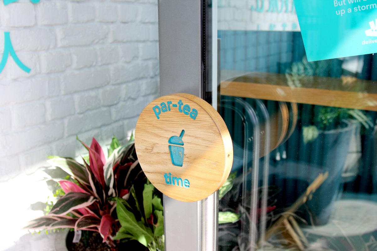
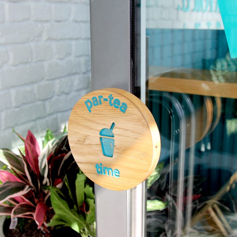
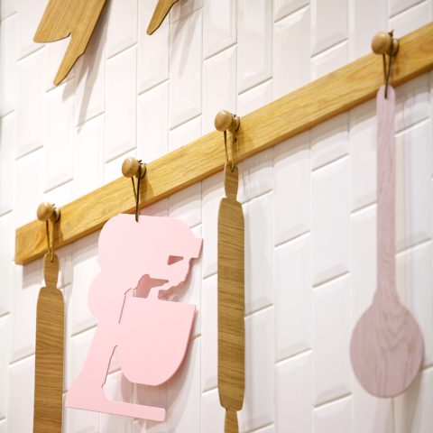
A thoughtful focus on micro-detailing elevates the primary entry point, transforming a standard touchpoint into a tactile brand interaction. The organic material choices create an immediate sense of warmth before visitors fully cross the threshold.

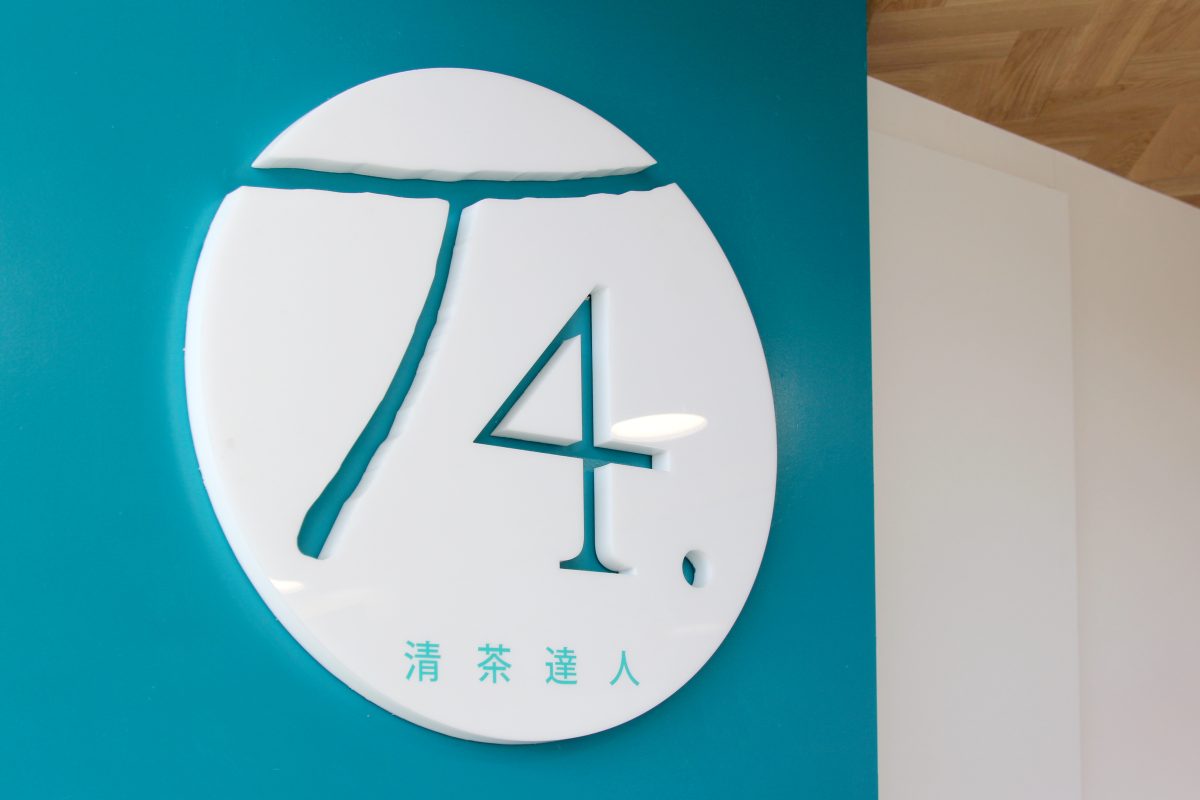
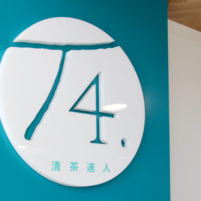
A crisp white brand emblem punctuates a vibrant teal partition wall, establishing a high-contrast focal point within the interior layout. The dimensional sign leverages negative space to integrate the brand's graphic identity smoothly into the architecture.