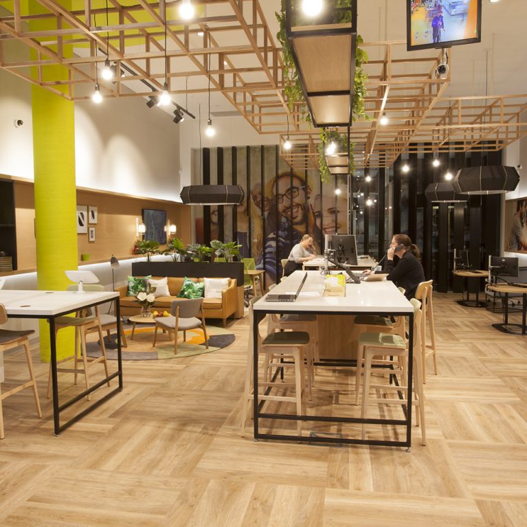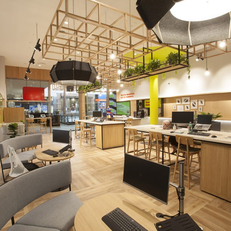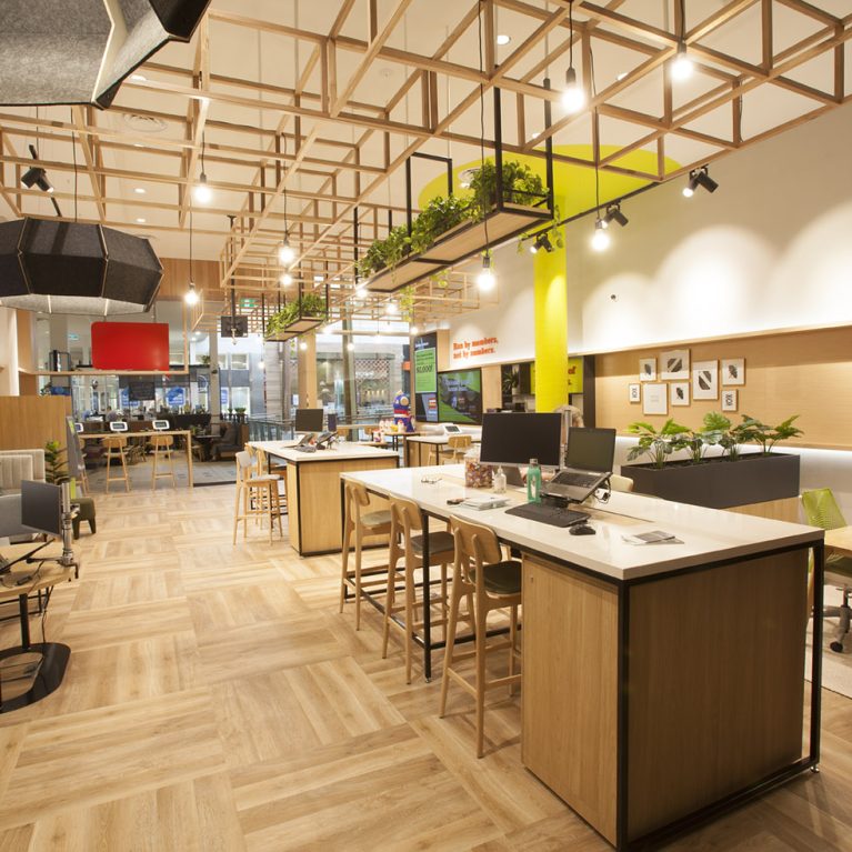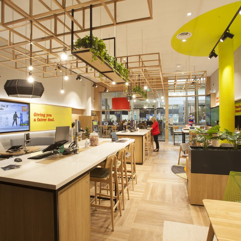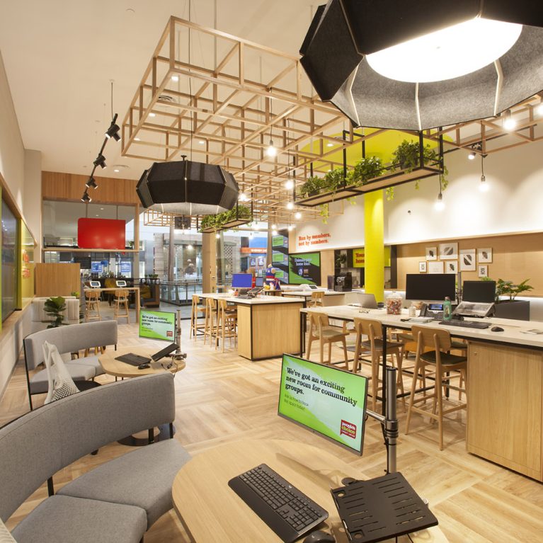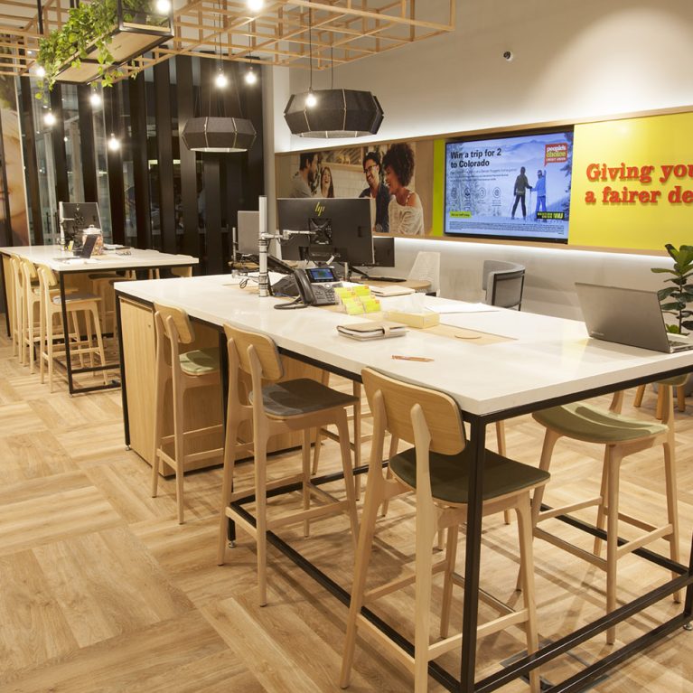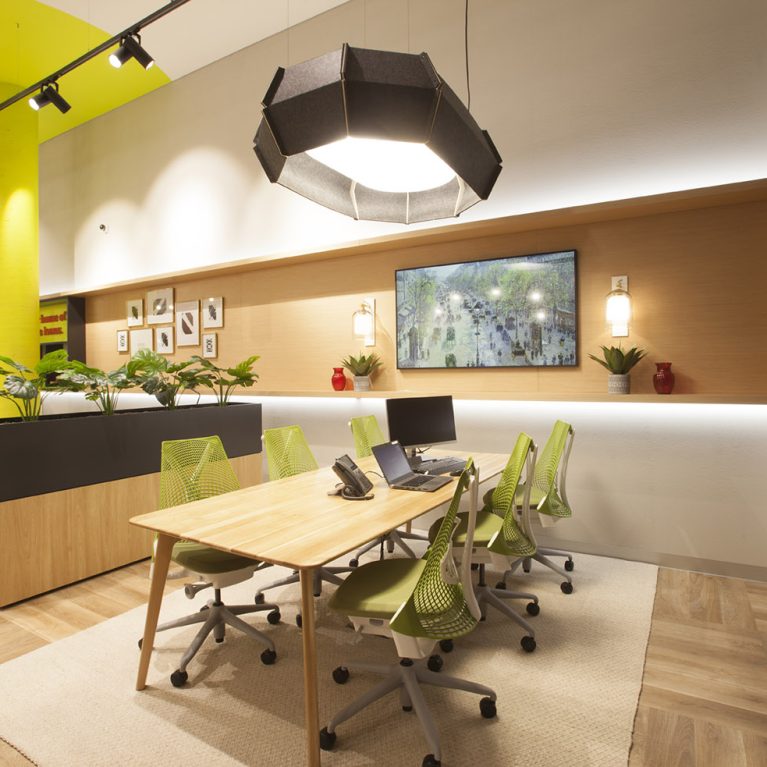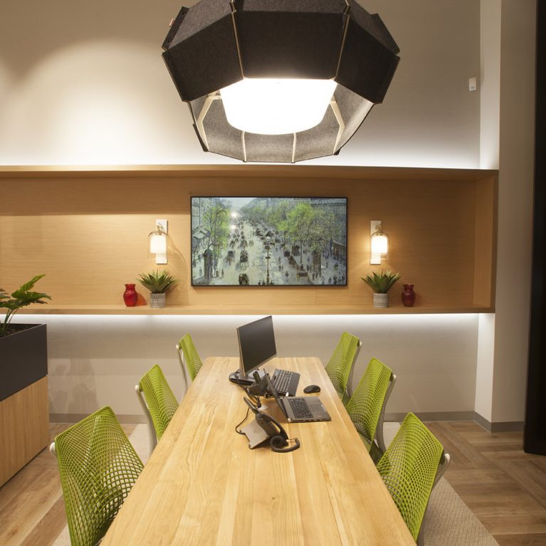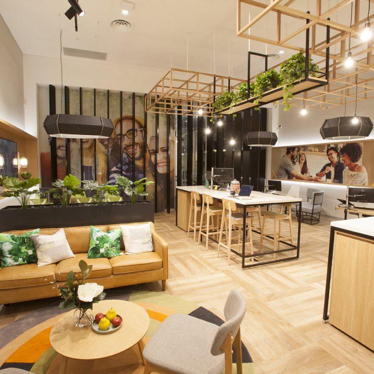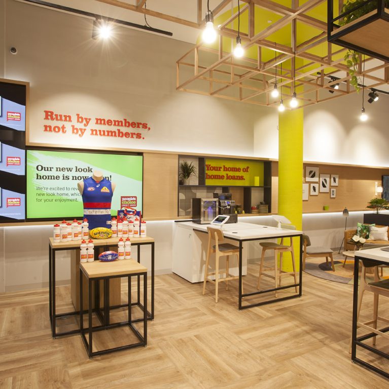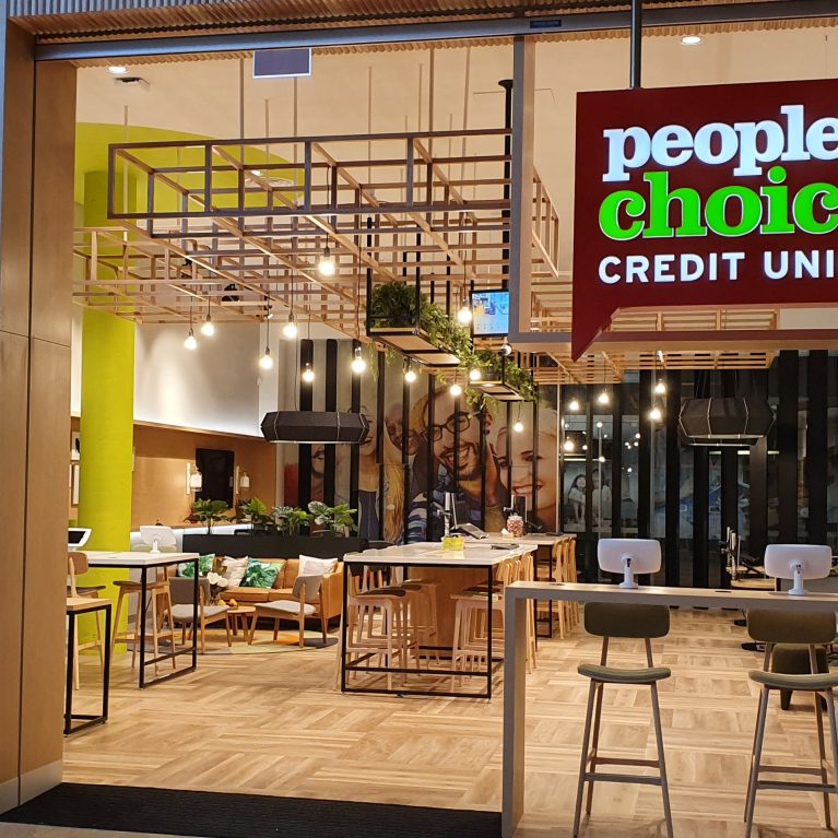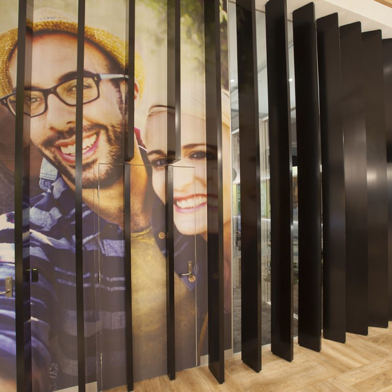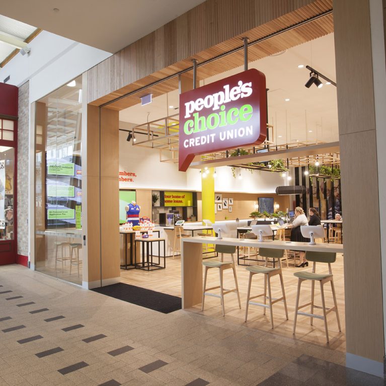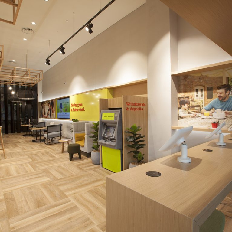
The shift towards digital banking doesn't mean the end of the physical branch; rather, it requires a total rethink of how the interior environment supports the user. In this Melbourne location, the design moves away from the traditional, high-counter teller model that often creates a sense of "us versus them." Instead, the focus is on creating an inviting, open-plan setting where technology is used to facilitate quicker transactions and educational moments.
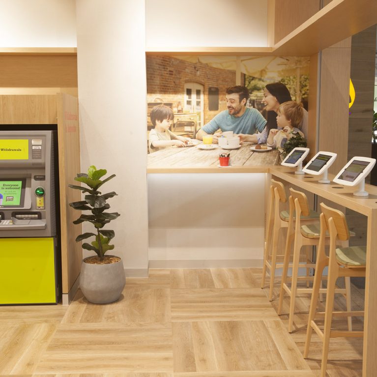
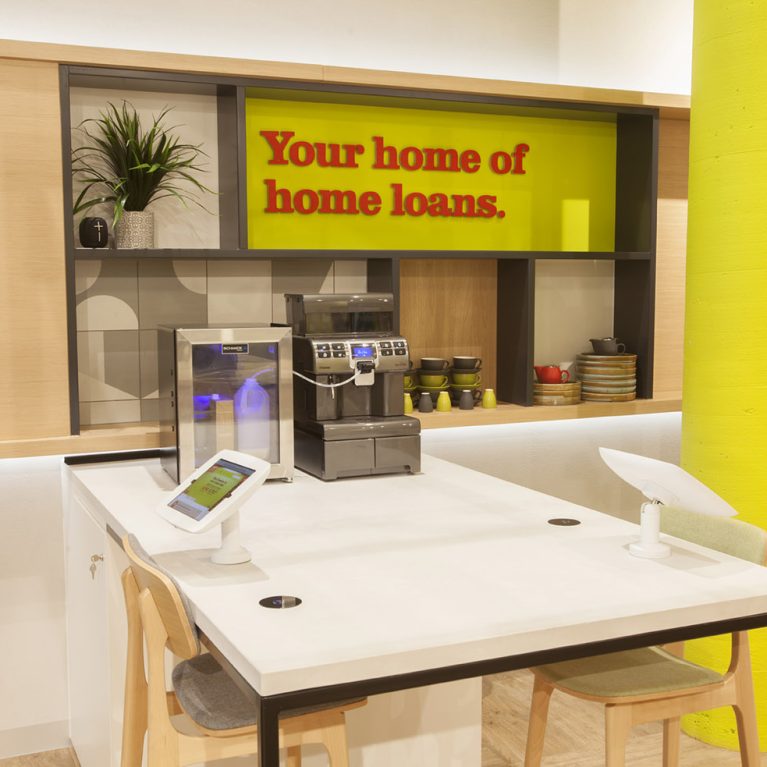
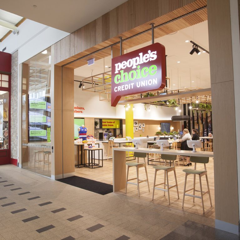
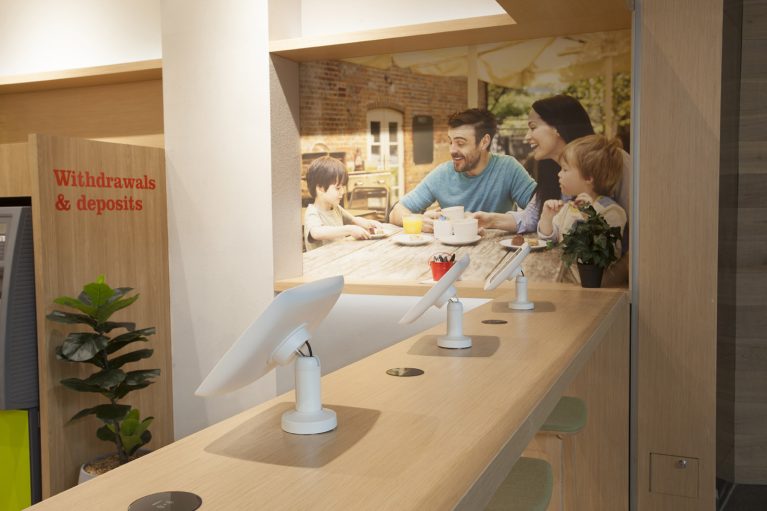
The interactive service bar is a masterclass in clean, functional joinery. Constructed from a warm, light-toned timber, the counter serves as a bridge between the bank’s digital capabilities and its commitment to human hospitality. Set into the surface are several ergonomic, white tablet mounts that allow members to log in, browse products, or manage their accounts with ease. To maintain a tidy and professional appearance, all cabling is cleverly concealed within the structure of the desk, ensuring the focus remains entirely on the user experience.
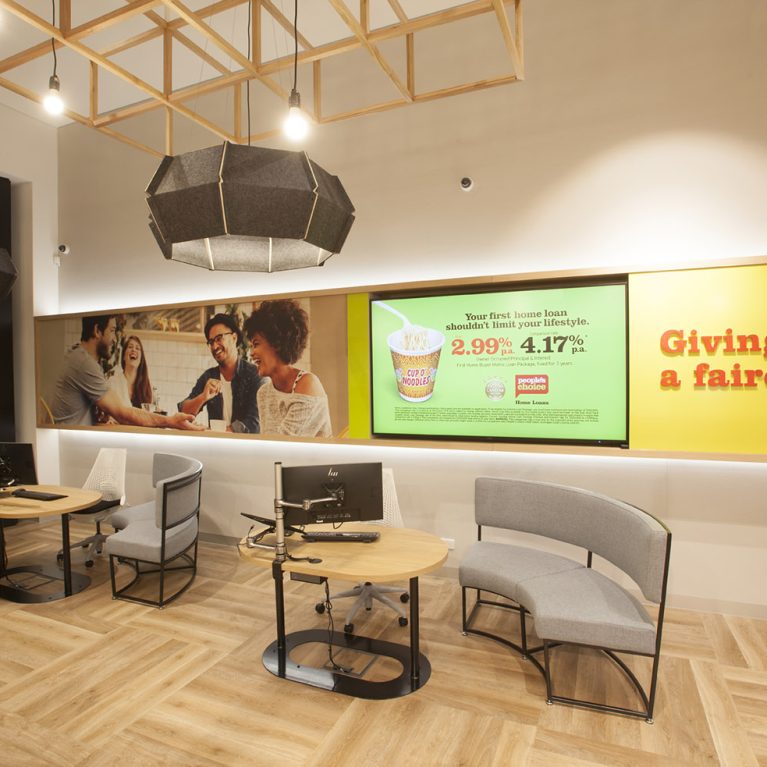
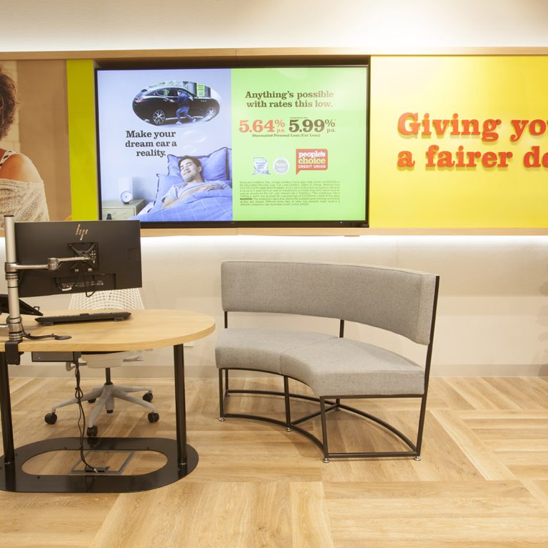
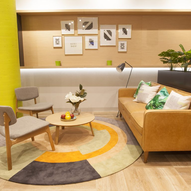
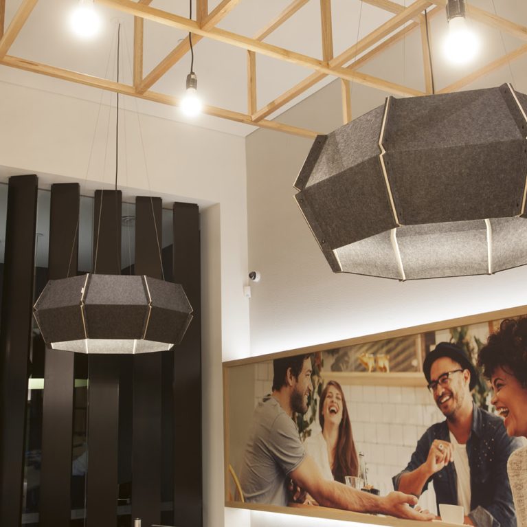
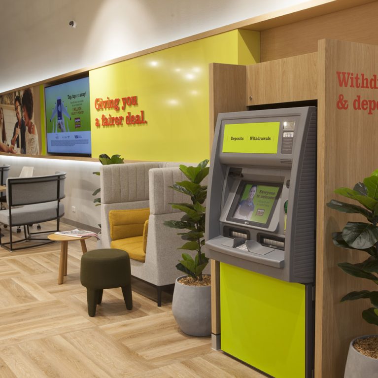
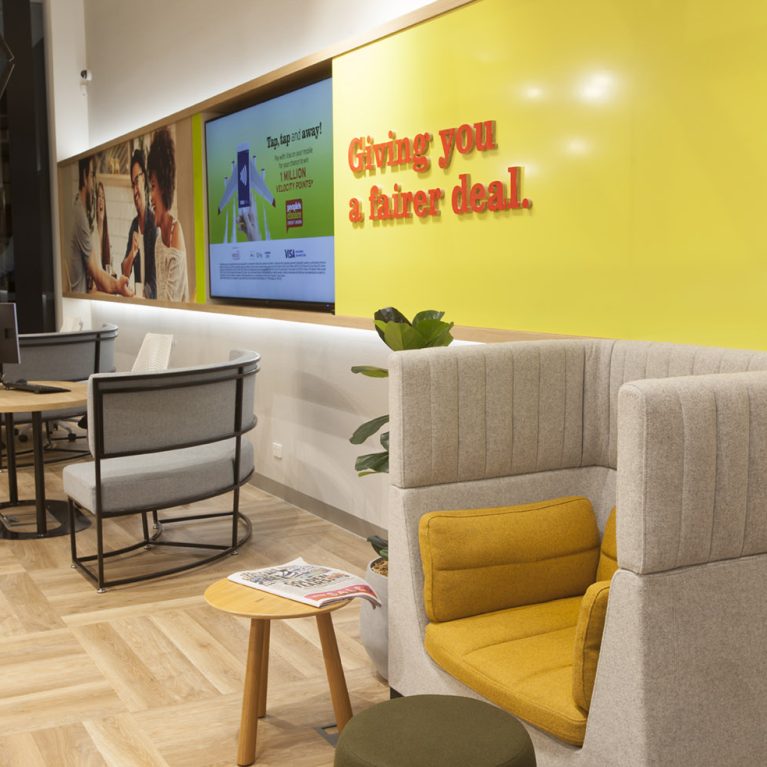
In the background, a large-scale lifestyle graphic is used to soften the technical nature of the kiosks. This imagery depicts a family in a relaxed, social setting, which helps to humanise the brand and remind visitors of the real-world life goals—like buying a home or saving for the future—that the credit union supports. To the left, subtle signage for "Withdrawals & deposits" is rendered in a friendly, clear typeface, guiding members to the appropriate areas without the need for overbearing barriers. The inclusion of indoor greenery, such as the potted plant nestled against the timber wall, adds a biophilic touch that improves air quality and creates a calmer, more natural atmosphere. Every element, from the soft-touch surfaces to the thoughtful lighting, is intended to make the banking experience feel like a seamless part of a member’s daily lifestyle rather than a chore.