Daniel’s Donuts

Welcome to Daniel’s Donuts, World Square—where colour, flavour, and fun collide.

A beloved Melbourne donut favourite makes its Sydney debut with a fresh, inviting fitout at World Square.

#Australia
#Daniel's Donuts
#Sydney


Design: Design Clarity

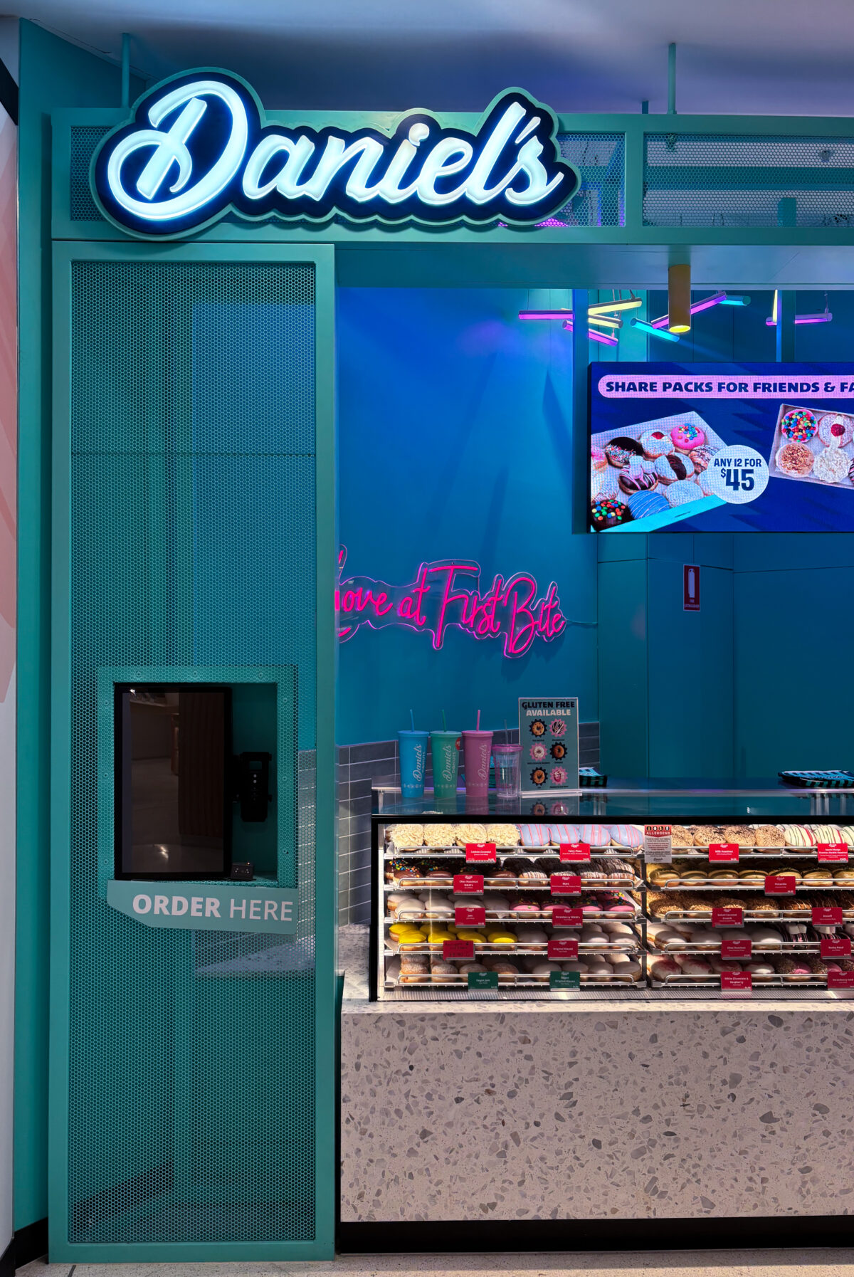
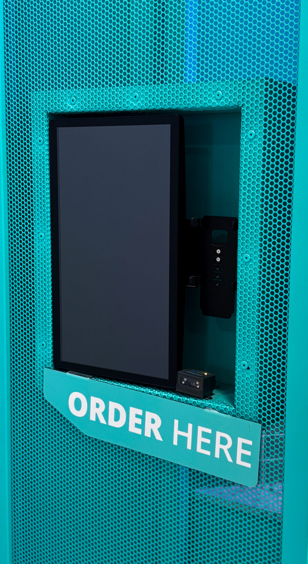
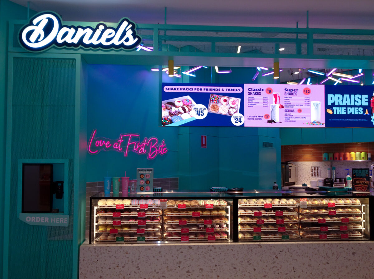
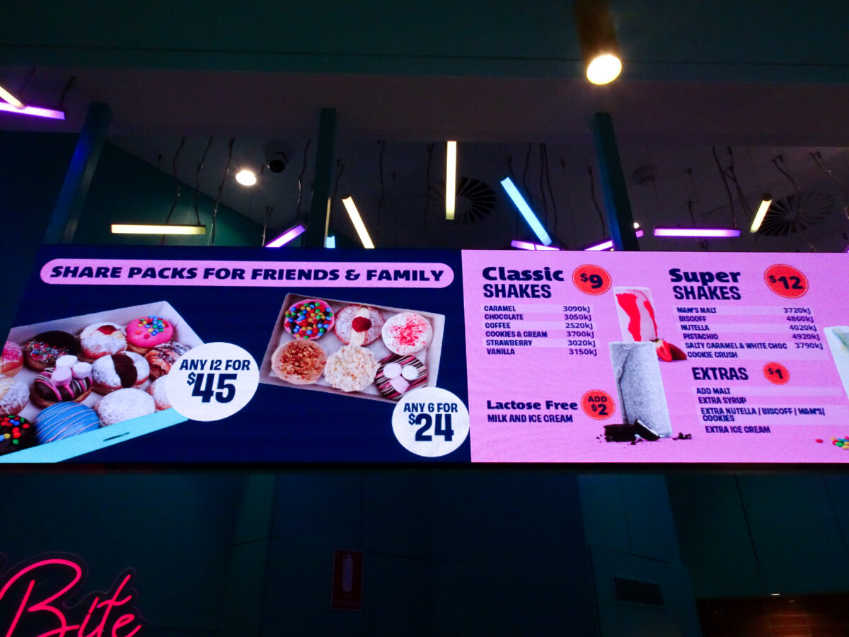
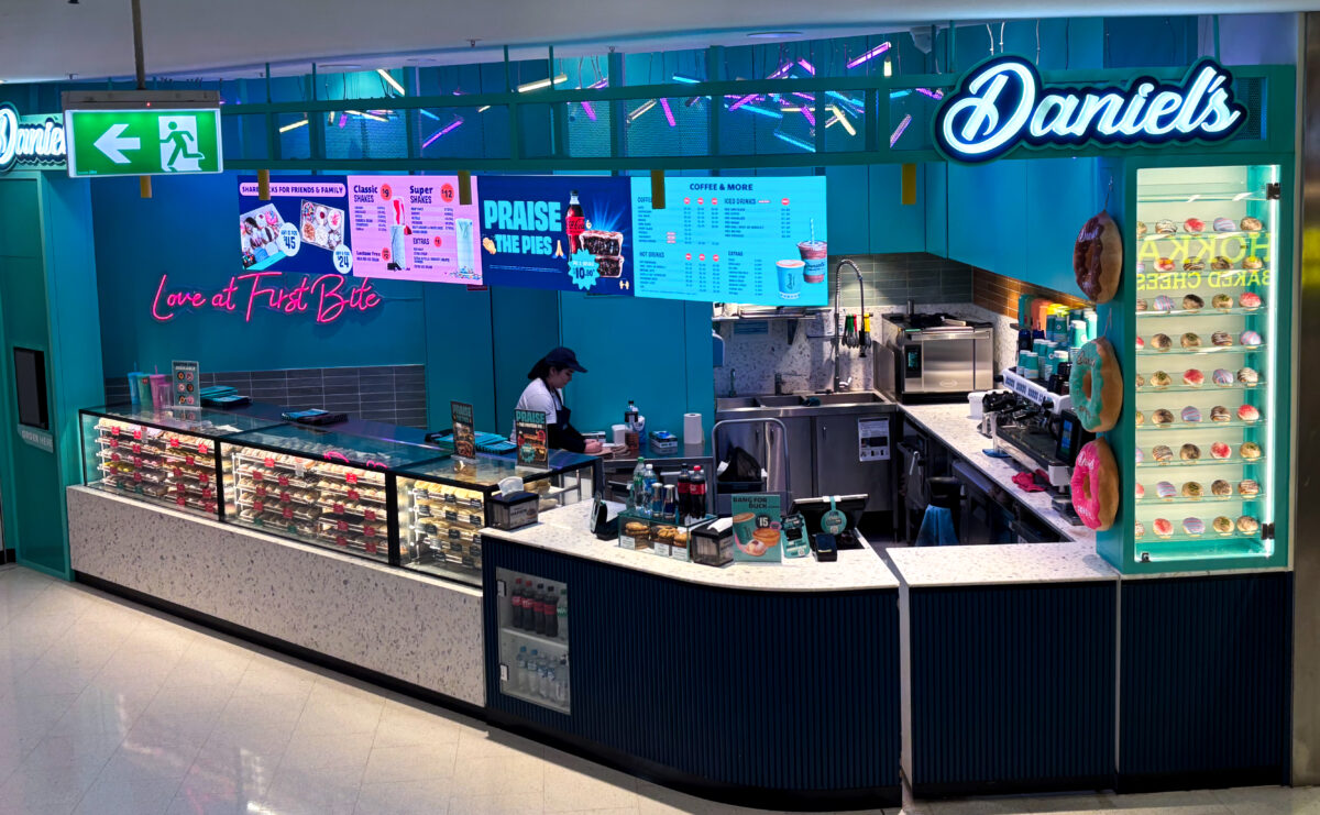
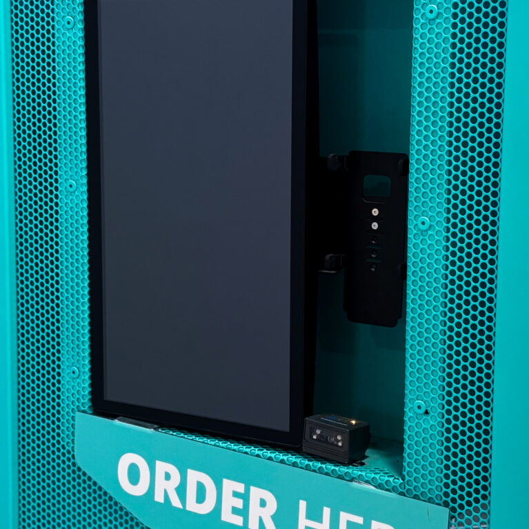
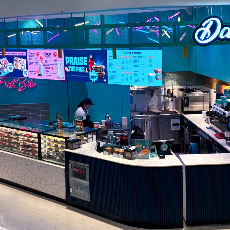
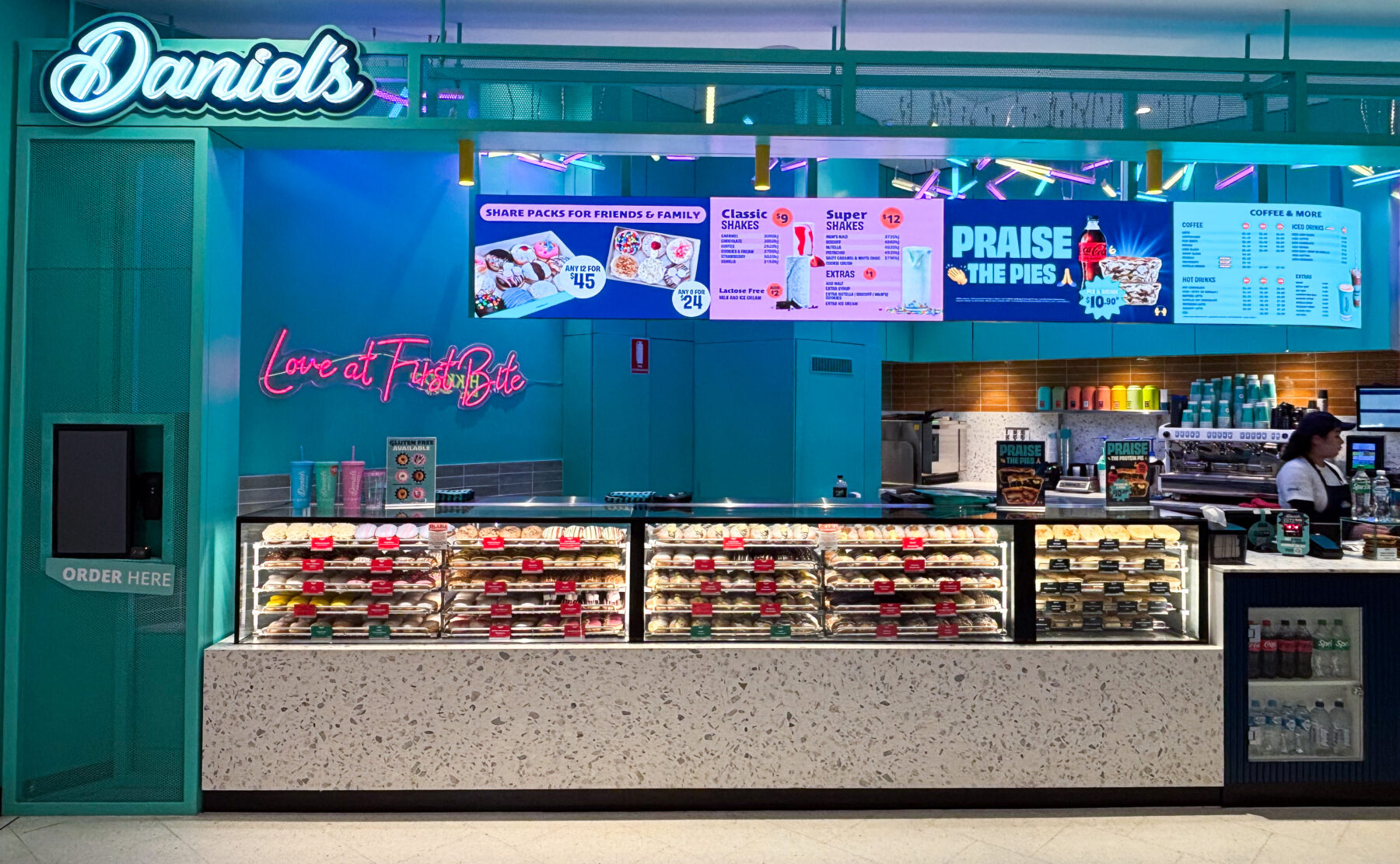
Daniel’s Donuts World Square introduces the brand’s iconic offering to Sydney with a bold and efficient retail fitout tailored to the fast pace of urban life. The kiosk format is carefully planned to support high volumes and quick service, transforming queuing into a part of the experience.

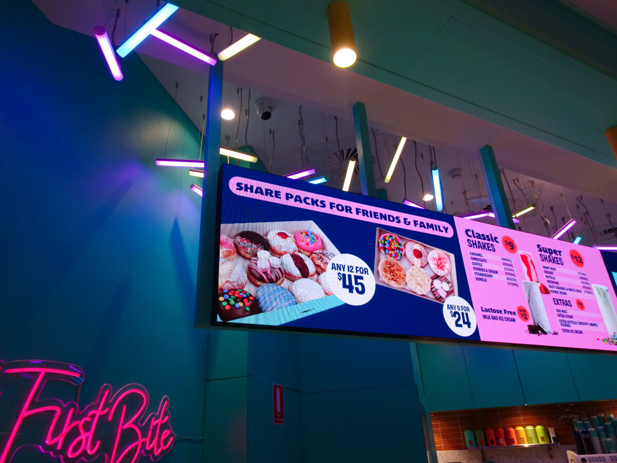
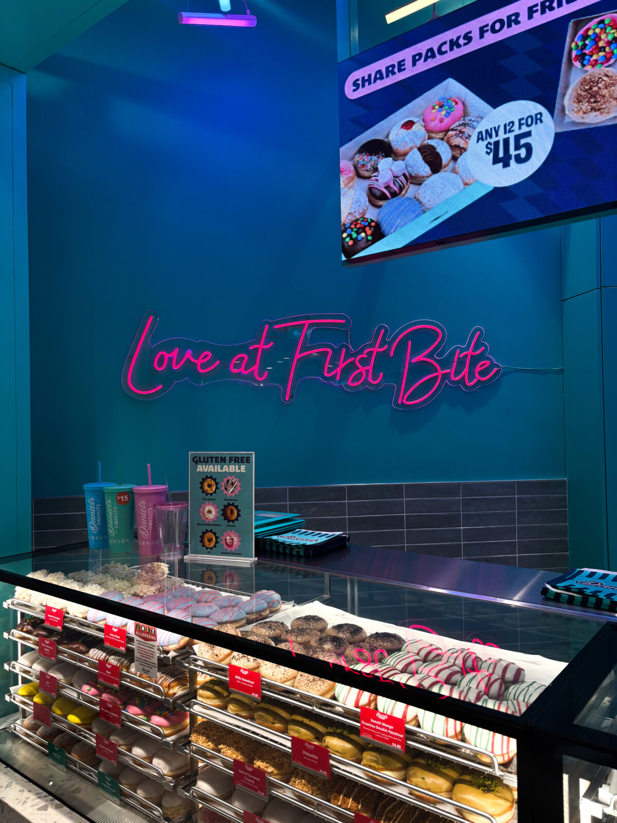
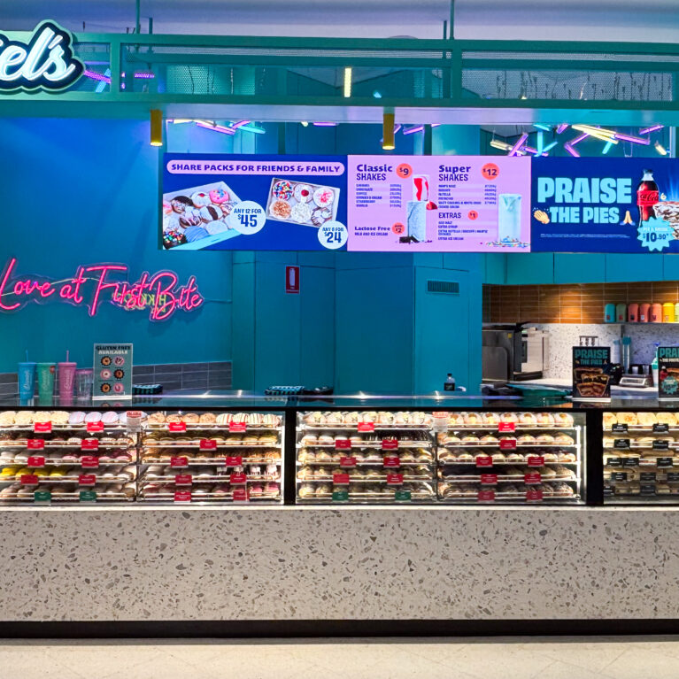
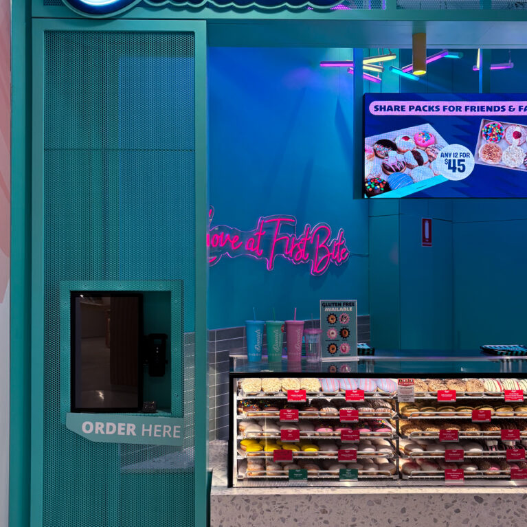
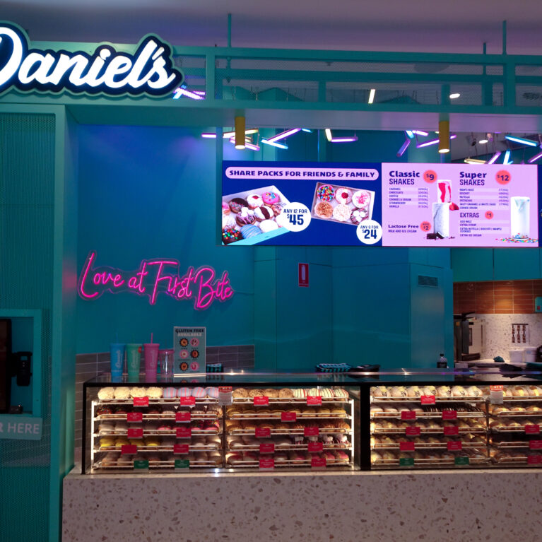
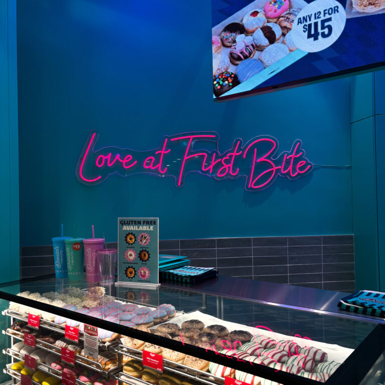
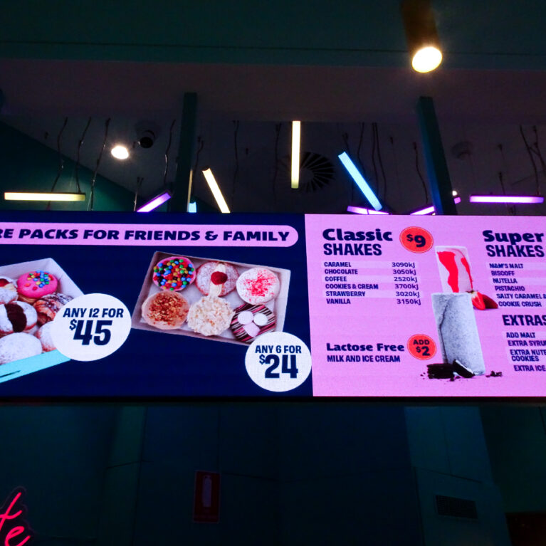
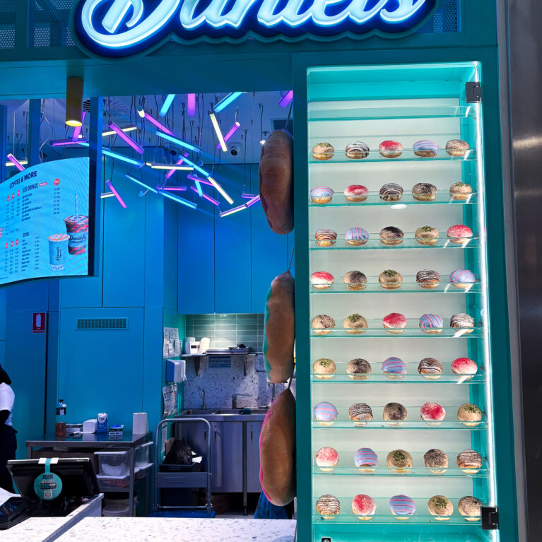
The layout follows a clear, linear assembly line—from selection to transaction—allowing customers to pause, browse, and admire the extensive donut display as they move through. This intuitive flow supports both operational efficiency and customer ease, making each visit smooth and satisfying.

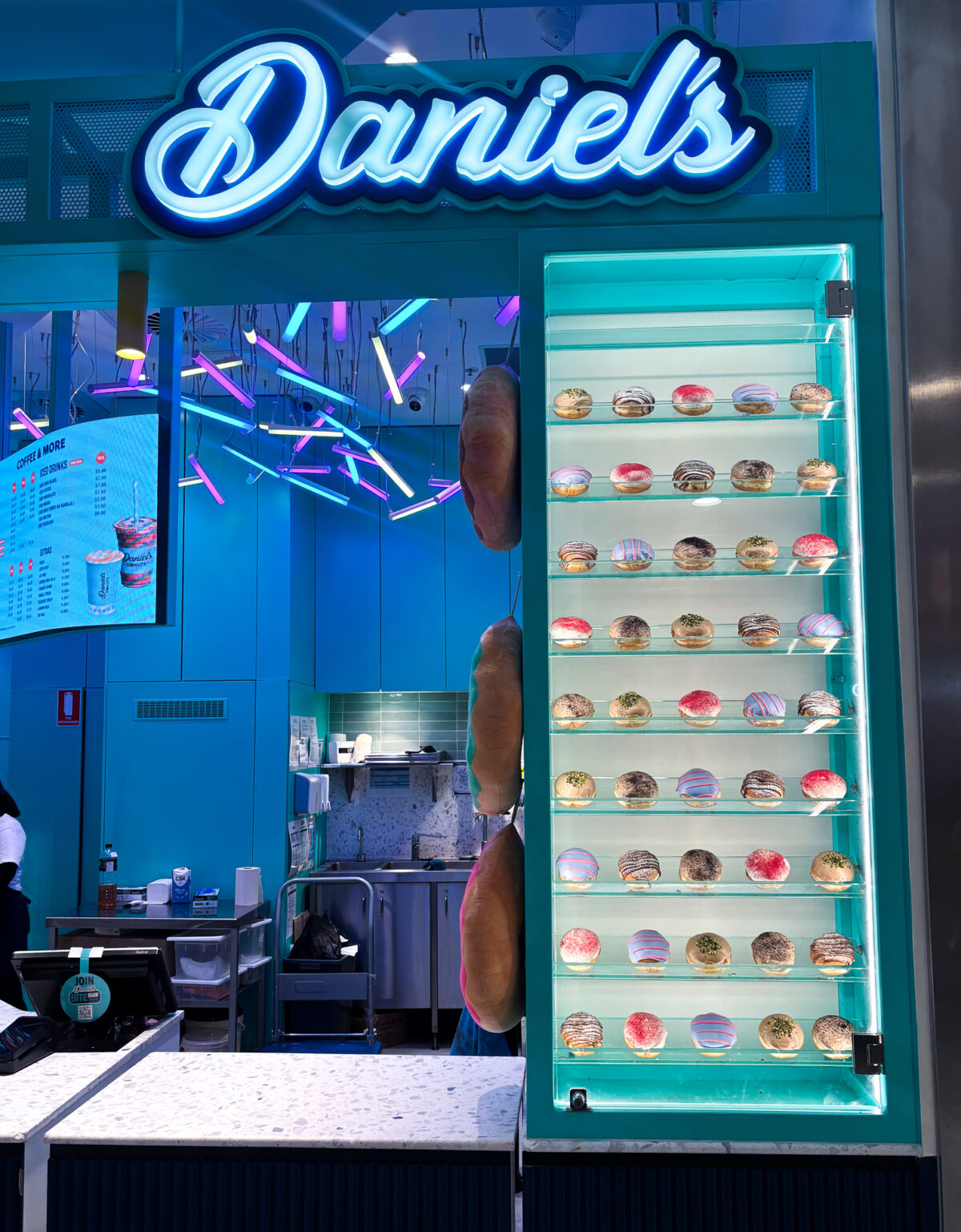
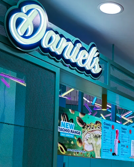
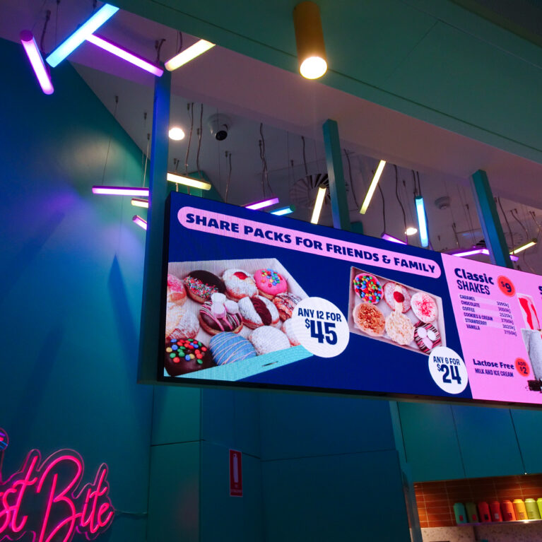
The design features subtle curves and a signature colour palette, anchored by the instantly recognisable Daniel’s Donuts vibrant teal-blue with strong brand recognition—confident, fun, and instantly eye-catching. Neon lighting adds energy and playfulness, while a terracotta-toned subway tile splashback offers a warm contrast and tactile highlight behind the counter.

While there’s no dine-in seating, the space invites interaction through its transparent display, friendly counter service, and layered visual elements. Pops of colour, product theatre, and strong brand cues make the kiosk not only a destination for a sweet fix, but also a moment of joy in the everyday city rush.

From the moment guests arrive, the space invites interaction. The integrated self-serve kiosk transforms ordering into a frictionless, tech-forward encounter—designed to maximise flow and minimise queues.

A playful, high-energy welcome to the Daniel’s Donuts experience, where the journey begins with a tap.

A vibrant ceiling installation energises the space while guiding attention to the illuminated menu.

Above the counter, angular lighting elements double as wayfinding and theatre.

A modern ordering interface seamlessly blends into the design language of the brand.

Digital convenience meets brand expression in this detail-oriented design moment.

The counter design supports the brand’s hero—the donuts—by putting them front and centre.

A linear, open display that celebrates the product and invites indulgence.

Joy is served—fresh, colourful, and with a smile.

At the heart of the experience are the staff and their passion for the product.

A photo-ready feature wall that says it all: Love at First Bite.

Beyond function, the space is built for delight and discovery.

Above the counter, angular lighting elements double as wayfinding and theatre.

Menu design is an extension of spatial storytelling—bright, accessible, and brand-aligned.

An unmistakable brand presence with curbside appeal.

Outside, the Daniel's Donuts identity is confident and cohesive.

A design that balances back-of-house efficiency with front-of-house charm.

Visibility and openness are core principles of the spatial plan.

Tucked to the side, this display invites customers to stop, take a breath, and simply enjoy the view.

A quiet pause in the rush—a curated wall of sweet possibilities.

Bold branding meets playful campaign—Daniel’s Donuts shows off its flavour innovations with confidence.

This signage moment is more than just identification—it’s a teaser for what’s inside.