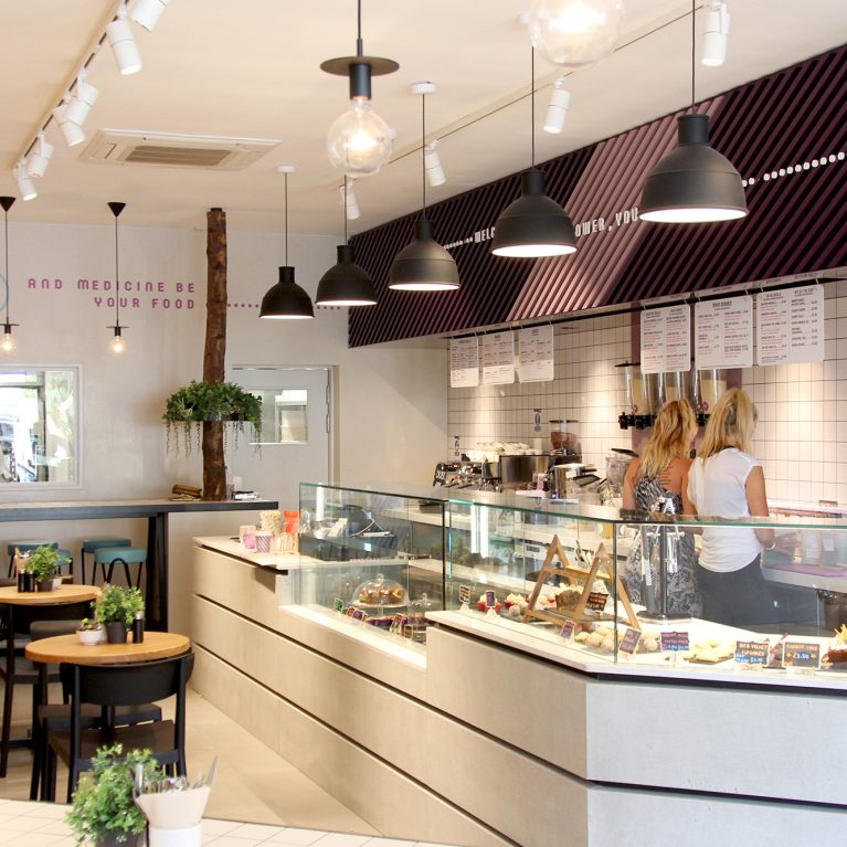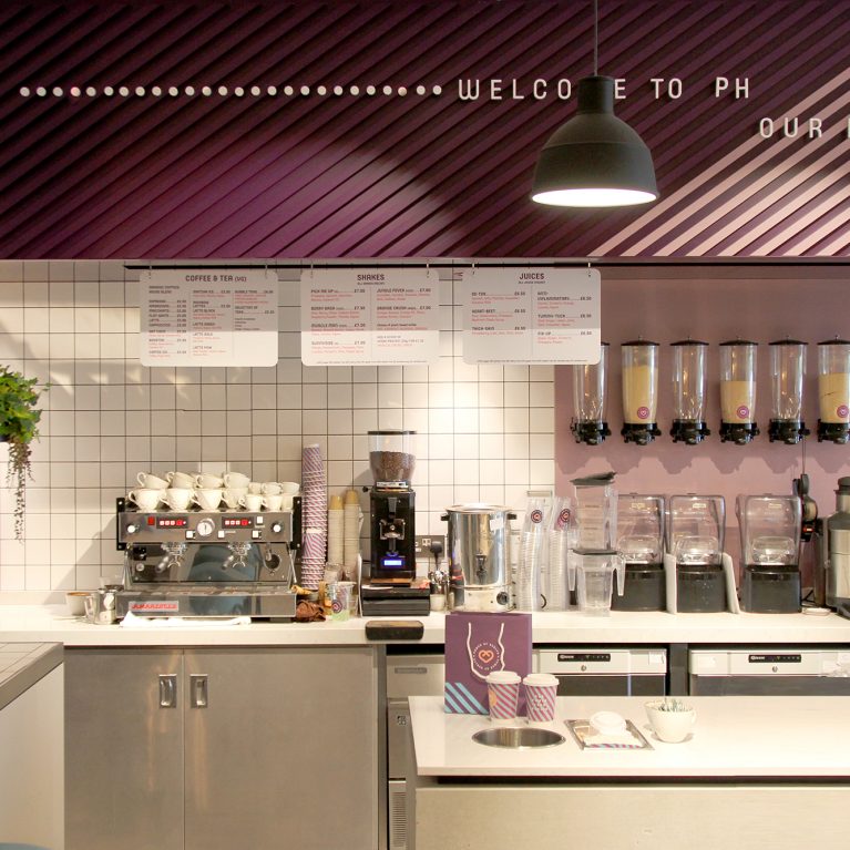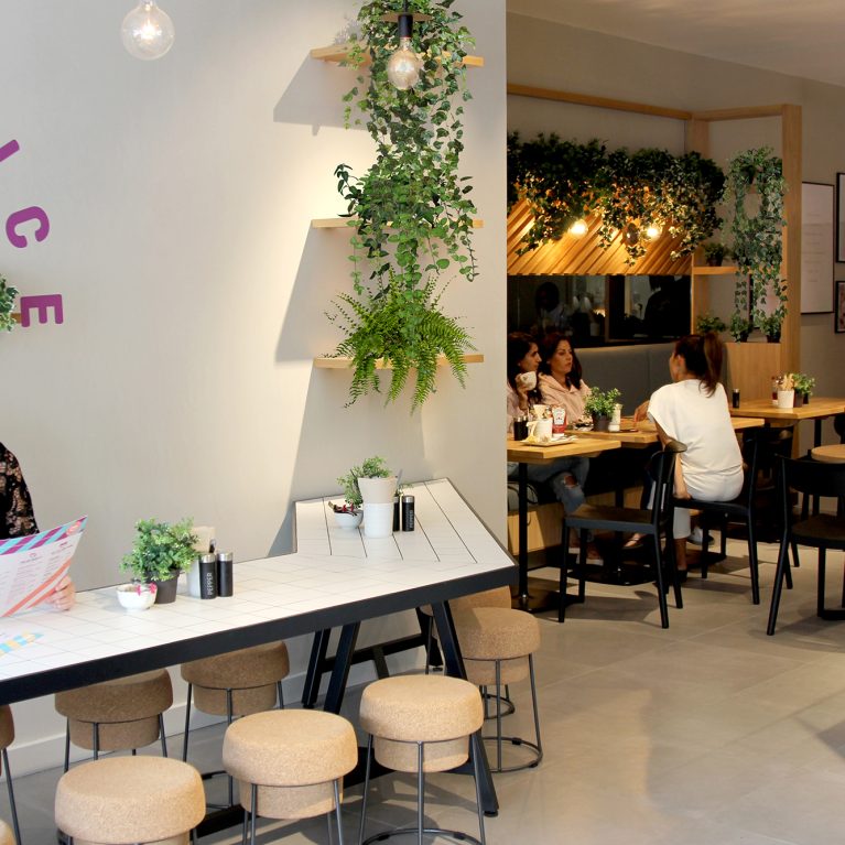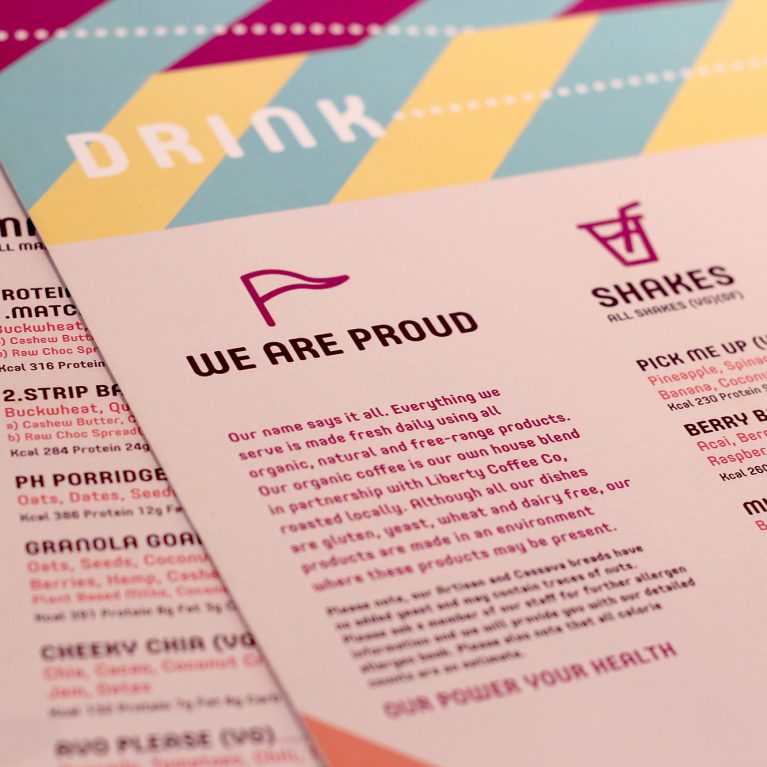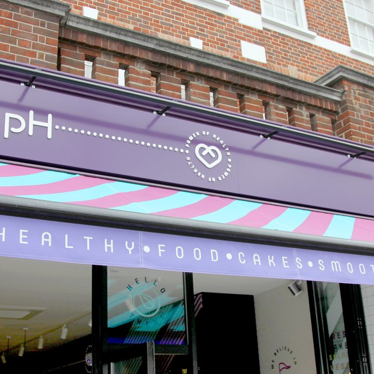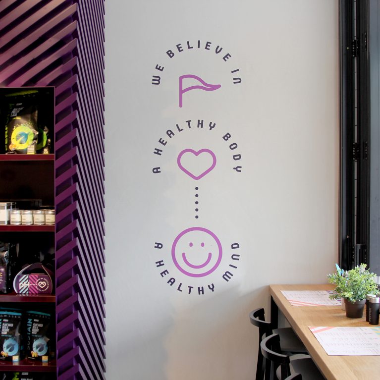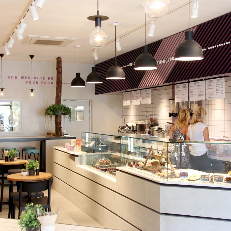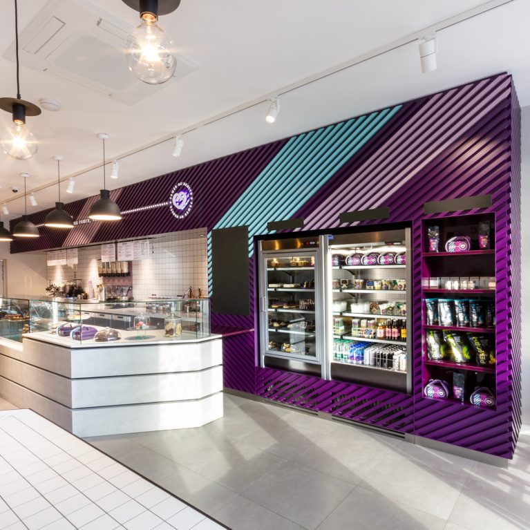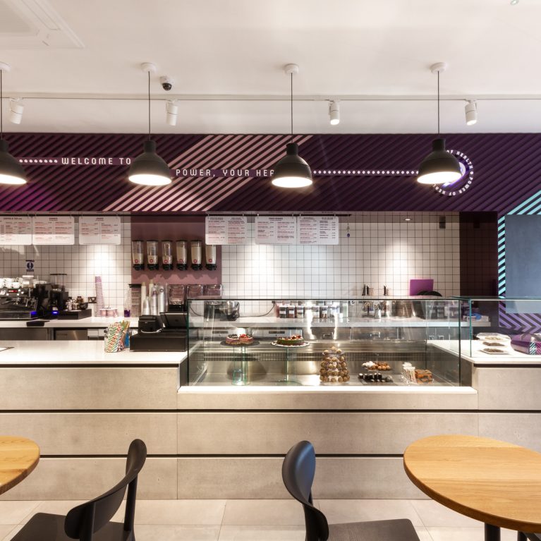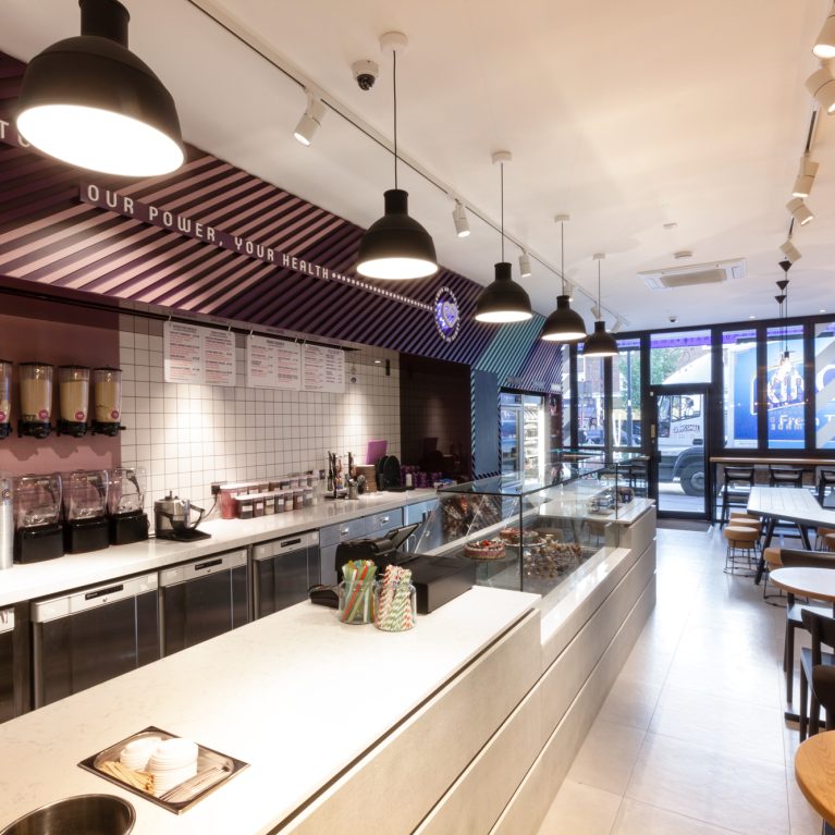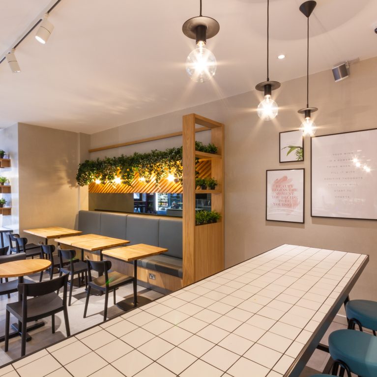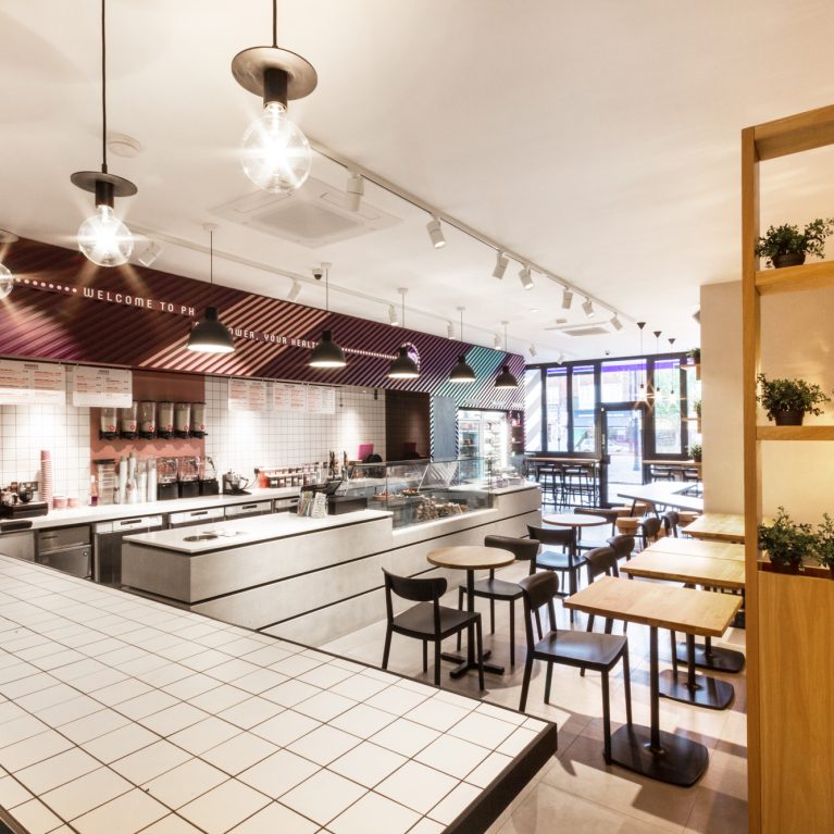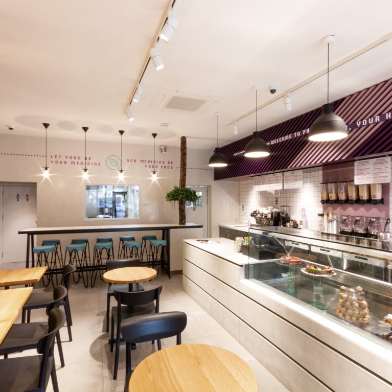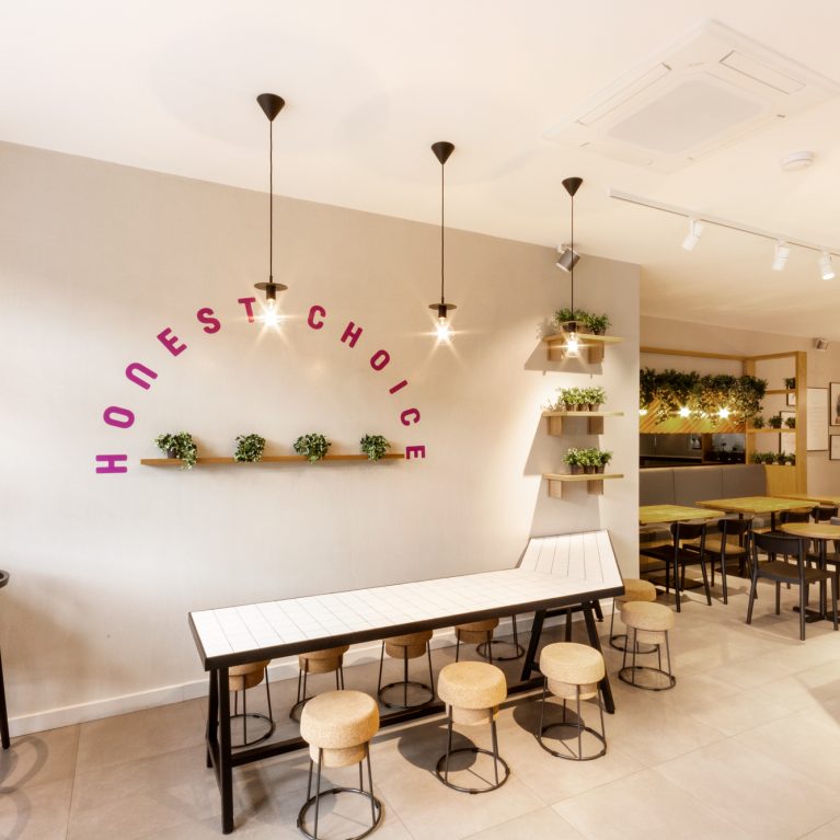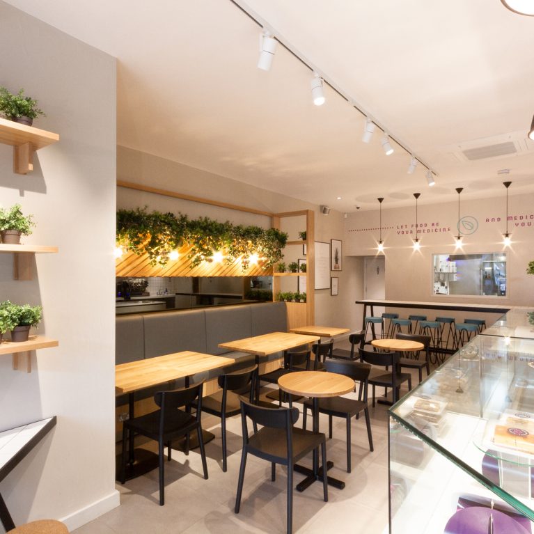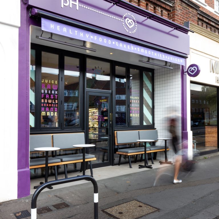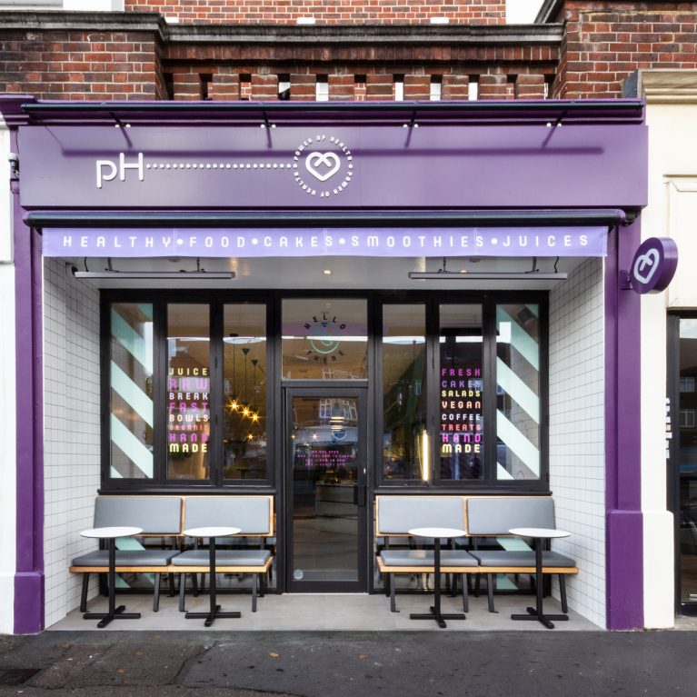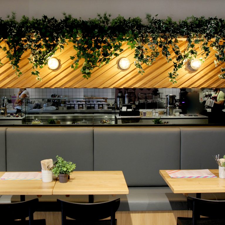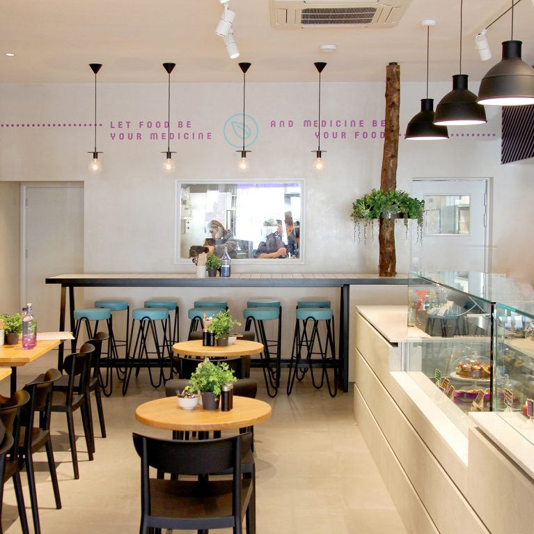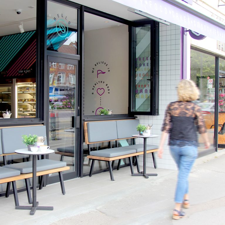
A comprehensive brand guideline coordinates every visual touchpoint, ensuring a seamless connection between graphic assets and the physical interior. The system translates the wellness concept into a clear set of design rules for signage, menu print layouts, and digital storefronts. This strategic framework ensures consistency across all retail channels.
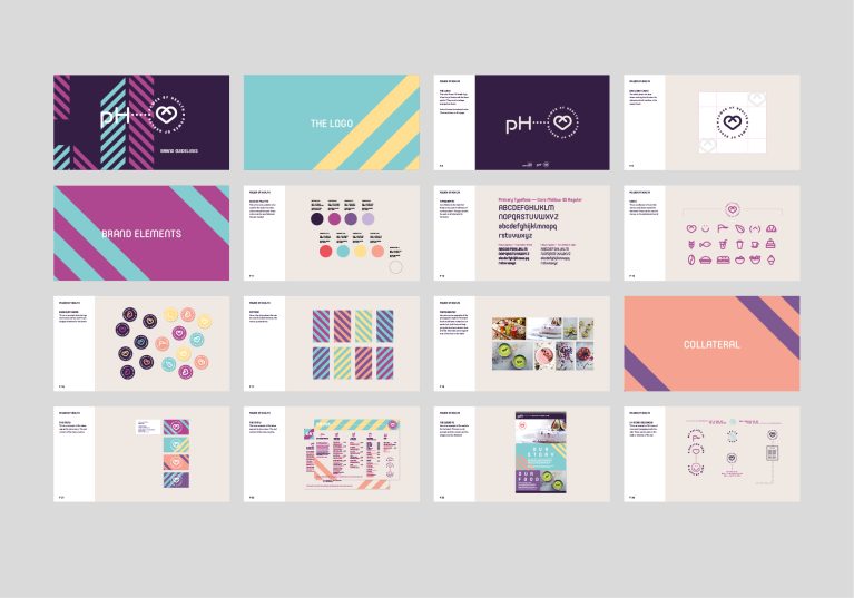
The multi-page matrix presents a detailed look at the corporate identity, organized on a clean, light grey layout with left-aligned typographic indexes. Individual sheets define the core logo placement, typography hierarchies, and secondary graphic rules, like the 45-degree diagonal stripe patterns seen on the cafe walls. This precise structure helps external fabrication and shopfitting teams execute the exact brand vision on-site.
The panels break down the packaging design, custom menu icons, and photography curation style that bring the wellness message to life in the space. The guide maps out color codes for the signature purple, teal, and peach color scheme, making it easy to match painted surfaces with printed materials. This rigorous system shows how corporate branding and spatial architecture work together to build an immersive hospitality experience.