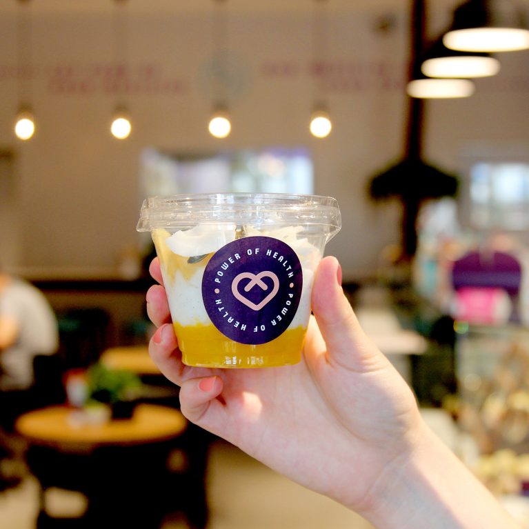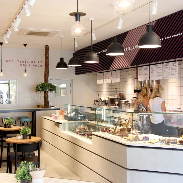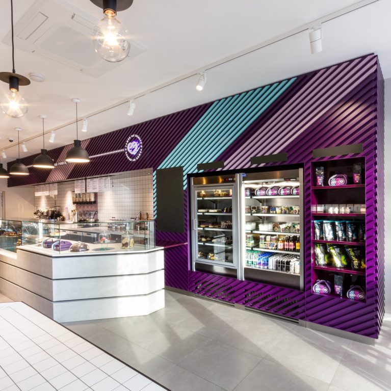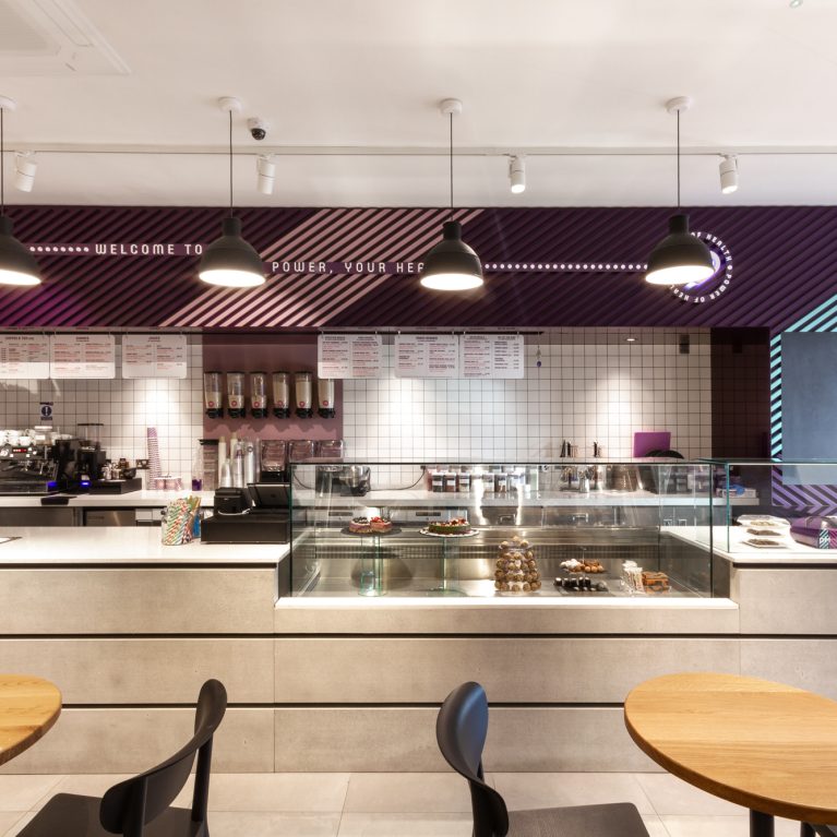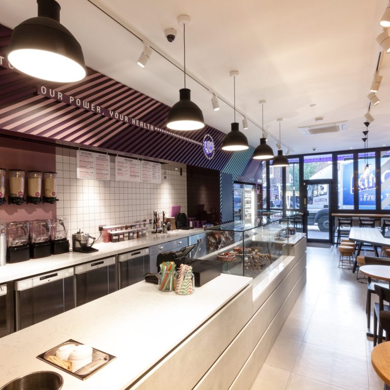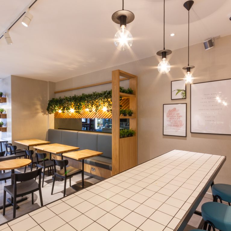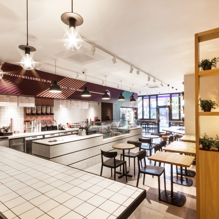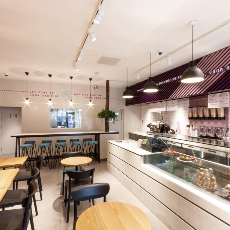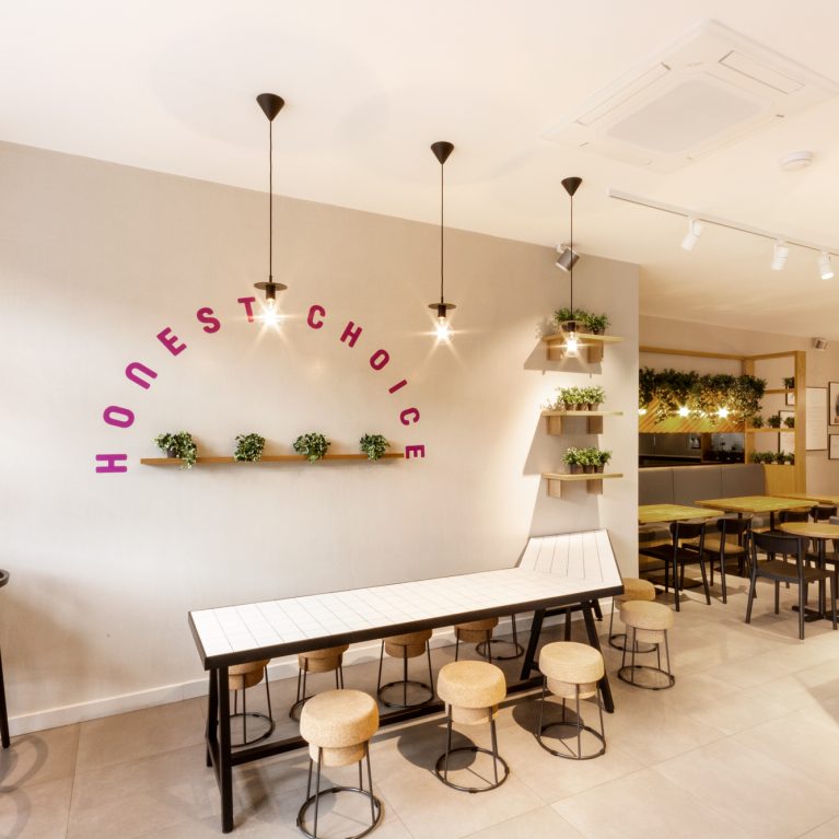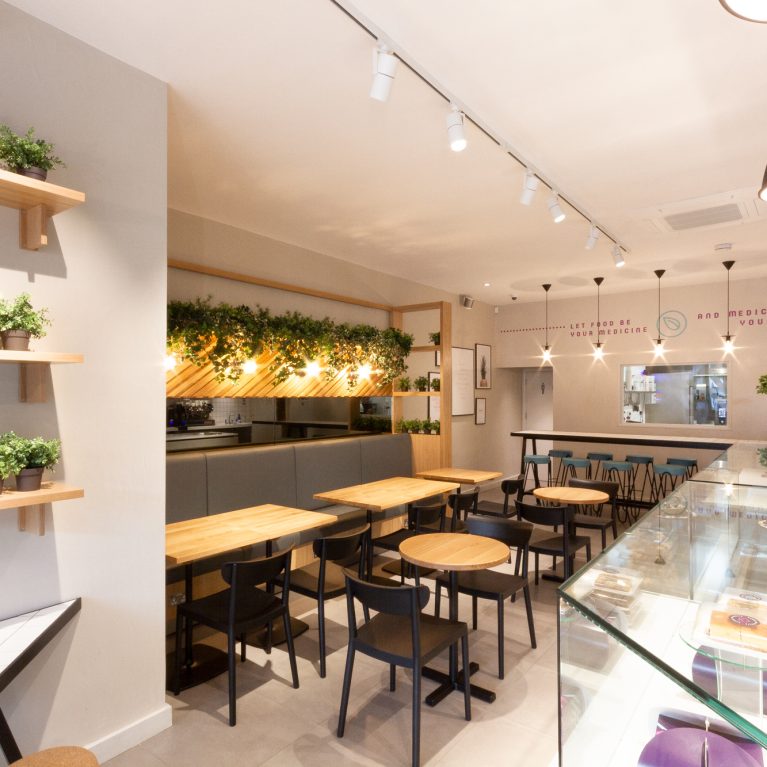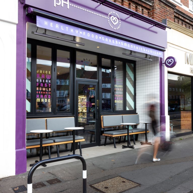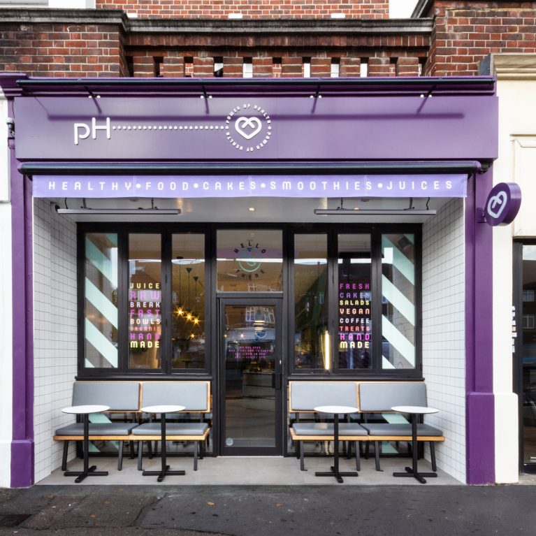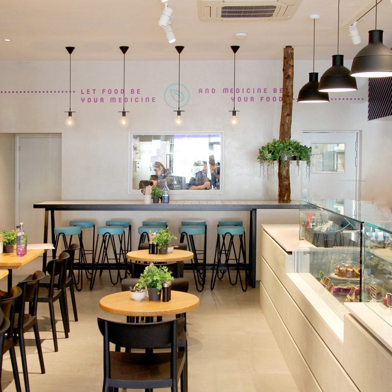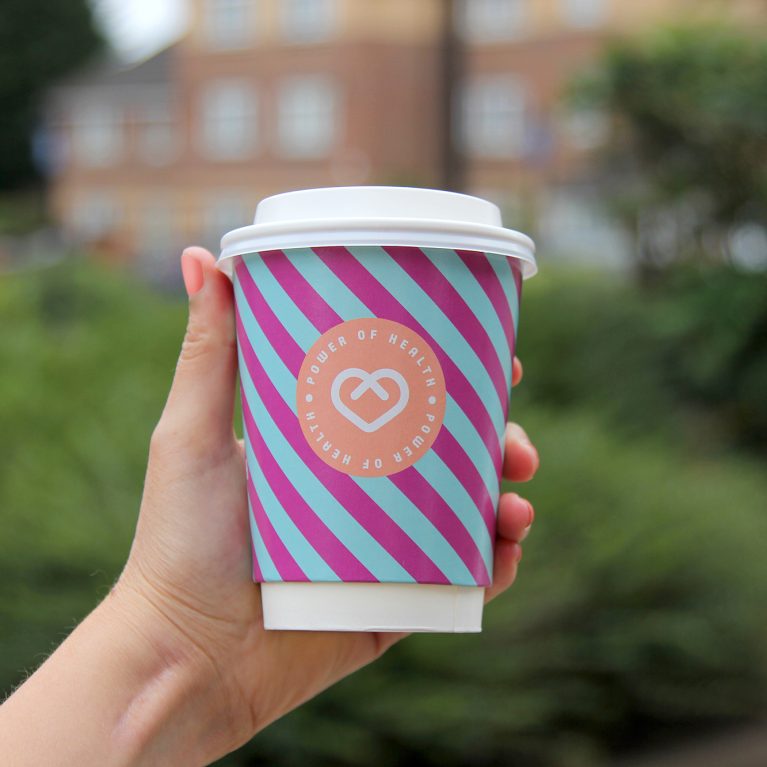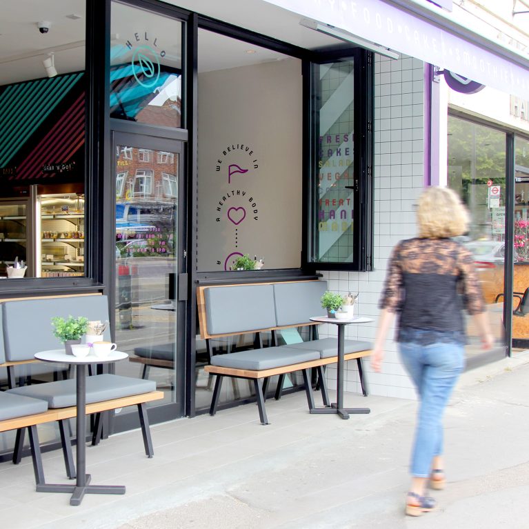
The takeaway container blends into the cafe's large-scale wall patterns, turning a simple product into a part of the interior architecture. This matching style makes sure the brand's identity stays strong whether a customer is dining inside or carrying their drink down the street. The layout uses high-contrast colors to catch eyes instantly in busy public spaces.
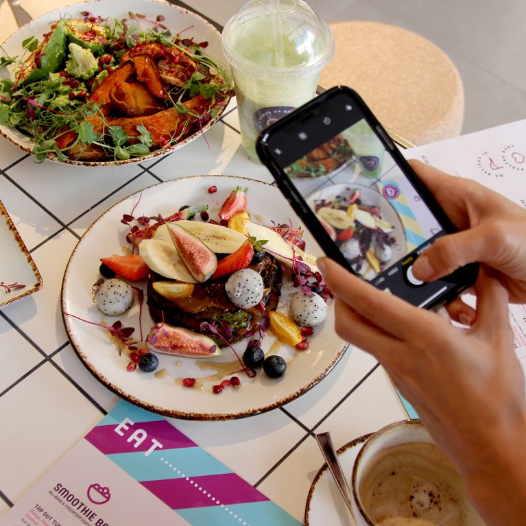
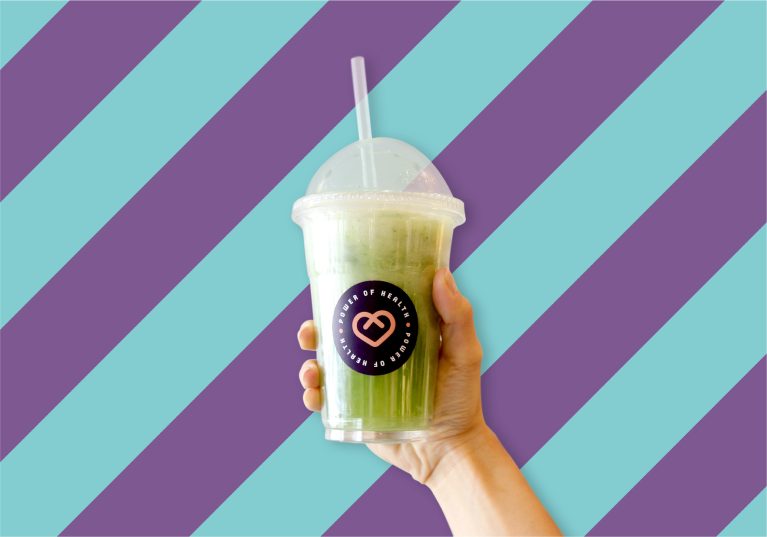
The clear plastic smoothie cup holds a vibrant green juice, letting the raw color of the fresh product serve as a natural design layer. Centered on the front, a round black sticker features the peach heart logo and clean corporate typography. This dark label contrasts sharply with the bright green drink, making the logo easy to spot from a distance.
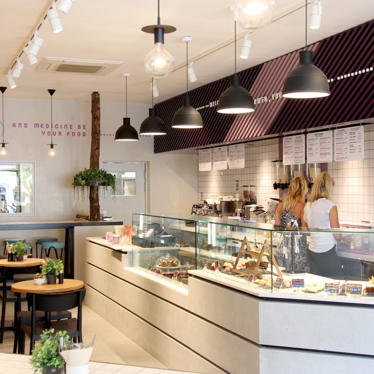
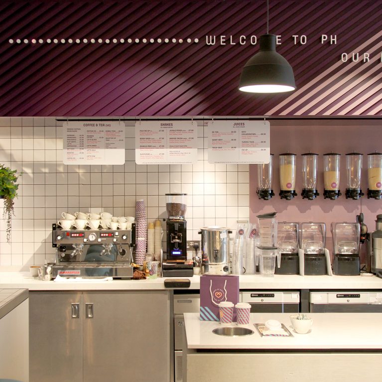
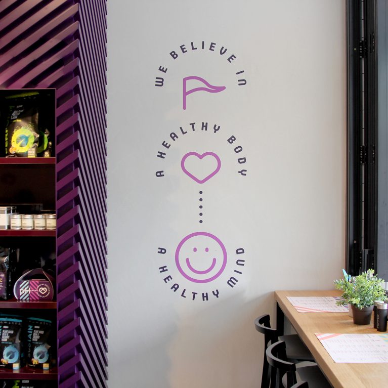
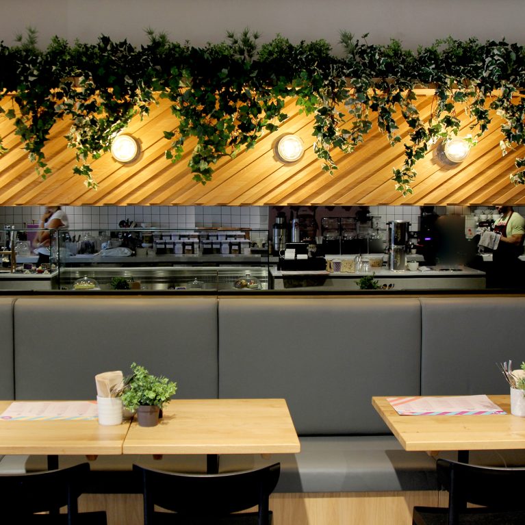
Behind the cup, the prominent feature wall displays the brand's signature 45-degree diagonal stripes in deep purple and teal. This geometric pattern references the custom timber slat installations built over the cafe's main service counters and display fridges. The smart combination of clear product packaging, bold graphic walls, and rich colors delivers a highly polished, memorable hospitality look.